
SKY ARTS LANDSCAPE ARTIST OF THE YEAR SERIES 8: MEET THE ARTISTS
20th Feb 2023
Sky Arts Landscape Artist of the Year Series 8 has treated us to some spectacular scenes, as talented artists from across the UK prepped their palettes, primed their canvasses, and prepared to compete to be crowned Landscape Artist of the Year. Cass Art has supported the show since it began in 2015, supporting all participants with art materials throughout the competition.
The artists are challenged with just four hours to capture scenes from the beaches of Blackpool to the races at Ascot, all under the watchful eye of judges - award-winning artist Tai Shan Schierenberg, independent curator Kathleen Soriano, and art historian Kate Bryan. All this, for the chance to win a £10,000 commission for Royal Museums Greenwich to create a work celebrating the Dutch fathers of seascape painting - the van de Veldes, and £500 of materials from Cass Art. This series saw 2,000 applications, 48 artists and six heats. Plus 50 additional artists painted along at each location in a bid to be chosen as a wildcard winner and be in with a chance of receiving an invitation to compete in the Semi-Final.
We caught up with the heat winners and wildcard winners from this series to discover the materials they love to use and their experience of the show.
HEAT 1: BLACKPOOL BEACH & VICTORIAN PROMENADE
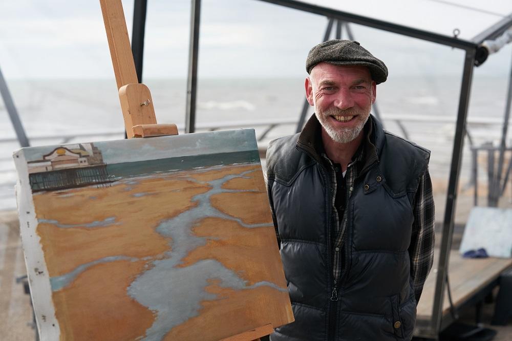
WINNER - FINN CAMPBELL-NOTMAN
Hi Finn, congratulations on winning Heat 1 of Sky Arts Landscape Artist of the Year Series 8! What was the experience like?
After
the previous two years I’d had and indeed after the interesting journey to
Blackpool (travelling through the Wye Valley and Shropshill hills with a
friend in a camper van) the day itself was a breeze. I was surprised how calm
and relaxed I was particularly as the day was, well, a typical British seaside
day to begin with: dark, rainy and grey upon grey. So despite us, the
contestants, all shivering and bleary-eyed we simply got on with the job hand
as best we could. The heat was a much bigger production than I had expected: a
big team, a lot of cameras but they all made us feel entirely at ease.
Conversely, that made focusing easier rather than more difficult since it is
such a contrast to painting solo in a studio that there is only one thing that
remains the same - making a painting. I’d say to anyone interested in
entering keep that in mind and don’t worry about the rest; being on camera,
interviewed, judges tapping you on the shoulder for a chat and so on. As for
the ’talent show’ aspects: working against the clock, the judges
selecting three from eight contestants during the first lineup and then the
winner from the subsequent lineup of the three: the pregnant pauses, the
waiting while the judges decide all of those things, whatever one hopes the
outcome to be, again those are out of one’s control so while a tad nerve-wracking
what I felt most of all upon winning was exhausted relief, surprise, more
relief and then joy. It’s a challenging day.
The judges said your submission was like a Symbolist painting, that everything has a meaning and sense of mood. You managed to create the same atmosphere in your painting of the shallow pools of water on Blackpool beach. How did you achieve this?
I
have a lot of influences, all of which find expression from time to time,
consciously or otherwise. Despite being a professional I’m very much still a
student of painting and of art, culture, literature, film and so on. This
continual study and practice all gets folded into my work. However the glue is
I suppose me: my personality, outlook on life, the world and that always comes
through in the work - which is a longish way of saying that that’s what the
judges picked up on; that everything in my work, from colour and tonality to
composition and motifs is both from observation but that is my filtered and
selective observation and the resulting work has that freighted, perhaps
Symbolist feel. I use the term Irrealist; as I say I paint in a
representational style but all of the above renders the scene or subject in a
somewhat visionary manner. I’m definitely not a surrealist. I do a lot of
pre-painting composition while allowing for the incidental and happenstance.
It’s as if in setting the stage correctly the ’story’ can unfold in real-time.
That’s how I achieved the atmosphere of the painting of Blackpool beach.
The composition I arrived at by arriving in Blackpool the previous evening and
noticing that the tide was out and I wondered if it would be the next day. I
checked the tide times and the weather forecast and thus knew that I’d have
until 1pm on the day with those pools, the sea pretty calm and a few hundred
feet away, a grey sky and glum looking pier. The first thing I did on the day
was sketch, very quickly, the composition. This was informed by two things that
I chatted about with the judges and presenters during the day. These didn’t
make the cut. Firstly I talked about a big influence on my work from long ago -
Michaelangelo Antonioni (about whom I’d written a thesis). His visual language
includes the blank mise en scene where the camera is looking at a view for a
time before someone, a car or a sound might appear and because our expectation
as viewers means that we know something will happen we just don’t know what, an
anticipation is built. Now this is very different than simply selecting a
random view, there have to be some cues and that brings me to the second thing
I mentioned to Tai et al - Gustav Klimt’s landscape paintings. These are
not well known but are interesting since in them Klimpt forces the horizon to
the extremities of the picture place. He does this to foreground the abstract
nature of what is in view. For this he used a telescope at times thereby
lessening the depth of field.
So together; Antonioni’s off screen/stage left/right expectation and Klimpt’s shallow depth of field were two things I was thinking about to create a composition from the paucity of what was in front of me that had a mood and a tension that was otherwise fairly absent. It is by no means a great painting but is perhaps an arresting image.
What are your go-to art materials that you simply can’t do without?
It very much depends on what I can afford! These are some of my preferred materials: Linen, preferably Claessens, rather than canvas but I use both for oils. I generally stretch and prepare my own supports principally because that allows me to compose without set formats. I do use pre-stretched canvas and for those I prefer the standard French sizes (this helps in finding great old frames from time to time). I like a warm ground very often and for that I use Old Holland Gold Ochre for the lightest grounds and that mixed with a Raw Umber (this can be very variable in hue so a more ruddy ground I use Rembrandt Raw Umber (which is also fairly transparent) or Roberson (which is a tad greener and thus cooler). I must always have Sennelier Sepia such a subtle green, brown bronze but almost never use Terre Vert at all. I always have a number of colours from, for me, the best oil makers: Blockx - their cadmium red is like nothing else (use very sparingly though). And always some inexpensive basic colours too Royal Talens, Titan etc. Recently I’ve been using Roberson’s quick-drying glazing medium to satisfying effect. Brushes: I have a couple of hundred in various states of disrepair, everything from knackered old household paintbrushes hacked at with scissors to a couple of small Cornellison sable brushes (well looked after these of course). Again I’ve found Roberson brushes really good. Trouble is, the way I paint nothing lasts for very long.
Thanks Finn! See more of Finn’s work at ficano.art or @finn_campbell_notman_art on Instagram.
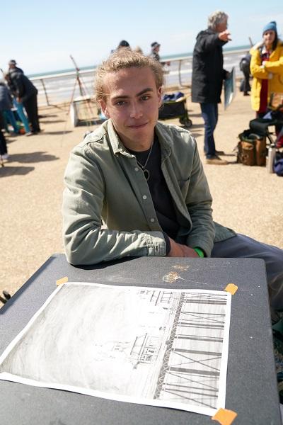
WILDCARD WINNER - LUKE STURGESS
Hi Luke, congratulations on being selected as the Heat 1 wildcard winner! Tell us about your experience on the day.
Thank you! Honestly, the day was just surreal. I entered simply on a whim with an excitement for the experience never expecting to even make it in let alone win the heat as a wildcard. Meeting the judges and presenters was great, seeing people I’ve looked up to for years watching this show and to have such kind comments and approval from them was indescribable. Though, I think the best part of the experience was meeting and being among the fellow wildcard artists and crew. The sense of comradery and chilled atmosphere just made it so nice to be there no matter how much pressure you would expect there to be, it felt like a breeze. We even have a little wildcard group chat going to stay connected. Overall, despite the weather, I would call this one of the best experiences and days of my life and would highly recommend anyone feeling like giving it a go to go on and do it.
The judges enjoyed the gothic quality of your drawing of Blackpool pier, with its brooding sky. What was it about that section of the scenery that appealed to you?
To be honest, I found not much else to draw from, my intention at first was to turn around in some way and paint the streets, yet we were lower than expected and I couldn't really get a good view of them. But the pier is just such an iconic part of Blackpool and compositionally the stands on it were just very satisfying. I felt the portrait composition was less twee than the typical landscape for the pier, also sectioning out this small block of character in a place full of characteristics such as Blackpool. The sky was brooding, to say the least, and I believe its inclusion along with the foundational trust holding up the pier and the crashing darkness below really captured the weather of the day along with grounding the scene in the water and the vast ironic openness of the coast of Blackpool. Personally, I find the piece quite joyful, given the charcoal does give it an eerie quality, I simply see a nice scene, which I’m sure many people have several joyous memories of finding happiness and beauty in the mundane.
What are your go-to art materials that you simply can’t do without?
I stand by Uni Pin 0.03 fine liners no matter how big my drawings get. I always fall back on these for details plus once I’ve drained them as much as possible, they're great for texturing. As for charcoal I honestly can’t go wrong with just a B&M set and used these pencils along with some unbranded charcoal sticks I found in the wildcard piece. I have also more recently branched further into acrylic painting and have been using Arteza acrylics almost religiously with WLOT miniature paint brushes primarily.
Thanks Luke! See more of Luke’s work @luke.sturgess.art on Instagram.
HEAT 2: ROYAL ASCOT RACECOURSE
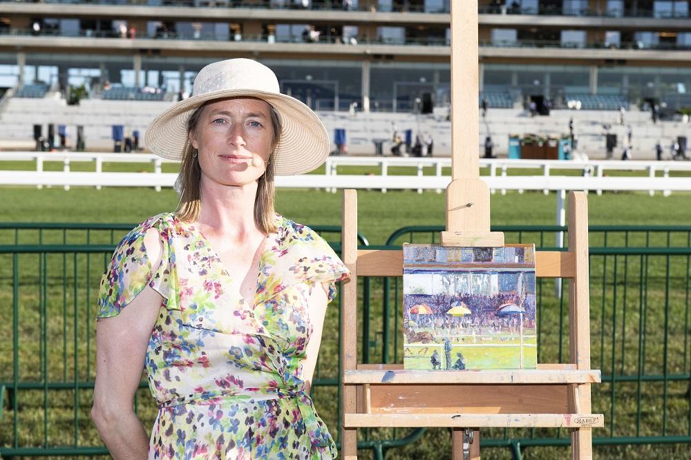
WINNER - SUSANNA MACINNES
Hi Susanna, congratulations on winning Heat 2 of Sky Arts Landscape Artist of the Year Series 8! What was the experience like?
Having had the opportunity to paint at three series of LAOTY ; wild card in 2019 Newcastle, a pod in 2020 at West reservoir and now a pod at Royal Ascot Racecourse for series 8, I have on each occasion had a great experience painting plein air among the crowds and in front of the cameras. Plein air painting isn’t for everyone, there’s no popping out of the studio for a cuppa or having control of the light, or taking a break and ‘coming back to it’ but for those of us that do it, it’s an unforgettable experience filled with colour, adrenaline, self-doubt, compliments, criticism, expression, and pure stamina. Ultimately it’s a way of sharing our passion for painting with a huge audience, both on the day and in the final broadcast in the case of Landscape Artist which I was thrilled to be a part of this year. It was amazing to win my heat. All the artists worked so hard and produced fantastic paintings. I really enjoyed the camaraderie and making new painting friends.
Both your submission piece and the work you made at Royal Ascot on the day captured a wonderful sense of light and take the viewer on a journey through the painting. How do you accomplish this in your works?
Light and how it travels through a composition forms the skeletal framework of my paintings on which I can then build up colour and tone. I am fascinated by the transparent and opaque quality of different paints as well as how colours react when placed next to each other.
What are your go-to art materials that you simply can’t do without?
Oil
primed linen to paint on, I use Poppy Seed oil, Michael Harding Portuguese Turpentine, Michael Harding Oil Paint Medium, Winsor & Newton Artists' Oil Colours, Michael Harding oil paints, Rosemary and co brushes,
in particular their evergreen angular brushes. For my submission painting and on the
day of filming I chose to paint on oil-primed linen adhered onto a square
10” x 10” board.
Thanks Susanna! See more of Susanna’s work at pindroppainting.com or
@pindroppainter on
Instagram.
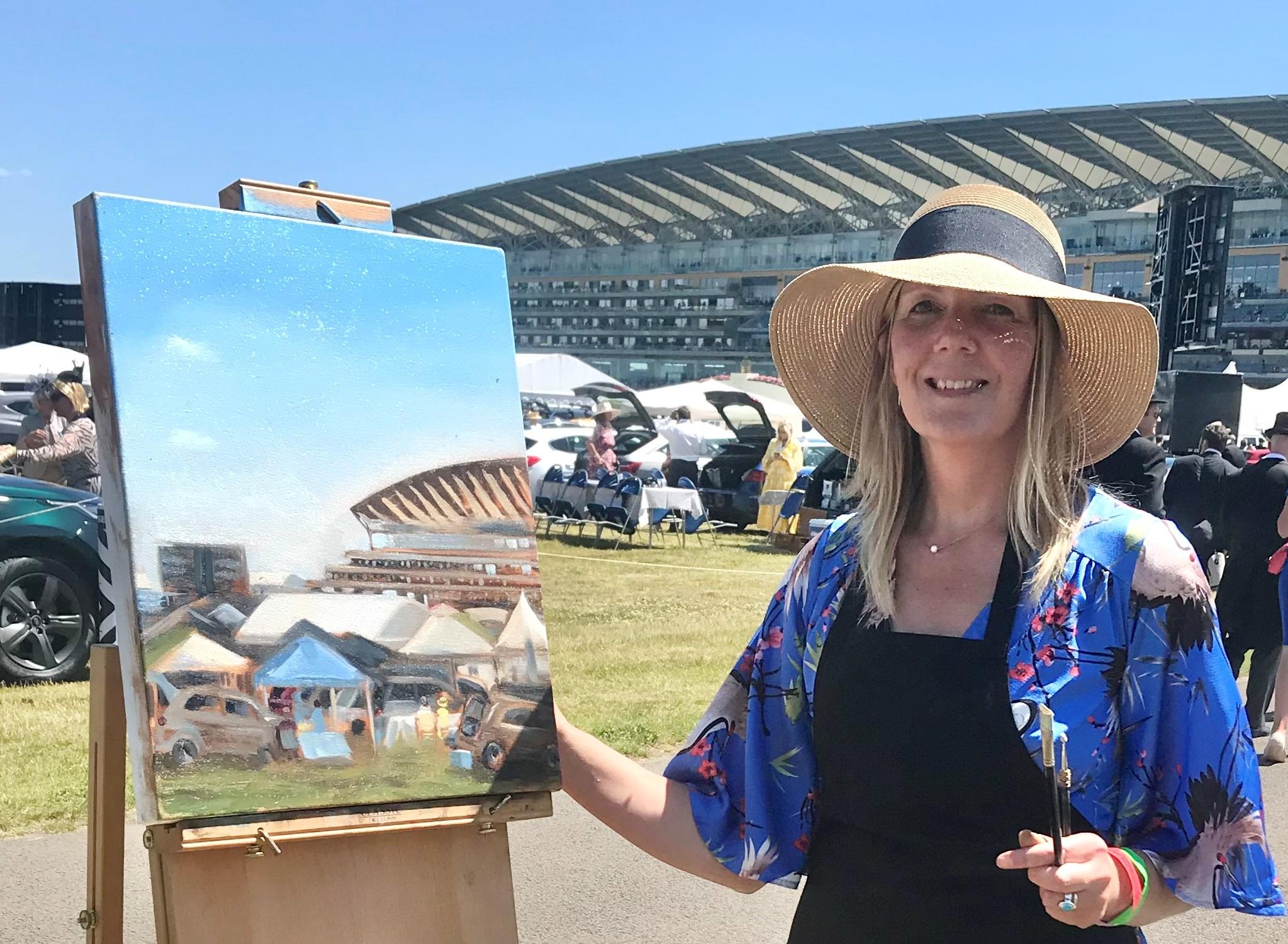
WILDCARD WINNER - KATHY EVERSHED
Hi Kathy, congratulations on being selected as the Heat 2 wildcard winner! Tell us about your experience on the day.
I enjoyed every bit of my day at Royal Ascot. This was my first time participating as a Wild Card having been encouraged to do so by a friend who had done it before. With zero expectation to win, I had simply set my mind to enjoying the day as much as possible so I was quite relaxed throughout the day. To then win was a complete surprise and a massive confidence boost!
Your painting captured some of the other action at Ascot, with parked cars and visitors seated at tables, it was full of character. You started by underpainting in browns, adding colour later, can you talk us through your process?
I painted using water mixable oil on the day. I often start my paintings with a coloured ground and wipe away the light areas with a wet wipe. This enables me to quickly ‘draw’ out the composition and make any adjustments easily and quickly. The subject matter was really complicated but I had been advised by my friend to just paint what was in front of me. I reminded myself that everything was a shape and a colour to avoid being too daunted by the car park! Thankfully a couple sitting down at a table caught my eye and gave me something I liked to build the picture around.
What are your go-to art materials that you simply can’t do without?
I love Rosemary and Co Brushes as they have such an amazing range and are really good quality. I use Winsor & Newton water mixable oils where I can but sometimes supplement with traditional oil paints.
Thanks Kathy! See more of Kathy’s work at kathyevershed.com or @kathyevershedart on Instagram.
HEAT 3: CASTLE WARD NORTHERN IRELAND
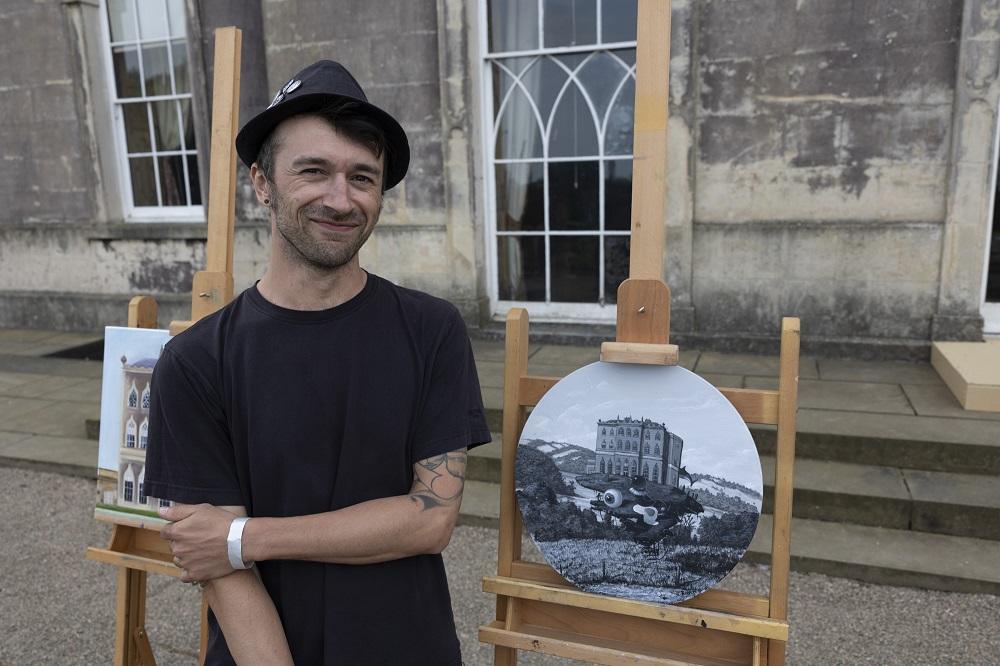
WINNER - STEFANO RONCHI
Hi Stefano, congratulations on winning Heat 3 of Sky Arts Landscape Artist of the Year Series 8! What was the experience like?
Thank you very much. It was great / strange / tense. I don’t usually paint anything in 4 hours and I rarely do en plein air, apart from something on my sketchbook. So, when I knew I was selected, I did a few fast en plein air studies. I then decided that my best bet would be a black & white painting, which would allow me to maintain a certain level of attention to details and the freedom to “fly away”, even in a short span of time.
Your painting was unlike anything the programme has seen before; in monochrome paint you captured the building, you turned your back and captured the other side of the landscape, and added your own magical touch with surrealist elements – a Dali-esque fried egg, a shark tail, an eyeball and more! And somehow you managed to bring all that together into a successful composition. Can you walk us through your thought process as the painting developed?
Thanks. I simply thought that the back landscape was beautiful (hills, lake, sky: perfect) and still part of the same environment. I turned my easel also to keep calm and to paint something chilled for some time, as I don’t like to paint architecture too much. I love Miyazaki’s Moving Castle and my idea was to make that strange Castle Ward fly above its lovely surrounding. Unfortunately I did not have the time to finish the painting, but in 4 hours I had at least a representation of that day, including the morning’ English breakfast.
What are your go-to art materials that you simply can’t do without?
Well, I mostly work on canvas and my favourite is the linen one. If I have available a cotton canvas, I add a few layers of gesso to it (the brand here does not matter much to me). If using charcoal, again I have no particular brand, but if we are talking about pencils, then Faber Castell are definitely my favourite. With acrylic paint I love using Ara, while for medium/varnish I go for Golden or Winsor & Newton. What I do with oil painting is mostly with Winsor & Newton products (including Liquin medium, Sansodor, varnish, paint). In terms of brushes, I literally devour 2 or 3 mini round brushes per month, usually the Pro Arte ones with triangular grip handles.
Thanks Stefano! See more of Stefano’s work at ronch.co.uk or @ronch1985 on Instagram.
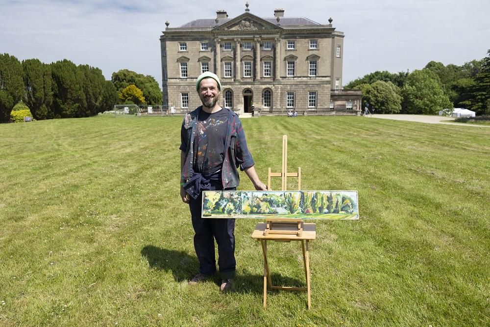
WILDCARD WINNER - MATTHEW TIMMINS-WILLIAMS
Hi Matthew, congratulations on being selected as the Heat 3 wildcard winner! Tell us about your experience on the day.
Having been a LAOTY fan for a long time and an admirer of all the participants over the years I was just super happy to have even been part of the Wildcard crew on the day. As for being selected as the winner on the day, that is a memory I'll never forget. The day kind of went by in a blur as I was very focused on my painting, however it was still a lot of fun and there was a real positive energy in the air. Everyone seemed to really be enjoying themselves, which made for a really nice environment for both me and my wife to be a part of.
You chose a very long, thin panel to paint on, using expressive brush marks in a loosely painted style, capturing the light of the day with deep greens in the shadows and a powder blue sky. Can you walk us through your colour palette and how you approach landscape painting?
My painting started as a basic sketch on the board rendered in a thin Prussian Blue acrylic. I have a tendency to overwork paintings with too much colour early on so having a structure to work to really helps me navigate my way around a painting. By the end of a painting, I've usually worked through all the colours I have. I don't use any black on my palette, instead I prefer to make my darker tones with a mixture of Raw Umber, Prussian Blue and Cadmium Red. I built up the layers in quite thin glazes making sure I didn't get bogged down on focusing on one area. This encouraged me to be active and move around the board a lot until the painting naturally reached a point of completion. The light quality of the day changed quite dramatically throughout the time of painting, so I decided I wanted to try and capture a sense of shifting brightness.
What are your go-to art materials that you simply can’t do without?
I draw a lot and my must-have pens are Pilot g-tec c5, Pentel Japanese Brushpen, and Mitsubishi Uni-pin 0.03. I only ever use water-based paint and I only ever really use System3 Acrylic, I like the plasticity.
Thanks Matthew! See more of Matthew’s work @matthew_timmins_williams on Instagram.
HEAT 4: BLACKPOOL PLEASURE BEACH
WINNER - ANNE BYRNE
Hi Anne, congratulations on winning Heat 4 of Sky Arts Landscape Artist of the Year Series 8! What was the experience like?
All the artists will have their own experience, but I found the day itself to be a combination of so many different aspects that collectively make the ‘LAOTY ‘experience such a unique one. Apart from tackling the creative challenge, it’s not every day that you find yourself having a film crew and production team capturing you paint as well as a lot of interest from the public (who were wonderful) who are watching too. An extra enjoyable aspect is being with other artists, and I’ve kept in contact with some which has been great.
The day is so fast-paced, with stop and starts for interviews and chats with the judges (who I found to be very supportive and keen to understand your approach), there simply isn’t as much time to step back and ask - as well as answer questions about the piece you’re working on. In my studio, that really is an essential part of my creative process. Consequently, I made sure that I found and took time to stand back and review my painting as often as I felt I needed to in order to create a painting that I felt reflected my interpretation of the day.
Physically, the weather was brutal with wind and rain for most of the day. Keeping focused and ‘in my zone’ was the only way I could successfully wrestle with those elements that otherwise could easily have stopped me from concentrating on the challenge.
Your finished painting was composed of bold and loose brush marks, it focused on the tension between the natural elements in the scene; a huge sky and an expanse of sea which met and contrasted with the man-made seafront of Blackpool, including the towering structures of the rollercoasters. How did you decide upon this composition?
When I arrived, I was surprised at the direction that the Pods were facing. I thought that we would be facing the pier but quickly realised that Blackpool’s North Pier had already been the subject chosen for the artists for the other Blackpool heat. Instead, the rollercoaster and the facades underneath wouldn’t usually be something that I would choose to work with. However, I knew I had to respond and carefully consider what was it about that spirit of place that spoke to me personally. Consequently, I searched for a narrative that I felt reflected Blackpool’s’ unique identity as a place of manufactured entertainment, but which is also surrounded by vast natural elements over which we have no control; the sea and the sky.
There’s a tension in that distinctive contrast that I wanted to capture; I felt that Blackpool wouldn’t be Blackpool without the heavily engineered rides and rollercoaster, but it also wouldn’t be Blackpool without the huge expanse of sea and sky running along a seven mile stretch of coastline. My composition was chosen to try to capture that tension and true sense of place and looked wider than directly facing the rollercoaster so that I could acknowledge the imposing presence of those natural elements. The long promenade presented a strong vanishing point that I felt supported my choice of composition.
What are your go-to art materials that you simply can’t do without?
I wouldn’t be without ‘The Masters’ Brush Cleaner and preserver. I go through a fair number of brushes, but I try to be quite disciplined about looking after them as much as time allows to get the best out of them. I work predominantly (but not exclusively) in oils, and I like to work on Ampersand gesso prepared boards as I find I can be more expressive on board and move paint around more freely than a canvas base might allow. Zest-It oil paint dilutant and brush cleaner is a must for me.
Thanks Anne! See more of Anne’s work at annebyrneartist.com or @annebyrnepainter on Instagram.
WILDCARD WINNER - JO BURNS
Hi Jo, congratulations on being selected as the Heat 4 wildcard winner! Tell us about your experience on the day.
Thank you! Yes. There was a great buzz amongst the wildcard artists as we each signed in and made our early start. Folks had come from everywhere and there was a lovely camaraderie amongst the 50 artists as we chatted and anticipated what lay ahead in terms of weather, equipment brought and which potential view we each might paint. The judges and Joan and Stephen were there early too, milling about and being welcoming and encouraging.
We set up and with the go-ahead to start, I rapidly sketched out a compositional idea on paper of the long, pink concrete promenade, a big sky full of marching clouds, a glimpse of beach and sea and a cropped chunk of sweeping, metal hoop from the THE BIG ONE rollercoaster. Thankfully the idea came quickly. Within 10 minutes I was pre-mixing the colours on my palette using a reduced Zorn- type palette to try and hold the colour range of concrete and metal together. The light was a bit flat, the weather was closing in and there was a lot of concrete in front of me, but actually, the muted pinks blues and greens were nicer than I had at first realised. I launched into the sky first with gestural strong marks. I used the warm pink of the unprimed wood panel to contrast the cool blue-greys of the shifting cloud patterns. Before I knew it, Tai-Shan Schierenberg was chatting with me on camera. We talked about the viewpoint and the close muted colours I had chosen and he kindly said how my picture put him in mind of the painter Gwen John (which was hugely encouraging!).
I was in fact painting at a great speed (for me). I felt so alive! I didn’t stop for fear of the clock beating me to the finish. Then the rain came. The wind blew harder. I was holding onto both an umbrella and my easel to try and keep the picture and oil palette dry so that I could keep working. Folks around me were also struggling. Judges Kathleen Soriano and Kate Bryan came by to offer us all heartfelt encouragement. It was ok. I managed to get the picture down and then it seemed to me like in no time, Tai was shaking my hand and congratulating me on being the wildcard winner. It was such a fantastic feeling! I was exhilarated and in a nice way exhausted too. I would definitely recommend the experience to any painter of any calibre.
Your painting captured a bustling Blackpool seafront, incorporating a blustery sky, the sea and elements of the rollercoasters, all with inventive use of colour and loose, energetic brush marks reminiscent of the French Impressionists. How has your style developed in this way and which other artists inspire your work?
I love plein air oil painting. I enjoy trying to capture fleeting atmospheric moments out in the landscape. I often take these sketches home and work up larger works in the studio. When home, before I know it, my palette becomes more heightened with brighter, more intense colours and without prompting I seem to have launched myself into some other world of sumptuous colour. It’s all a bit magical and joyous and it’s a great place to be! But I do have to try and keep grounded by referring back constantly to the original scene and sketch otherwise the pictures can turn too saccharin or nonsensical. It’s hard to pick out favourite artists that have influenced my work but definitely 'greats' like Bonnard, Turner and Gwen John are up there.
What are your go-to art materials that you simply can’t do without?
These days I love painting with Michael Harding oil paint. It is so beautiful. It is buttery and the colour is authentic and intense. Michael Harding produces a fantastic Warm White that is great I find, for cloud painting (and for life painting flesh tones too!). I also use Winsor & Newton Artist colours and mediums. Liquin Paste medium makes oil painting outside a lot more transportable. I like the liquid version too for atmospheric washes. I like painting on wood-cradled panels and also primed canvas. The Ampersand Gesso Cradled panels are great to take out in my plein air kit bag.
Thanks Jo! See more of Jo’s work at joburnsart.co.uk or @joburnsart on Instagram.
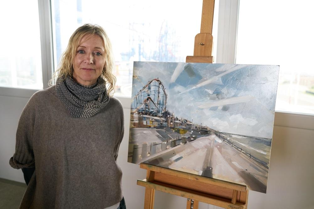
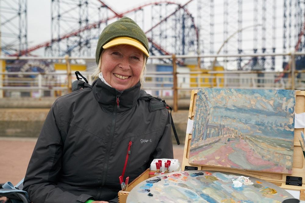
HEAT 5: ROYAL ASCOT PICNIC AREA
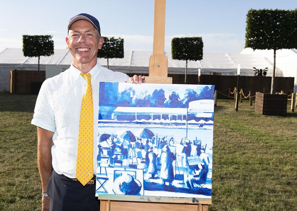
WINNER – STEVE NICE
Hi Steve, congratulations on winning Heat 5 of Sky Arts Landscape Artist of the Year Series 8! What was the experience like?
It was a fantastic experience, I enjoyed every minute. Meeting everyone, seeing new places and having the chance to paint in these locations was out of this world. I would encourage anyone to have a go.
Your painting started with you mapping out tonal values in a blue, with a view to overpainting with more colours later, however a comment from judge Kate Bryan made you decide to continue painting in monochrome. The resulting painting became a depiction of the figures populating the landscape described loosely by rendering form through shadows and light. How challenging was this for you and how does it differ from your usual process?
I'm so glad Kate said that as I am sure I would have run out of time and not made a good job of it. It was such as complex subject, something I had not done before. Once I had made the decision I was so happy as I could see it coming together and it started to make sense. With such a complex subject you have to simplify the shapes, make suggestions for the viewer to complete the scene. Tonal values are extremely important in all painting and sticking with one colour does make it easier. I have painted like this in the past, and in fact my submission was monochrome with some small colour highlights so I guess this is my style evolving. I have continued to paint like this using different colour combinations and it's working well.
What are your go-to art materials that you simply can’t do without?
I like acrylic. It's very forgiving as you can over-paint. My preference is the Winsor & Newton professional range. The colours are magnificent. There are much cheaper acrylics, but I find they can be thin and loose. The professional range in the long run saves you money. However, I have used the Galeria range for preparatory pieces and sketching. For brushes, my preference is Pro Arte Sterling Acrylix long flat. These take up the paint extremely well and maintain their shape.
Thanks Steve! See more of Steve's work at stevenice.art.
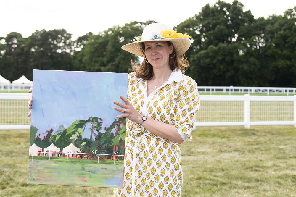
WILDCARD WINNER - LUCIA HARDY
Hi Lucia, congratulations on being selected as the Heat 5 wildcard winner! Tell us about your experience on the day.
Thank you so much. Wow, what can I say…the whole experience felt very surreal, a bit crazy and such a fantastic day. Being a follower of the show I quickly realised that my heat was going to be a little bit different, not only being at Ascot but placed in front of the pod artists and in quite close proximity to each other. Along with the heat, light and dress code, the day had a unique kind of intensity, which I tried to manage by facing away from the crowd, taking a long walk before making a start, having breaks and listening to music on my headphones. This helped me to relax and enjoy painting. I was lucky enough to chat to the judges throughout the day and will treasure some of the wonderful comments they made about my work.
Your painting managed to capture a sense of light and movement. With crisp, descriptive brush marks adding movement to the trees and a fleeting glimpse of horses dashing by captured with just a handful of brush strokes. The underpainting in vibrant orange peeking through in places added vibrancy and contrast to the blues and greens in the piece. Can you walk us through your decision-making process?
Generally I try to do more with less. I enjoy art with just enough description, but also enough space or abstraction to engage with it. I also love moving, natural subjects and the shapes and lines of natural physicality. Vibrancy of colour is also a big factor for me and my bright ground on the day helped me with this. I find this colour really compliments both the greens and blues in landscapes and brings light and contrast when it comes through in the finished work.
In terms of my choices on the day - when we arrived at the painting area, to be honest, I was quietly panicking… the Ascot vibe is classy, smart, showy - not me or my comfort zone at all.However, I looked out at the racecourse and was drawn to a break in the trees with bright blue sky coming through exposed branches - that connected me back to my love of landscape and helped me plan a composition using the Royal enclosure’s eastern style gazebos against navy green trees, white rails and the racing green. It also gave me the option to include the horses later on when the races began and I thought the distance of the scene would work well with my spare abstract marks. I’m really pleased I took the risk and added them in the end.
Interestingly, as I videoed the horses coming past on that first race (the only race I’d have time to paint) I realised that the cheers came too early - and I was viewing horses that had already passed the post. Their tails were swishing, heads high, jockeys relaxing or standing - reigns loosened. It was an interesting dynamic and I went with it. The few people I added in at the far rail were now either winners or losers, the race was done. There was another story element in the scene that I hadn’t anticipated but really appreciate in the work now too.
What are your go-to art materials that you simply can’t do without?
My favourite and most versatile acrylic paints at the moment are Amsterdam Acrylics. They have colours that match my brain somehow and are fantastic quality for the price. As I paint with minimal water I try to use the vibrancy, opacity and body of the paint to maximum effect. If I need to add even more body I go to my heavyweight Daler Rowney Cryla paints. I often use soft pastels too to enhance my work and have recently discovered Contè pastel pencils which I really like, particularly in the initial stages of planning a work on canvas and adding highlights. For canvases - my go-to are Winsor & Newton Cotton classic canvases. One last thing I can’t do without are my small A5 cheap-as-chips sketchbooks - I worry too much about ruining nice ones! Here I can play in messy, private ways guilt-free. My pencil case that accompanies them has pencils, charcoal and Uni Pin fine liners in it for anytime drawing, thinking and ideas.
Thanks Lucia! See more of Lucia’s work at luciahardy.co.uk or @luciahardyart on Instagram.
HEAT 6: STRANGFORD LOUGH, COUNTY DOWN
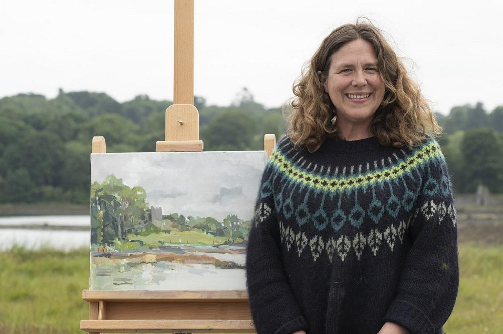
WINNER - HELEN LLOYD ELLIOT
Hi Helen, congratulations on winning Heat 6 of Sky Arts Landscape Artist of the Year Series 8! What was the experience like?
The experience was a positive one, largely due to the beautiful setting and the local people I met along the way. I think I was very fortunate to be given Strangford Lough as my heat and the flat grey day allowed me to really see the landscape colours.
Both your submission piece and the painting you completed on the day have a playfulness in the execution. The works are slightly abstracted, and judge Kathleen Soriano described how the colours dance across the surface like musical notes. How do you find the balance between describing the landscape and allowing simple, joyful shapes and colours to take centre stage?
I am quite short-sighted and often paint without my glasses so I am not distracted by detail. When I start painting, the most important thing for me is composition and I usually do a number of drawings first. I paint instinctively, using colour and composition to lead the eye through a painting. I keep a simple, limited palette of titanium white, ivory black, yellow ochre, raw umber, raw sienna, cadmium yellow, cadmium red, alizarin crimson, cobalt blue and ultramarine. Depending on what I see in front of me, I will often add other colours, for example, a dash of viridian green or chrome yellow.
What are your go-to art materials that you simply can’t do without?
I use Winsor & Newton Artists oil colours and Michael Harding too. I mostly paint with round brushes and am moving away from brushes made with animal hair and am now only purchasing synthetic brushes, for example Winsor & Newton Oil Synthetic Hog brushes are great.
Thanks Helen! See more of Helen’s work at helenlloydelliott.com or @helen_lloydelliott on Instagram.
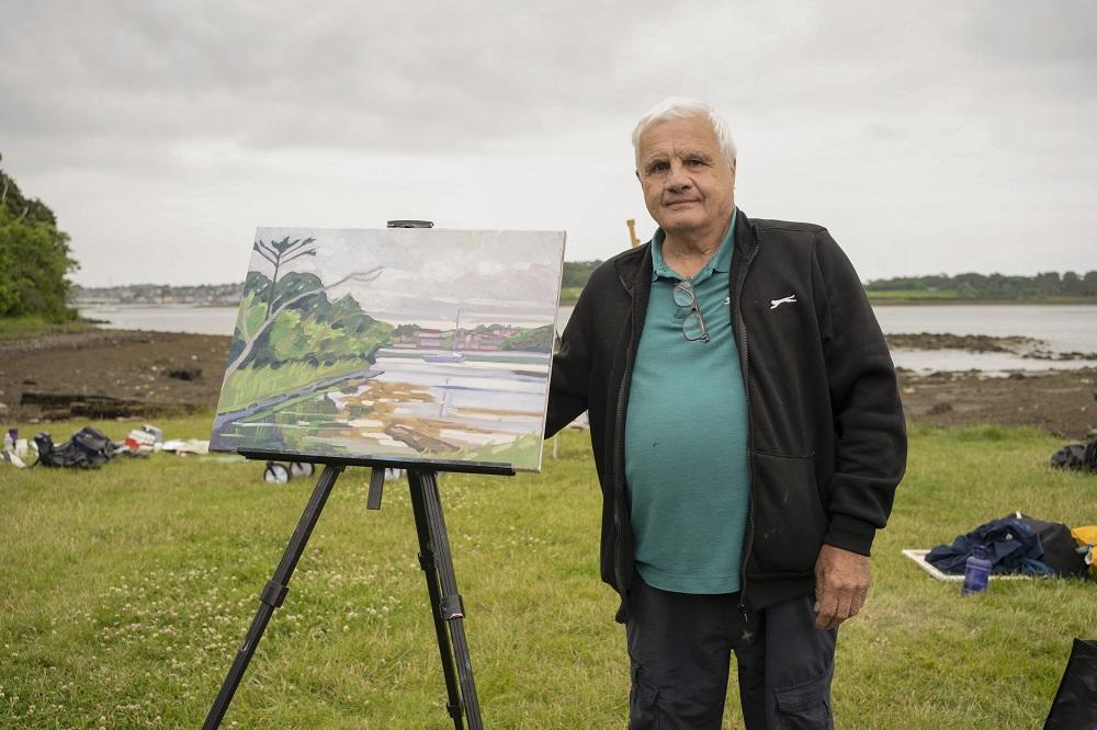
WILDCARD WINNER - HARVEY MARTIN
Hi Harvey, congratulations on being selected as the Heat 6 wildcard winner! Tell us about your experience on the day.
I had a great day topped up by winning the wildcard; which was a lovely surprise!
Your painting contrasted an overcast sky composed of subtle tones with a riot of colour in the vegetation and reflective surface of the water. You managed to capture the light of the day and the reflections perfectly, and judge Kathleen Soriano even likened your painting to Post Impressionism! Can you walk us through your process?
I chose my composition quite quickly. The trees on the left led into the distant hill and village and the centrality of the boat anchored the scene. Early on there was an orange light on the horizon which I held onto. I managed to capture the reflections in the water before the tide went out. I always paint quite loosely and simplify the scene. I'm used to painting outside and I paint quite quickly which is a benefit with changing light conditions. I was pleased with Kathleen's remarks about Albert Marquet; his paintings are beautiful. It would be great if they had a special wildcard competition rather than judge just the paintings themselves.
What are your go-to art materials that you simply can’t do without?
I paint with oil on canvas, with a variety of makes; of course Michael Harding's colours are superb; but I use Winsor & Newton and sometimes fast drying Alkyd Griffin paint.
Thanks Harvey! See more of Harvey's work at portfolio.artistsandillustrators.co.uk
Feeling inspired?
If you've admired the works on the series, visit skyartsartistoftheyear.tv where selected artworks from all nine series, as well as from Sky Arts Portrait Artist of The Year, are now available to buy.
If you think you have what it takes to be the next Sky Arts Landscape Artist of the Year, entries for Series 9 close at midday on Friday 28th April 2023. Find out more and apply at skyartsartistoftheyear.tv/landscape. Good luck!

