
Artist Interview Victoria Sundqvist on tattooing and Promarkers
Posted by Cass Art on 25th Feb 2021
We caught up with Winsor & Newton professional ambassador Victoria Sundqvist to talk all things tattooing and Promarker! From her brightly designed tattoo sleeves, to large scale spray paint installations and vivid Promarker sketches Victoria explores colour with style. She brings her characters to life with bold lines and intense colour. Discover her work today, find out what she loves to use and how tattooing, painting and drawing intertwine.

Thanks for taking the time to chat, firstly could you introduce us to you and your creative journey? You speak about invoking happiness with your designs and motifs, something which I think we all need a dose of at the moment!
My name is Victoria Sundqvist aka Vickan and I am a tattoo and graffiti artist. I have always loved drawing, painting and doodling characters and done so as far back as I can remember. Around 2012 I embarked on the journey to become a tattoo artist by starting an apprenticeship at a tattoo shop in Stockholm.
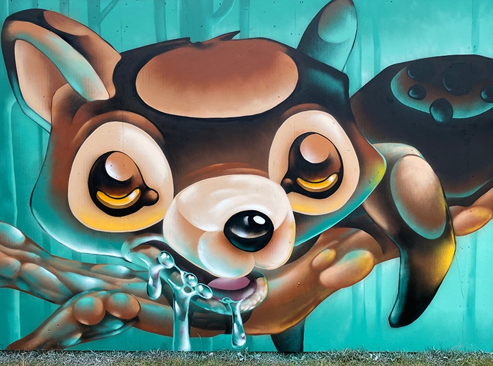
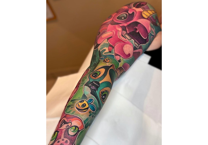
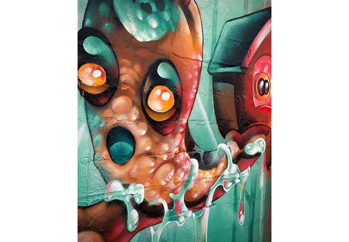
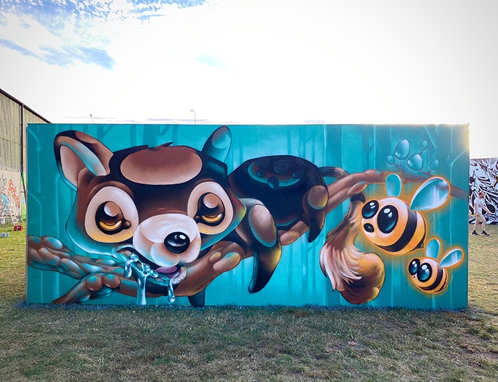
Today I specialise in a tattoo style called New School. It’s a style that has clear influences from the graffiti scene and what characterises the style is bold black lines and really bright saturated colour. Often New School tattoos have a rendered 3D-look to them and the artist often exaggerates and warps the depth and perspective in the tattoo design.
Besides tattooing I paint large murals with spray cans as well as smaller paintings on canvas. When I set out to create a new design regardless of if it’s gonna be a tattoo, mural or a painting, I first decide what emotion I want the piece to give the viewer. Usually my motifs are a bit goofy looking, containing cute characters and the emotion I want to evoke in the viewer is happiness.
I love the way you speak about the surface or a canvas in comparison to the bodily surfaces you work on with your tattoo practice. Could you reiterate this sentiment for our readers?
It’s a big difference between creating on surface such as a wall or a canvas and tattooing on skin. First of all a canvas is flat and you can twist and turn it however you want. A canvas doesn’t have to go out for a smoke or leave early to pick up their kids. But there are perks of creating on skin. I get to illustrate a customer’s idea and in some sense give my art to them. Having somebody wanting my art on their body for the rest of their life is a huge honour and humbling.
Creatively, do you approach the canvas in the same way as you would approach an arm, a leg, or a back?
The creative process is a bit different for me when it comes to designing a tattoo or creating art on a canvas and walls. When it comes to a tattoo I usually have more factors to take in consideration and adjust to. The space can be oddly shaped to fit in with already existing tattoos surrounding it and of course the customer can have their own ideas and wishes they would like to see incorporated in the design.
When I’m going to create on canvas I usually have a lot more freedom regarding the motif, colour palette and size.
In previous years the tattoo industry and the art industry were seen as similar, but very different disciplines. Tattoo artists were referred to specifically as Tattoo Artists, not simply – Artists. Do you think that attitudes have changed over the years, and your tattoo practice is viewed with the same consideration as your painting?
Today the tattoo industry is full of extremely talented artists specialising in many different styles of tattoos. It feels like customers these days give more freedom to the tattoo artist and want the specific artists unique expression to be present in the tattoo.
You enjoy experimenting with colour, mixing, blending and layering. How do you begin selecting your colour palette for a work?
When I start a new project and is about to decide the colour palette, I first decide what kind of emotion it is I want the piece to perceive. After this is settled I usually choose two complementary colours that enhances the feeling and use them as the base for the colour palette.
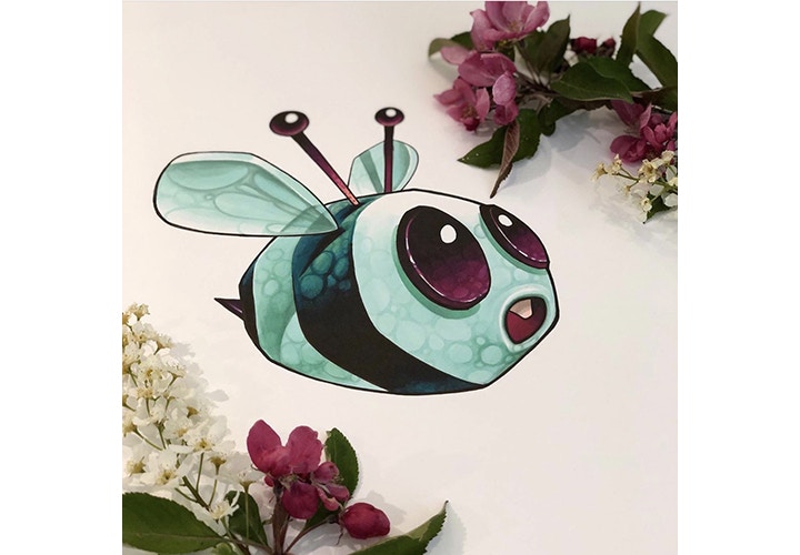
What is it you love to use about Winsor & Newton Promarkers?
When I do smaller illustrations I usually use Promarkers on Promarker Bleedproof Paper. I like that it gets a bit of an animated look and I love how you can blend them and build up saturation on the paper.
And what other materials do you like to use in your work?
I mainly use acrylics and spray cans for creating art on canvasses or walls and Promarkers for smaller illustrations.
Do you have any advice for someone trying Promarkers for the first time?
Choose a high quality bleedproof paper created for use with ink pens like Promarkers. If you use paper designated for other mediums the end result will not be as good and it can be hard to blend the colours and build up saturation.
Thanks so much Victoria! Finally, what’s next on the horizon?
Next on the horizon for me is to continue creating goofy looking characters that put a smile on people’s faces and using what’s left of the summer to paint outside. Next week for example I’m heading to Borås to make a huge character on a three story building during a street art festival.
Feeling Inspired?
Explore our ProMarker range in store and online today!
Follow Victoria on Instagram today and discover more of her work - Vickantattoo and Vickanart

