
Modern Lettering: Artist Interview with Calligrapher Rebecca Cahill Roots
Posted by Cass Art on 6th Oct 2018
From mastering the art of soaring ascenders to swooping descenders, perfecting delicate hairlines and injecting definition into your majuscules - calligraphy can seem a like foreign language to the novice looking to transform their handwriting style.
Re-discover the joy of putting pen to paper with Rebecca Cahill Roots' new guide to calligraphy. Learn how to become a master of modern letter forms and inject some personality into your penmanship, as the founder of Betty Etiquette takes your through her step-by-step guides, creative challenges and top tips.
We caught up with Rebecca to find out where her love of calligraphy began, the inspiration behind her latest how-to guide and her toolkit essentials to make achieving a variety of different styles a breeze…
Hi Rebecca! Can you tell us a little about yourself and how you began exploring calligraphy?
I’m a hand-lettering artist based in South East London, where I run Betty Etiquette, a stationery brand and design studio that celebrates the power of handwritten correspondence. After beginning my career working behind the scenes in London’s theatre land, In 2012 I went part time to pursue my love of lettering and launch my small business.
After learning basic formal italic script when I was younger, I have continued to use and be fascinated by decorative lettering techniques. With the rise in popularity of hand lettering in magazine editorial, stationery and marketing materials, I began to experiment with more modern pointed pen techniques and develop my individual style.
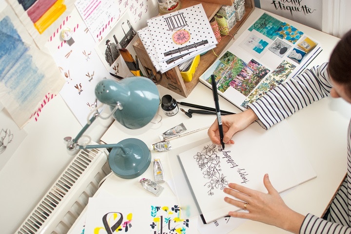
A normal day in my studio at home might see me working on a wedding stationery commission, producing a hand drawn logo design or developing new letter forms for upcoming projects.
Over the last three years I have developed a workshop programme and teach Modern Calligraphy and Brush Lettering in venues across the UK. It one of my favourite things about my current work, meeting new people each week, being part of their creative journeys and finding out the reason they want to experiment with hand lettering.
Often these can be extremely personal, I think this is the reason I love the art of lettering so much. A person’s hand writing is so entwined with their personality and often workshops draw out fantastic stories of forgotten pen pals, lost love and treasured relatives. I’ve been lucky enough to teach in such varied and interesting places including The Victoria & Albert Museum and Liberty London.
I’m currently preparing for a big tradeshow in September 2017 where I will preview some brand new ranges of my stationery, and I’m working on some exciting brand collaborations behind the scenes that will come to fruition later this year.
How did you become interested in letter forms and calligraphy?
My love of lettering started when I was really young. My dad had a book about The Book of Kells and I remember finding it on the shelves and sitting pouring over it looking at the letters and illuminated illustrations. My little brother and I used to spend hours copying out the letters, using sweet wrappers to make our own versions of the pictures. I was fascinated in the process and the way that my hand was able to copy the same letters made centuries earlier by someone else’s hand.
I think I always saw writing as having the potential to be decorative as well as informative and throughout college I was constantly told off for creative fancy titles and borders for my work and not concentrating on the content. After university I ended up working in the theatre for 8 years, but I continued to practice lettering in my spare time.
I slowly moved away from the more formal scripts I had originally learnt and began to experiment with modern styles and new materials. It was when I found my own letterforms emerging that I started to try to apply them to stationery design and my illustrations. Then I took the leap and put them out into the world to see if anyone else would like them.
Through some excruciating but invaluable days at craft markets and in shops trying to get them to stock my work, I learnt more about what the modern tastes were in lettering. Getting feedback and frank criticism was hard but so useful and I used this to adapt designs and think more about what hand lettering needs to do for a contemporary audience.
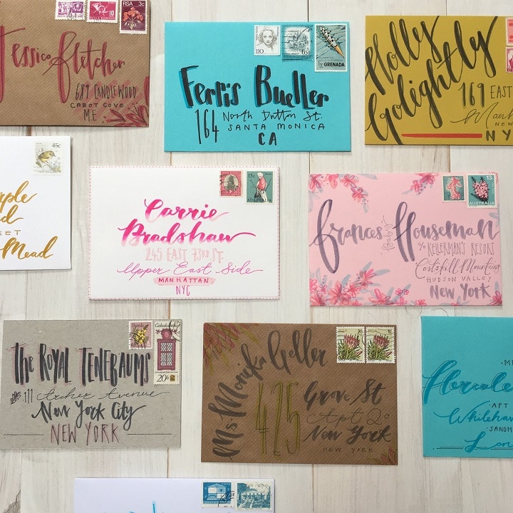
I am still constantly experimenting, learning and seeking inspiration from other lettering styles from around the world for my work. Although I produce work for client briefs and my product range, some of my favourite lettering is still just penning a good old-fashioned letter. There’s noting quite like a bit of handwritten post to brighten up your day.
Calligraphy can seem a little daunting to the beginner! How does your guide help us learn new styles and the right techniques?
I think the biggest stumbling block for those starting out with calligraphy is that our minds play this massive trick on us and tell us we should be instantly really good at it because we can already write. I often see people at my workshops getting really frustrated that they aren’t picking up in the first few lines. Lettering is like any new creative skill, it needs time and loads of practice to get the flow of it. If you were picking up a violin or knitting needles for the first time you wouldn’t expect to be playing concertos or knitting up a fairisle jumper straight away.
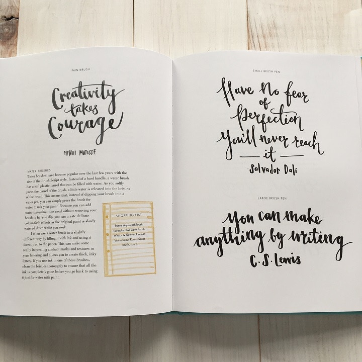
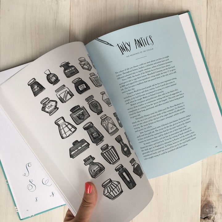
Modern Lettering starts by taking you through the basics of using a pointed pen and ink to create a modern calligraphy style. I think this process is key to enabling people to develop the flowing movements needed in many lettering styles. There’s a workbook section with pages inside that you can write on to practice your letter forms and then once you’ve gained confidence with your nib and ink, it works through how to use a range of paints, papers, brush pens and brushes for those letter forms. The final part of the book looks at a range of projects you can use your lettering on including writing on ceramics, creating invitations and lettering on fabric.
You use a breadth of different materials to create a range of lettering styles. What are your must-have materials in your calligraphy toolkit?
I have a little pen roll case that my sister-in-law made me that’s full of my favourite pens and it goes everywhere with me! When hand lettering is your bread and butter it feels like you can’t just use a biro in a birthday card, so I always have some pens with me to use on the go.
My favourites at the moment are TomBow Duel Brush Pens, I use Moleskine Notebooks and Journals for pen work and Cass Art Layout Paper or Rhodia pads for my nib work.
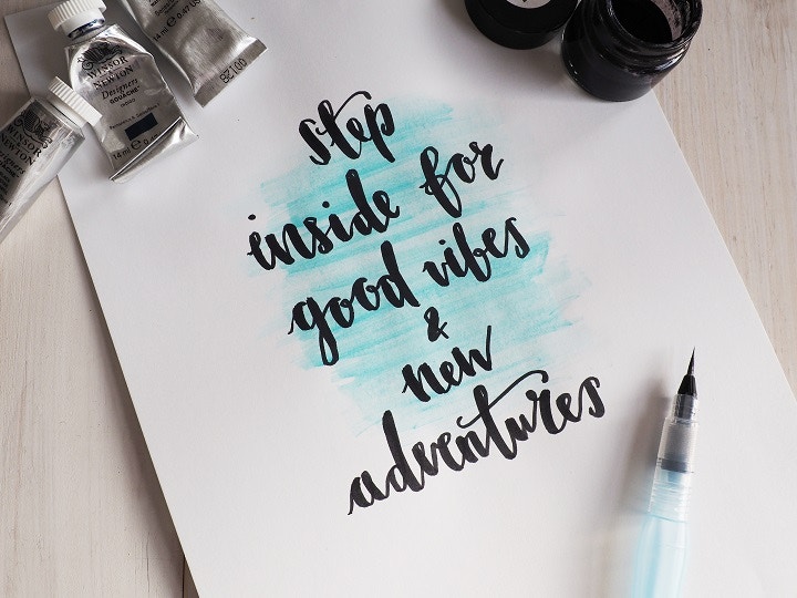
In my studio I have lots of different inks and paints on the go at any one time. I use lots of Higgins Inks and Kuretake Sumi ink and love Winsor & Newton Gouache for colour work. FineTec metallic ink pallets are really lovely to work with for both nib and brush work and give the most beautiful shimmery tones to your work. I mainly use a Brause EF66, Nikko G or Leonardt EF Principal nib for my work.
How important is it to you to keep creative penmanship alive?
There is something utterly magical about a bit of handwriting, whether it be an ornate piece of formal calligraphy or a just a quick postcard. It’s like a little work of art made by an individuals hands, acting like a little time capsule, capturing that person’s mood and rhythms of the day. I’ve learnt so much about my Grandparents from looking at the letters they left behind and I wonder what we will leave to our children to discover more about us in the same way? An email password?
As digital devices reduce our attention spans and more and more writing is done on computers I think the art of lettering can offer a meditative escape. Participants in my workshops often tell me that they have found the process calming and go on to practice it as a stress relief. Calligraphy demands that you practice composition; legibility, form and interpretation, which I think can be beneficial to all sorts of creative careers. But perhaps it could even support creative thinking in careers like engineering, medicine and town planning.
How has your style developed over the years?
My lettering has definitely followed my own development, from angry thick letters in black eyeliner in my teenage diary, to a romantic, whimsical copperplate as Bride-to-be for my wedding. I have a core alphabet that I’ve been using for years; it jumps about all over the lines and has some crazy angles on some of the descenders and ascenders. But my style has changed with the materials I have experimented in and also the development of such great brush pens and specialist inks.
I originally used just nib and ink for my client work and brushes and brush pens for my own projects, but I think people are more open to more relaxed styles now so I’m seeing more requests for brushwork in my commissions.
For my own learning I really enjoy researching past lettering trends and seeing what they tell you about the culture at the time they were created. I’ve recently been looking at the 40s and 50s Californian lettering trends so I expect some of that will start to come out in my sketchbook.
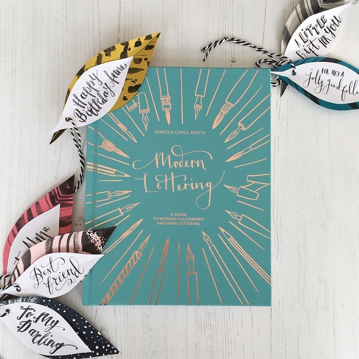
Congratulations on the release of your new book ‘Modern Lettering’ - can you tell us more about how the concept for the book began?
At the end of each workshop I teach, I’ve always written notes about questions participants had, things they struggled with or stuff they wanted to try that we didn’t get round to. So when the lovely people at Batsford Books approached me about writing a book on modern lettering, I had a list of topics ready to help shape it.
I’m really aware that the idea of learning hand lettering can feel slightly like punishment to some. It often takes people back to that feeling of being told off about their handwriting at school, comparing your writing with your fellow class mates or sitting in cold exam halls for hours. I wanted to write a supportive and easy to understand book that introduces a reader to modern lettering, focussing on the idea that by following a few basic techniques, you can quickly develop your own lettering style.
Hand lettering has had a revival over the last 10 years, I think partly because of the personal nature of it in juxtaposition to the impersonal nature of digital devices. I hope this book, with its workbook section and creative projects, allows a reader to find ways to fall back in love with lettering and use it more frequently to express themself.
Calligraphy is such a versatile skill. How did you narrow down which creative challenges and inspirational tips to include in the guide?
Modern Lettering is focussed on getting people started so everything in there is about forming good foundations in your lettering practice. I think it can be hard to get to grips with a craft like this through a book, my terrible crochet skills are testament to this, so I have really tried to use everything I learnt through teaching workshops to get people started.
I have selected a range of letterforms that I think will enable readers to start to find ones they like and dislike to help create their own style. All the materials suggested are great for beginners and there’s a big trouble shooting section to try and help you get through some of the snags you might have when starting out.
Calligraphy has massive scope to be used in conjunction with all sorts of other crafts and art forms and I hope that people will be able to use some of the project ideas to actual find ways to use lettering in their everyday lives.
What advice would you give to someone looking to start calligraphy?
Buy good quality materials, as they will help you to bypass some of the problems you can face when first starting out. Set aside time to practice each week as repeating your letterforms again and again is the only way to build muscle memory until your movements start to flow naturally. Seek inspiration from other calligraphers, explore lettering in other cultures and look at how lettering styles have changed through the decade’s inline with the current fashions. But most of all have fun, experimenting with new nibs, pens, brushes and inks to find the perfect combination to create your unique lettering styles.
TRY A CHALLENGE FOR FREE
DOWNLOAD YOUR FREE TASTER NOW
Feeling Inspired?
Explore Rebecca's new guide to calligraphy ‘Modern Lettering’, available in-store and online now.
We’ve got everything you need to start experimenting with calligraphy. From brush pens and inks to a range of nibs and versatile papers, find everything you need to explore letter forms in our Calligraphy section online or ask our staff artists in-store for more advice on finding the right materials.
Share your experiments from Rebecca's book and your own letterform creations with us on social media. Tag us on Facebook, Instagram and Twitter or use the hashtag #CassArt

