
Enter the BP Portrait Award 2018 & Read our Exclusive Artist Interviews
Posted by Cass Art on 11th Jan 2018
Lucy Stopford
Lucy Stopford undertook foundation studies before gaining a BA in fine art and English at Leeds University, College of Ripon and York St John. Her work has been seen in group exhibitions including the NEAC Open Show at the Mall Galleries.
You have quite a sculptural approach to painting – can you tell us more about how you have developed this technique?
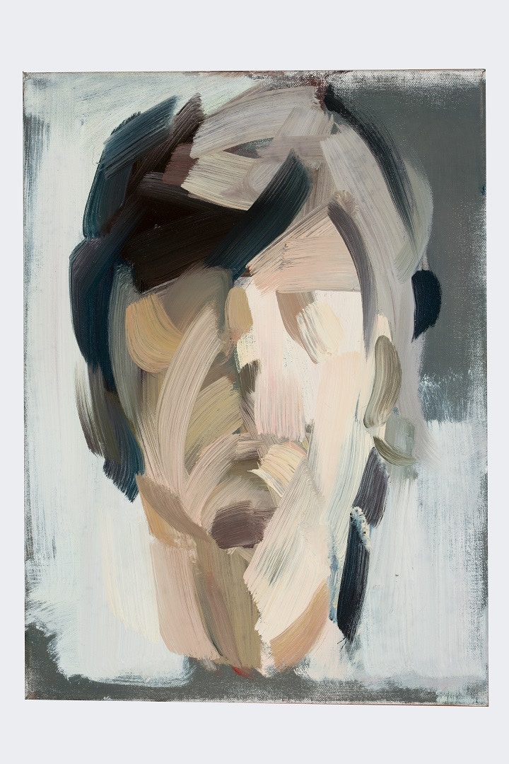
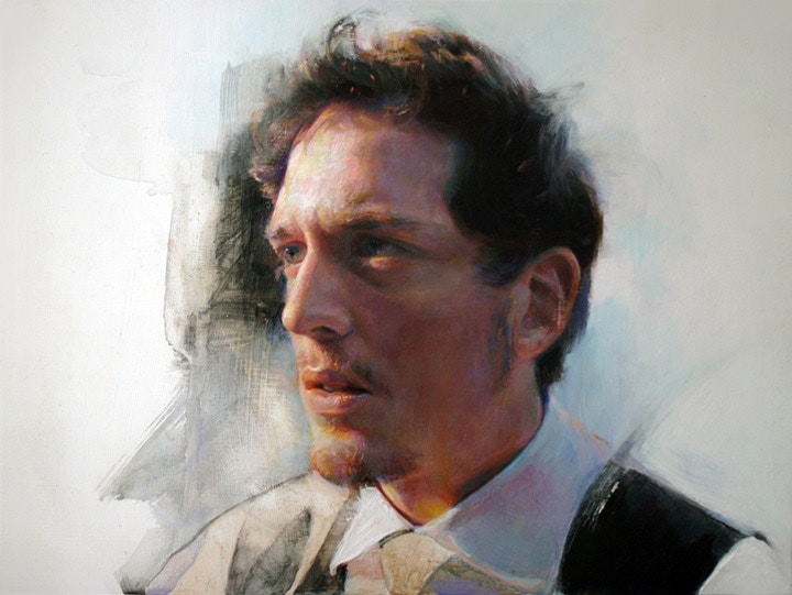
My technique has developed through my interest in recording the process of painting by deliberately retaining the raw marks as they occur through close observation and repeated enquiry.
To create the structure of a face in portraits I use large brushes to reduce detail and describe planes which results in a sculptural effect in the finished piece.

How important do you feel detail is to a painting?
I prefer to leave detail implied, revealed when the image is seen from a distance. I like to engage whoever is looking at my paintings in actively completing the portrait by providing a suggestion of features through tonal relationships and the direction of the marks.
Even with such broad strokes and a limited colour palette, you have still captured an essence of your sitter. How do you determine a likeness and is it necessarily important?
I use a limited palette of warm and cool primary colours because of the flexibility this allows for me to respond directly and intuitively to the model in front of me. The broad strokes come from working alla prima and from life. Both disciplines demand speed and have an immediacy which transfers an energy to the work.
A likeness in a portrait is very important, however even more important to a painting is vitality. Having the model present while I work is essential to study the dynamic shapes and colours of their face. Rather than approaching a portrait by identifying characteristic features in order to create a likeness, which could lead to caricature, I work in reverse and objectively by building up an image in individual abstract marks through which the subject's presence can then emerge.
Explore more of Lucy’s work at www.lucystopford.co.uk or find out more about her work selected for the BP Portrait Award 2017: Lucy Stopford
Marco Ventura
Marco Ventura studied at the School of Visual Arts, New York. His illustration work has been seen in publications worldwide and he has exhibited in Italy, the United States and the UK, including the exhibition of the Royal Society of Portrait Painters in 2015 and the BP Portrait Award 2015.
The profiles of your sitters have a strong correlation to religious iconography – How do you translate biblical references into your work and does this influence you painting style?
I've always been attracted by artwork inside old churches and by religious paintings and sculptures. They connect to me on a higher level of feelings and emotions, I'm Catholic and I have a special reverence for the holy representation of the Madonna and Child. In the last few years I've been commissioned by the Vatican to create stamps and a portrait of Pope Franciscus. I'm now working on a bas-relief with the Holy Father's araldic emblem.
Religious subjects are definitely something I like and which I'm interested in. ‘S. At End of Summer’, the painting now on display at the National Portrait Gallery for the BP Portrait Award 2017 exhibition, is inspired by verses in the Book of Genesis referring to Eve choosing to eat the fruit from the tree of knowledge in the Garden of Eden. A nude in a beautiful natural setting, surrounded by a tapestry of leaves - this was my starting idea for this portrait of Barbara S, my model.
Your portraits are especially detailed, how do you achieve such a precise application?
I like to paint small and I use very small brushes. I work flat on a table using oil colours on gessoed boards. I usually start sketching to get a rough idea of what I'll be painting. When the sketches are in an advanced stage, I proceed to transfer the outlined drawing to a board using tracing paper. The boards I'm using lately are Ampersand Gesso panels that I coat with additional gesso and pigment.
Then I make a very detailed shaded drawing that will be my underpainting. This will be spray fixed and then coated with a thin layer of oil colour, diluted with Winsor & Newton Liquin. This allows me to paint over the drawing, which remains visible.
I paint using a mix of oil colour brands: Winsor & Newton, Lucas, Maimeri and Old Holland, I use several driers as medium and Sansodor as solvent. I apply the colours very lightly with synthetic brushes and I use sable brushes later for extra blending of tones. After the first full coating is finished I start refining with transparent glazes using Liquin again to thin down the paint. A final varnish of pure Liquin is then applied in the end when the colours are perfectly dry. This will yellow a bit with time and it will give the painting a special old masters' look.
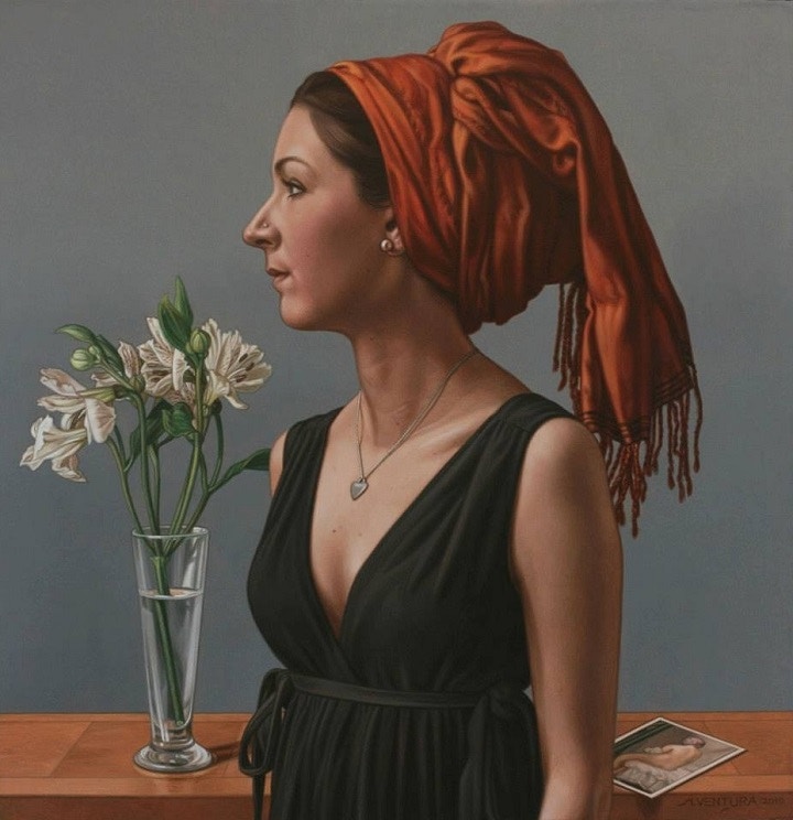
Where do you look for inspiration?
I look back to old magazines of the 50s and 60s, and to old books and photographs. I have a file where I keep clips of interesting images I come across, that I look through when searching for ideas. The Italian Renaissance painters Giovanni Bellini and Piero della Francesca are my favourite artists ever, their work is always inspiration!
Explore more of Marco’s work on his www.venturamarco.com or find out more about his work selected for the BP Portrait Award 2017: Marco Ventura
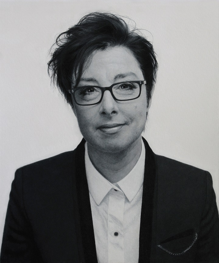
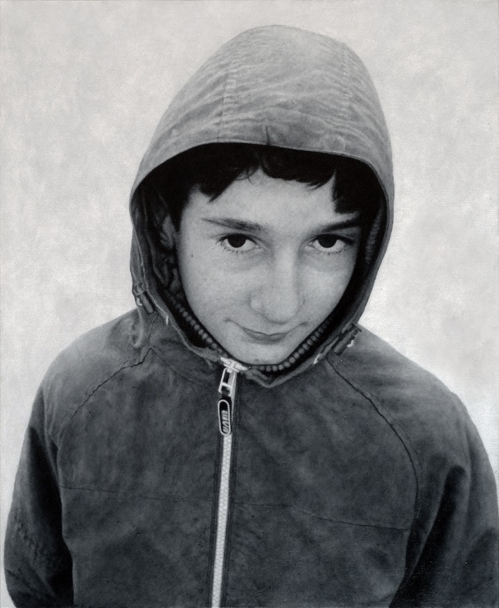
Martyn Burdon
Martyn Burdon gained a BSc (Hons) in product design from Brunel University and works in retail design. His art work has been in group exhibitions including the National Open Art Competition, 2016.
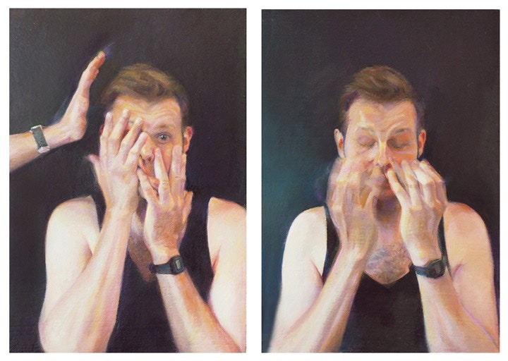
You have captured a lot of famous faces over your career as an artist. How do you capture a different side to them that we do not see in the public eye?
What you see in a portrait of mine is always just my impression of an individual’s personality on that day, and my personal understanding of the physical structure of their face. If I am working with someone whose face and persona may already be familiar to me from their depiction in the media. I just try not to let that influence me and concentrate on the person as they are, in that moment.
I just try to capture truthfully what I see when I meet someone. Any portrait is usually as much about the artist as it is about the sitter, so in one of my paintings, I think you are just seeing my individual understanding of another person. You are seeing them, reflected off me. I also try not to flatter anyone that I paint or draw, I just try to be honest.
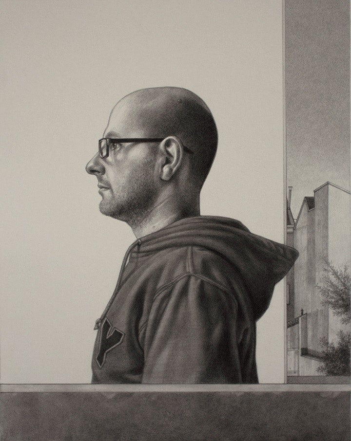
Your paintings are all monochrome. How do you think this influences the perception of work, and why have you chosen to remove all the colour?
I probably spend more time drawing than I do painting. I really love to draw, and whether it’s using pencils or charcoal, drawing is predominantly focused on just light and shade - I love the bold simplicity of it. My painting style maybe owes a lot to my fascination with drawing.
I love colour when I see it used in other people’s work, but in my own work I like to reduce the number of the elements involved. I like the idea of building something out of fewer parts, there can be a very satisfying purity to it.
My paintings are never entirely monochrome, they do have subtle colours in them, but they are very muted. The focus is always on tone, but if a painting has no colour at all, it will tend to look a little flat. When I paint, I build up the image with multiple layers of thin glossy translucent paint, I scrub it into place with the largest brush I can get away with, and I hopefully end up with something that has a lot of depth, and a sort of lush richness to the surface.
I find paintings that are made up of a limited range colours can have a lot of drama to them, they can be very impactful. A monochrome image can have a weight to it, a sense of importance, it can seem old, but it can also seem ageless - Maybe I’ve just watched too many black and white movies!
Matt Berry sat for you in person, outdoors on a bright yet cold day. Do you think capturing your sitters from life changes the final composition and feeling the viewer receives from the portrait?
For a good portrait, I think it’s vital to have spent some time with the individual that I’m painting. As I have said, I think it's very important if I intend to try and capture something of the sitter’s personality and avoid any preconceptions.
Moreover, from a technical point of view, to capture a good vivid likeness, I think it’s vital to spend as much time as I can, just looking at the person I am painting. I need to be around the person, and see them move, in order to best understand the structure of their face.
For me, a good painting will always be the result of a particular experience, at a particular time. I like the idea that you are capturing how someone was, on one unique occasion. It's good to try and capture something of where and when I was during the sitting. The quality of the light on a particular day can give such a sense of time and space.
The structure and composition of a painting will invariably result from the actual sitting, I never really have too many preconceived ideas about what I want to achieve with a painting. I might have a basic plan, but I often find that in the end I arrive at something completely different. The final composition and feel of a painting will generally just evolve naturally from the situation and the space. I do like to use natural light if I can, as I have said, I think it can root you to a particular moment.
If I can, I like ending up with paintings that are quite direct and uncluttered.
Explore more of Martyn’s work on his website www.martynburdon.com or find out more about his work selected for the BP Portrait Award 2017: Martyn Burdon
Maryam Foroozanfar
Maryam Foroozanfar undertook a BFA in illustration at the Fashion Institute of Technology, New York. Her work has been seen in the annual exhibitions of the Royal Society of Portrait Painters, the Society of Women Artists and previously in the BP Portrait Award in 2004 and 2007–10.
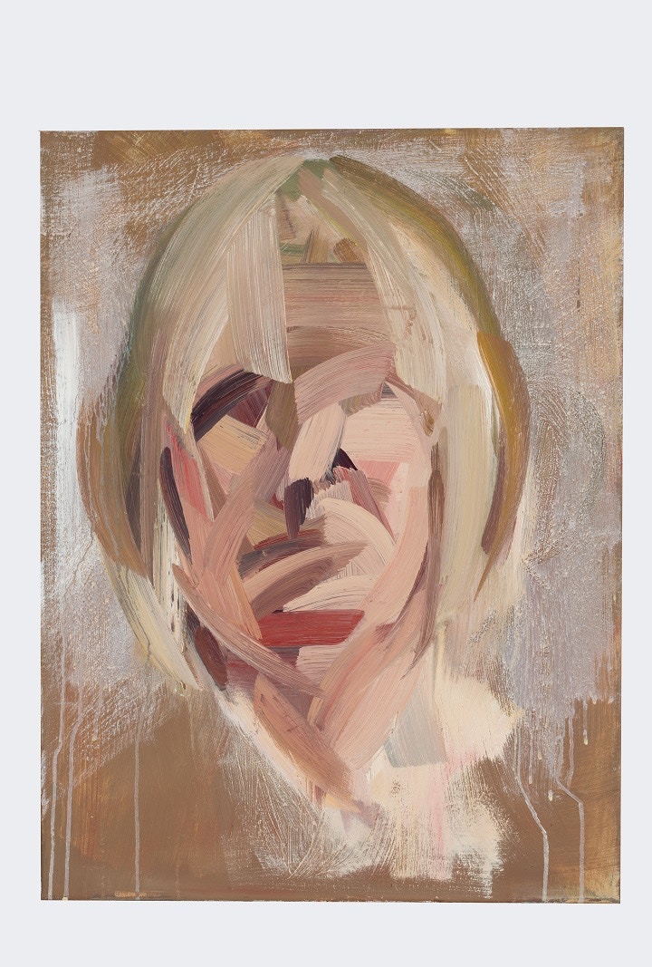
You combine a juxtaposition of fine detail with broad, expressive brush marks. How have you developed this style and do you find there are key materials which help to perfect this approach?
The juxtaposition evolved naturally over time, as I've realised the paintings I most admire obtain this dynamic quality in some form of variation – be in large brushstrokes verses small ones, smooth, blurred passages vs choppy, slap-dash thick paint, etc. Variety is key in creating anything visually impactful.
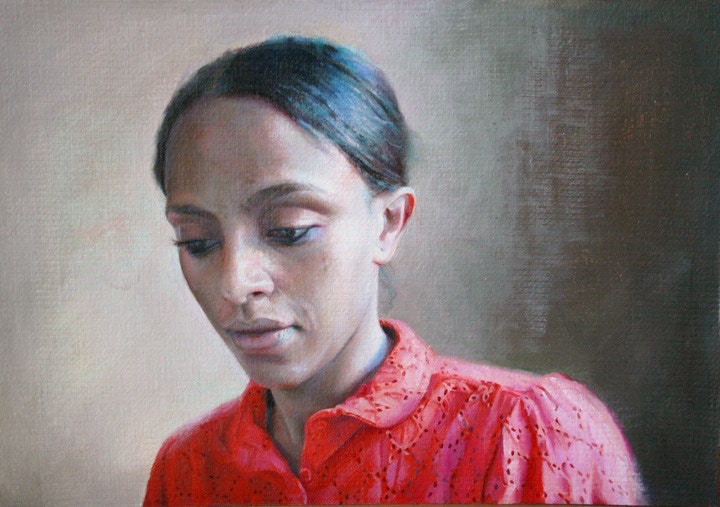
There is almost a photographic quality to your paintings. Do you work from photographs or prefer to work from life?
There is value to be found in both. Painting from life is always a challenge due to time constraints, so it's great to begin work from life and finish from photos if the need should arise, or vice versa. When painting from life, we must squint in order to get rid of extra noise. Working from photos is a short-cut, in that sense.
Personally, I like to begin working from photographs and finish my work painting from life (whenever possible), in order to enrich my work with extra colours that can only be seen with the human eye.
Your practice explores themes of alienation, solitude and singularity. How do you think your compositions convey this narrative within your work?
The recurring themes in my works are based on universally shared emotions. In order to find the right vantage point, I’ll take into consideration which angle and composition will help showcase the subject and mood conveyed most effectively and appropriately.
Explore more of Maryam’s work on her website www.foroozanfar.com or find out more about her work selected for the BP Portrait Award 2017: Maryam Foroozanfar
Madeline Fenton
Madeline Fenton studied at the Royal Academy of Music before undertaking painting studies with David Cranswick. Fenton’s work has been seen in the RA Summer Exhibition and the annual exhibitions of the Royal Society of Oil Painters and the Royal Society of British Artists.
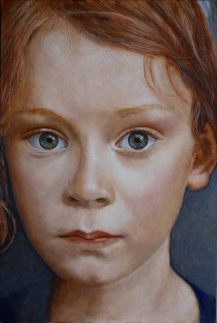
The portrait for the BP Portrait Award is of your granddaughter Cecilia. How do you think this portrait conveys a sense of her personality? Is it part of a series of portraits documenting her life?
I think my portrait of Cecilia does convey a sense of her personality as she is a serious child, although she does love to climb trees dress up too! She has always loved drawing as long as she was able to hold a pencil and now she also devours books and is never bored.
You prefer to use natural and traditional materials in your work, even making your own pigments and creating your own brushes. Can you tell us a little more about how you achieve this and what difference it makes to your work?
I have learnt the old masters technique of painting and I love the craft aspect of it. I make all my own paints by grinding the pigments in either water for egg tempera or oil for oil paint. I keep the pigment paste I make for egg tempera in little jars and the oil paint I put in small watercolour tubes. I use very little paint so they last a long time.
I use a lot of small sable brushes and a few years ago I went to India and met a brush maker who showed me how he makes his brushes. I bought various sizes but mainly the ones they use for miniature painting.
Your techniques are based on that of Renaissance artists. Are there any artworks or artists in particular who you draw the most inspiration from?
I love the Memling portraits. I stumbled on an exhibition of his at the Frick Museum in New York a few years ago that was a real inspiration and then the wonderful Holbein exhibition at Tate Britain. There is also an amazing exhibition at the National Portrait Gallery called 'Encounter' which is 50 drawings from Leonardo to Rembrandt.
Explore more of Madeline’s work on her website www.madelinefenton.com or find out more about her work selected for the BP Portrait Award 2017: Madeline Fenton

