
Face to Face: Exclusive Interviews with BP Portrait Artists 2019 Part 1
Posted by Cass Art on 28th Aug 2019
The BP Portrait Award is back for its fortieth year at the National Portrait Gallery. The prestigious painting competition brings us the very best in contemporary portraiture today; showcasing a breadth of approaches to portraiture this year’s award includes the unusual, the beautiful and the uncanny. This year’s exhibition has ranged from self-portraits, to portraits of friends, family and strangers. This year’s group of artists truly express the breadth and diversity of contemporary portraiture, from detailed hyperrealism to bold blocks of colour. They push the boundaries of figurative painting and show us that portraiture is still very much present in painterly conversation. Portraiture and figurative painting is as relevant and exciting today as it has been for hundreds of years.
We caught up with some of the shortlisted artists of 2019 ahead of our Face to Face exhibition in Cass Art Islington for an insight into their process, their must-have materials to achieve their unique approaches to painting and the inspiration behind their works:
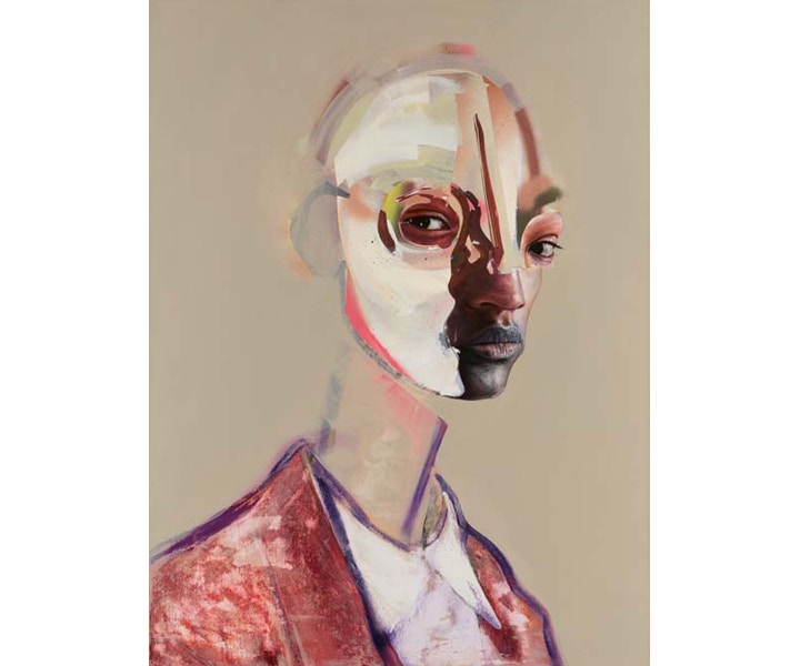
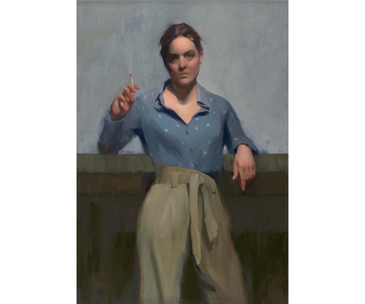
David Booth, Unit (on show in this years BP Portrait Award)
DAVID BOOTH
David Booth (b.1986) gained a BA (Hons) in fine art at the Institute of Technology Carlow, Wexford. His work has been seen in numerous exhibitions in Ireland including those of the Royal Hibernian Academy (2012, 2016, 2018) and the Zurich Portrait Award at the National Gallery of Ireland, Dublin (2018).
Your goal to portrait multiple identities within a single portrait is fascinating – can you expand on how you arrived at this working process?
This is in part the result of seeking out of a playful formula to my approach in the studio. I have developed an interest in collage, bringing cutouts from the physical through to a digital process and then back onto the canvas. Confounded by the fluctuating nature of the present, the idea of using multiple identities within a single portrait attempts to convey both cultural diversity and the present disorientation associative to identity in the modern age. In the making I will go through multiple compositions, selecting and reducing as I look to find a measure, where, although there are multiple subjects and many moments of abstraction within a piece, it is at balance, to the degree where the subjects look as one and with that comes the emergence of another.
The sections of Unit that remain undefined, unowned by a specific identity with each holding rather distinctive finishes and styles. Could you talk us through the use of the ‘unfinished’ sections to bind together the portrait as a whole?
Much of the abstracted areas are made near the final stages of the painting. It is a game of parts, which to leave and how to replace these territories with a balanced acts of mark making. These latter stages echo that collage-like process, of disassembling and re-assembling, just with mark-making this time. I mask and cut, protecting different features, surfaces and textures until I find the right balance between representation and abstraction.
Luis Ruocco, Passion Fruit (on show in this years BP Portrait Award)
LUIS RUOCCO
Luis Ruocco (b.1974) is an Italian art teacher living and working in London. Her portraits and short films have been seen in solo exhibitions in Naples and London and in group exhibitions including the Chelsea Art Society Annual Open Art Exhibition (2015–7).
The way you use colour is so interesting, each is allowed to keep their own visual space within your palette, the blues, greens and reds work together but separately on the surface. Could you talk about your use of colour?
I am totally in love with the use of primary colours. I think the strength of red blue and yellow and the contrast they create gives a great liveness to the image. I love expressionism to the point that I wonder how we moved from there!
Sometimes even in my dreams I see myself deep into background made of complementary colours and that s when I feel totally good.
As an artis anyway I love experimenting so I also try and work with pastel colours or sometimes even with no colours at all.
Art is like life, you have to live it in any possible way.
What are the essential tools that you always have in your studio and do you have any particular brands you return to?
As I previously said I am quite experimental so I sometimes use brushes, sometimes just my hands and that goes as well with the material I use. I have to say anyway that I LOVE natural linen canvas, I think the colours blend so much with the background colour they give and the resulting mood is quite unique.
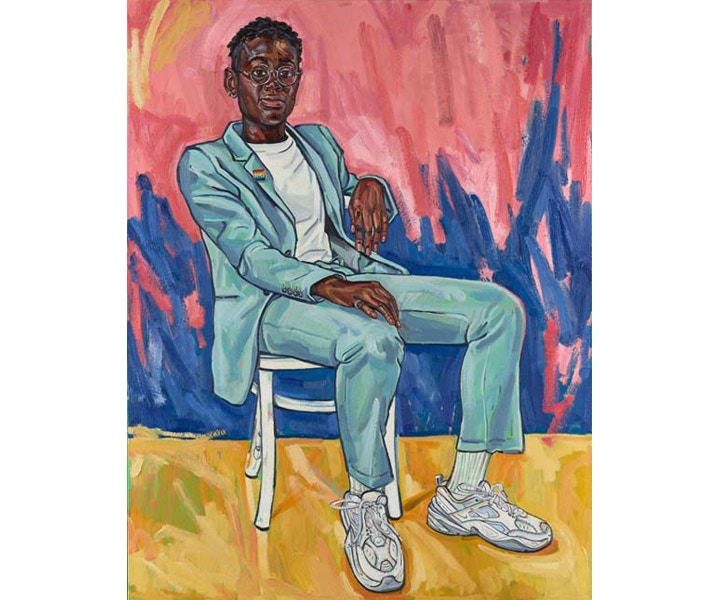
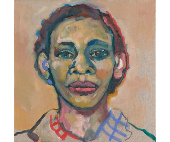
Sarah Jane-Moon, Dr Ronx (on show in this years BP Portrait Award)
SARAH JANE-MOON
Sarah Jane Moon (b.1982) gained a BA (hons) degree in visual arts theory and curatorial practice at the University of Western Australia and undertook studies at the Heatherley School of Fine Art, London. Moon’s work has been seen internationally in the exhibitions Queer Art(ists) Now (2017, 2018), the Royal Society of Portrait Painters (2011, 2014–16, 2019) and the Adam Portraiture Award at the New Zealand Portrait Gallery.
What colour! Could you talk about how you choose your palette? And do you have any brands of paint that are your go to tubes?
I tend to use 200ml Winton as I go through a lot of paint & know the palette well. I consistently use a split primary palette of two of each primary (lemon yellow, cad yellow, cad red, alizarin crimson, cerulean blue, ultramarine blue) plus titanium white & sometime supplement with yellow ochre & burnt umber. I find this sufficient to mix most colours & generally prefer to mix from the primaries to create secondary and tertiary colours.
I have been using bright and bold colours for a number of years, including pinks and greens. Growing up in the harsh clear light of New Zealand I have always had a strong affinity for colour and I've been trying increasingly to embrace this on canvas.
Your work often has political influences, exploring identity, gender representation and sexuality. Could you talk us through the importance of art in exploring and representing themes such as these?
I think it's hugely important that art, and portraiture in particular, reflects our contemporary realities and is diverse. As I identify as LGBTQI+ myself I'm particularly aware of the comparable lack of representation historically in a genre that is often used to uphold status and heteronormative family structures. My paintings seek to broaden this scope and represent people, often my community and friends, who may fall outside these structures. It is a celebration of those living their lives unapologetically and with integrity and drive.
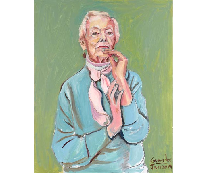
Gandee Vasan, Aunty Therese (on show in this years BP Portrait Award)
GANDEE VASAN
Gandee Vasan (b.1962) gained a BA (Hons) degree in fine art, painting, at Kingston Polytechnic. He won the Royal Society of Portrait Painters’ Prize for a Young Artist in 1985, leading to a commission to paint Harold Macmillan, 1st Earl of Stockdale for the Worshipful Company of Stationers and Newspapermakers. Vasan’s photographic work has been seen in the Taylor Wessing Photographic Portrait Prize at the National Portrait Gallery in 2005 and 2012.
Your portrait in this year BP Portrait award was painting in a comparatively short time, and it one sitting! Do you often find that you work quickly while you paint?
I find that I usually spend a lot of time thinking about it and try and execute it really quickly. My paramount goal with any image is the concept, or what the image is saying, which requires a lot of thought. Because pictures are about visual communication. My favourite quote, from the French Artist Degas is, “Drawing is not what you see, but what you want others to see”.
I’ve also had lots of practice as I have been drawing since I was 5 years old. I’m 57 now, so I have had thousands of hours of practice! This also means that you have to have an understanding of the materials to work fast. My favourite drawing medium is charcoal as it’s so flexible but it’s very messy. So I fix it with fixative and then work on top and add loads of layers of charcoal.
My favourite painting medium is oil paint; although it’s an extremely flexible medium when you are working quickly you can make it dry a lot faster by adding alkyd resin to the paint. I love experimenting with the materials.
You also work a lot with photography – how do you find the sides to your practice complement each other?
I learnt a tremendous amount working as a commercial photographer for advertising and for picture libraries and as a digital artist. Because what drives the advertising world is commerce and as such, the images have to have impact and to sell. I’m finding that understanding this is very relevant for any kind of creative work. I also spend a lot of time manipulating the imagery; most of my preparatory work is done on an IPad before it’s applied to canvas. Very often, while I’m painting I take a photo of work in progress on the iPad and try out several different versions of an image before I put it back on canvas. I love turning something that’s virtual and digital into something tangible in the form of a painting. Digital to analogue and vice versa!
Ola Sarri, Smoke Break (on show in this years BP Portrait Award)
OLA SARRI
Ola Sarri (b.1980) is a largely self-trained portrait artist, who generally works to commission for private collections and organisations. His work has also been seen in group, juried and solo exhibitions Sweden.
Your use of brushwork in your painting is bold, it seems to pull vertically on the canvas. Could you talk us through your techniques?
I spend an almost excessive amount of time thinking about the abstract qualities of my work – things like brushwork, texture, value compression and color harmony. It’s something I consider almost as much as getting the correct hues, values, proportions and so on. In order to keep the viewer (and myself) interested, I like to vary the way I apply paint – from thin washes to areas of thick impasto. I render some areas in detail, while simplifying and abstracting other parts.
I used to paint a lot of alla prima portraits and figures (i.e. wet-in-wet before the paint has dried) but that left me unsatisfied after a couple of years, because I wanted to take advantage of the endless opportunities offered by oil paint when it comes to glazing, dry brushing, scraping, wiping, etc. So now I paint in many layers and slowly build up a piece from the bottom up, trying to anticipate the effect one layer will have on subsequent layers. It's hard but exciting work – it definitely keeps me on my toes! I used to be able to finish a portrait in one sitting, but now each piece takes a lot longer. The painting in this exhibition, Shapes, was repainted almost from start to finish at least three times before I was happy with my statement. I’m no longer able to whip out a painting every couple of weeks, but this process is much more fulfilling to me as an artist.
And what tools are your go to when completing a work?
I make sure the materials are artist-grade, but other than that, I try out different brands frequently. As for canvas, I prefer linen from a Belgian company called Claessens. I paint on everything from super-smooth canvas to rough jute, depending on what I'm trying to achieve. The support greatly affects how the brushes behave, so I'm constantly experimenting with different canvases. For the last year I've been trying out a range of polyester canvas, but recently switched back to linen. I probably have too many brushes, at least a few hundred, and I keep them until they fall apart completely, because raggedy brushes create the most interesting effects. In fact, I dislike brand new brushes because of the sharp, mechanical strokes they produce. A small element of unpredictability is something to cherish while painting. Other than the usual painting knives, rags, rollers and splatter brushes, I employ arbitrary kitchen utensils like bowl scrapers, bamboo skewers and Saran wrap to achieve various effects.
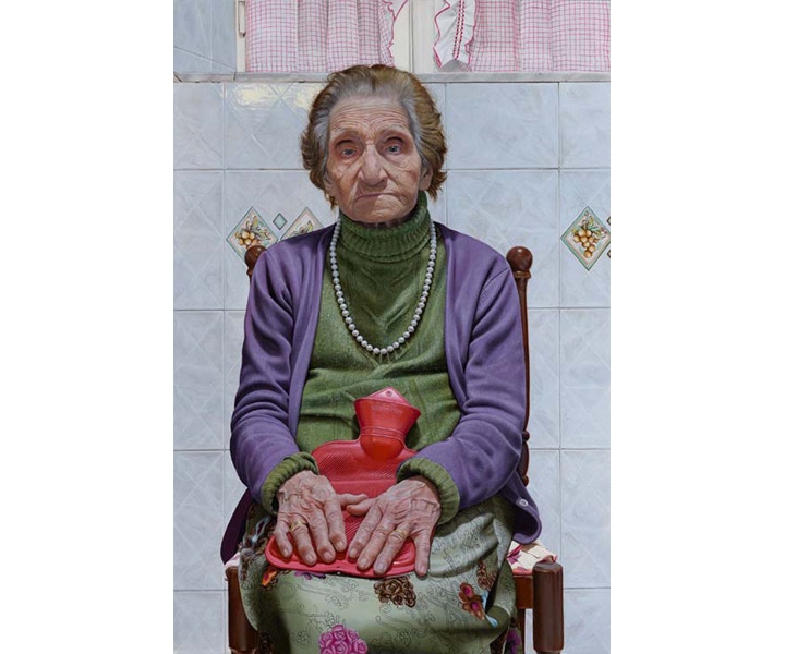
Massimiliano Pironti, Quo Vadis? (on show in this years BP Portrait Award)
MASSIMILIANO PIRONTI
Massimiliano Pironti (b.1981) is a largely self-taught artist who gained inspiration from the techniques of the Renaissance masters including Michelangelo, Leonardo da Vinci and Botticelli. Pironti has a career as a theatrical performer in addition to painting portraits to commission. His work was previously selected for inclusion in the BP Portrait Award 2018.
The portrait exhibited for the BP portrait artist of the year is of your Grandmother Vaincenza, do you think that painting such a close personal subject has a big influence on the outcome of a portrait?
The subject of the portrait "Quo vadis?" is my grandmother Vincenza and of course I think it's completely different to paint people from the family instead of everyone else. There's such a level of love in every centimeter of the painting and I think the people looking at the portrait can really feel it.This portrait in particular is truly important to me, it touches emotional chords tied to memories of past life. Selfishly, I wanted to capture her image, to freeze time. Every wrinkle tells her story as a woman and at the same time, ties me to my family roots. Then it wants to be food for thought for everyone.
The portrait is intended as a reflection upon the mystery of life. Grandma Vincenza lives each day as if it’s her last and often tells me: "you'll see that tomorrow, I’ll be gone."Quo vadis? Is the question that the portrait puts to the beholder. Where are we going?
My grandmother is an example of strength, dignity, but also authority, despite its simplicity and irony. She taught us with simplicity and authenticity that what is important is the heart of a person and not what social class you come from.
The level of detail in your painting is quite phenomenal, the shine and faded pattern of a tile, the stitch of her dress and knitted jumper, the wrinkles in her skin. How do you achieve such a level of detail?
My pictorial style can certainly be defined as realist or hyperrealist. I am really obsessed by the details, the more I represent them, the more I continue to want to represent them. It means for me to get as close as possible to reality and have the illusion that what I am creating can at some point take life and reveal a soul. In the case of my grandmother, I wanted to reproduce an image with a strong visual impact as alive as possible.
For some years now I have replaced the canvas with aluminum. The smooth surfaces obviously adapt better to my painting technique, made up of very thin layers of color, of overlapping glazes. The "velature". The construction of the image takes place slowly and progressively; usually the minimum time for a medium-sized portrait is three/four months. I developed this technique studying from the old masters and practicing every day since I was a child.
Bas Nijenhuis, Girl Without Pearl Earring (on show in this years BP Portrait Award)
BAS NIJENHUIS
Bas Nijenhuis (b.1976) undertook an MA degree in psychology at the Klassieke Academie voor Schilderkunst, Groningen. His work has been published in numerous magazines and periodicals in the Netherlands and exhibitions including Pictura Groningen (2017) and Kunst und Cultuur, Assen (2018).
I love the use of your brushwork to create the notion of texture in your paintings, can you talk us through how your use your brush on the surface?
Thanks! It is my aim to make an interesting and rich texture. The more it aids in resembling aspects of the real thing (i.e. hair, skin or fabric) the better. When you paint directly what you see this richness is not always there. So instead of the direct painting method I use an indirect one: Several layers are used where all layers account to the final result. To make the textures the most important aspect is controlling the thickness of the paint. A ‘dry stroke’ of pigment heavy paint (drybrush) is very different then a juicy and medium rich buttery paint application. So variation is key and working towards an effect in this layered approach. The brush itself is not overtly important. I would suggest choose one you like. I currently like more coarse bristle brushes with long hairs. When holding a long handled brush at the end of it, I get a more painterly (less precise) stroke with more schwung.
What are the vital tools in your studio and how do they influence your process?
I would consider many tools important. They all contribute to an end result. Using the ‘best’ of these is what helps me a lot in getting what I want to depict. What is ‘best’ is very subjective though and I find the search for it interesting. Important ingredients (in no praticular order) in painting are for me: a good working surface, a good working easel, a nice large palette, the ‘best’ oilpaints, the safest odourless mineral spirits and the nicest brushes. These materials help me enjoy the proces of painting more if they work well and I can forget about them totally during painting. If these tools don’t do this they may hinder me more then aid me.
I like to paint on prepared birchwoodpanels, alupanels and oil prepared linen. My palette is the New Wave Grand View Confidant (the largest one) and my brushes vary. My favourite is a fairly large gray hog haired fresco brush. My favourite paints are from Old Holland, Blockx and Williamsburg.

