
How To: Draw a Patterned Landscape Illustration with Michael McCallum
Posted by Cass Art on 9th Jul 2019
Scottish artist Michael McCallum gives us an insight into his creative practice by showing us how to create our own patterned landscape illustration using Staedtler Pigment Liners. Following a meticulous process of layering lines and dots to create subtle shading effects, he's given us a step by step guide accompanied by photos of his artwork coming to life. Over to you Michael!
WHAT YOU NEED
- Steadtler Pigment Liners (set of 6)
- A light pencil - a 2H graphite pencil is ideal
- A putty eraser
- Good quality drawing paper - I use Moleskine Art Plus Soft Square Sketch Album
STEP 1
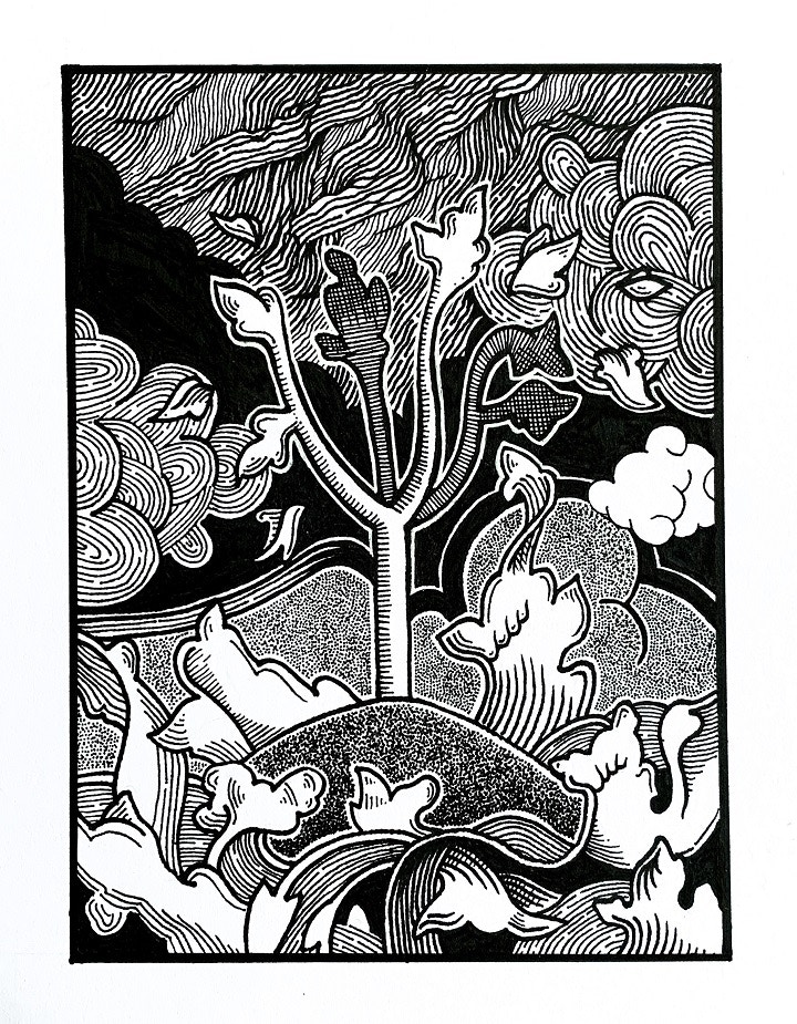
Think about what you would like to produce. The idea doesn’t have to be complex, you can add loads of visual interest with different patterns and by varying the lines and marks you use. Here I’ve gone for a tree on a wee island with a stormy sea. Think about how you break up your drawing and try to have a foreground midground and background as well as a focal point. In my drawing the sea is the foreground, the island is the midground and the clouds make up the background. The tree is the focal point.
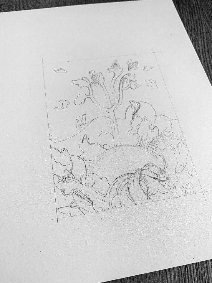
STEP 2
I always draw out my idea lightly in pencil first. This lets you tweak and adapt as you go. Once I have a composition that I like I measure out and draw a frame for the drawing to develop within.
STEP 3
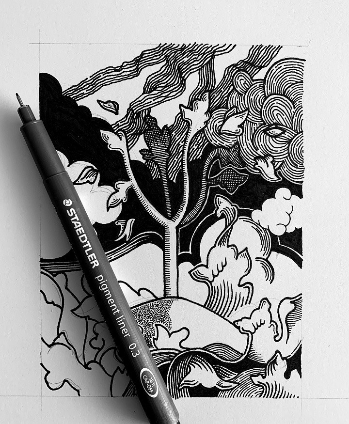
I use Staedtler pigment liners for the next stage of my drawings. There is a great variety of nibs and I use from a tiny wee 0.005 all the way up to a chunky 1.2mm. There are a few reasons that I love these pens; they make really consistent marks, they rarely bleed into the paper and they seem to go on working for ages. Also, I have been using them for about 15 years and they are super lightfast. When I see a drawing of mine hanging on someone’s wall from 15 years ago they look as good as new.
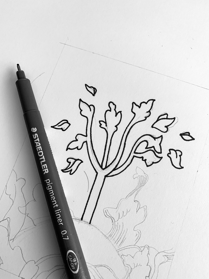
STEP 4
I always start with the thickest lines and draw those in as carefully as possible. It’s really important that, while you are being as precise as you want, you embrace any little differences and ‘mistakes’ that happen. These individual marks are what makes drawings completed with a pen on paper so interesting and tactile. Even digital artists normally start with a real world drawing before they scan it in.
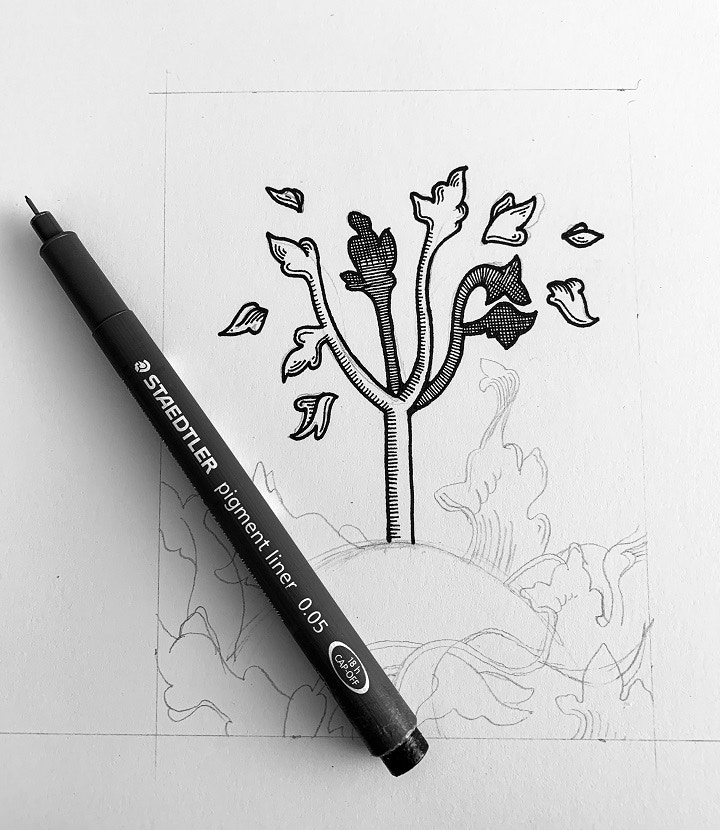
STEP 5
The visual interest in my drawings come from how thick and thin lines look near each other. The thick outlines never look very exciting on their own but when you start adding tiny shading lines with a .005 pen, like on the trunk of the tree, it takes on so much more interest.
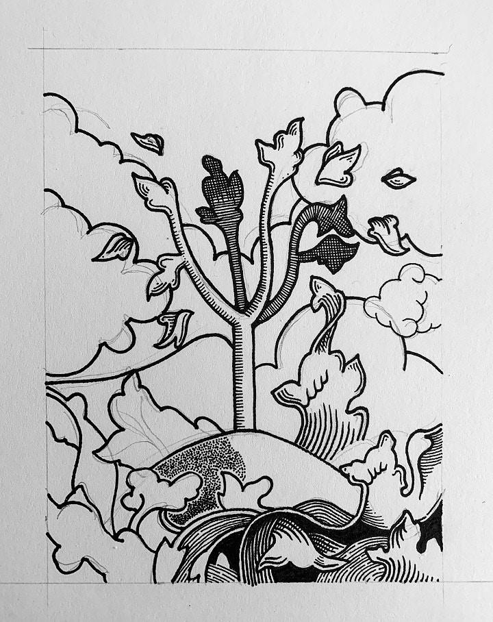
STEP 6
I try to use dotwork in separate areas of the drawing because it creates such a great subtle shading effect. This creates a strong contrast to the line work in the drawing. These pens are really good at maintaining their point while covering areas in dotwork.
STEP 7
Once I have added all the little details and patterns in a variety of fine pens I finish the drawing with a thick black boarder.Once I have added all the little details and patterns in a variety of fine pens I finish the drawing with a thick black boarder.
Thanks for your insightful How-To demonstration Michael!
FEELING INSPIRED?
Visit Michael's Instagram channel and see more of his fantastic work

