Interview with Award-Winning Designer Angus Hyland: The Face Behind The Cass Art Collection
Posted by Cass Art on 15th Feb 2018
For over 15 years, Angus Hyland has championed creativity at Cass Art, from launching our brand identity and activating the Cass Art Manifesto, to the expressive mark making of our own brand range.
Graphic Designer, Author and Creative Director, Angus Hyland has worked with some of the world’s best known brands; from Mulberry and EAT to Penguin Random House and Lawrence King Publishing.
As a Partner at Pentagram, the world’s largest independent design consultancy, he has also received over a hundred creative awards, including two D&AD Awards for the Cass Art Paper Range and our iconic Collection of Tote Bags.
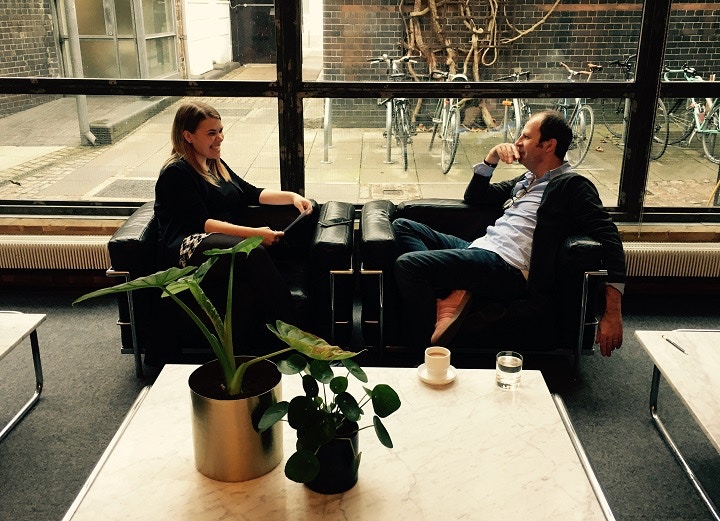
We caught up with Angus to find out more about the inspiration behind The Cass Art Collection…
Hi Angus! How did you come up with the concept for the Cass Art Paper Range?
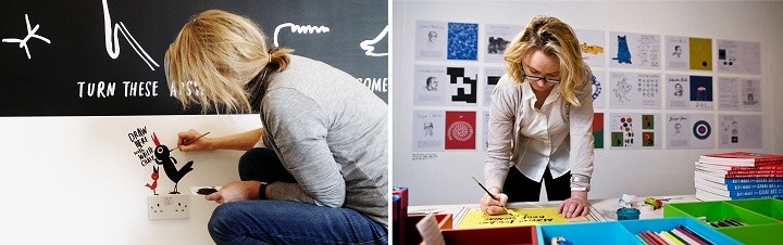
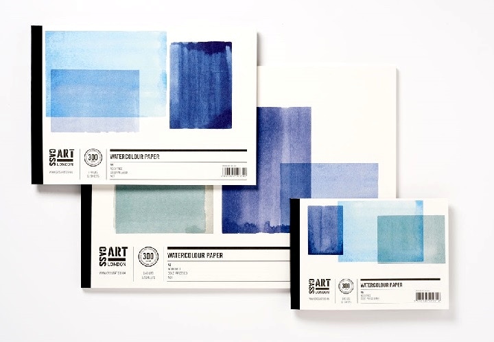
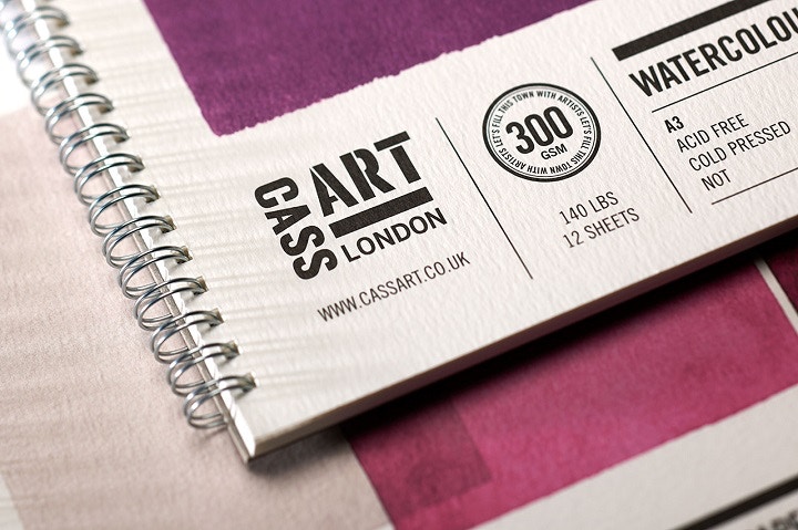
The first pads were very small – A5 watercolour postcards – that we released in a variety of different covers and colours. I asked my wife, the artist and author Marion Deuchars to do them as little marks – ‘posh doodles’ if you will – that would visually describe the properties of the material.
Essentially, we took the idea that within the store you have these little moments where you can try and test out the medium on the stock, and so they were really kind of a way of formalising that onto the product.
This was also a move away from providing the customer with a perfect artist’s landscape, which had been water coloured or traditionally painted, tying in with the fact that anyone could buy them and make what they can with them. They were deliberately abstract and as colourful as possible, an informal realisation of the medium.
How did you develop this process into the broader collection?
After the first ones, my wife said to me, “If you actually believe in what you're saying, that everyone can have a go, why don't you do it?” So I decided to do the next range myself. Marion’s designs were very free form, and when I took them on I thought all we needed to do was use the covers to demonstrate the quality of the material inside.
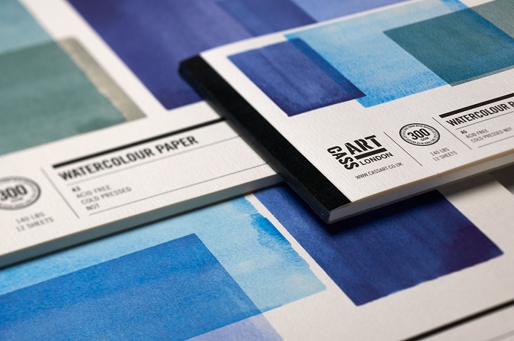
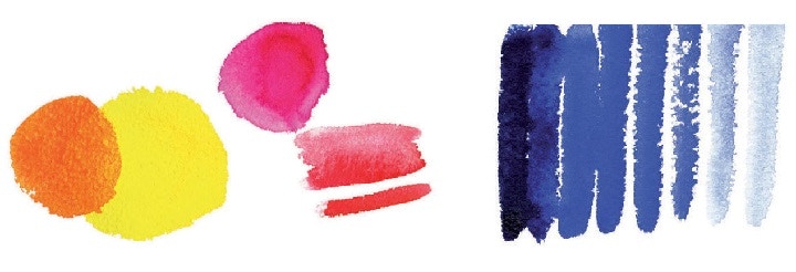
So, the best way of describing the properties of watercolour paper was through simple washes. We choose to do them in rectangles because we didn't want to make any creative decisions about what type of landscape or still life to do, but to actually just do it in pure pigment - pure tone, pure colour. If you took the principal for the first series, this could be applied to a range of media and types of paper.
How did you decide on the colour for each?
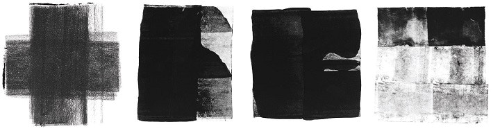
Each pad is based on the same simple idea; to represent the media directly on the cover. And so we started by asking artists their reasons for buying different papers; Why do you buy heavyweight cartridge? What can you do with it? Is it to draw on it, what medium can you use on it? Can wet mediums be used on it, is it better for drawing? What tooth does it have? Is it better for charcoal?
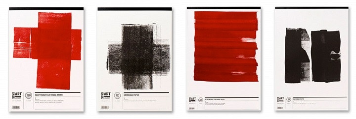
The challenge was to express a commonality that would connect the range. For example, the Smooth Hot Pressed Pad, has the same swashes of watercolour, but with cartridge it’s all sorts of things. From charcoal to graphite to rolling out pink Indian ink on it to light washes of colour, the qualities of the paper broadens your choice of colour and variety of mark making. So we chose to make the heavy weight red and all the regular weight black, then you have instant visual recognition - a type of coding system.
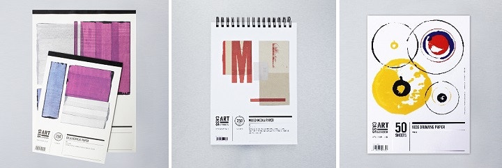
Some are self-evident, if its Acrylic and Oil then you use the medium to express the quality of the material, but with Mixed Media we could be more experimental as the properties of the paper allowed you to stick things on, as well as roller a bit of ink across it.
How did you arrive at the final marks?
On one hand, they are super simple, but on the other, like with all mark making, there is actually good and bad mark making. We were just presenting artists with what we considered good mark making.
Good mark making is not straight forward. To get one doodle that can basically survive ten years and still look kinda cool, probably takes a hundred versions. Mark gets regular bills with all the materials I'm experimenting with, just to get one pad out!
How has this design idea expanded into the wider Cass Own Brand products?
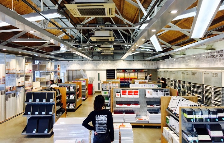
The pads have given an attitude to all the other own brand products. Though the brushes were the first own brand products Mark and I worked on, the pads were the first on any scale, which took up a significant space in the stores that you could visually merchandise.
By and large, the best thing about ‘own brand stuff’, is that it doesn't have to compete in other environments, where you aren't in control of how it is represented. It gives you the opportunity to extend the overall experience of the store, the manifesto, the lifeblood of the brand – so it should be the best packaging in the store.
How do you communicate quality to an artist through design?
That’s a tricky one, because it’s a given that its high quality, as Cass Art have chosen the best materials for the range. My job is to express the quality in the best light. If you've got a nice pad, and it’s nicely designed, there is a unity.
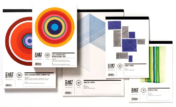
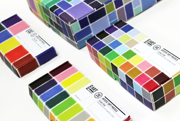
For example, with the pastels, all of the colours that are inside are displayed on the front, rather than one little drawing of what you can do with them, so in a sense, you allow the artist to make the quality or value judgement.
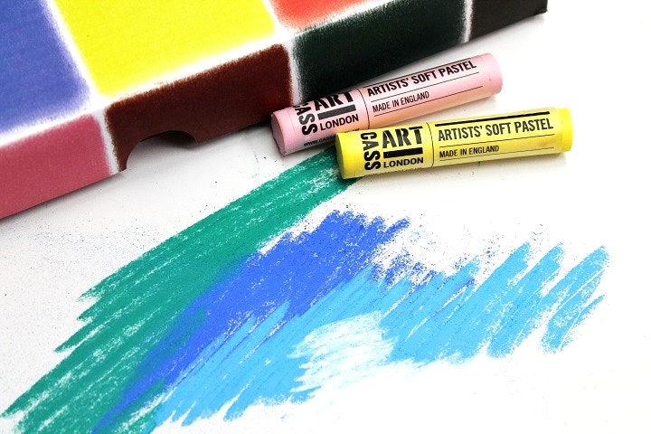
The representation of the mark making, in terms of pastels, is a good example of how colour is represented. This is a true representation - we haven't done anything with it - just putting pigment on paper really. This is the true starting point, and gives artists some clarity that this is the starting point, the media to realise your ideas, rather than leading you anywhere else.
How does The Cass Art Collection compare to other art materials?
If you look at all the brand leaders, who sit next to the Cass Art range in the store, they tend to take a completely different approach. This is because they haven't got the luxury of being an extension of the whole store experience and the brand. Therefore they have to be self-selling. We don't have to fall into that trap. Artists make a value judgement about brands that are trying to push something - but were pulling - and I think that’s the difference.
If you're expressing something like ‘come to me, come to me’ rather than ‘look at me, look at me’, it becomes a more relaxed, soft sell as its part of the whole experience. Whereas, the brand leaders do that in ways which are kind of stereotypical, or expected, because they don't have the luxury of experimenting.
What has been your biggest highlight working on the Cass Art Range?
That’s a really, really tricky question. It’s got to be working with Mark. It’s a close relationship, we know each other well. In truth, I think the stronger the relationship between the client and the designer, the more trust that is engineered between the two, the better the result.
As the relationship grows and the trust deepens, it becomes increasingly rewarding, whilst also allowing you to become more bold and ambitious.
Was it difficult finding the right design to represent a new, artist quality Own Brand range?
It was an odd paradigm. Here we were in a graphic design business, looking at high quality artist materials that were represented in a way that was actually turning off artists – especially people from just having a go.
We wanted to make art more accessible to everybody, and actually very few people come into an art store. Making the products more appealing was an invitation to everyone, regardless of ability, to come in, pick up some materials and experiment with their creativity.
With every new design and new product, the manifesto and desire to encourage creativity has become more than just a statement - it’s become a reality.

