
SKY ARTS LANDSCAPE ARTIST OF THE YEAR SERIES 7: MEET THE ARTISTS
Posted by Cass Art on 13th Dec 2021
Sky Arts Landscape Artist of the Year Series 7 has treated us to some stunning scenes, as talented artists from across the country tied their aprons, steadied their easels and prepared to battle it out to be crowned Landscape Artist of the Year. The artists are challenged with just four hours to capture scenes from the biomes nestled in the gardens of The Eden Project, to the bustling harbour in Whitstable, under the watchful eye of judges award-winning artist Tai Shan Schierenberg, independent curator Kathleen Soriano, and art historian Kate Bryan. All this for the chance to win a £10,000 commission for the Manchester Art Gallery and £500 of materials from Cass Art.
We caught up with the heat winners and wildcard winners from this season to discover the materials they love to use and their experience of the show.
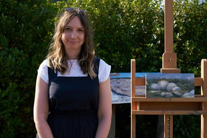
HEAT 1 WINNER – ELISHA ENFIELD
Heat 1 location: The Eden Project, Cornwall.
Hi Elisha, congratulations on winning Heat 1 of Sky Arts Landscape Artist of the Year Series 7! What was the experience like?
The atmosphere on the day at the Eden Project was electric, and there was an amazing sense of enjoyment amongst the artists, film crew and family. Painting can feel quite insular, so one of the loveliest things was connecting with the other artists; Doug, Denise and I have kept in touch, and I’ve acquired one of Doug’s works. It’s a long day but time moves very quickly, so it’s hard to find a moment to enjoy it in the present. The moments I did were surreal and beautiful.
The judges called your work magical, dream-like and other-worldly. How do you achieve this atmosphere in your work?
When I arrived in the early morning, the light reflecting off the biomes made them appear to glow. It looked very alien and I just thought wow, that’s what I want to capture. I used thinner paint for lighter areas of the biomes for a sense of translucency. I also like to use rags to lift off paint as it creates soft edges. I used this for the highlights, allowing the gesso underneath to become the very brightest part of the painting.
What are your go-to materials that you simply can’t do without?
My favourite brush is the no. 8 filbert from the Cass Art White Synthetic Brush Set of 6. I own several in various states. I love them when they're new, but I’m also very hard on them, so over time they splay out and become useful for blending. I’ve tried other brushes of this size and shape, but always come back to this one. I lost my collection briefly whilst we were filming and was distraught!
See more of Elisha’s work at: elishaenfield.co.uk
HEAT 1 WILDCARD WINNER – MAX PANKS
Hi Max, congratulations on being selected as the Heat 1 wildcard winner! Tell us about your experience on the day.
Thank you! My intention for the day was to have fun, soak up the atmosphere (and the sun!), have some good conversations and create some work that I could be pleased with. I made some great friends and learnt a lot about myself along the way. It was wonderful to be in the thick of it and to feel the vibrancy of energy coming from the other contestants.
Heat 1 was at the beautiful Eden Project in Cornwall, it was a brave decision not to include the famous biomes in your painting, but it paid off! How did you decide on your composition for the piece?
I actually painted about 4 pieces on that day and struggled to decide which one to submit. But I knew that I wanted to paint something other than the domes, and the first thing I noticed upon arrival was the spectacular cliff face which captured dynamic light so readily. After considering the composition in my mind for some time, I started with a few pencil sketches so as to establish light and dark on paper. And after 2 watercolour sketches, I was ready to begin the final piece (which was the first of the 4 I painted throughout the day).
What are your go-to materials that you simply can’t do without?
I tend to mix and match between Daniel Smith, Cass Art, Schmincke and Winsor & Newton paints as each brand offers something different, and I generally work with a fairly limited palette of around 5 or 6 colours - though every time I find myself in an art shop, I buy a colour that I’ve never used before. When it comes to paper, I absolutely love working on Arches Rough Watercolour Paper. It seems to work extremely well with my technique, there’s just nothing else like it.
See more of Max’s work at: maxpanks.com
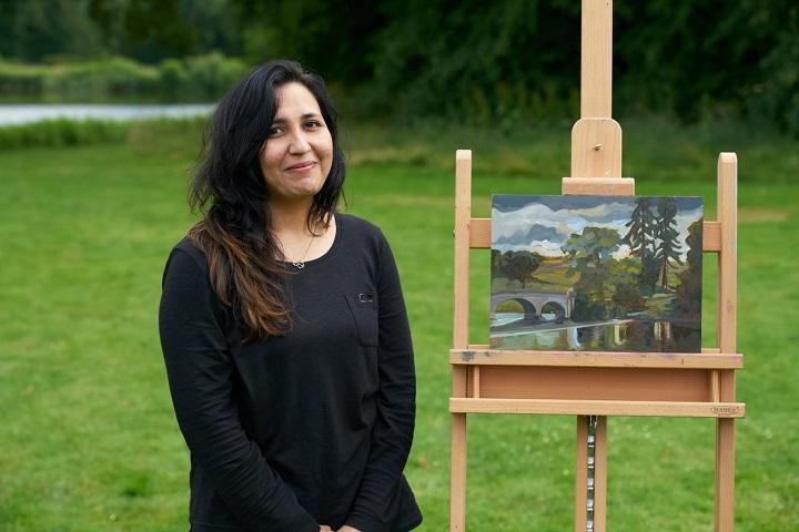
HEAT 2 WINNER – AFSHEEN NASIR
Heat 2 location: Compton Verney, Warwickshire.
Hi Afsheen, congratulations on winning Heat 2 of Sky Arts Landscape Artist of the Year Series 7! What was the experience like?
I surprised myself on the day when despite the intensity of the situation, I thoroughly enjoyed just focussing on producing something. It was the first time I painted plein air and I LOVED it - I found the stimulus of feeling the weather changes and seeing corresponding variations in light incredibly inspiring. The locations were amazing. My absolute favourite was the Forth Bridge. Just arriving there at 7am, it felt like an other-worldly place. Never thought I would enjoy painting something like that but I liked it so much, I did another bigger painting of it later. The experience gave me an opportunity to prove to myself, more than anything else. The judges were remarkably kind and their comments are something I will always cherish and remember to help keep me on track.
It was a thrilling, frightening and exhilarating experience all rolled into one. I am humbled especially painting alongside some remarkably talented artists. I know it’s a competition but definitely doesn’t feel like one - it is one happy community of creatives. Chatting to fellow contestants was such a treat and I am full of admiration for all of them.
The judges called your submission piece beautiful and evocative, and you create a wonderful sense of mood and atmosphere in your work, with loose brushwork and interesting palette choices. Can you tell us a bit about how you decide on the colour palette for each piece?
Before starting to paint, I plan out most of my colour on the palette - which is a glass top from an old table I bought at a charity shop. The colours must work together to help create the same mood I experience. A lot of the time the scene can be quite simple, but the combination of light and atmosphere can really draw you in. The right colour choices at the beginning help me capture that so that’s how I decide. Once I have mixed the paints and decided on that particular combination, I don’t add anything further. I don’t overmix either as I like to use my brush strokes to swirl the mixes in and create some happy accidents. Spending some time upfront thinking about my palette choices and then just mixing while painting gives me the freedom to get lost in the painting bit more.
What are your go-to materials that you simply can’t do without?
I love Indian yellow by Michael Harding. Mostly I use Winsor & Newton colours. I do use a lot of angled brushes as I really like the way I can manipulate the paint with this shape, and they work well with my style of painting. A big glass palette is a must. I also really like Ampersand clayboards - something I discovered recently. The smooth surface is much more suited to my style so I don’t think I will be going back to canvas anytime soon.
See more of Afsheen’s work at: afsheennasir.co.uk
HEAT 2 WILDCARD WINNER – HELEN MCDONALD MATHIE
Hi Helen, congratulations on being selected as the Heat 2 wildcard winner! Tell us about your experience on the day.
The grounds of Compton Verney are beautiful and well worth a visit. I was lucky enough to find a position which suited my style with loads of green in front of me and acres of reflections. I painted two A1 size boards to make sure that I could include both the amazing cedar tree to my left and the bridge to my right. It was exciting to see Joan Bakewell and Stephen Mangan come around and chat throughout the day to other wildcards. The judges were lovely and passed through our area regularly. Being an artist can be a lonely existence and I was encouraged by our chats and their positive comments. The atmosphere, I felt, was like that of an art festival.
I was gobsmacked when Tai said congratulations and that I was the winner! I probably cried; I can’t remember. It didn’t feel real, my paintings which I’d splashed paint on, scraped it off, applied more texture with my fingers, brushes and even a feather were then treated with great care and taken off by the production team. What a day! I can’t recommend the experience highly enough so if you are thinking of having a go then just do it.
You produced a beautiful and loosely painted diptych on the day which was impressive! How did you capture the sense of light in the piece?
The minute I decided to paint a diptych I knew I had to link the two canvases in some way. That led to using my wash brush and me sweeping colour across both canvases in quick motion. I then moved onto a two-inch brush and, using horizontal marks, I painted in the tree to the left and the bridge to the right. Having positioned my darks with phthalo deep green mixed with ultramarine, some dark browns and purples, I then had the opportunity to create contrasting lighter areas to enhance the sense of distance and space. The light kept changing all throughout the day. I suppose I tried to chase it at some points throughout the day, an impossible task!
I concentrated on painting some lighter tones in the foreground, and this enhanced the effect of the light reflecting on the water. Colours in reflections add to a sense of shimmering light on water too so I used light greens, yellow ochre and Kings Blue Deep mixed with white near the bridge at the right-hand side to show the light coming in over the bridge and onto the water there. Deep tones under the bridge completed that area of the painting.
What are your go-to materials that you simply can’t do without?
The materials are the main ingredients of any artists work and as you say artists have their personal favourites. I like square ended brushes, Daler Rowney system 3 Short Flat and System3 SH Skyflow, which are much wider. I also use Cass Art Grey Synthetic acrylic and oil sets. I’ve recently started experimenting with Cass Art palette knives and I’m enjoying the extra textures I can achieve with them. For paints, I like the Michael Harding oil paint range in particular the Kings Blues, I also regularly use Ultramarine blues, Cadmium and Ochre yellows, Alizarin Crimson. Also, Winsor & Newton Winsor Blue, Magenta, Chrome Yellow, Naples Yellow, Sap Green, Phthalo Deep Green, Burnt Sienna and Ultramarine Violet. I often start my oil paintings with acrylics and for that I prefer System Three large pots.
I mainly work on canvas and canvas boards like Cass Art triple packs for smaller paintings and Winsor & Newton artists canvases for larger pieces. I also like Cass Art natural linen 11.3 oz exhibition grade.
See more of Helen’s work at: helenmcdonaldmathie.com
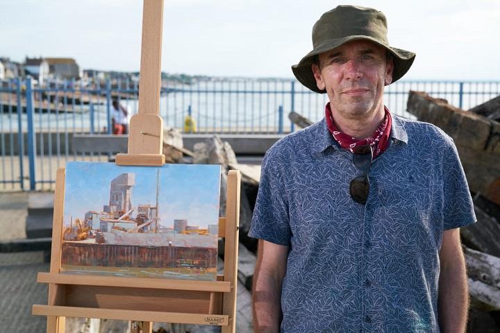
HEAT 3 WINNER – DESMOND DOWNES
Heat 3 location: Whitstable Harbour.
Hi Desmond, congratulations on winning Heat 3 of Sky Arts Landscape Artist of the Year Series 7! What was the experience like?
I really enjoyed the whole experience, thanks. Such an exciting thing to do. The crew made it very easy on the day despite the chaos on the harbour. It was such a different painting experience to the solitary endeavour that it usually is. I’d recommend it. One off the bucket list!
You take a very practical approach to painting, and the judges were impressed with the way you construct a painting, can you talk us through your process from start to finish?
I’m pretty logical about painting. The hardest part is deciding on what, or where to paint. I’m the worst procrastinator! Once I have a design in my mind it’s a matter of going through steps. Block in is the drawing part. I use a thin wash to get the big shapes in. I can take away with tissue or add until I’m happy with the composition. Colour next and I’m looking for a variety of marks. Semi-transparent/opaque, thick/thin etc. to represent what I have in mind with a balance. I try to keep the lights vibrant. Colour, Light & Shade, materials etc. are based on logic in nature but I’ll push that sometimes for design. That’s usually the plan, but you know how plans can go...
What are your go-to materials that you simply can’t do without?
I prefer a wide flat synthetic brush to cover ground quickly early on. Palette knife for mixing colours on a glass palette, and also for straight lines etc. Usually Winsor & Newton and Michael Harding oils. Burnt Sienna/Umber for drawing and tonal. Brushes: Synthetic flats and a mix of Rosemary and Richard Oliver Bristles & Filberts. My colour palette includes a warm & cool of each primary... Lemon Yellow/Transparent Indian yellow, Cadmium Red/Alizarin Crimson, Ultramarine Blue/Prussian Blue and Titanium White.
See more of Desmond’s work at: desd.ie
HEAT 3 WILDCARD WINNER – KATIE THOMAS
Hi Katie, congratulations on being selected as the Heat 3 wildcard winner! Tell us about your experience on the day.
I am abundantly pleased that I applied to be a part of this experience. I did so with no expectations; only to soak up the atmosphere with the other artists and have a day that was dedicated completely to my passion. I admittedly made a mistake at first, by drawing straight onto my Lino but forgetting to reverse the image. Fortunately, I had layout paper with me, so I traced and transferred the image over to a fresh Lino sheet to start again. This amused the judges and set me back by an hour!
Winning the wildcard was a huge shock to me. It’s wonderful to see so many beautiful artworks being created but to also be recognised for your interpretation is a hugely warming validation. I would recommend that any creative would apply and give the experience a try, as it is such a welcoming and educational day.
Your piece was a stunning three colour print, and you chose a very bold composition which gave the piece a real sense of narrative. How do you create a narrative within your works?
I am a Graphic Designer by trade, so I have never been particularly good at achieving a whimsical and painterly approach to image-making. When I take in a subject, I split it into shapes and colours, which is why linocut printmaking is such an appropriate technique for me.
At Whitstable, I did sit for 20 minutes just taking in the view. I decided that there was too much visual information and I needed to edit it, making a decision on one element to focus on. This element needed to be something quintessentially Whitstable - and for me, as someone who has been visiting for years, it had to be the Lifeguard Station. The role of the building, the equipment and the workers are the reason why Whitstable is the successful seafront town that it is. When capturing a landscape, this is the main focus for me. Not necessarily what is pretty, but what I see is important.
What are your go-to materials that you simply can’t do without?
I have always used soft cut linoleum, as I have carpal tunnel and find traditional grey Lino aggravates it. My go-to is Essdee soft blue rollers and find them hugely superior to the many others that I have tried over the years - including those at higher price points. It’s vital to find a product that works for you and in this case, it does. My ink is Caligo Safewash, which is an oil-based ink but environmentally and user friendly as it cleans up with vegetable oil. These inks give you a beautiful level of coverage, flawless finish and vibrant colours.
My use of paper is fluid, as it depends on the outcome I am trying to achieve. If I am hand pressing I will use HoSho, which is a Japanese fine paper. If I am using my press, I prefer something with slightly more weight, such as Kent or Snowdon. I also strive to make my own paper using offcuts and scraps. This does yield an uneven surface, but there are times when the result I am looking for benefits from the visual noise that is created.
See more of Katie’s work at: printingclementine.com
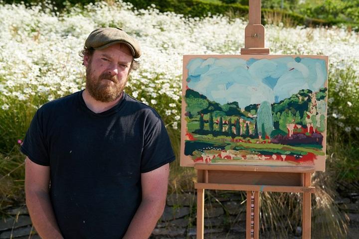
HEAT 4 WINNER – THOMAS MACGREGOR
Heat 4 location: The Eden Project, Cornwall.
Hi Thomas, congratulations on winning Heat 4 of Sky Arts Landscape Artist of the Year Series 7! What was the experience like?
It was very daunting but I really enjoyed the experience, having previously been on Portrait Artist of the Year I had some idea of what I was getting myself into. I’m not sure why I enjoy it so much. The added pressure of time and constant presence of the film crew make it so hard to concentrate but I really like what the pressure can throw up.
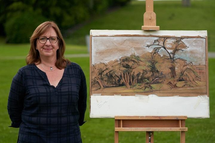
You decided to work on two pieces at once, and your final piece was created with a heavily textured and rhythmic application of paint. Can you tell us a bit about how you apply the different textures in your works.
I have a tendency to overwork a painting. So working on more than one at a time is a good way to combat this. To slow me down or make me deliberately leave parts. My thinking was also that I could go in two very different directions until one of the paintings started to emerge as a winner. I don’t always attack in the same way, but it felt right for the wall of green that we faced. The initial layers of matt emulsion create an absorbency that sucks the sheen out of the oil and allows quite a thick layer of oil to sit on top with quite a dull texture. This means the painting holds different layers of interest as the eye moves around it and as light hits from different angles. I wanted to get the feeling of movement and urgency into the painting, so it felt right to drip and scrape and leave areas unfinished. Painting has a lot to do with the time it has taken to create and how that is visible on the piece. The submission piece had areas of more slow calm deliberation but within that there is some frantic movement too.
What are your go-to materials that you simply can’t do without?
My go-to materials have generally been dictated by what I can afford at the time. The reason I use matt emulsion is that it was a cheap or free source of paint when I was at art school. Also it dries quickly like acrylic so I can get lots of information down as quickly as possible. I like to work fast. Having lower quality items or limited ranges of colour forces you to work differently so a lot of my style has come from forgoing things and trying to make it work with what I do have. I’m very happy using Daler Rowney System3, and the Winsor & Newton Galleria range suits me just fine. When I was working in Bolivia the only oils I could source was the Pebeo range and they were ok, really love their Rouge Cadmium Clair imit… but, and I think this is predominantly because I use a lot of paint, my go-to oil is the Winsor & Newton range (and actually the deal on Titanium White that you get at Cass Art is hard to beat) but I’m really not that bothered about which paint I use. So long as I have some.
See more of Thomas’ work at: tdmacgregor.com/work/landscape
HEAT 4 WILDCARD WINNER – KIRSTEN ELSWOOD
Hi Kirsten, congratulations on being selected as the Heat 4 wildcard winner! Tell us about your experience on the day.
Thank you! I had such a brilliant day as a wildcard artist at the Eden Project. I arrived at 7am, with all my equipment for a day’s plein air painting. My blank canvas was stamped at the registration desk with the Landscape Artist of The Year logo, and off I headed down the hill to the biomes, with the other 49 wildcard artists. We were all relatively close to one another, but I was pleased with the view I got. After some preliminary sketches, I quickly sponged on a ground of my favourite Quinacridone Nickel Avo (Golden), then got going!
All of the production team, crew and presenters were friendly, helpful and patient. There was a really fun atmosphere, where although everything is very professional and taken seriously, people all enjoy themselves. I loved chatting to Tai and Kathleen and felt a huge confidence boost! I would definitely recommend entering - I loved the day.
You captured the foliage in the foreground with bold brushwork and a rich variety of greens. Do you have any tips for painting vegetation?
I prefer to mix my own greens when painting trees, plants and grasses. My favourite mix is a Payne’s Grey with a Cadmium Yellow, which I think produces a natural, believable green. I also try to concentrate just on the general shapes so not to get lost. A botanist might despair, but I wanted to get an overall impression. The colours were pretty accurate as the team had trouble taking a photograph of the painting with the scene behind as the painting of the vegetation camouflaged into the place!
What are your go-to materials that you simply can’t do without?
I use the best quality acrylic paints I can afford, and especially love Golden and Liquitex brands. I use acrylic ink (Liquitex and Daler Rowney FW), acrylic spray paint (Montana and Liquitex) and Posca pens. I would also not be without my water spray bottle (which I use for making effects on the paint surface as well as wetting paints). As well as brushes, I use sponges, silicone wedges and paint rollers!
See more of Kirsten’s work at: kirstenelswood.co.uk
HEAT 5 WINNER – REBECCA NOELLE PURVIS
Heat 5 location: Compton Verney, Warwickshire.
Hi Rebecca, congratulations on winning Heat 5 of Sky Arts Landscape Artist of the Year Series 7! What was the experience like?
The experience was definitely a surreal one! Seeing the Artist Pods for the first time that morning made it real and then the first film shot of the artist walking made the nerves start and I thought “what have I done?”. As the morning progressed, I just had one thought of doing justice to the wonderful location of Compton Verney. When I started my drawing, I was able to concentrate and focus on doing the best piece I could. One of the most amazing things about taking part in this series was the series and production itself. From the hostess and judges to the production company the whole day ran like clockwork. Wonderful to be in the centre of it all. Then to be shortlisted was wonderful! I wasn’t sure if my drawing was going to stand out against the other wonderful paintings. Then the wait for the judges to decide seemed very long. I really didn’t think I was going to be chosen. The other two paintings were so strong that I was sure one of them would be the winner. To my surprise it was me! It was a wonderful feeling and the best comment I had was from Kate Bryan when she said that I had worked hard for the drawing. Then the surreal feeling came back!
Your piece was a mixed media drawing in subdued colours on used brown paper. You transformed the landscape in front of you. You gave the trees character and the finished drawing had a magical and mysterious feeling. Your submission piece was similar, can you walk us through your process?
I enjoy drawing landscapes on the used brown paper because it is an excellent middle tone to work on. I start all my paintings and drawings the same way, with a sketch to work on the composition and values. Then I choose the colour palette, a bit limited with the brown paper but still a factor. From there I start drawing with a Conte hard charcoal pencil and build up with compressed charcoal and white gouache to achieve the dark darks and whites. I try not to cover all the paper to allow it to work as the middle values. I like to use Conte sepia sticks and pencils along with pastels. I find a really strong composition and I always look at the negative space. That for me is as important as the subject matter. I also like to have a connection and movement throughout a piece. With the submission piece it was all about the very close foreground framing the cityscape in the distance. The white negative space of the sky was as important as the tree and city. The white gouache on the brown paper adds to that mysterious feeling.
What are your go-to materials that you simply can’t do without?
I draw and paint equally and sometimes the materials cross over. For drawing it’s charcoal pencils, Conte when I can find them, as well as Conte sepia sticks and pencils and finally white gouache. For painting it's always oils and always Winsor & Newton oil paints. My surfaces change but my materials stay the same.
See more of Rebecca’s work at: rebeccanoelleartstudio.com
HEAT 5 WILDCARD WINNER – EWAN ASHLEY
Hi Ewan, congratulations on being selected as the Heat 5 wildcard winner! Tell us about your experience on the day.
When I heard I managed to get a wildcard place I was over the moon. On the day, as we came to our destination artists shuffled around to find their perfect spot and composition, I was drawn to the water and the colourful deck chairs on the other side of the bank. I started quickly, sketching and doing my value and colour studies. I was happy that I had a reasonable composition and began sloshing on black ink, allowing it to drip down my paper. I then applied my ink blocks giving them a water wash and again allowing the colour to find its own way on the paper. I began layering on my soft pastels.
After a good way in, Tai came and asked me about my technique, I continued painting feeling like my day was complete - I had met one of the judges! Soon afterward Kathleen appeared with the film crew, and began asking me about my painting and in particular the small colour study and told me about Constable's numerous cloud studies, inspiring stuff! Again this had made my day, how could it get any better?! Soon it was time to stop painting, I saw Kate approaching me with the film crew and other artists clapping and she told me that I was the wildcard winner, I have to say I was completely gobsmacked! It really was a memorable day, I am so glad I entered in the first place and am currently working on a few ideas for paintings to enter again this year.
You made a fantastic pastel drawing of the view across the lake, with a deep contrast between the dark greens in the shadows and the light reflecting off and the highlights in the treetops. Can you talk about how you build layers with pastels to create this effect?
My approach feels almost ceremonial, there is a clear order in which the process needs to take place, sometimes I almost feel like an observer and the painting happens in front of my eyes. I do quite a lot of preliminary work, first I take care to select a scene and the composition, doing a very rough sketch to really compose it, followed by a small value study using grey scale markers. Once I have done this I then do a colour study on a 2.5 inch x 3.5 inch, I use a black marker to map out the darks and then I limit myself to 50 strokes of pastels, this gives me a real sense of the composition and colour.
To being on the main piece, I start with black ink looking for the dark areas, here my value study is really helpful, I am fairly generous with the ink and it gives me a real chance to be expressive, I love the drips! Once that had dried, I then applied ink blocks, generally looking for a complementary colour to help balance the final colour. I then apply water or vodka depending on the surface onto the colour blocks, again very expressive and looking for those drips. Once that has dried I then begin to apply soft pastel, I usually start with the darkest darks followed by the lightest lights (not highlights), I then build the layers to work towards the mid-tones using lighter values of the initial layer of pastels. I usually work from back to front, i.e. from background to foreground, cooler and more grey colours in the background, warmer and more vibrant in the foreground. At times I can be too heavy-handed and fill the tooth of the paper so quite often I use a paint brush to remove layers. I am also careful not to completely cover the underpainting and let elements and some of the drips peep through, I find this helps give the picture atmosphere. I then finish off by looking for the highlights and enhancing the colour in the focal point really to draw the viewer into the scene.
What are your go-to materials that you simply can’t do without?
My must haves for studies are Winsor & Newton greyscale markers, Magnum black Sharpie, 2H and 2B pencils, sketch book 220gsm. For underpainting, I use black ink, Derwent Ink Blocks, vodka or water. For supports, UART 400 sanded paper or Clairefontaine Pastelmat, and for the main piece, I use Unison Colour Soft Pastels, the starter set of 120 half sticks that I used on the day were ordered from Cass Art!
See more of Ewan’s work at: instagram.com/eashleyart
Thanks everyone!
Feeling inspired?
If you think you have what it takes to be the next Sky Arts Landscape Artist of the Year, entries for Series 8 close at midday on Thursday 14th April 2022. Find out more and apply at skyartsartistoftheyear.tv/landscape. Good luck!

