
World Exclusive: Michael Harding discusses his latest colour Pyrrole Red
Posted by Cass Art on 28th Jul 2021
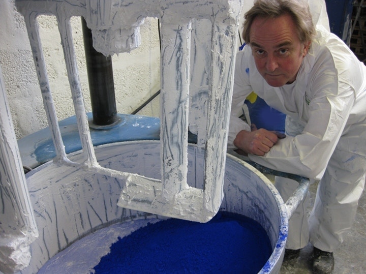
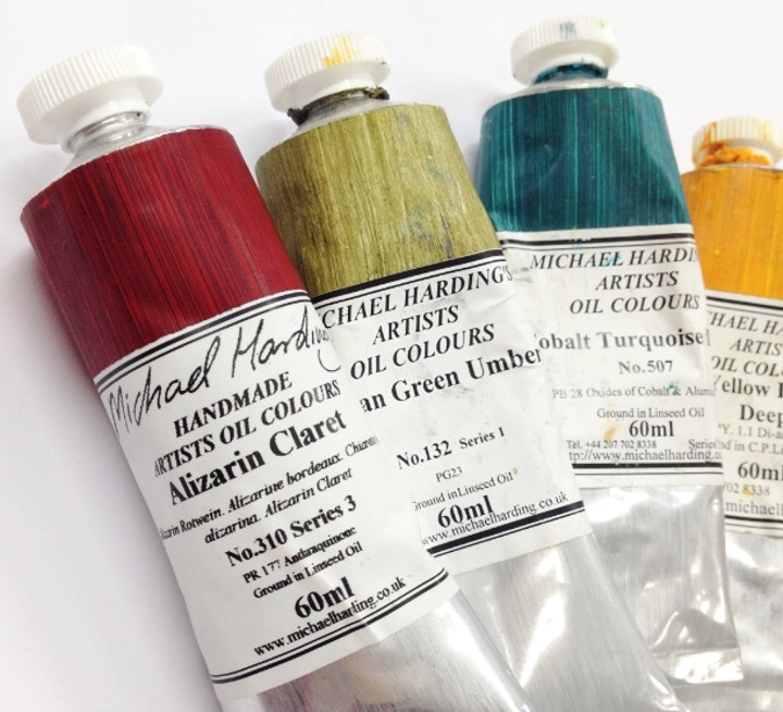
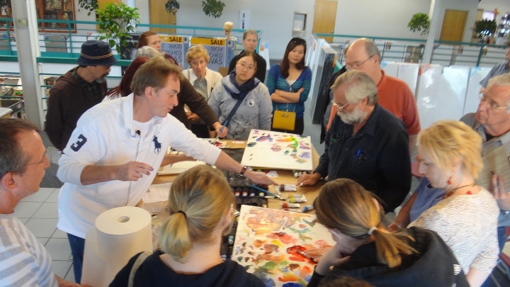
Over the years Michael Harding has brought us exceptionally beautiful pigments across a broad spectrum of colours. Manufacturing oil colour since 1982, each colour is handmade in the UK. He uses only the finest pigments, from Afghan Lapis Lazuli to real Chinese Vermilion, and is a celebrated favourite of artists worldwide, including David Hockney, Howard Hodgkin and Chris Ofili.
And this summer we're delighted to bring you Pyrrole Red - the latest colour added to Michael Harding's range of professional oil paints - sold exclusively here at Cass Art. Read on to find out more about this colour and for an exclusive interview with the man himself. Michael Harding is journey in creating world class oil colour and his ambition to develop the perfect consistency and aesthetic.
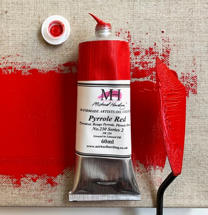
Pyrrole Red
Michael Harding shares his motivation for creating this new shade: "I get immersed in vivid colours. I wanted to add an affordable red to my product line that compliments my currents reds and provides another level of depth in the family of MH reds. While my first passion is pigments from the period of our grand Old Masters time, today’s modern made pigments offers us yet another level of discovery and enjoyment. I feel Pyrrole Red is such a colour, an affordable, highly lightfast vivid red. My Pyrrole Red is like a lot of my oil product line, bold and bright yet with a cool, crisp undertone."
Technical Specification of Michael Harding Pyrrole Red:
Pigment Index Number Pr 254
____________________________________
Oil Content High
____________________________________
Opacity Covering Transparent
____________________________________
Drying Speed Average
____________________________________
Lightfastness Excellent
Michael Harding Interview
Hi Michael! Thank you for taking the time to talk to us. Can you tell us how you developed your processes to find the right consistency and aesthetic look in your oil paints?
I was driven by my own particular quest - to understand what enabled Rembrandt to make his whites have such a beautiful sloppy goopy nature. So, the first colour I made was Titanium White with linseed oil and my finished product looked great, until it dried as a very yellow white. I realised that due to its natural colour, the oil tended to come to the surface producing this yellow colour, a problem that was alleviated by adding zinc white. I was in my early twenties and had a wonderful naivety. Things would go wrong, but I learnt quickly and soon found making paint a wonderful and experiential process.
It has to be said that your range of oil paint is now extensive, with more and more new colours. What prompted you to expand on the original colours available?
After many years of being asked for numerous additional colours I decided that the time was right to add new and exciting oil paints to my range. Customer demand primarily drove the desire to create my new colours. Also, my love for some colours which I privately had my eye on for many years like Rose Madder, a wonderfully romantic deep red familiar for centuries to the old masters, spurred me on to make them. Finally, some of my new colours are historically valuable to artists and are important to my range in providing artists with both the historic tones of the Old Masters and the new colours of our ever changing world.
The craft of paint making seems like a combination of science, cookery and wizardry – is this at all similar to what developing the new colours has been like?
Sometimes it seems a mystery to me I seem to just put the ingredients together in a way that appeals to me. The result comes out in a way that everyone tells me is wonderful, beautiful. I really enjoy formulating and mixing ingredients to create something of great value to the artist’s eye. Finally the way in which I formulate and make my colours is that I want them to “leap” out to the artist and scream “paint with me!”
It’s been said by many artists who use your materials that there’s no need to include a medium as the paints are so perfect already. Can you tell us about the mediums available in the Cass Art rangeand what elements they bring to working with the paint?
I always tell artists if they can already achieve with the paint what is in their minds eye then there is no need to add a medium. That said, a medium should only be added to assist in a handling quality or to obtain a surface which cannot be achieved with paint alone. I feel often artists mistakenly assume that adding a medium is like adding a magic ingredient which will have magical results which is not the case.
Beeswax paste is added to a paint to give it body and increase the impasto brush stroke.
Dammar varnish is applied at least 6 months after a painting is totally dry and gives the painting a moist, glowing appearance enhancing the colours and at the same time providing a protective coat against atmospheric dirt.
Oil Paint Medium (PM1) is added to the paint to increase its flow and translucency. It will naturally thin the colour making it more transparent for the artist who desires more translucency in their paintings.
Do you still paint yourself?
Yes…Shh.
What are you most proud of through the last few decades of paint-making?
I am a person who always looks ahead. I look at what I want to achieve next more than I look at what I have achieved. I love what I do and I am one of the lucky few that can say that. I just love oil paint!
Thank you Michael!
Feeling Inspired?
Explore the full range of Michael Harding colours
Read about the story behind Michael Harding Oil Paint

