
Sky Arts Landscape Artist of the Year 2019: Exclusive Heat Winners Interviews
Posted by Cass Art on 19th Nov 2019
Sky Arts Landscape Artist of the Year 2019 has been a rather wet one! After battling through the elements, we’ve seen fantastic castles, otherworldly orbs and beautiful seascapes. Over the weeks the judges have selected their favourite works and the contestants are one step closer to the £10,000 commission and £500 of art materials from us at Cass Art. We caught up with each of the heat winners to find out a bit more about their experience of the show, their work, and the materials they love to use.
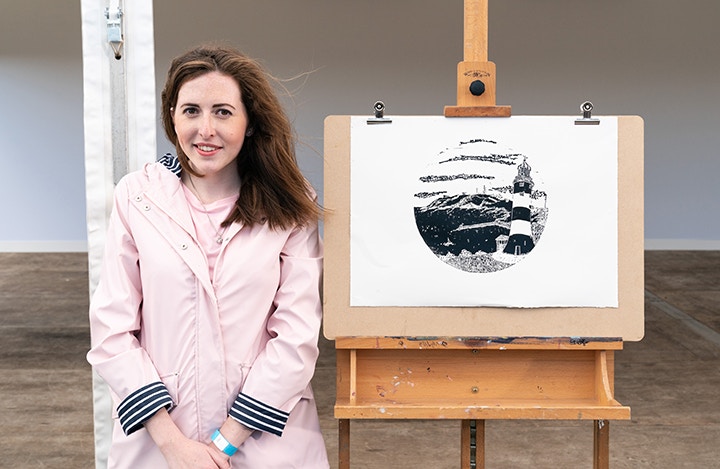
CATHY REDDY - HEAT 1 WINNER
Irish artist Cathy graduated with a Bachelor of Fine Arts from Crawford College of Art and Design in Cork. Her work as a printmaker is strongly influenced by her upbringing in Ireland her pieces are filled with inspiration from the agricultural history of the country.
Congratulations on winning Heat 1 of Sky Arts Landscape Artist of the Year 2019! What was the experience like painting at Smeaton’s Tower?
I had never been to Plymouth before until l my adventure with Sky Arts, when on the evening before I went to visit the location, I still didn't know from what aspect of the coast line I had to work with until the following morning. I found it a really beautiful landscape, but somewhat daunting as it was a huge landscape with possible views everywhere. Smeatons tower was only my second ever coastal landscape, the first coastal landscape didn't turn out quite as well as Smeatons tower, so I was somewhat nervous of attempting another coastal landscape. It’s a beautiful location, with a huge range of possibilities for lino prints, for me texture in the landscape is a big plus, i.e. Rocks, so seeing the cliffs was a big help! Printmaking is not meant to be done outdoors, and to draw, carve and print a lino print in 4 hours in atrocious weather is like flying to Australia and back in one day, it’s virtually impossible.
My biggest fear was the wind and rain, as the carving wouldn't be affected by the weather it’s the printing that would. I used Zerkall paper which works well with hand printing, but is heavy enough not to blow away in the wind. trying to lay the paper onto the inked lino bock was my biggest fear as the paper could blow in the wind and upset all my registration, keep in mind its high pressure, printing with 20 mins to go with Stephen Mangan and a camera crew and the general public all watching on! Luckily my print came out well. It was a big shock to me to win the heat considering the atrocious weather conditions that morning! Overall it was a really fun experience, and it was really lovely to meet the people of Plymouth, all whom told me that I had captured there true Plymouth!
It must have felt very daunting using linocut for your landscape, as you couldn’t see your work right until the final moment! What is it about lino that you enjoy as a medium?
I love the graphic nature of lino, you really have to analyse the landscape to create a lino cut from it. I suppose in creating a lino cut you have to find what the most important elements of the landscape is. I also really enjoy carving and creating all the different textures, and the actually printing is the best bit, it’s like magic seeing print being printed for the first time! I was proud to be the only printmaker in the semi-finals, sometimes I feel that print isn’t revered as painting, and hopefully that will change in the future, with printmakers like myself, showing the process in detail, removing the mystery surrounding it.
And do you have any specific inks that you like to use when you’re printing?
For my own work I use Lawerences Linseed Oil Relief inks and I mix a stiffer into the ink as well as lino ink has to be stiff, as they are permanent, acid free, and light fast and they give a really good solid print, but take days to dry. For workshops I use waterbased lino inks called Speedball inks, I find them really good for introducing people to printmaking the colours are accurate and the consistency is similar to the professional grade inks I use, and they dry fast. I’ve also used Cranfield inks which are also excellent. I use battleship lino the grey lino with the hessian lino, lino is completely environmentally friendly as it is made from linseed.
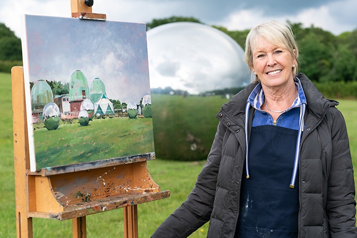
PATSY MOORE - HEAT 2 WINNER
Patsy lives in West Sussex, between London and the sea where she draws inspiration in her town and country scenes. Primarily a watercolourist Patsy also works in oil, pastel and ink.
Congratulations on winning Heat 2 of Sky Arts Landscape Artist of the Year 2019! What was the experience like painting at The Observatory? It was one of the most challenging landscapes that have ever been featured on the show!
When I first saw our view of The Observatory at Herstmonceux, I couldn’t have been more pleased! I love landscape subjects with some element of architecture and enjoy the challenge of painting reflections. We had both!
Despite getting cold and soaked, the weather conditions were perfect for my style of painting; stormy, moving clouds and clear, neutral colours. I was fascinated with the fact that the sky reflections in the big silver globes were actually lighter than the sky itself and that in each globe was yet another complete picture.
It was, of course, a challenging subject to recreate on canvas, especially in the time we were given, but the experience has taught me to make faster assessments and get on with capturing the ‘essence’ of a subject, rather than dithering with details!
The judges loved the way that you used pink as a grounding colour for your painting, as it brought a real warmth and depth to the painting. Do you often use this technique as a tool to bring a specific mood to a painting?
I nearly always paint on a prepared ground of a mid-tone, for several reasons:
I find it difficult to paint directly onto a white canvas. Unlike painting with watercolour, where I prefer to save as much of the bright white paper as possible, using a mid-tone as a base for oil painting helps me to assess the relative tonal values as the painting progresses.
With a painted ground as a base, I can ‘scumble’ paint over it, leaving slightly broken areas, which I find more atmospheric and pleasing than a blocky ‘wall’ of solid paint.
The ground colour I decide to use rather depends on the ‘mood’ of the picture. I do often use a neutral, ‘plaster’ pink for a daytime scene, as it’s a warm colour which to me is evident in the warmth of both clear skies and clouds.
This pinky hue is also a complementary colour to the greens found in most landscapes, so can help to make the various green colours shine brighter.
Finally, this particular ground colour can be found very often in the wonderful pictures of one of my great heroes – Edward Seago. I like to think he used it for the same reasons I do!
And do you have any particular materials that you love to turn to?
Favourite materials? I only use good quality canvases, paints and brushes, as I believe they’re more likely to be ‘on my side’ and trustworthy in performance. Like most cooks who rely on their favourite knife or spatula, I tend to regularly dive for my old favourite brushes, although these days I would generally replace ones that are very worn with Sterling Acrylix brushes rather than hog, as these are softer to use and apply the paint well.
On ‘Landscape Artist of the Year’ I did discover Cass Art’s short handled synthetic brushes, which were brilliant for final touches and small areas of detail. Also new to me on that series, I saw one contestant using a Catalyst Painting Wedge, which gave me equipment envy. So I rushed off to Cass Art and bought one and love using it.
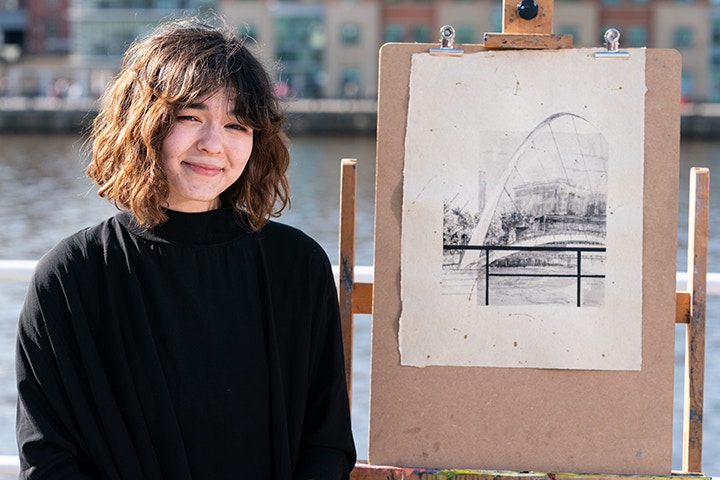
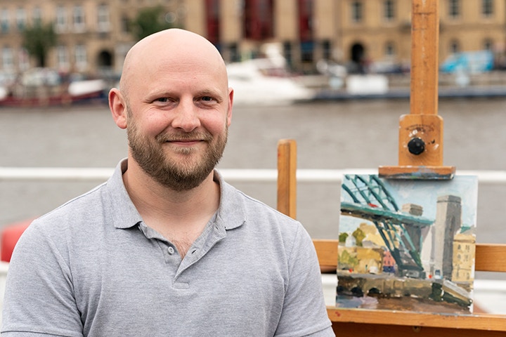
FUJIKO ROSE - HEAT 3 WINNER
Fujiko Rose contrasts the man made with the natural in her work. She balances her life as a fine artist with that of a designer, having set up her own design studio making interior decor.
Congratulations on winning Heat 3 of Sky Arts Landscape Artist of the Year 2019! What was the experience like painting at the Gateshead Millennium Bridge?
It was very exciting to win the heat and then getting to watch it back on the telly has just been a bit surreal. I think my favourite part of the day at Gateshead was getting to share this sort of wacky experience with the other artists, the day was a lovely combination of fun, creativity, confusion and panic.
You have such a delicate touch with your technique, subtle washes and bold ink line work. Could you talk us through how you approach a new piece?
Millennium Bridge was definitely a scene I found myself underestimating the complexity of, as when I first began my layout plan I simplified the scene a bit too much. I first tried to determine where the main contrasts and details would go and overall I stuck to the structure of my initial plan though it was a slightly turbulent path to the finish. In regards to how the composition is initially designed I usually try to come up with a concept, nothing profound but at least something that I can use to help dictate decisions, so at Gateshead I had thought about old photos of Newcastle for the overall mood of the piece but then paired that with something more abstract and edgy like some Japanese woodcuts that I like.
What is it about working in monochrome that you enjoy?
I've always been a fan of drawing and by its nature it's a technique that lends itself well to monochrome, but I've always been drawn to black and white art, especially prints, I had and still have a passion for engravings and etchings and have always found them charming, and as I was trying to learn how to draw with ink I used to study the prints up in our house.
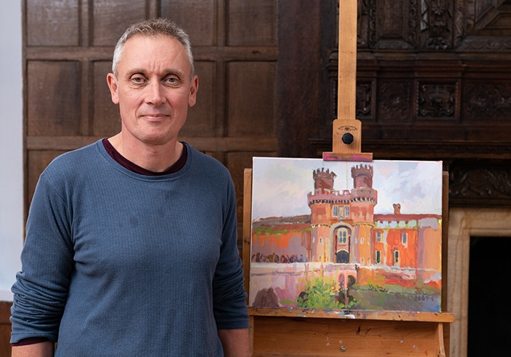
GARY JEFFREY - HEAT 4 WINNER
Gary has worked in Children's publishing and retail and in 2015 after a long break has got back into his art making.
Congratulations on winning Heat 4 of Sky Arts Landscape Artist of the Year 2019! What was the experience like painting at Herstmonceux Castle?
A joyous one! I approached the Heat determined to enjoy both the programme-making, and art challenge aspects of the day to the full. It helped that I had been on the show before (in 2016) and knew what to expect. This time I was able to keep my nervous energy to a pleasant, steady hum and actually function effectively, and above all - have fun!
The judges loved your use of colour in your depiction of Hestmonceux Castle, could you talk us through your use of colour and the choices you make with your palette?
In planning for the Heat I had pondered using complementary (or opposite) colour to block out my painting for three reasons:
- As a bit of theatre to make a visual splash at the start of the show.
- As a way of avoiding being too cautious, precious, or tight with the work.
- Simply because I love playing with colour for its own sake!
Working en plein air deliberately painting in opposites is such fun. To me it feels a little bit transgressive, naughty even, and turns the act of seeing colour into a game!
For years my basic acrylics palette has been:
A couple of bright greens/viridian hue/crimson/Prussian blue/ultramarine/cerulean hue/bright blue/ochre/cad yellow med/cad yellow light/cad red med and white
For the Heat I added:
Colbalt blue deep/cerulean (chromium)/cad red light
And ditched Prussian, ultramarine, and cad red med because I wanted the castle to have “lift”
Do you have any particular brands that you tend to return to with your paint?
My preferred acrylics are Liquitex Heavy Body and Winsor & Newton Artists quality with a large tub of Student Titanium white (any brand!)
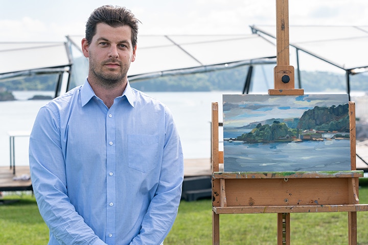
DAVID YOUDS - HEAT 5 WINNER
Based in the North West of England David lives with his wife and five daughters. His work is influenced by the painters such as LS Lowry and the more recent work of Liam Spencer.
Congratulations on winning Heat 5 of Sky Arts Landscape Artist of the Year 2019! What was the experience like painting at the Tyne Bridge?
It was my first experience of Newcastle and Gateshead as I had never been before. Once Sky had told me the location of the heat it I was searching for Images of famous landmarks in the area. I knew it was an Industrial City and anticipated something to do with the river Tyne. The closest place to me of that nature was probably Manchester or Liverpool. As a practice I made a trip to Salford quays in order to get to grips with a similar subject.
I travelled up the day before the heat as it was an early start the next day. It also gave me chance to have a look around and get a feel for the place. It was a fantastic day, the sun was out the River Tyne and the surrounding city was in all its glory. I was surprised at the sheer scale of the Tyne Bridge as it was absolutely monumental in size. As most of the other artists expressed I don't think many of us had a particular good nights sleep. I think I managed about 4 hours. I woke early and drove to the location of the heat.
I was quietly pleased about the choice of subject as I much prefer painting more urban landscapes and Townscapes as opposed to a more traditional landscape. Everyone was really friendly and we were well looked after throughout the day. The producers did their best to make us feel at ease and were very patient during the interviews. Once we started painting the nerves began to settle a bit and the focus moved towards creating something that would be good enough to impress the judges. I surprised myself in that I seemed not to fall apart under the pressure but instead felt pleased that so many people were paying an interest in what I was doing. This gave me a boost of confidence and added a bit of momentum.
I was surprised at how many people were involved in the production, from the sound technicians, camera crew, the people who put the set together, runners, photographers, judges, presenters, producers, amongst others and that's just the people you see on the day. There are a lot of people behind the scenes that you don't get to see in the final edited episode that help make the show a success. It all felt very organised and well planned and you got the direction you needed without it making you feel like a complete novice, which of course I was.
I took a lot from the experience of being involved with the show. It was a bit of an emotional roller coaster at times from the feeling of excitement and nervousness to it being challenging, daunting and exhausting. Having said that I would definitely recommend people to apply for next year as they might just surprise themselves, like I did.
Your use of texture in your mark making is fascinating and the judges described your colour palette as luscious. Could you talk us through your approach brushwork?
I guess the mark making is down to a combination of the materials I use type of brushes and my own style of painting. I also like to apply the paint in a slightly looser fashion than some painters. I find this a more exciting and enjoyable way of painting in contrast to being too laboured. I seem drawn to paintings that are done in this fashion. I enjoy studies and find that sometimes the transition from study to finished painting can lose some of that freshness and directness. If you think too consciously about how you want the brush marks to look it would not come across naturally and potentially look too stylized. Other marks that I make other than using a paint brush include softening edges with my fingers or a piece of kitchen roll. I sometimes like to use the handle of the brush to draw back into the painting.
I think the lusciousness the judges referred to was more about the consistency and oiliness of the paint that I use. I like to use a painting medium with a high oil content this does tend to give that kind of look or effect to it. I like to use a lot of colours an even mixture of earth and chromatic colours, somewhere between 20-25, the pallet can sometimes look a bit cluttered but I do have some sort of system when laying out the colours. I find having the colours to hand saves time when painting outdoors. Although I do think it is important to know how to mix colour.
If I delved into your studio what materials would I find?
I have only recently converted my garage into a studio space. It is not fully completed yet so doesn’t look like much of a studio at the moment. There is nothing particularly unique or fascinating about the space as I have yet to make the space my own. I suppose it is a bit of a novelty as I got used to using my pochade box and dining room table as a makeshift studio for the last few years. I have the usual bits and pieces, tubes of oil paint, brushes, boards that I can cut down to size, a large work bench and table saw, other materials include primer, glaze mediums, Linseed oil amongst other stuff.
I have 2 painting boxes; one is an open box m which is very popular pallet and panel holder that you can attach to a tripod. The other is a bitterroot pochade, an all in one studio box with storage for materials and wet panels both bought from America. There are cheaper alternatives that are much easier to get hold of. I have considered building my own so I can tailor it to my requirements. I might get around to it one day.
The idea is to use the new space as somewhere to prep boards and work on studio based paintings, also as a bit of a workshop and eventually somewhere that I can hold open studio days and exhibitions.
JAMES MURCH - HEAT 6 WINNER
James is based in Devon he works mainly with oils and specialises in local scenes and portraiture - he loves to paint his local area of Torbay, Devon.
Congratulations on winning Heat 6 of Sky Arts Landscape Artist of the Year 2019! What was the experience like painting at the Drake’s Island?
Thank you very much! The whole experience of being filmed and interviewed was surreal and winning my heat was obviously very exciting and rewarding. I didn’t have time to feel particularly nervous, it’s more adrenaline than anything else, especially once the painting started.
I must admit, on arrival, it was very grey, the low morning cloud and rain made Drakes Island look very nebulous. If I had been out on my own that day, I might have moved on, or waited for it to clear.
The temptation was to paint something on the shore below but that came with the risk of missing any developments if the sky cleared, so I decided to stick with it, and I’m glad that I did.
I’m used to painting outdoors, so keeping glare off the painting and palette is paramount, but it often means wrestling with an umbrella which has a tendency to double up as a kite, so I felt very spoilt to have the comfort of a sheltered, dry, level platform to paint from, complete with food and drink deliveries!
It was a great day and the production team made me feel very at ease.
The judges loved your use of tone in the painting and you were able to restrain yourself enough to not overwork the sky and leave some canvas coming through. Could you talk us through how you approach tone in a work?
That’s great. OK, well this is a favourite topic of mine, so I’ll try not to go on too much.
If I can just clarify what I refer to as a tone, for the benefit of your readers:
Strictly speaking, I tend to think of tone as the degrading of a colour/hue, by mixing a compliment (its polar opposite on the colour wheel) to create what is known as a chromatic grey. A pure tone, or chromatic grey, would be the visual mid-way point between, say, an Orange and a Blue (this makes a mysterious gem like green!). The number of colours, and therefore tones, is infinite.
The fascinating part of painting, for me, is the way colour interacts – one colour changing the characteristics of another, simply by its proximity. This is the sort of thing that I concern myself with in a painting, so it’s very encouraging that the judges picked up on it.
Chromatic greys can be really useful in serving to punch up the original colours they were mixed from. The chromatic mix of blue and orange (the rare jewel, mentioned above) is used in places on Drakes Island, with the aim of complimenting the blue in the sky, for example.
I usually mix 3 pools of colour that work in a harmony (a triad, as seen on a colour wheel) for example: orange/violet/green with the intention of adding small accents belonging to an opposing triad which, for this example, would be: yellow/red/blue.
Once I have taken my best guess of the local or overall colour and value for a given area, I think about modifying it by employing some of the contrasts of colour: cool/warm, saturation, dark/light, the use of compliments, and so on (7 in total).
I also try to think in terms of pictorial planes (foreground, middle ground background plus smaller planes within each.) and when working within a given plane, I aim to keep the overall value and saturation consistent when applying other colour contrasts. This normally prevents any unwanted popping out or sinking in from where it should be, visually.
Another challenge for me is to try and guide the viewer, tonally, through the painting, from one plane to another. For example: The same pool of orange is used for the near shore and middle shoreline with a final, faint accent on the far hills, all with only slight tonal changes.
As the sky opened up and the sun started to shine through, I was able to use the extremes of cool and warm (blue and orange/yellow). A bit of loose brush work, and the use of fingers as well – less is more. This approach normally means that the (yellow ochre stained) panel is left exposed beneath, which takes on a warm glow of its own.
And do you have any favourite paints that your return to time and again? And what other materials are essential to your work?
My favourite paints in terms of makers, is Old Holland and Michael Harding because they are just pure pigment and linseed oil without any fillers and they have a nice buttery consistency.
I pretty much use the same 12-14 colours for everything (3 each of the primaries plus black and white, raw umber, burnt sienna, Genuine Terre Verte). I like the challenge of mixing secondary colours, as opposed to buying them (orange/green/violet). I feel I’m learning more that way.
A palette knife is essential for mixing and testing colour.
A grey or ochre or some sort of wash on the painting surface before I start is crucial. Judging colour against a bright white gesso is nigh-on impossible.
A 50/50 mix of turps and poppy seed oil is quite important.
Rags are a must!
Long handled Chungking brushes – generally filberts and rounds and a few flats are my go to and I really don’t mind synthetic brushes either. I like having lots of brushes!
I also work on panels or boards and love the smooth texture of a finely sanded, hide glue and chalk gesso prepared board as opposed to a canvas.
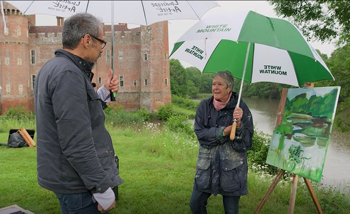
SUE ENGLAND - WILDCARD WINNER
Working as a graphic designer Sue has been painting for the last 10 years, she also enjoys exploring printmaking. Sue graduated with a Diploma in Art and Design from Manchester Art college.
Congratulations on being the wildcard winner of Sky Arts Landscape Artist of the Year 2019! What was the experience like and how did it feel when they judge’s came over to your work?
It was a wet old day! But if you paint outside at all, you have to get used to adapting and just ‘going with the flow’. I was quite near the back of the line of 50 artists, so many had already picked their spot by the time I got chance to look around. We were all very close to the castle and I have to say, I thought the building was pretty ugly, so decided to go round the corner a bit -the moat, pond and trees beyond were more interesting and in the rain, I knew the light would change, which I liked. I was packing up feeling cold and wet by that stage, the adrenaline having worn off, and not paying much attention to Tai’s walkabout, so was really very surprised when he came over and shook my hand as the wild card winner. Amazed actually!
You made a really interesting compositional choice in your painting of Hestmonceux Castle, and he judges enjoyed the way you structured your mark making. What made you decide this framing and could you talk about how to approach your painting?
Thought I’d better make a ‘token gesture’ to the castle and slotted it in top left hand corner, which actually worked well-a sliver of reddy brown amidst all the greens. I painted like I always do - some quick compositional line drawings and then straight in to getting some paint on. I put lots of paint on and then it about and work into it. I have a tendency to change my mind compositionally after a while, but knew this wasn’t an option with such limited time. So I quickly made the decision to not put most of the castle in and stuck to that. The general view the wild cards had was very ‘front on’ and we were very close-not good for showing how it sits in the surrounding landscape. The trees were just ‘blocks’, showing very little detail in the flat light-perfect for me as I tend to see landscape in shapes anyway. The reflections in the water kept changing, so so did the painting!
Are there any brands or materials that you frequently turn to when you’re painting, do you have any favourites?
Materials-I use anything I happen to have with me. In the studio, I prefer oils, generally Daler/Rowney Georgian range (very reasonably priced for the big tubes) but outside, will paint in acrylic first (do like Golden and Liquitex’, but not all the time as they are more expensive). I added some oil on the castle painting for more solid areas and to counteract the rain! When I sketch outside, I like Caran d’ache neocolour aquarelle sticks and graphite, chalks, oil pastels...whatever is to hand.

