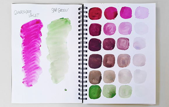
Quinacridone Violet is known for its deep, rich purple tone and holds a unique place in the realm of colours. Its ethereal beauty and versatile nature have found a place not only on the canvases of painters but also in the realms of design, fashion, and even beyond. Read about the fascinating origins and characteristics of this colour as we delve into its historical significance, and the methods employed to produce this captivating pigment. Also, scroll down and enter our latest Cass Art Colour Competition and be in with a chance to win £100 Cass Art Voucher!

DISCOVERING THE DEPTHS OF QUINACRIDONE VIOLET
Quinacridone Violet has an intense vibrancy and boasts a deep, rich hue that sits somewhere between violet and magenta on the colour spectrum. Take a look at the story behind its radiancy and almost fluorescent quality and why it has become a favourite among artists.
ART HISTORY
GEORGIA O'KEEFE
Georgia O'Keeffe often used colour symbolically in her work. violet is associated with various meanings, including mystery, spirituality, and royalty. In the context of "Purple Leaves," the colour symbolises the mysterious and awe-inspiring aspects of nature. It can evoke a sense of wonder and contemplation, inviting viewers to explore the intricate details of the leaves.
Her signature style involved zooming in on natural subjects to emphasize their form, texture, and intricate details. Violet, in this context, may be used to enhance the contours and shapes of the leaves, drawing attention to their unique characteristics.
Also in this work often violet is paired with other colours such as green or white. This use of colour contrast can create visual interest and balance within the composition. Purple may have been chosen for its ability to harmonize with other colours while still standing out.
Overall, the use of purple in Georgia O'Keeffe's "Purple Leaves" serves multiple purposes, including conveying symbolism, emotion, and personal expression, while also enhancing the visual and compositional aspects of the artwork. It is a testament to her mastery of colour and her ability to infuse her paintings with depth and meaning.


ART HISTORY
PABLO PICASSO
The use of violet in "The Weeping Woman" serves to intensify the emotional impact of the painting. The cool, melancholic tone of violet contributes to the overall feeling of sadness and grief depicted in the subject's face. Thus vivid hue on her face and in the background helps convey the depth of her suffering.
Picasso's Cubist style involves breaking down the subject into geometric shapes and reassembling them in an abstract and fragmented manner. The violet hues are applied in a way that enhances the fractured nature of the composition. The subject's eyes, nose, and mouth are deconstructed and rearranged, further emphasizing the distorted emotional state of the weeping woman.
The use of violet is often contrasted with other colours in the painting, such as the bright green and red elements. This contrast adds to the visual tension and unease within the artwork, intensifying the emotional impact on the viewer.
“Fresh air is violet - I finally discovered the true colour of the atmosphere”
CLAUDE MONET
THE CASS ART COLOUR CHALLENGE
To celebrate Quinacridone Violet we’re giving you the chance to win a £100 Cass Art Voucher with our next Cass Art Colour Challenge!
All you have to do is create an artwork using the colour Quinacridone Violet in any medium you wish! Post it on Instagram and use the hashtag #cassartviolet and you’ll be in with a chance to win! Competition closes on 16th October, good luck!
