
Angus Hyland: Artist Interview and Exhibition
Posted by Cass Art on 5th Jul 2021
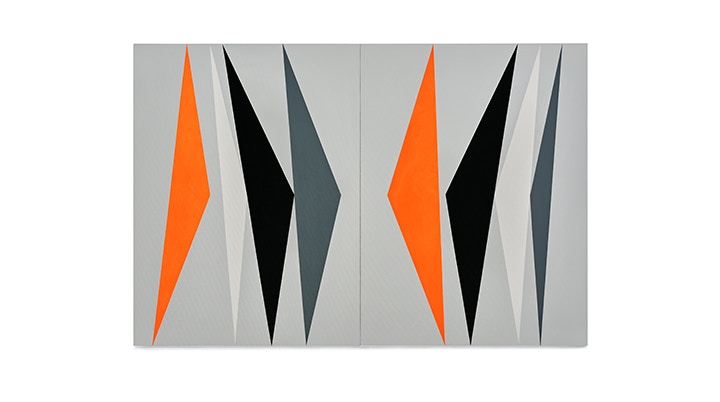
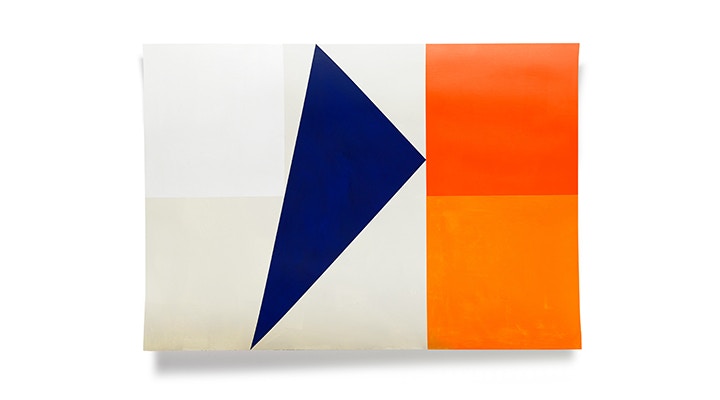
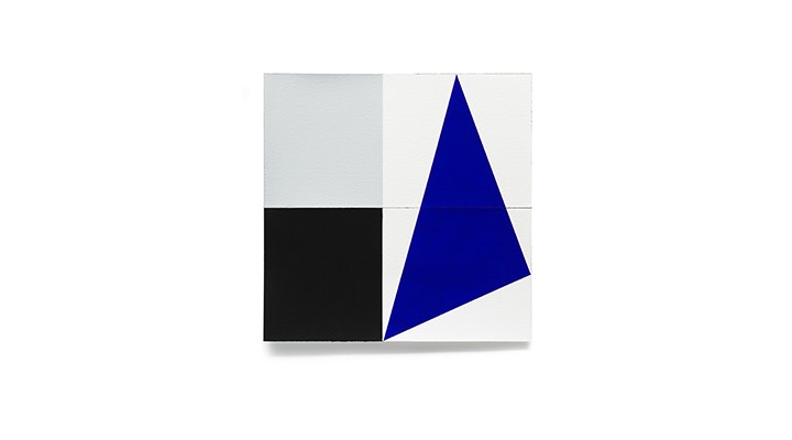
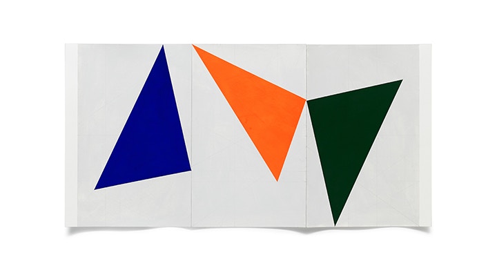
We're thrilled to welcome Graphic Designer, Artist, Author and Creative Director Angus Hyland to our Cass Art Glasgow for his exhibition 'Looking for a Certain Ratio'. The title of the show is a direct quote from a Brian Eno song, The True Wheel. A reference to a musician and artist Angus much admires and, conveniently, it’s an exact description of the territory explored in these paintings.
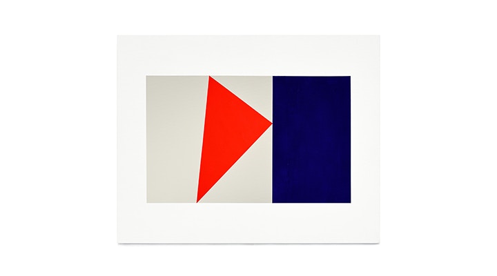
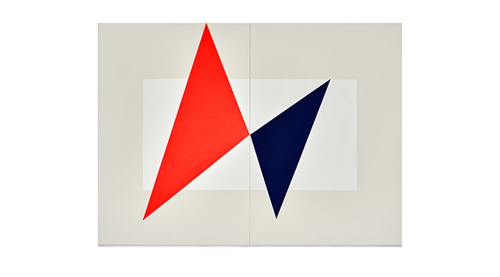
‘Looking for a Certain Ratio’ broadly describes Angus’s motivation, which is searching for beautiful compositions and harmonies within prescribed sacred geometry. Painted at his London studio, the paintings explore different colour palettes, from the striking combinations of tightly pigmented colour to subtle variations in pastels and monotones. Exploring different relationships between three or more individual reference points formed the basis of all of these intriguing compositions.
Angus has worked with some of the world’s best known brands; from Mulberry and EAT to Penguin Random House and Lawrence King Publishing. As a Partner at Pentagram, the world’s largest independent design consultancy, he has also received over a hundred creative awards, including two D&AD Awards for the Cass Art Paper Range and our iconic Collection of Tote Bags.
Hi Angus - thanks for taking the time to chat. Your relationship with us goes back a long way! We’ve spoken before with and about you as a designer and partner at Pentagram in relation to the collaboration between Cass Art and yourselves. Today however, we’re here to discuss Angus Hyland the artist.
For those who may not be familiar with your personal creative practice, could you talk a bit about your journey as an artist?
Frankly, I’m not sure anyone will be at all familiar with my ‘personal’ creative practice as I’ve been pretty secretive about it – I doubt if anyone beyond Mark (Cass) and my wife, Marion Deuchars knew what I was doing. It’s only with this exhibition that I’ve actually ‘broken cover’.
I had been doodling with paint for around five years prior to this with no intention other than to play around. It was a kind of art therapy – more about getting away from the day job and just fiddling about really; trying to work out, I guess, how all those early poster artists managed to produce such graphic work with a paintbrush and pot of gouache. This art activity was all somewhat sporadic – I’ve made tiny little paintings over the years in my downtime with the occasional outburst on holiday when I was afforded the time. I must say I found it hugely enjoyable. I was mainly working on little freehand compositions trying to perfect geometric shapes and flat colours. The results were sufficiently interesting to want to warrant further exploration.
I had no strategy or expectations of where I was going – the more time I worked on the painting, the more compulsive the need became to paint. So I asked Mark if he was interested in showing the results – even before I had established a strong direction. I guess this was a deliberate – self-fulfilling prophesy on my part. And partly because I was able to share my wife’s studio - away from my commercial practice - and partly because Mark offered me the exhibition space I was able to produce a body of work quickly and with a sense of purpose.
We’re thrilled that our Art Space is Glasgow is back open and we’re finally able to exhibit your wonderful paintings! How would you say your paintings physically impact a space when viewed in person rather than on the screen?
Interesting question this, because the paintings themselves are all about dividing up space. They are made to work within a physical space. Perhaps they fulfil some deep desire - as If I’m compelled to come up with solutions to break up space. Maybe decades of practicing graphic design means that I’ve developed an inbuilt need to divide up a blank page. It’s a filter I quite often have to turn off. The content (words/pictures) of my professional practice is often outside of my control so the paintings are in fact acts of pure design because the content is entirely that of form. This is not decoration; the interaction between form and colour are tensions which are being resolved on the canvas
At Cass Art we believe that the Art Shop is sacred to the creative community, they are hubs in which to create connections, gain advice and experience new materials first hand. What do you enjoy about the experience of shopping for art materials in person?
I always considered the Cass Art shops to be like the metaphorical marriage of a sweet shop to a hardware store. Both practical and attractive at the same time - they offer solutions and inspiration.
You were due to show in our Cass Art Glasgow Art Space last April, but given the situation you temporarily moved your exhibition into the digital realm and have created your own website for the show. How do you think artwork behaves when physical pieces are moved onto the screen?
Since I couldn’t show the work in Glasgow in any physical sense - it seemed that the only option was to create something in the digital space. My team quickly put together this website. It’s really just a carousel. The work being very simple in composition and graphic in application it translates relatively well to screen in terms of design. But as paintings, they lose quite a lot of the tactile qualities of the paint on canvas.
The site really only gives an impression. It makes the work less painterly and more graphic. After all, the paintings are analogue - that’s the very point - it’s not digital so being squeezed into binary - there’s quite a difference – they lose – how to put it... warmth. This is even more apparent on the Instagram feed. Instagram is immediate, seductive and addictive. Like fast food. These paintings, I hope, are the art equivalent of ‘slow cuisine’ despite their very graphic, immediacy.
You recently started working in Acrylic Gouache and Gouache on canvas and paper. What is it about the quality of gouache that compliments your work so nicely?
I began using gouache because it felt as though there was some semblance of heritage there to what I do for a living. It is, after all, correctly called, Designer’s Gouache. In truth, it’s an absolute sod to work with.
On paper you have to mix the paint to the exacting consistency of single cream then applied in one execution. Get it wrong and the whole thing is screwed up. It’s hard to apply layers of gouache because many of the pigments ‘pull’ the lower pigments. My admiration has grown and grown for the craft skills of those early commercial artists who managed to tame this fickle medium.
I love the brand new Liquitex Professional Acrylic Gouache. Although it’s not nearly as rich in pigment as the designers gouache, acrylic gouache by contrast is an absolute dream to work with, especially on canvas rather than paper, which is just as well as it often requires many coats to built up the intensity of colour, especially in the fluoros. I tend to use canvas board because it’s stretched so tight and it enables me to create accurate diptychs and triptychs. For the acrylic I use Liquitex Professional Gouache, and for the designers gouache I use Winsor & Newton Designers Gouache.
You manage to keep quite a physicality with the works - showing the curl of the edge of paper, the shadow beneath a bend of canvas. It helps us as a viewer to be reminded of the object-ness of the works – was this an important consideration for you?
That I think is a good observation. I had the pieces photographed as they are; the works on paper prior to having them framed, so naturally, they curl at the edges. It wasn’t intentional, but I think your point is a good one.
The body of work is called ‘Looking for a certain ratio’ how important is a title of a show for you? And do you believe that the work you’re showing needs to be encapsulated under the title as an umbrella in order for its context to be fully understood and appreciated?
The title of the show is a direct quote from a Brian Eno song, The True Wheel. It’s a nice reference to a musician and artist I admire and, conveniently, it’s an exact description of the territory explored in these paintings. None of the paintings has a title, so I guess its quite nice to give some indication of what they’re about in the title. They share this sense of exploration of searching for very precise harmonies.
Your painting process seems to go through several iterations of preparation before you get to paint on canvas, from rough sketches and colour swatches to mathematical line drawings. Do you approach this preparatory phase of a painting in the same ay each time?
It does rather look as though I employ a rigid method to the work. In reality, it’s much looser than would appear by the sense of all that proprietary work. I use the line drawings which are created on the computer to map out the territory, where certain ratios intersect, harmonic points, ‘sacred’ proportions dissected, perceived ‘rules’ of composition etc. etc.
Once they’ve been established as wire frames, I tend to follow my instinct as to what makes a painting work. I often make with little colour sketches, but these are more often modified or built upon for the final composition. All in all, I see my working method as I kind of ordered chaos. I guess the final results don’t really illustrate that – they look highly deliberate, which is not always the case. Although there is always a destination in mind, I often leave the A roads in search of a more interesting journey.
Let’s talk colour! We touched briefly on your use of colour swatching to prepare your colour selections, how are you influenced in your palette selections for each piece, and are there any rules you apply for yourself to follow? Indeed, in your website you keep these colour swatches underneath each of the works almost as reference.
It’s an interesting question. I have an intuitive sense of colour. I never seem trouble myself with which to apply. Perhaps I work entirely in my comfort zone with colour, and maybe at some point I should challenge myself? With this body of work, I tended to rely on what I knew was working, and what was working both individually and as a body of work.
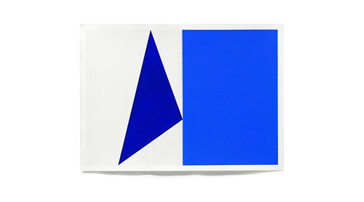
Tonally the works are highly saturated, primaries, intense purples or fluorescent shades sit starkly against pale grey and off white backgrounds. What is it you love about working with such vivid tones?
Most of my early paintings are very muted and tasteful in my choice of colours, possibly because I explored smaller more detailed paintings. As I became more confident and moved towards applying much more aggressive and demanding colors, similtaneuosly the compositions became more much more simplified, and in turn the colors became even bolder still. Everything became more focused.
Thanks for taking the time to talk Angus! Finally, do you have any pieces of advice for those of us who are trying to maintain a creative process whilst at home?
The work for the show is currently all being stored at my framers, King & McGaw near Lewes on the South Downs. I haven’t seen it for 10 weeks! I’ve currently reached a deliberate hiatus while the lockdown has been in place. Of course I have my commercial work to consider which is a priorty at the moment and that takes much longer working remotely than before with a team to hand. I’ve been dividing my time between work, exercise, healthy eating and living.
My personal practice has been currently subsumed into broader family art creativity. As far as my painting goes – I’m allowing this time for gestation rather than practice. I feel good about it because the ideas, thoughts, musings; there’s a slow percolation. I’ve no idea where this is going but I know that when I eventually start again there'll be a difference, a change. It might be sublte or more pronounced, and I feel that’s a good thing. Change is, after all, a reassuring sign of life.
Feeling Inspired?
Shop online for everything you'll need. Don't forget to hashtag #cassart on social media to show us your creations.

