Watercolour Tips with Artist Rachel Levitas
Posted by Cass Art on 9th Mar 2020
Artist Rachel Levitas takes us through how to mix your watercolours, and then creating depth in watercolour landscapes. - from colour blending to gradients. Rachel is a graduate of the Royal Academy schools where she was awarded the Turner Gold Medal for Painting, and in 2010 was awarded first prize at the prestigious Lynne Painter-Stainers.
Thanks for taking the time to take us through some of your tips Rachel, now over to you!
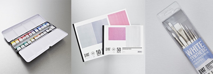
Thanks! Here are a couple of techniques that I use, if you want to follow along you will need:
GRADIENT WASH
The first technique is to paint a gradient wash as the base for your landscape. This creates the illusion of space. The way I do this is to mix up two colours, this time I’m using Payne’s Gray and Opera Rose, but you can use any colours; and I’m mixing up plenty of each colour in my steep sided daisy palette. I’ve got a clean brush for each colour, which is particularly important if you’re using yellow which at the touch of a blue brush will turn green!
I’m using my Payne’s Gray wash at the top of my image, and painting my Opera Rose below it.
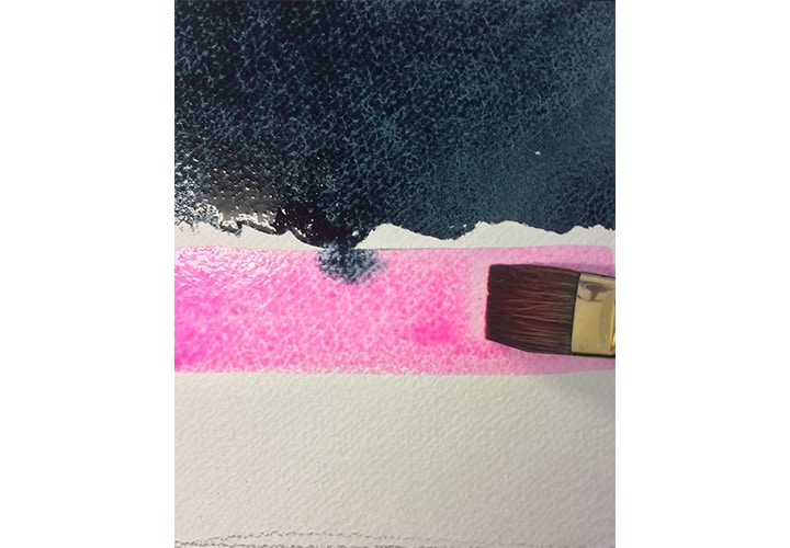
Payne’s Grey and Opera Rose
COLOUR BLEND
Using a clean brush I can then blend the two colours together. If you find this very difficult add some blending medium to your paint, this will make the paint more viscous, more like a glaze, and is slower drying so you have more time to manipulate and blend it. If you want your Opera Rose to fade out, blend the bottom edge with clean water, or you could have clear band of water in the middle of the gradient and blend both your colours into that.
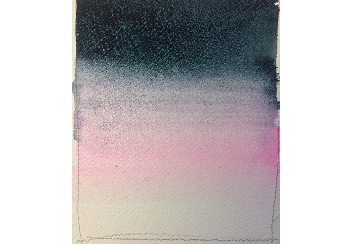
Blend the two colours together
ADD YOUR LANDSCAPE
Once you have painted your gradient allow it to dry then paint your landscape over the top of your gradient; this avoids that cut out edge of the sky effect that can look jarring in a watercolour landscape. I have painted this scene using the same Payne’s Gray I use in the gradient; the mountains are painted with a same colour as the foreground only diluted to create the effect of distance.
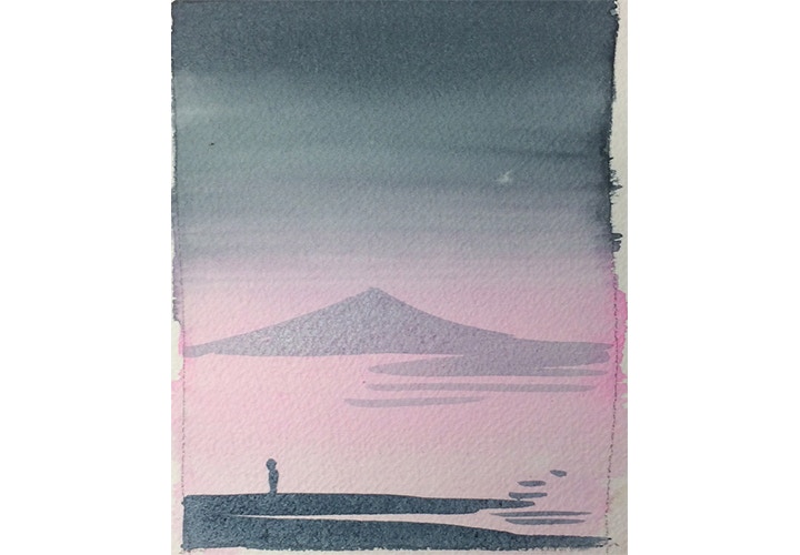
Paint your landscape over the top of your gradient
Gradients like these are used extensively in Art; I use them in my oil painting too - good luck!
Tip number 1: Tubes or pans?
Do you use tubes or pans for your watercolours ? I use both. It depends on the volume of paint I require; tubes are useful if you want to mix a large amount of paint for a wash while pans are more portable and smaller amounts of paint can be mixed in the lid of your paint set. I tend to use my tubes in the studio and my pans for sketching in the field.
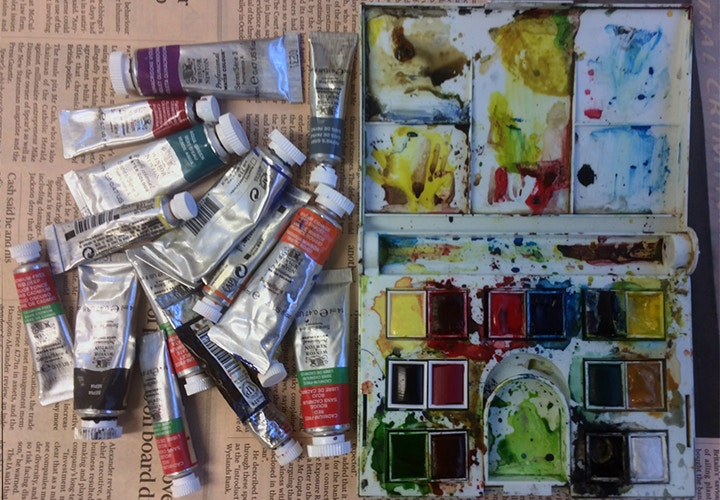
I use tubes and pans.
Tip number 2: Mix enough paint for your project.
It’s a common mistake to run out of paint halfway through a painted area; if you have mixed a colour and run out you may find it difficult to rematch it, try to mix more and then realise that meanwhile your initial paint has dried resulting in those tell-tale tide marks. Mix up more paint then you think you need.
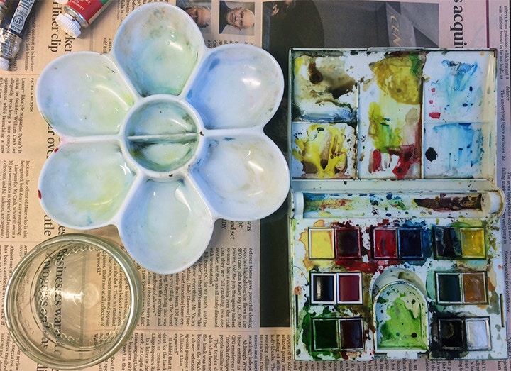
Tip number 3: Vary your mixing containers.
If you are mixing colour for a large wash use a container other than your paint box lid to mix in. Your paint box lid has a flat surface area and colour mixed in it will evaporate quickly. I use shallow glass jars or daisy palettes with steeper sides. You will be able to mix a larger quantity of paint than you can in your paint box lid and you won’t run out of colour half way through your wash.
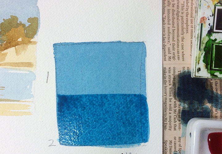
Tip 4: Use more than one layer of colour.
if you want a strong solid colour it can be tempting to use a thick, dense layer of watercolour paint almost in the way you would use gouache, but the result can look flat and dull. Instead use a thinner wash, let it dry, then apply a second coat of the same paint to make the colour more intense.
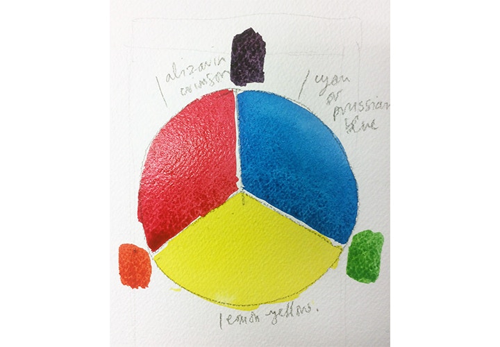
Tip number 5: Make a colour wheel using Lemon Yellow, Prussian Blue and Alizarin Crimson.
My students often ask me how to mix colours together. I recommend making a colour wheel from your own paint set. Draw a circle and divide into three sections for your primaries: you may find that classic primaries like Cadmium Red, Yellow and Ultramarine Blue can be muddy when mixed together, instead choose colours like Lemon Yellow, Prussian Blue and Alizarin Crimson as your primary colours as these will mix together well. Lemon Yellow and Prussian Blue will make a vivid green, Prussian Blue and Alizarin Crimson will make purple and your Lemon Yellow and Alizarin Crimson will mix to a strong orange. You can layer other colours over your primaries and experiment with your own paint set.

