A pure blue pigment, Cerulean Blue is opaque and bright due to its highly refractive particles. It is stable and does not react to light or chemicals, making it a permanent and invaluable part of the artist’s palette.
For a clue to the origin of the name, you need to look upwards. The word cerulean comes from the Latin caeruleus, meaning dark blue caelum – which in turn probably derives from caelulum, meaning heaven or sky.
A BRIEF HISTORY
After the discovery of cobalt blue by the French chemist Louis Jacques Thénard in 1802, the Swiss chemist Albrecht Höpfner created cerulean blue from cobalt stannate in 1805. It is made by the calcination of tins, salts and silica with cobalt sulphate and is an inorganic synthetic mineral pigment.
This new process resulted in a more stable and vibrant pigment that was quickly adopted by artists. One of the most famous artists to use Cerulean Blue was Vincent van Gogh, who used it extensively in his paintings.
It took a while for the colour to become widely available to artists – more than 55 years, in fact – and was introduced in the 1860s under the trade name coeruleum.
Cerulean blue was quickly adopted by artists, including the Impressionists, because of its hue, permanence and opaqueness. It was particularly useful for skyscapes and can be found in the sky of Monet’s 1877 La Gare Saint-Lazare, the pointillism of Paul Signac, and in Édouard Manet’s 1878 Corner of a Café-Concert.
EXPLORING CERULEAN BLUE WITH WINSOR & NEWTON
CULTURAL SYMBOLISM
The colour has earned widespread popularity. In 1999 it was nominated by Pantone as the colour of the millennium. According to Leatrice Eiseman, executive director of the Pantone Colour Institute, “Psychologically, gazing at a blue sky brings a sense of peace and tranquillity to the human spirit.
Cerulean Blue carries cultural significance in various parts of the world. In many societies, it represents trust, loyalty, and wisdom. Ancient civilizations, such as the Egyptians and Mayans, utilized similar shades of blue in their religious iconography, symbolizing divinity and spirituality. In modern times, cerulean blue is often associated with clarity, purity, and the vastness of the sky and the ocean.
POP CULTURE AND FASHION
Beyond the realm of art, cerulean blue has made its mark in the world of design and fashion. Its versatile nature allows it to be used in diverse applications. In interior design, cerulean blue can infuse spaces with a sense of calmness and sophistication. From accent walls to furnishings, this hue adds a touch of elegance and serenity to any environment.
Cerulean blue has a starring moment in the 2006 film The Devil Wears Prada. Meryl Streep’s character, powerful magazine editor Miranda Priestly, uses it to lecture her new assistant on the cultural influence of colour. “What you don’t know is that that sweater is not just blue, it’s not turquoise, it’s not lapis, it’s actually cerulean. You’re also blindly unaware of the fact that in 2002, Oscar de la Renta did a collection of cerulean gowns.
And then I think it was Yves St Laurent, wasn’t it, who showed cerulean military jackets? And then cerulean quickly showed up in the collections of eight different designers. Then it filtered down through the department stores and then trickled on down into some tragic ‘casual corner’ where you, no doubt, fished it out of some clearance bin.”
"It's not just Blue, it's not Turquoise, not Lapis... it's actually Cerulean"
- MERYL STREEP, THE DEVIL WEARS PRADA
FAMOUS WORKS FEATURING CERULEAN BLUE
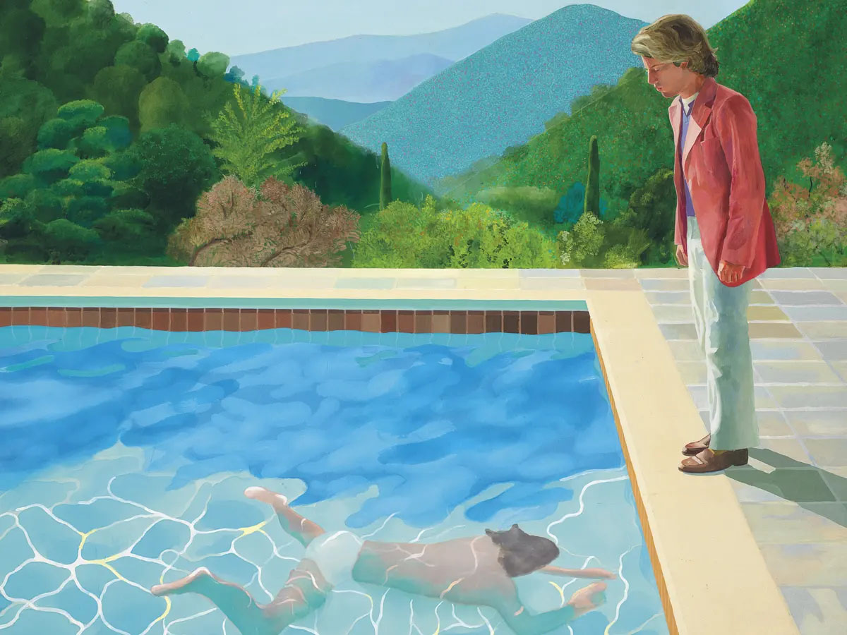
In David Hockney's "Portrait of an Artist (Pool with Two Figures)," the use of Cerulean Blue plays a significant role in capturing the essence of the pool and water in the composition.
The painting features a large body of water, depicted using different tones of blue. Hockney skillfully employs lighter and darker shades of blue to create depth and convey the illusion of water. The varying blues also help to create a sense of movement and reflection, giving the water a realistic and dynamic appearance.
The blue hues in the painting contrast with the surrounding landscape and the figures within the composition. The choice of blue adds a cool and refreshing quality to the overall atmosphere, reinforcing the idea of a tranquil pool setting.
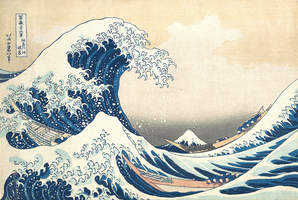
The use of Cerulean Blue in "The Great Wave off Kanagawa" is notable for several reasons. Firstly, the vividness and intensity of the blue shade capture the power and energy of the crashing wave. The use of a cool, vibrant blue creates a sense of movement, emphasising the dynamic nature of the scene and conveying the sheer force of the water.
Cerulean Blue also serves a symbolic purpose too. The wave, with its dramatic scale and the inclusion of Mount Fuji in the background, represents the power of nature. The intense blue colour enhances the dramatic impact of the wave, evoking a sense of awe and capturing the overwhelming force of the ocean.