Here's a wonderful step by step guide to lino print portraits by artist, teacher and contestant on Sky Arts Portrait Artist of the Year Lucy Bartholomew. Here Lucy gives us a wonderful insight here into how she approach’s portraiture and a fascinating look at the medium of lino.
Over to you Lucy!
Begin by selecting a subject for your portrait. You might be lucky enough to have someone who will sit for you to draw from life, or you might want to work from a photo. In either case, the most important aspect to consider when setting up your image/model is lighting. You will need to work with dramatically contrasting tonal values (light and shade) when drawing out and carving your portrait, so it really helps if you have a clearly identifiable light source, perhaps coming in from a side/ diagonal angle. This type of lighting can easily be achieved by asking someone to pose near a window, turning one side of their face towards daylight, or you could use an artificial light such as a table lamp.
When teaching beginners, I often also recommend that they try editing their chosen photo using any basic photo editing software (perhaps a phone app) to create a stylised, black and white, high contrast image, like the examples below. This can help you to visualise what a ‘high contrast’ version of your portrait might look like. It is not essential to edit the photo, but might help if you are struggling with the concept of exaggerating tonal values.
Once you have chosen your subject, take a sheet of tracing paper the same size as your lino (here I am working on A4), and start drawing. Begin with an HB pencil for sharp lines. Sketch in your outline shapes, not pressing too hard at first, and taking care with proportions. The more accurate your proportions, the more likely you are to achieve ‘a likeness’ (if, indeed, that is your primary goal). If you are confident with your drawing skills, try to work free-hand, but you could consider using a grid or even tracing over the outlines of your photograph if you are nervous about ‘getting it right’.
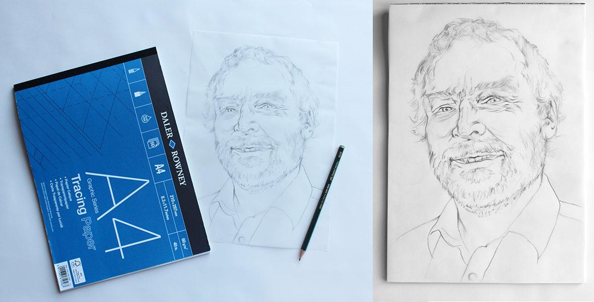
Once you are happy with the outline shape of the face and features, you will need to start blocking in tonal values. I switch to a 4B pencil (or similar) at this stage because the softer, darker graphite helps to create a wider range of tones. Also, the darker graphite transfers nicely onto lino (see stage 3).
In terms of how you actually shade your portrait drawing, there are two key factors to think about:
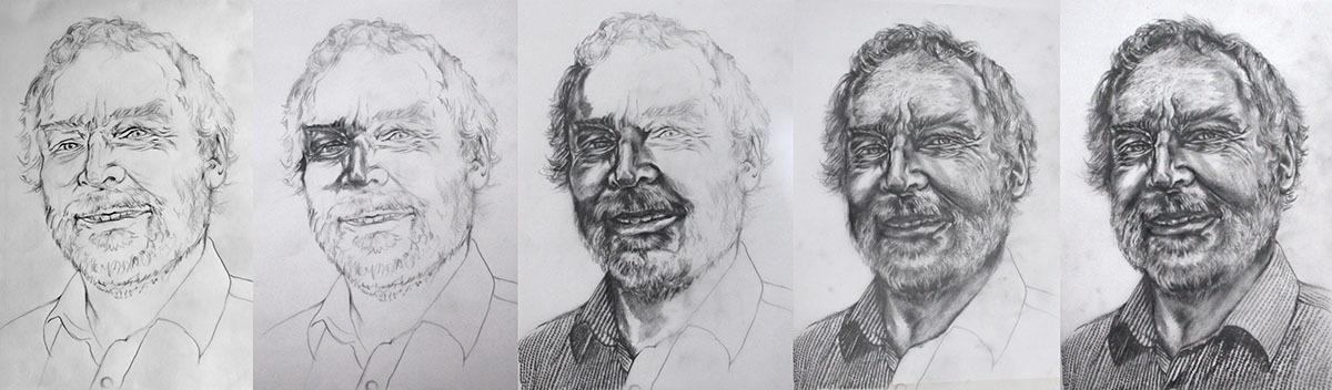
Creating a single-layer lino print portrait requires a dramatically tonal approach to drawing. Some lino printmakers will simplify the face, using only black sections against white sections to create bold, graphic prints. I like to try to create transitions between the darkest and lightest tones by experimenting with different carving techniques, but subtle differentiation between tones is not easy. There is always an element of simplification and stylisation when it comes to translating the portrait drawing into a lino carving (see stage 4) so it helps if the drawing mimics the intended style of carving. When shading the face, therefore, I try to work with strong, bold lines, exaggerating shadows where I see them, sometimes blocking them in completely black, and not trying to blend too subtly or smoothly between different tonal values.
I try to add texture and variety to my prints by experimenting with mark-making and varying the density of marks to create tonal graduation. The more visible and obvious the shaded lines are on your drawing, the more helpful those lines become when trying to decide how to go about carving your portrait. When shading, I try to use a variety of lengths and shapes of mark, reflecting the different surface textures that I see. I also use directional shading as a key device - shading in the direction of the contours of the face, so that the lines describe its three-dimensional form in a bold, exaggerated style.
Here are a series of progress photos of a preparation drawing for a lino print:
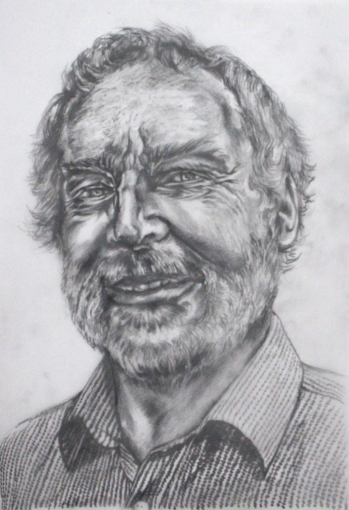
The drawing itself is a working drawing. It does not have to be perfect - what matters is that you are able to translate that drawing into a carving when it is transferred onto the lino. If you are particularly proud of the drawing that you did (or want to document it for your sketchbook) then take a copy of it now before it is destroyed in the process of graphite transfer.
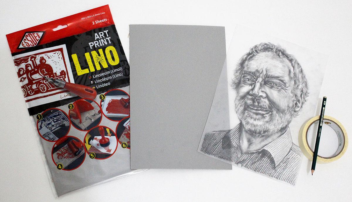
Next, it is time to select a piece of lino. Here I am using Essdee Art Print Linoleum Blocks in approximately A4 size. This is ‘traditional’ lino, and it is made of biodegradable materials such as linseed oil, which makes it the most environmentally friendly choice. Traditional lino has a hard, slightly brittle surface, which I like to work on because I think the carved marks hold a crisper, more defined shape. The disadvantage to this type of lino is that it has a ‘shelf-life’ - the older it gets, the more brittle it becomes, so it is better to buy it fresh when you have a project in mind, rather than stockpiling it, and keep it in its sealed packaging until you are ready to use it. Warming the lino before carving is a simple trick which can soften a particularly difficult block.
Some people prefer ‘softcut’ lino, and I recommend this with beginners because it is easier to carve. Softcut linos are made of synthetic materials. They are very durable and a little more malleable than traditional lino, so the carving tools tend to glide through the softcut linos more easily. The choice of lino is really up to personal preference so if you’re not sure, try different types and brands until you find a favourite.
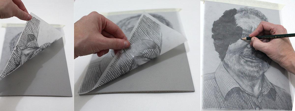
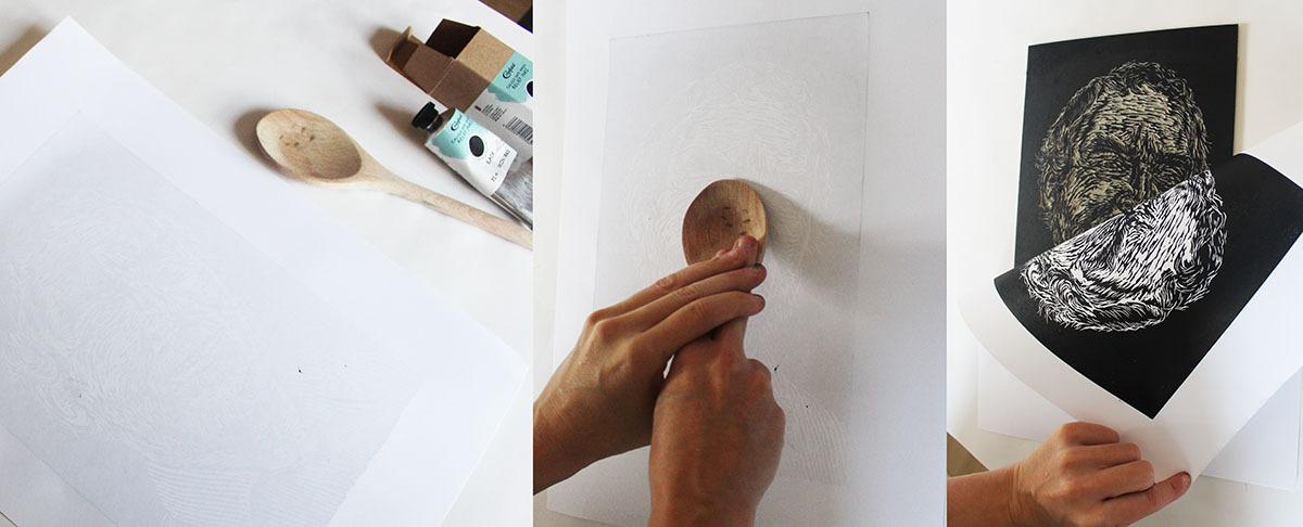
In order to transfer your drawing onto the surface of the lino, take the tracing paper, flip it over, and place it face down on the smooth surface of your lino. It is very important that the drawing (graphite) is touching the surface of the lino, or it will not transfer. It is also essential that the tracing paper does not slide around when you carry out the transfer, or the image will turn out smudgy and patchy on the lino, making it harder to see what you are carving. A little bit of masking tape is all that is needed to keep the tracing paper in place.
Once the tracing paper is secured, take an HB pencil (or a similarly hard pencil from the ‘H’ range) and start to scribble over the back of the paper in a methodical manner, applying firm pressure over the drawn lines. Take your time over this process - scribble purposefully, one small section at a time. You want a clear, crisp transfer of your drawing so that you can use your shading and mark-making to guide you as you carve. Lift a corner of the paper and check it occasionally, going over any patchy parts again, being careful not to let the paper shift from its original position.
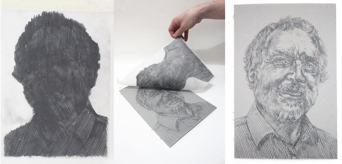
Once complete, remove the tracing paper and discard. Your lino is now ready to carve. You might want to spray the surface with a light layer of fixative at this point to stop the graphite from smudging. You could even go over some of the lines with a permanent marker pen if you think it would help give clarity to your portrait design, but this is not essential.
When you are ready to carve your lino, set it up in a bench hook with the lino held in place by the L-shaped ridge. The bench hook supports the lino as you carve, ensuring that the hand you are not using (your non-writing hand) is nowhere near the blades of the lino carving tools. Never carve towards your hands, or any other part of your body.
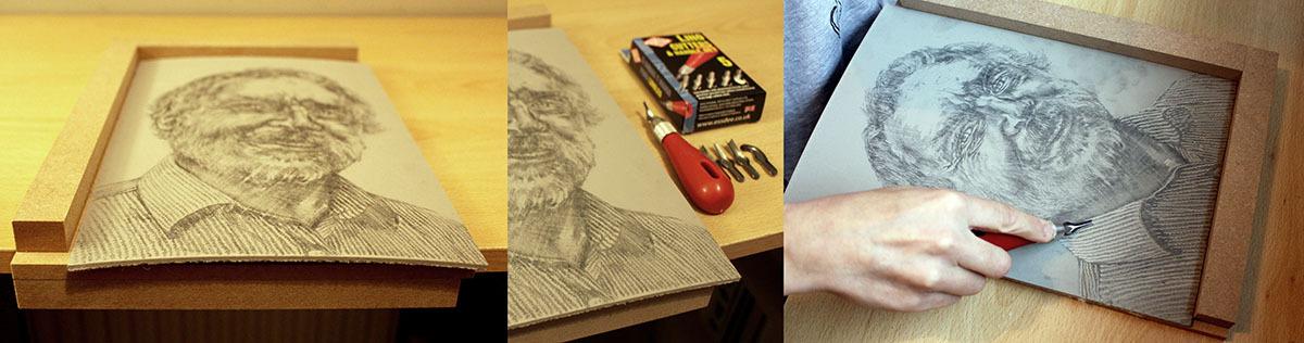
Students often ask how deep to carve. You want to avoid making holes all the way through the lino (it’s not necessarily a problem if you do, but you might need to tape up the back of the lino if your print becomes too flimsy). The proper technique is to keep the lino tool at a shallow angle, with the handle fairly close to the table surface. If you look at the shape of most carving tools, the handle is flat on the underside to allow for this shallow carving angle. Dig into the lino with the blade, aiming to carve a mark around 1mm - 2mm depth, then lift the blade up slightly to finish your cut.
The tool may slip as it loses contact with the lino. This is fine, so long as the blade hits the bench hook and does not come into contact with your skin. If you need to change the direction of your mark, don’t be tempted to turn your blade towards yourself - instead, turn the lino around within the bench hook so that you are always carving away.
Before carving your final portrait, it is important that you understand your carving tools. I am using the ‘Essdee 5 Lino Cutters and Handle’ set because it contains a screw-top handle with a useful range of interchangeable blades, which will allow me to create different types of marks when carving. If this is your first time carving lino, it might be useful to spend some time practicing your mark-making skills in a spare piece of lino, or at least take a look at the examples below to understand the variety of marks that can be achieved using the tools.
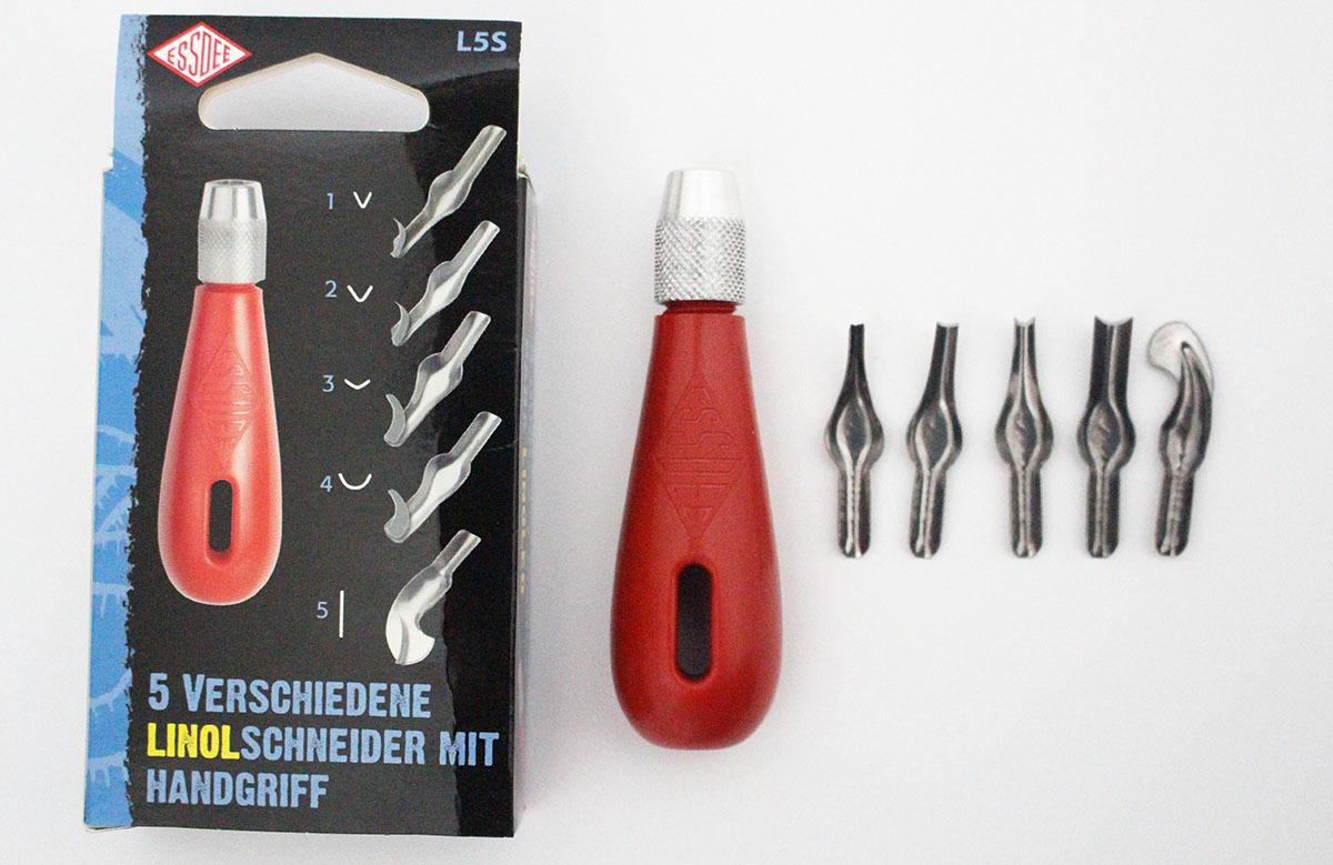
Numbers 1, 2 and 3 are ‘V’ shaped blades, which gradually increase in width. The narrower the V, the thinner the line, so number 1 is your best tool for the finest lines.
Number 4 is a ‘U’ shaped blade, sometimes called a ‘gouge’. The U shaped tool will create a much wider mark than the V blades. The U shaped tool can be used to save time when carving away large areas of lino, and can also be useful for creating marks that are softer in appearance than the thinner lines from the V blades. The softer, wider marks are useful when trying to represent the difference in texture between, for example, hair and skin.
Number 5 will cut a straight line. This tool can be used for carving very fine lines, or for actually cutting through the lino if any edges need trimming, similar to a craft knife
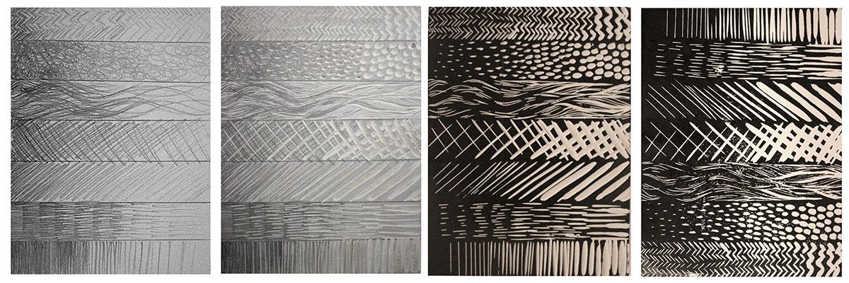
In addition to knowing which blade to choose, you will also need to make careful decisions about what shape, direction and length of mark to carve. Below is an example of a mark-making and tonal graduation exercise which can really help a beginner to understand the subtleties of the carving process.
1. Take a piece of lino (here I am using an A5 sheet)
2. Divide it into columns
3. Take a pencil or permanent marker pen
4. In each column, use a different shape, direction or style of mark to create a tonally graduated block, blending from dark to light by changing the density of the marks (the further apart the marks, the lighter the tone)
5. Next, take your carving tools and have a go at carving the lino. Rather than carving the lines themselves, the challenge is to carve around the marks, leaving the pencil lines intact and taking away the blank/ negative space. You have to be inventive in terms of how you choose to carve away these negative spaces. Think carefully about the length, shape and width of the marks that you carve. Switch blades when necessary.
6. Print the block (see stage 5) to see how the carving experiments look when printed.
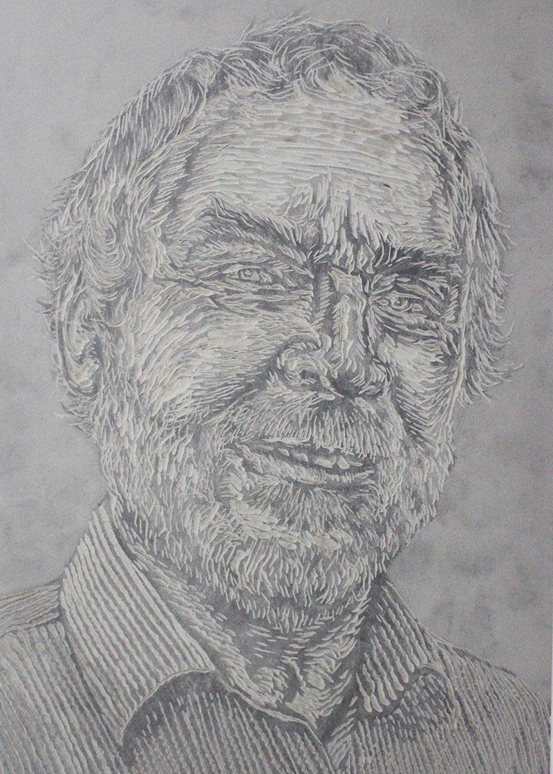
After an initial practice, it is time to start carving the portrait. When carving a portrait, I always make sure that I have a copy of the original photograph, and a copy of the design drawing, next to me (printed out or on my phone screen). I flip the images to create mirror images, as the transferred tracing will be the reverse of the original image. It is really important to keep looking at the reference images when carving.
When carving lino, it is important to remember that you are carving away the lino surface to reveal the lightest tones, leaving the blackest/ darkest tones intact. Dark ink (often black) will be rollered on to the ‘relief’ parts of the surface of the lino (i.e. the parts that have not been carved away) with the carved parts revealing a lighter toned paper beneath. So, rather than carving the same marks that you made with the pencil, you are in fact carving around the lines and shapes that you drew in graphite.
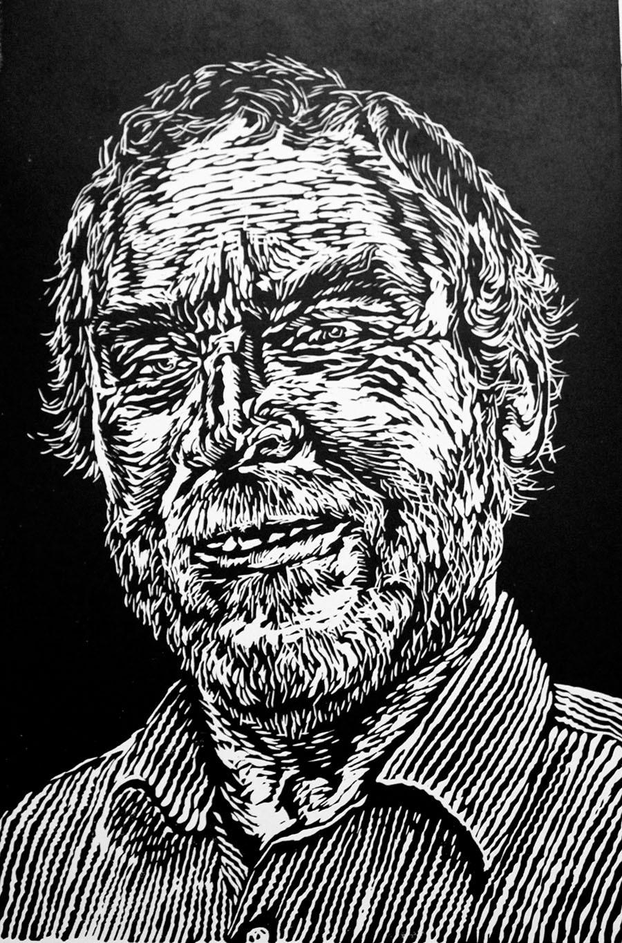
As you carve away the lighter tones of your portrait, remember to consider the weight (thickness), length and shape of line in order to reflect the surface textures and 3D contours of the face. The more inventive and varied you make your carved marks, the more personal and unique your style of lino printing will become. Here is image of the carved surface of my lino print, showing the variety of carved marks, though it is hard to tell what the final print will look like until the ink is applied:
Before printing, you may need to clean the surface of the lino with detergent (e.g. washing up liquid) or solvent (e.g. white spirit) to stop any residual graphite, marker pen or fixative from mixing with the ink. Also, the surface of the lino may be a little bit greasy, and this grease can cause the ink to separate and become patchy. If you find that your prints are coming out really patchy, a light sanding with very fine sandpaper will usually solve any issues with ink reticulation.
Set up your materials on a smooth, flat surface. First, you will need some printing ink (sometimes called block printing ink or relief printing ink). Here I am using Cranfield Caligo Safewash Relief Ink. I like this ink because it has the properties of an oil-based ink (smooth finish, durable) but it is easier to wash up than traditional oil-based ink as it does not require solvents. Saying that, it is not entirely straightforward to wash up - it is important to wipe off excess ink with paper or cloth before washing, then lather with detergent (e.g. washing up liquid) and scrub with a brush before rinsing in water.
Another brand of ink that I often use at home is Schmincke Aqua linoprint colours (also sold by Cass Art) - this is a water-based ink that washes off more easily in water, has a quicker drying time, and is a particularly good choice for beginners and those working from home as it creates less mess.
In order to print, you need an ink tray and a roller (also known as a ‘brayer’). Here I am using an Esdee plastic tray and an Esdee Professional roller - I would recommend investing in high quality rollers because I think that they give more consistent results when printing.
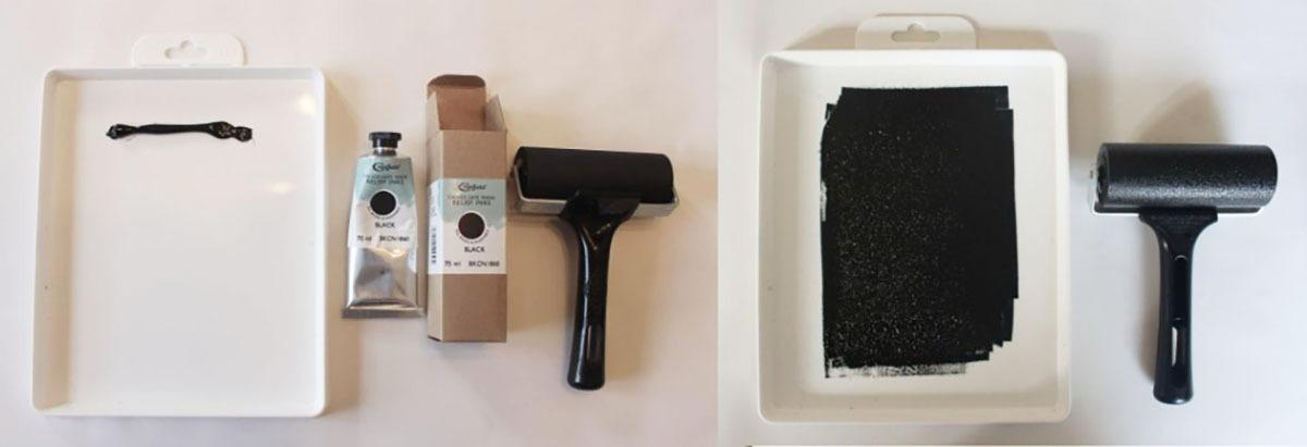
Squeeze out a fairly generous blob of ink at the top of your ink tray. Take the roller and roll the ink into a roughly rectangular shape. It can help to roll in two different directions (vertical and horizontal), ensuring that the ink on the tray (and, therefore, the roller) is consistently even. If the ink is too thin, your print will turn out patchy. If the ink is too thick, the ink will overflow into the carved parts of the lino, blurring the lines and obscuring the image. The more you practice printing, the more you get used to what feels like the correct amount of ink. Once inked, place the roller on to the surface of your lino and roll it up and down or side to side. The best way to ensure even coverage is to apply a thin layer of ink at first, then build up extra layers by repeatedly rolling over the surface of the lino 2-3 times before printing. I tend to roll the ink in different directions, too, to ensure an even finish.
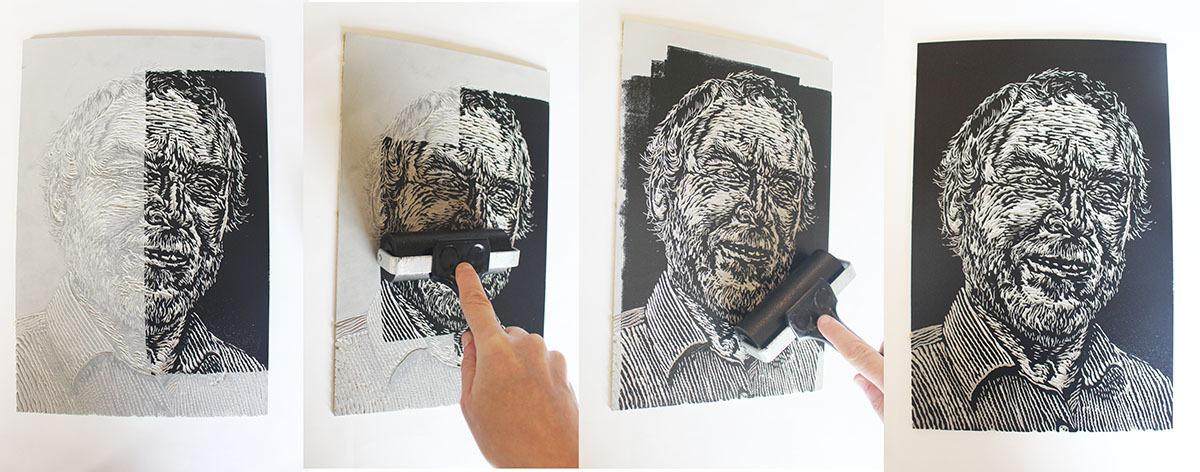
Next, take a sheet of paper and place it on top of the inked-up lino. Here I am using 120gsm Cartridge Paper from Cass Art. I like this paper for printing on because it is fairly smooth and is also quite thin. Thinner papers tend to work better when hand-printing a lino print because you can apply a high level of pressure to the back of the paper to get the ink to transfer more evenly. Rub the back of the paper with the palm of your hand. Sometimes this is all that is needed to take a print, but I often find that prints turn out patchy unless I burnish the back of the paper with either a spoon or a tool called a ‘baren’. Here I am working with a simple wooden spoon. Rub the back of the paper methodically and evenly all over to ensure a completely even finish. Peel back the paper carefully when you think the print is ready.
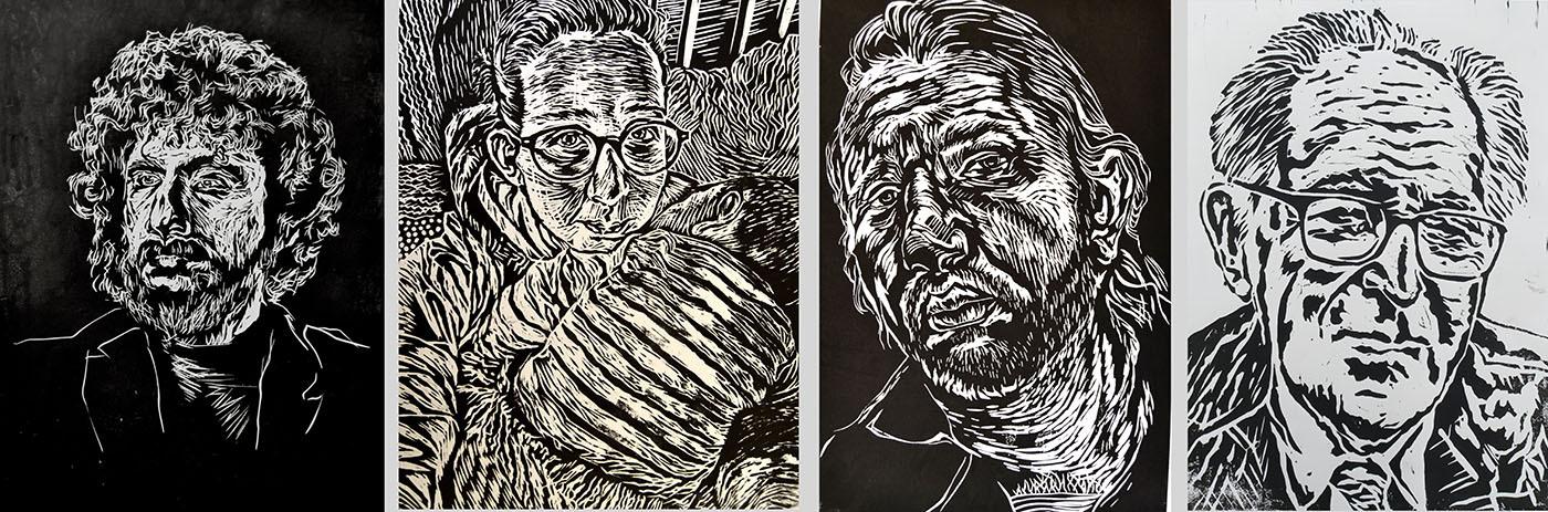
A single-layer lino print can be very effective in just black and white, but there is more that you can do with your print once you have carved the lino. Lino is very durable so you can print it over and over again if desired, either to create an edition of identical prints, or to create variations using other techniques. Here are some ideas:
1. You could print with different coloured inks on to different coloured papers
2. You could print multiple copies of your print on different backgrounds, then cut out certain elements and piece them together in a jig-saw style collage
3. You could hand-colour your print with translucent inks, watercolours, colouring pencils or pens, or even ‘natural dyes’ like tea and coffee.
4. You could create painted or collaged backgrounds then print the lino over the top of them. A double print (print once, then paint, then print again) is an effective way to make sure that colours and tones align.
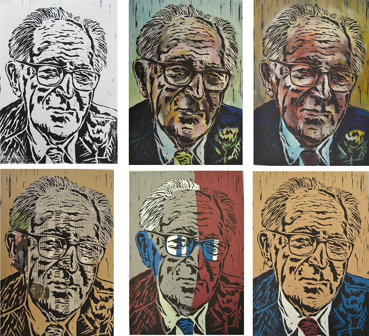
Here are some examples of previous prints that I have developed using a mixed-media approach. The first example is the lino print self portrait that I submitted to Sky Arts Portrait Artist of the Year. The first image shows how it looks as a black and white print. The middle image is the one that I submitted, where I used a coffee and Indian ink wash to put some tonal values back into the print. The third version is a double layered print, where I printed the image onto white paper then painted over it loosely with different tones of blue acrylic paint (referencing Picasso’s Blue Period). I then printed the lino again, over the top of the blue underlayer, so that the tones of the paint matched up with the tones of the lino print:
The next example is one of the first portrait prints that I ever made. I spent quite a bit of time experimenting with printing on multiple different background papers, cutting or ripping parts of the print up, and collaging the pieces back together. I also made some by printing once, painting a loose acrylic paint underlayer, then printing again on top:
Add To List
Add a Wishlist
form to add wishlist here