
Step by Step Oil Painting with Michele del Campo
Posted by Guest Writer on 1st Jan 2019
HOW TO: PAINT WITH OILS
With “Sunny Time” I wanted to contrast a bright sunny scene with a certain idle and melancholic mood in the two young girls. In my paintings strong colours and light, especially the direct sun, are essential features. I am not too faithful to nature or to what I see, and I often exaggerate slightly the contrasts, the intensity of colours, the forms and textures to give more interest and intention to the image.
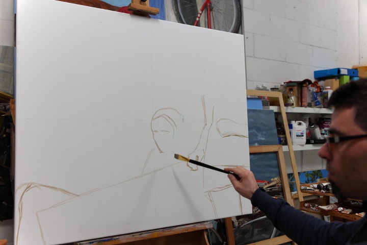
I started drawing on the white canvas with a brush and raw umber, this very thinned with white spirit and some Winsor & Newton Liquin. I had traced just a cross in the middle of the image, to help me keep the proportions in comparison with the reference image. I always avoid squaring up too much, it would constrain too much my interpretation of the forms. I value more the results that come from a more spontaneous capture of the forms, I think that it allows more life and personality in the final painting.
Finished the drawing, which provides just the essential outlines, I start working from the furthest elements in the background to the closest ones.
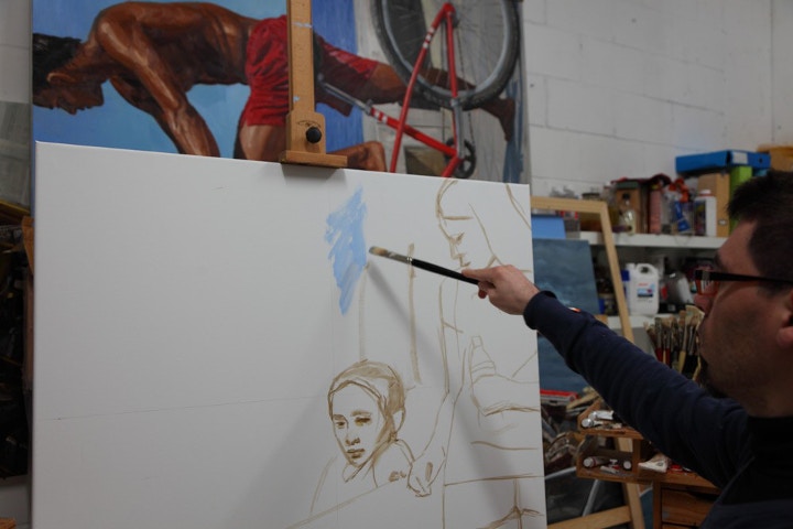
All colours are thinned with white spirit at this stage. Thicker, unthinned paint straight from the tubes follows on the top, following the rule of fat on lean, even when painting “alla prima.”

I apply unnatural bright colours to create a more interesting visual texture and a stronger vibrancy. I use various types of blue colours, yellows, greens and browns. In my palette I count with about 30 different hues of Winsor and Newton Artists' oil colours, but I am careful not to mix too many of them together, as that can deaden the result and turn into greyer tones.
My range of Winsor and Newton Artist's Oils.
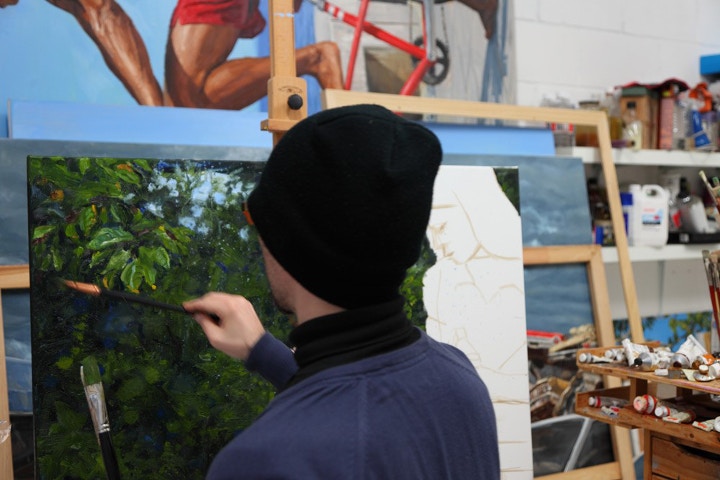
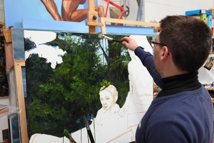
I start at this point to define the leaves, avoiding going too much in details.
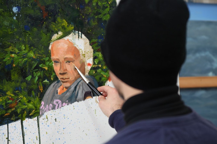
I leave momentarily the background to dry and I start painting the first girl. Big flat hog brushes are good even for delicate areas like the face, they avoid getting stuck in details.
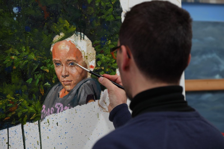
I tried the blue colour for the eyes but, unhappy with the look in general, I changed them to green eventually (I then gave a blue glaze to the background instead, to make it recede).
This is how the first girl appears in the finished painting, with the green eyes.
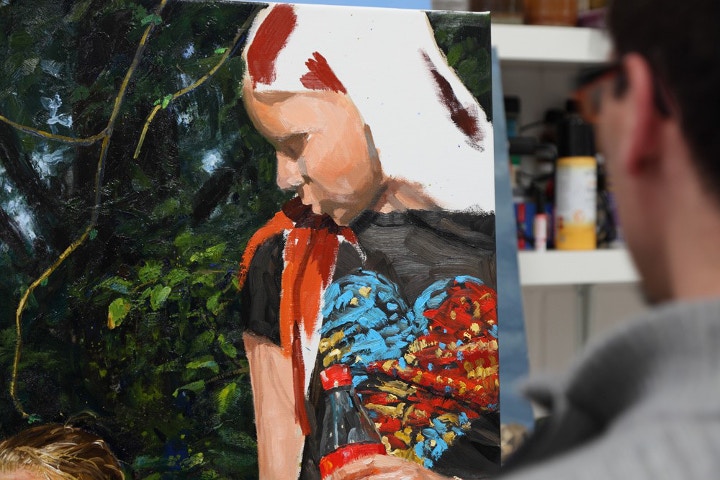
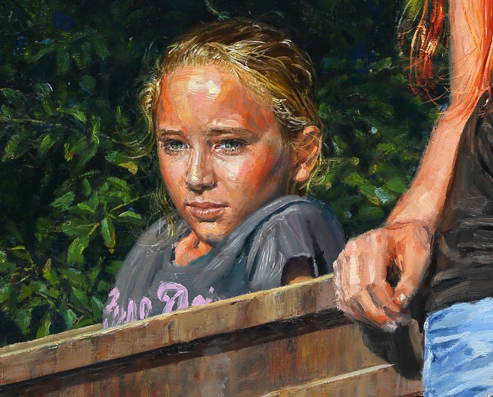
I start now the portrait of the redhead girl.
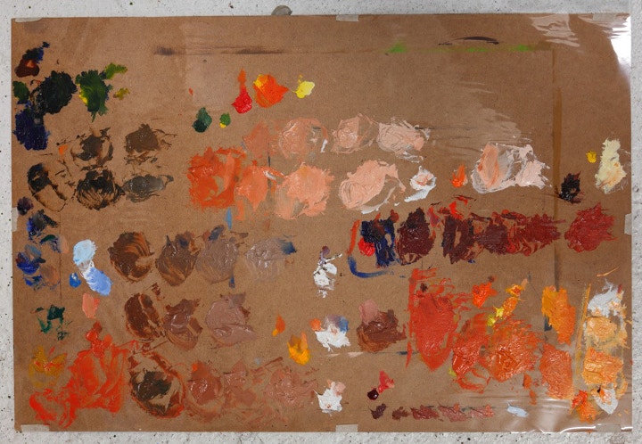
This is the palette that I used for the skin and the hair of the redhead girl. I create a gradation of tones from dark to light, paying attention to keep them separate. For this purpose I also use many brushes, for each colour I use at least one brush for the light, one for the shadows, and sometimes one for the mid tones. Keeping the mixes well separated helps also towards a farter application on the canvas.
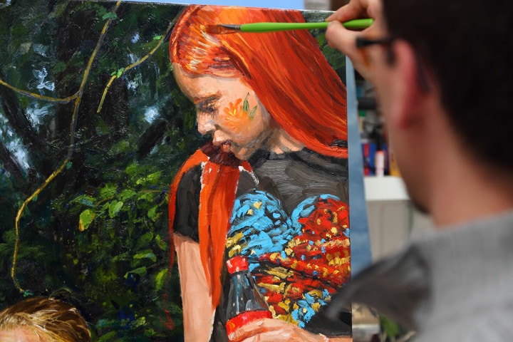
With a softer brush I apply the highlights on the hair. Brushstrokes are individual and I am careful not to blend them too much.
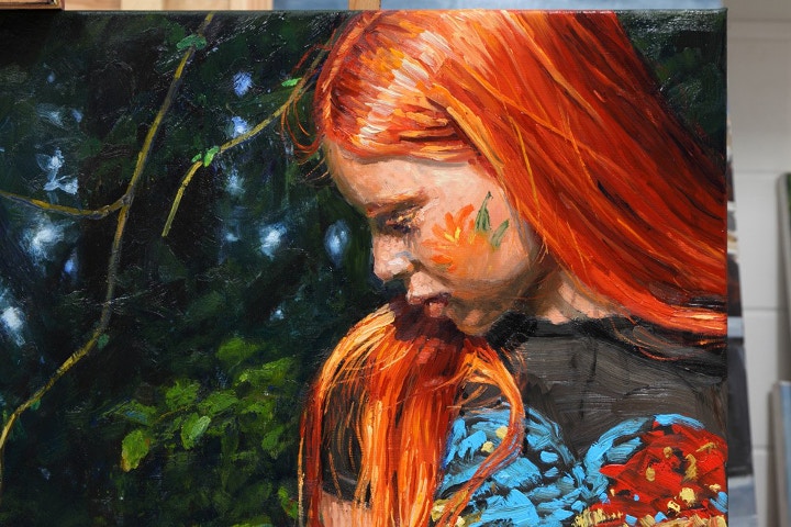
The head of the redhead girl finished. In the background I sandpapered slightly the surface and then I applied a blue glazing to give more unity to so many colours. This way the girl stood out more.
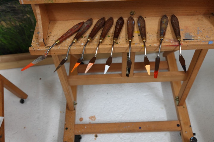
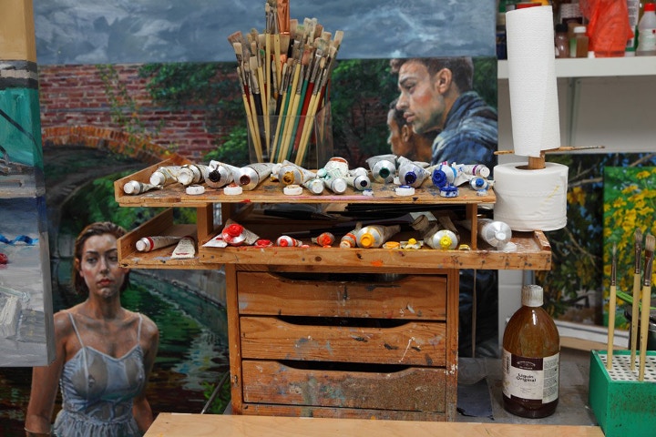
I use palette knives to prepare my colour mixes on the palette. I keep everything tidy, it saves me time and it is a good philosophy when one aims to work with clean colours.
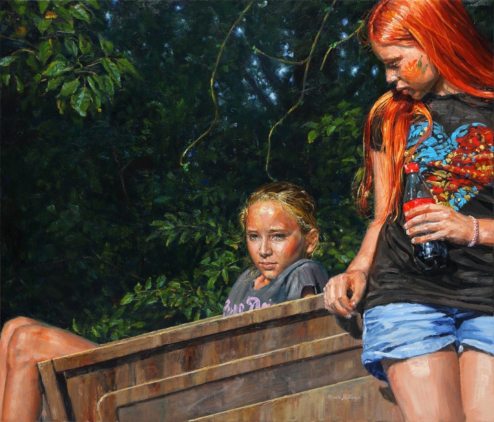
The finished painting: “Sunny Time”, oil on linen, 90x105cm
Feeling inspired?
Watch a time lapse of this painting below, and shop for your own oil painting materials at Cass Art.

