
Sky Arts Portrait Artist of the Year Series 10: Heat Winners
30th Nov 2023
It’s the tenth Series! Celebrating a whole decade of Sky Arts Portrait Artist of the Year, artists from across the UK took to their easels to capture celebrity sitters in just four hours. Competing to win a £10,000 commission to paint conservationist Dr Jane Goodall to hang in the renowned National Portrait Gallery in London, their works are carefully selected by a panel of expert judges - award-winning artist Tai Shan Schierenberg, independent curator Kathleen Soriano, and art historian Kate Bryan.
Working with Winsor & Newton, Cass Art has supported the show since the first series in 2013. We caught up with the heat winners to find out more about their experience of the show, their work, and get tips and advice for budding portraitists…
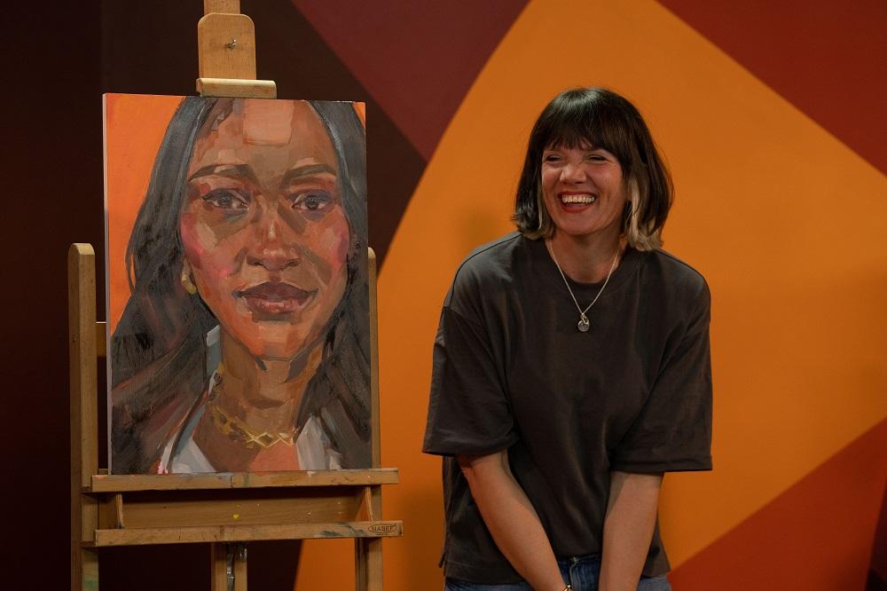
HEAT 1 WINNER: ANNA LOY
Hi Anna, congratulations on winning Heat 1! How did you find the experience of painting a celebrity in front of the cameras and judges?
It was all very surreal, but in a good way! I’m used to painting in my bedroom by myself. So initially, I felt so exposed, like every single brush mark I made was being watched. Once I got my headphones on and favourite playlist on shuffle, it was as if all the eyes and cameras had disappeared and I was in my bedroom again. I even caught myself dancing a few times!
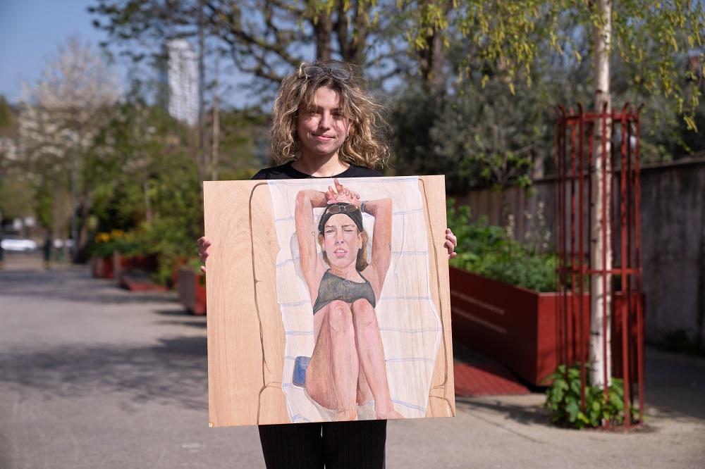
Your submission piece was powerful, at once simple and compelling, the judges enjoyed the pose and the tilt of the head. This was part of a series of annual self-portraits you’ve been creating, tell us about that project.
Thank you so much! This project started by accident actually! Last year I noticed that since 2020 I have painted one self-portrait each year that reflected my artistic skills and the space I was in mentally at the time. I've set it as a personal project to continue this annual self-portrait so in 50 or so years' time I can look back at where I've started. To see how I grow as an artist and as a person.
At first you mentioned you were struggling with the colours in the face, and mentioned you just needed to relax and ‘trust the process’. You quickly overcame your nerves as the colours in the final piece were beautifully subtle, with purple highlights picking up the colour of the suit and contrasting masterfully with the yellow tones in the background. Tell us more about your process and how you approach your colour choices.
Honestly, the moment when I am painting, my mind is blank. On reflection, I guess the best way to describe my colouring process is that it's like I'm doing a puzzle. I'll study the colours I can see in the face, hair, clothes and background and pick out the pieces (colours) that I feel are missing. I usually keep going until all the pieces are filled in. If I feel like a colour is missing then it's like having an incomplete puzzle.
You painted Singer Fleur East, who wanted the artists to capture her personality. When the works were revealed, she chose your work to take home, and said of it ‘I’m absolutely flawed by this! With this one I feel like I’m feeling it rather than seeing it – it’s just moving me looking at it – it’s incredible!’. How did it feel to have your work selected and to see your work connect emotionally in this way with the sitter?
Her words melted my heart! Honestly the best compliment! I was shocked when Fleur picked me, I knew that I was going into this competition as a music student (at the time) painting with professional artists so I was just happy to be there, but to be picked absolutely blown my mind.
What are your go-to materials for portrait painting?
I like to do portraits in oil paint and colour pencils. I love the vibrancy and depth of colours that I can achieve with both mediums. For oil paints I use a mix of Georgian and Winsor & Newton, and I use Faber Castell Polychromos color pencils. I like to practice doing oil paintings on oil painting paper.
Thanks Anna! See more of Anna’s work at @zfrica_art on Ingram.
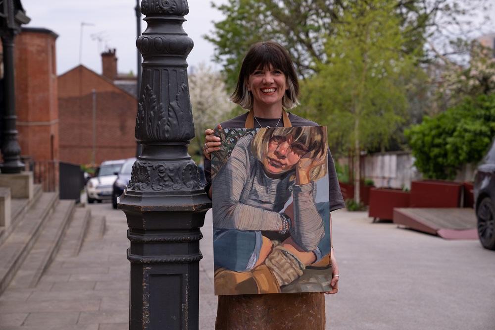
HEAT 2 WINNER: GAIL REID
Hi Gail, congratulations on winning Heat 2! How did you find the experience of painting a celebrity in front of the cameras and judges?
Thanks! It really helped that I do quite a bit of livestreaming, public event portrait sketching, and am generally used to chatting with sitters while painting them. In fact it was easier than in my studio, because the Storyvault team had sorted out the set, refreshments, etc - all I had to do was talk and paint… two of my favourite things!
Your submission piece was a self-portrait of you wrapped up warm, at work in a busy-looking studio. This was part of a daily painting challenge you took part in. Can you tell us more about that project?
That was the Strada Easel Challenge. Run on Instagram and Facebook, artists register and commit to posting a work done from life, each day, through the whole month. Participating artists who complete the challenge hope to win the prize draw (an easel), but the real reward, as with PAOTY, is what you learn from the practice. At some point in the January challenge I was stumped for inspiration, so I grabbed the bathroom mirror, put it up in my studio, and spent the next few days working on my self portrait. Much of the process is documented on my Instagram feed.
You painted Observer Food Critic and Jazz Pianist, Jay Rayner, who had a real presence on the stage. The judges loved the way you portrayed his character and physical form through your composition. He chose your painting to take home, how did it feel to have your work selected from three wonderful portraits?
I absolutely loved painting Jay, he really played a big part in the process with his attitude (physical and interpersonal). I felt humbled to have my work selected, as Dale and Caroline both produced incredible portraits, with excellent likenesses. The ‘reveal’ is such a big deal for a portrait artist, to have the sitter be happy with your work can never be taken for granted, but it’s great when it does happen.
You started very quickly with burnt umber undertones and started to block in colour over this. At one point you even turned the painting upside down to seek a likeness. Could you talk us through your process from start to finish?
The first, and perhaps most critical part, is the composition. I usually do quick sketches on kraft paper, cut to the same proportions as the canvas, to decide how to orient the painting, crop/place the sitter. I usually work in portrait format, but given that Jay’s special object was his cufflinks I thought it was important to include his hands. As he was sitting in a relatively low comfy chair, I decided to go for a landscape format. Once the composition is decided I start with a wash of dilute burnt umber acrylic paint, then use a process of subtraction (wiping) and addition (painting with more burnt umber acrylic) to ‘find’ the figure. This continues for the first hour. For a fresh look, I often use a mirror, turning my back on the canvas and observing the sitter and canvas together in the mirror.
Next I block in the colour using oil paints, starting with the background because that affects how the colours appear on the figure. As long as the sitter is reasonably still, and I have a clear view of them, I continue from life for the first couple of hours. I block in a ‘best guess’ across the canvas, working mostly from dark to light, especially looking to identify and preserve any interesting ‘pops’ of colour/value (such as the saturated skin tones under Jay’s chin).
Around about the third hour I use a photo, turning both the photo and the canvas upside down. Depending on how it’s going, I may use this for a quick check of proportions, or I may work continually from the photo. Jay was quite still, and it seemed to be going OK, so I went back to working from life for most of the rest. Then I just try and keep refining, hopefully stopping (or running out of time) before refinement becomes overworking!
You spoke about inheriting your grandmother’s brushes and your being gifted a handmade brush and pencil holder from your daughter. What brand of brush has lasted the test of time?! And can you tell us what other materials we’d find in your studio?
I’m pretty hard on my brushes - I mix paint on the palette with them, don’t always wash them as thoroughly as I should, and I scrub pretty relentlessly on the canvas with them. I’ve got a bit better at washing them, now I have a big pot of B&J The Masters Brush Cleaner & Preserver. I use a variety of hog and synthetic bristle brushes, round and long flat. I mostly use Pro Arte Series A Hog (size 12 and down), Pro Arte Sterling synthetic, and Rosemary & Co long flats. I like the Loxley soft 2” (or wider) hake brush for spreading on the acrylic wash. In my submission self-portrait you can see assorted Rosemary and Pro Arte Sterling brushes in the pot in the foreground. I used Tom Hughes’ ‘Uber Ruler’ to paint the straight lines of Jay’s chair - it’s great for buildings too because you can anchor it against the side of the canvas and it doesn’t slip as you swing it to different angles. Also a dart to scratch the piano key design onto Jay’s cufflinks.
Thanks Gail! You can read more about Gail’s PAOTY strategy on her blog here. See more of Gail’s work at gailreidartist.com or @gailreidartist on Instagram.
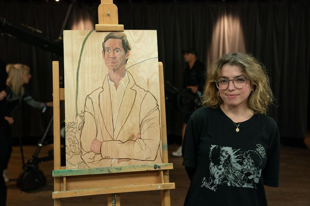
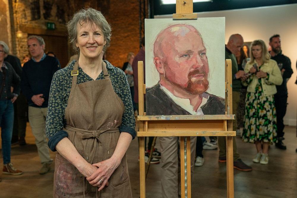
HEAT 3 WINNER: LORENA LEVI
Hi Lorena! Congratulations on winning Heat 3! How did you find the experience of painting a celebrity in front of the cameras and judges?
It was definitely a unique experience. I’ve never painted with people watching, least of all an audience in a competition setting. I was okay tuning out of what was happening behind me and focussing on the painting, but it would feel very weird turning around occasionally and seeing a lot of strangers watching me paint.
You painted Diplomat & former Cabinet Minister Rory Stewart, can you talk us through your process from start to finish?
He decided to pose standing, which I was surprised by because of the time scale. Once he got his position, I took photos and decided on one. I start with the face and go detail by detail which allows me to focus on specific features and then move on to the next. This creates slight exaggeration in the faces I paint because I don’t really map out the face with larger strokes, it’s about moving through the details. So with Rory Stewart I was able to start on the cheek, move through the whole face and then do the linear painting of his suit jacket and boots behind him. My final touch was the hint of green and blue behind him which was put in to place him in the surrounding.
In the show, they mentioned your influences are Alice Neal and Lucien Freud, what is it you admire about their work and how has it influenced your own?
Early Lucian Freud is a really big inspiration because of the exaggeration in how he paints eyes and I think that brings in a lot of the character of his subjects, which is what I am very interested in. Same as Alice Neel, whose depictions of her sitters are embedded with a lot of analysis of the inner worlds.
The judges frequently talked about the illustrative nature of your work, and how you ‘walk a line’ between illustration and painting. You manage to capture character brilliantly by exaggerating features without it becoming caricature-like, instead creating a painting with a unique style. How do you navigate that fine line?
I learned classic and traditional painting styles when I was at university and then when I was able to be more self directed with painting projects, I could mix that painterly quality I had learnt with something a bit more contemporary. There’s always an effort to have a painterly quality to the work, but because of my process of going piece by piece and exaggerating features I could blur that harsh line of cartoon and painting. Being around illustrative images in our everyday life influences me and I combine what is in my environment with the style of painting I have been taught.
You work on wooden panels, incorporating the wood grain into the composition of your piece. How do you prime your panels and what kind do you use?
I don’t prime my panels I work straight on the board. I get my wood from an online distributor who provides hardwood ply. They are more durable and never loses the front veneer as well as not warping. I get them from ply direct online store. When I was just starting out using wood I would get it from my local builders merchant who had wood cutting services on site.
Thanks Lorena! See more of Lorena’s work at lorenaleviart.net or @lorenalevi on Instagram.
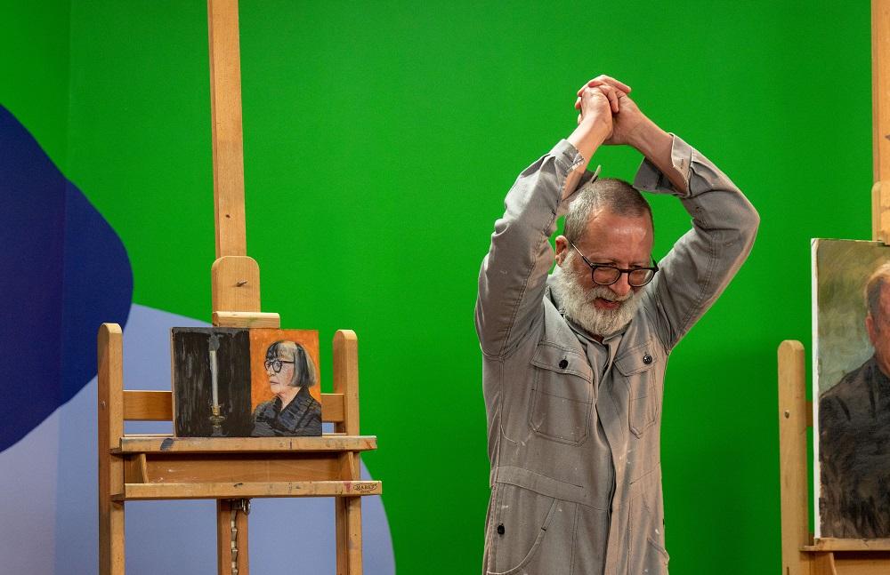
HEAT 4 WINNER: DAVIDE DI TARANTO
Hi Davide! Congratulations on winning Heat 4! How did you find the experience of painting a celebrity in front of the cameras and judges?
It was a very different experience from working at home, where I usually work alone from reference photos and images. The StoryVault production team looked after us very well and I managed to focus on my work and cope with the cameras, the lighting, the spectators and the interviews! The judges and the presenters were also very kind and supportive. I suppose when I work I shut everything else out and so, even in the busy studio, I found that I could concentrate on my portrait of Philippa .
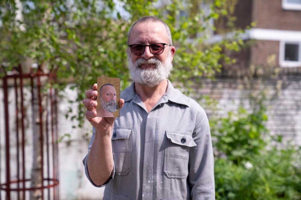
Your submission was a very small, very detailed, devotional self-portrait with a gold background. Could you tell us a bit about your art historical influences?
I studied fine art and then worked as an art restorer in Florence for 12 years. So, that detailed intimate knowledge of great medieval and renaissance Italian art, including religious art and miniature portraits has become an integral part of my own way of working. In fact, my submission was quite big compared with some of my recent work - a series of miniature portraits of 21st century men painted on aluminium domed discs which I had upcycled from the bottom of aerosol cans! These paintings combined two of my passions: detailed portraits using traditional methods and using found materials.
You painted Psychotherapist & Author Philippa Perry, who chose your piece to take home! You decided on a black ground to work on and built up the features with small brush marks, notably more gestural than in your submission piece. Could you talk us through your thought painting process and how you adapted it for speed on the day?
Normally, I work building up the image with tiny brush strokes and then applying gold leaf as a background. But I realised that I had to change my working methods in order to finish a portrait in exactly four hours. So, as soon as I heard that I had been selected to be a PAOTY, I started practicing using friends and family members here and in Italy as models. They were all very happy to have a portrait made and I developed the bolder, less detailed approach which I used in the PAOTY heat and you see in my portrait of Philippa.
Your composition stood out, the judges commented on its resemblance to icon paintings. You split the surface in two, placing the portrait on an orange background and the sentimental object the sitter brought - a candlestick Perry inherited from her mother - on a black background on the left. A lighter grey area like smoke fills the top left side of the painting. This created an interesting narrative in the work. What made you decide on this composition?
That was a combination of factors. Firstly, Philippa was the perfect sitter for me because her calm, thoughtful presence and her pose with the candle suggested to me that she was reflecting on her life and memories. So, I decided it was very important to include Philippa's mother's candle as a key element, not just a decorative item. Initially, I was going to use two separate boards, one for Philippa, one for the candle but this was not practical. So, I divided a single board to create the two separate but interrelated spaces, one for Philippa and one for the candle. The inspiration for the colours, black vs. orange, came from the fantastic décor the design team had provided as a backdrop for Philippa. The black behind the candle allowed me to emphasise the idea that candles are a source of light in the darkness. The grey patches reflect the grey stripes in Philippa's clothes and help unify the image.
What are your favourite art materials for portraiture, and do you have any specific brushes you use for fine detail?
I am very worried by the waste of the modern world, so I use found, wooden boards as a base for my paintings. Until very recently I only used Winsor & Newton's paints, but since my trip to London for the PAOTY heat I have started using Cass Art's own brand and find them very good. We don't have a branch of Cass Art in Southampton! For my fine brushwork, I use ProArte's miniature brushes sizes 2,1,5/03/02/0 and 10/0.
Thanks Davide! See more of Davide’s work @davideditaro on Instagram.
HEAT 5 WINNER: SARA REEVE
Hi Sara! Congratulations on winning Heat 5! How did you find the experience of painting a celebrity in front of the cameras and judges?
Thank you so much! It was so brilliant watching it back as I think you can see how genuinely surprised I was that I’d won! I’d made the decision not to look at any of the other artists paintings all day, and I’m glad I didn’t - they were all so good! The day itself was such an incredible experience - I’m used to working under pressure (12years working as a wedding photographer was good training!) but painting in this environment really was like nothing else. The judges, hosts, our wonderful sitter and the crew were all so lovely that they really did help calm the nerves and ultimately it was such a positive confidence-boosting experience.
You painted Vanessa Kingori OBE, who chose your piece to take home. You caught her likeness very early on and both the judges and Vanessa commented on the openness and warmth of the piece. How do you capture a likeness in your portraits?
Vanessa was the perfect sitter - when she walked out I was over the moon! We were all so nervous and she was really calming and kind, and a real support to me, Shirley & Daniel. It was such a strange environment to paint in - genuinely like you’d stepped into the telly - that the only way I could work was to focus on Vanessa as the reason I was there - to paint a wonderful warm inspiring person who was giving their time to sit for us. I do a lot of life drawing, and that connection between the sitter as they pose and yourself as you draw/paint is everything - it’s a really rewarding experience. Exploring that connection is more important to me when I’m working than getting too bogged down in likeness, because I think you’re capturing something real. Then if you’re lucky the sitter still sees themselves in the work.
Incredibly, you finished before the 4 hours! Do you always work so quickly and how do you know when to stop?
I do work quickly, so 3-4 hours suits me well - I have a really low attention span and a very busy mind!!! I’m used to either working in life drawing classes, or working in slots of time I’ve shoehorned around work and family life, so timed poses are my comfort zone. If I am working without time constraints, I usually know when to stop when the painting starts to give me a bit of an attitude back - it sounds strange but it’s like they seem to know when they’re done.
Your mark-making is very confident. The directional, bold, brush marks and subtle tonal values help to mould the contours of the face. Tai called you a ‘brilliant colourist’! Can you tell us a bit about your process and your colour palette?
Thank you so much - and yes Tai’s comments made my day! It’s funny what comes out of your brushes as you paint - and definitely I do make bold marks and love playing with vibrant pops of colour. This is why I used the bright pink ground in the heat (it’s just a neon pink acrylic paint) as it can create a lovely glow under skin tones and you get the odd little slice of neon pop through. It looks pretty weird until you’ve covered it all up though so that was an exercise in confidence to just keep going and trusting myself! For most of my paintings I use a fairly limited palette of colours - I call it the Zornish palette (as it’s a variation of the Zorn palette - I’m still waiting for the name to catch on!) so I use Titanium White, Yellow Ochre, Cadmium Red, French Ultramarine and Raw Umber. I’ve painted 90% of my paintings with that palette, occasionally introducing a guest colour in to see what it’ll do.
With regards to how I paint, I tend to follow the following steps - ground, under drawing (painting with a thin solution of solvent and raw umber to sketch in the composition), then block in key areas of tone and colour with paint working from dark to light, then adding in the detail. It’s a tried and tested process!
If we rummaged around in your studio, what art materials would we find and do you have any favourite brands?
Ooh it’s a good studio to have a rummage in as it’s in my garage so you could find anything (including a cat if you’re lucky!). All my art supplies are up one end - I work in oils, and I’m a big believer in keeping things simple - and affordable! I work a lot on paper (specifically paper for oil paint) as it’s affordable, easy to store, and I feel less precious working on it and more free to play. I love the Seawhites Oil painting paper, and also cradled wooden panels, which I used for PAOTY. I use low odour solvent, and synthetic flat brushes - and paint wise I prefer big tubes of oil paints. When I started I used Winton oil paints which are fantastic - they’re good value and strong pigments. But really the best materials are the ones you’ve got to hand and just making them work!
Thanks Sara! See more of Sara’s work at sarareeve.com or @sarareevedraws on Instagram. Sara also teaches painting and life drawing at Draw Brighton.
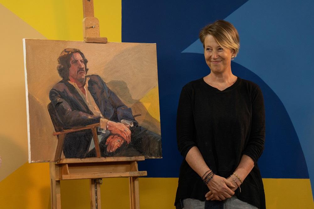
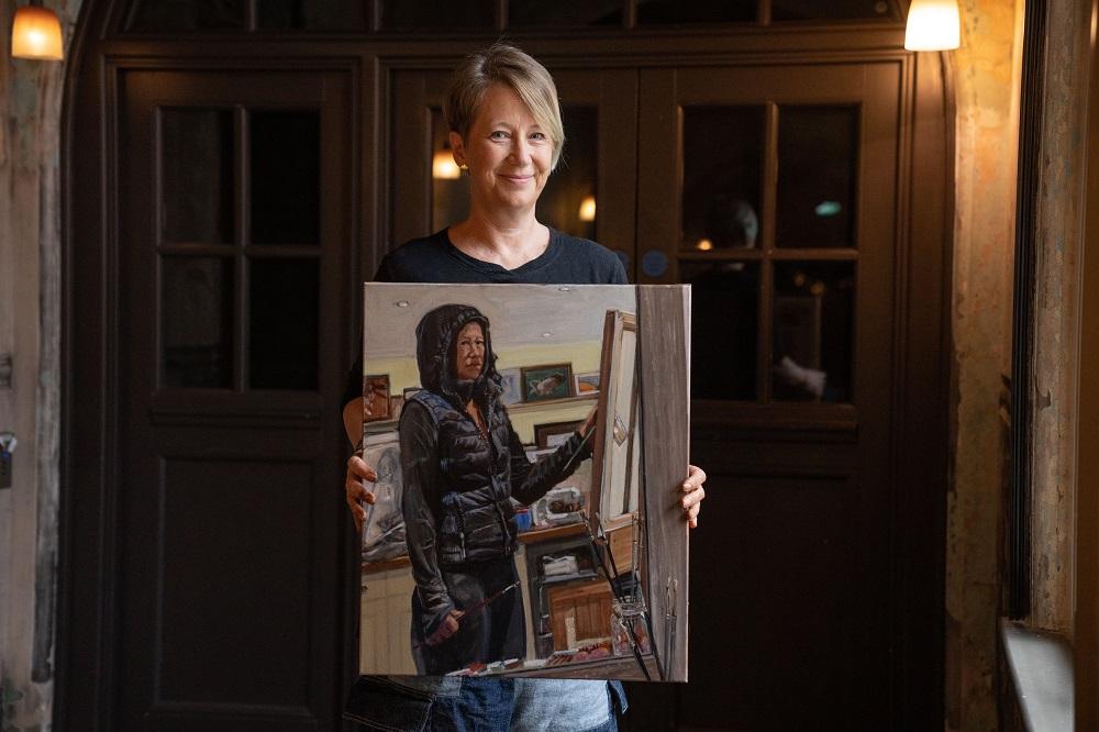
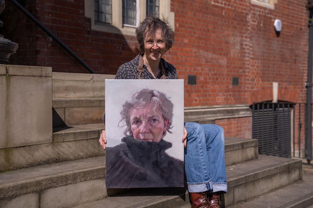
HEAT 6 WINNER: WENDY BARRATT
Hi Wendy! Congratulations on winning Heat 6! How did you find the experience of painting a celebrity in front of the cameras and judges?
The experience was definitely a new one! I think it was a small help that I have had years of experience of teaching and doing demo’s in front of classes, but that experience definitely goes up several levels when you know you’re being watched by such expert judges, cameras and a live audience and ultimately trying to produce a painting which will be true to a live sitter. I also had to trust that once I was in the 'paint zone’ those worries would disappear… or at least not be such a worry.
You painted Scottish Tenor Nicky Spence and you spoke about ‘finding the landscape of his face’ and looking for the sculptural quality of his head. Your self-portrait submission piece was also very sculptural. How do you use line and colour to convey form in your painting?
I discovered the wonder of drawing in line back when I was a young art student on my foundation course in Chester. The discovery that I could describe form with line was quite a revolution and has been important in my artwork ever since. When drawing with line I have in mind that I am touching a 3 dimensional surface which comes towards me, then disappears behind the form, only to re-appear elsewhere. I draw lines that aren’t necessarily there. They may describe an outer contour or they may describe a very faint track that I see or sense going across the surface or they may trace my eye movement and where I want to direct the viewer. I liken it to sculpting in 2D. Up until my mid thirties I constantly drew in black and white, mainly in charcoal and graphite, so as well as line, I understood how to describe form using tone. This was hugely beneficial when I started to work in colour and those lessons in tone are used when mixing colours to describe form in my paintings.
Once the planes of colour are in, you draw back into the work with painted lines to guide the eye across the surface. Your colour palette and line work are reminiscent of Euan Uglow’s paintings from life, was he an influence of yours and which other artists do you look to for inspiration?
That's quite a compliment to have the influence of Euan Uglow picked up in my work - thank you! Yes, Uglow HAS been a big influence on my work since the late 90’s and studying his paintings has taught me a lot about colour and drawing in paintings. Other artists who have had a big influence are Rembrandt, Frank Auerbach, Lucien Freud, David Bomberg, Cezanne, Paula Rego. I have not only been inspired by painters but also by the drawings of sculptors such as Henry Moore, Giacometti and Antony Gormley and the way they describe form on a 2 dimensional surface.
You still teach painting in your spare time, do you have any tips for artists starting out with portraiture?
Yes, the only way you’re going to learn how to draw or paint portraits is to draw or paint portraits…LOTS! It’s easy to find images of faces to work from and that is a really useful lesson but it’s also important to draw portraits from life as much as you can. If you can, join a local life drawing group. All the lessons learned in a life drawing class, you can apply to a portrait. If that isn’t an option then you could get a few like minded people together and draw each other or you may have friends and family who are willing to sit for you. As well as in-person life drawing and portrait drawing classes, there are many great online resources nowadays which means you can draw almost every day from some really inspiring models from the comfort of your own home.
What are your go-to art supplies for painting?
The brushes I use are a mix of synthetic and hog hair. I tend to use Pro Arte Series A Hog, mainly flats and filberts. I also use a lot of Rosemary and Co brushes, namely their Ivory range in flats, filberts, rounds and riggers. I also really like the DaVinci Grigio synthetic brushes, both flats and rounds.
I use a mixture of different brands of oil paint, mostly Michael Harding and professional ranges. For thinners, I use Zest-it and linseed oil. I sometimes like to use Liquin especially when painting from life, plus I like the consistency that the it gives to my paint. I mainly use a medium grain canvas of cotton or linen which I like to prepare with a Michael Harding non-absorbent clear or white gesso. It has just the right amount of ’tooth’ for my first drawing in paint.
Thanks Wendy! See more of Wendy’s work at wendybarratt.com or @wendybarrattart on Instagram.
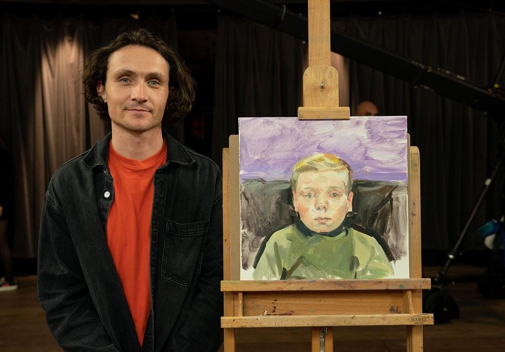
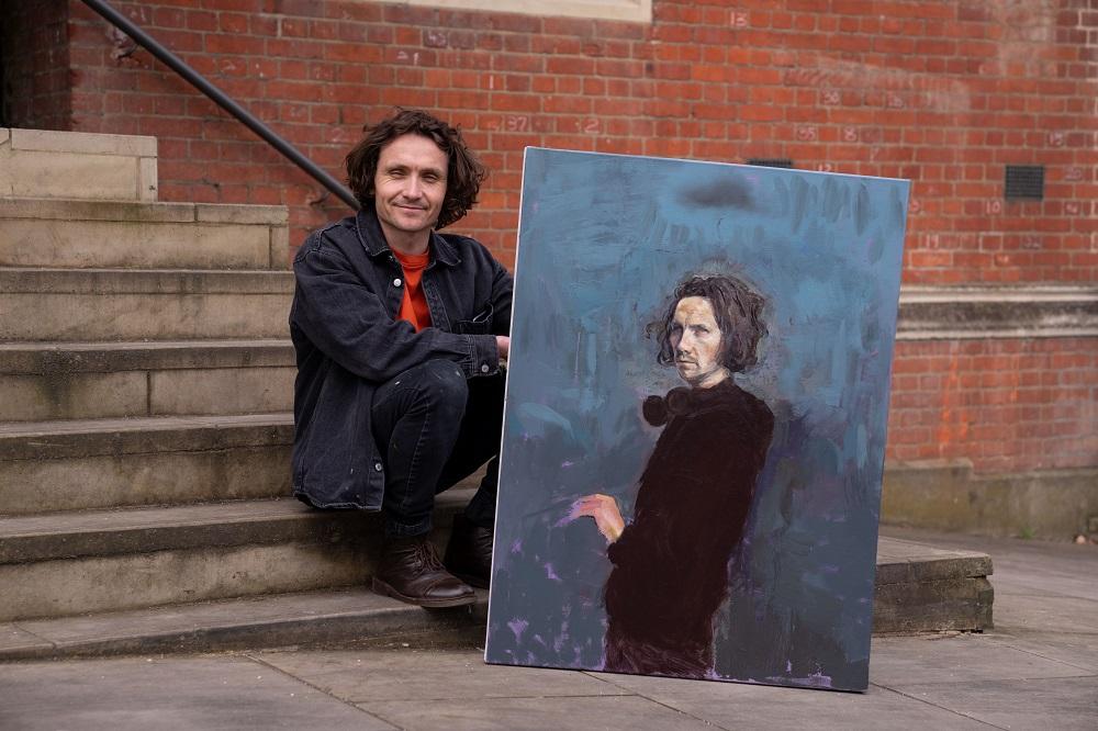
HEAT 7 WINNER: ED LAWRENSON
Hi Ed! Congratulations on winning Heat 7! How did you find the experience of painting a celebrity in front of the cameras and judges?
I tried to not let it all phase me. A few years ago all the lights and attention would have been quite daunting. It reminded me of my first experiences of life drawing as a young adult - feeling exposed having your work and methodology on show to everyone! Lenny was very sweet and humble which helped!
You painted BAFTA winning actor Lenny Rush and began with a very small study to determine the composition and colours, which in itself was a very accomplished painting! Do you always work in this way and how does it help you to make decisions about the final piece?
Wow thank you! I am trying to adopt this into my practise - especially for larger canvases. There are so many methods and processes used by historical painters, which I am very good at ignoring. But when you actually incorporate them, whether it’s a colour study or a grisaille, they can be incredibly time-saving in the long run.
Both your self-portrait submission and the painting of Lenny had a sense of mood, and you captured a seriousness in Lenny’s expression. How do you create atmosphere in your paintings?
I think that may occur accidentally on my part. The dark cloud over my head in my self-portrait is a comical nod to my tendency to take painting a little too seriously. I am a great fan of classicism; painters like Rembrandt and Caravaggio. I taught myself to paint by adopting an attitude of no ‘pain no gain’, so maybe I’m secreting this anguish into the surface of the canvas - haha. I am looking for naturalism and I think when both the model and sitter relax into a pose you may capture some of that meditative quality that comes with hyper-focus.
Although painting a still figure, your loose, expressive brushwork gave energy to the painting, and Tai even commented on your ‘lyrical mark-making’. You seem to play with the thickness of the paint – creating interest across the surface. How did this style develop in your work and which other artists do you look to for inspiration?
Thank you. I’m not entirely sure-although I imagine it comes from my love of Impressionism. I find Constable’s studies far more compelling than his finished works. My parents have always been great fans of the Post-Impressionists and I think I was always exposed to paintings that look painterly. My desire to achieve naturalism and good drawing is counterbalanced by an innate laziness and impatience when working. Painters like Sorolla, Sargent and Zorn always dazzle the viewer because their intuitive and laser sharp drawing ability is coupled with such an effortless looking economy of brushwork. I, a mere mortal, can only aspire to that quality. As I get older I have tried to embrace the unique mark-making character that we all possess, like handwriting. The brush is an extension of your arm and hand, and so it’s only natural that we all paint differently. That’s what makes it infinitely beautiful and interesting.
What art materials would we find in your studio, and do you have any tips for aspiring portrait painters?
I’m afraid I follow the starving artist model and often paint with whatever I can get my hands on! However, I do love Coates charcoal, Winsor & Newton Liquin (as a fast-drying medium), Cranfield and Old Holland colour. I’m always trying new brushes and I have my eyes on some Rosemary’s, but generally I find hogs bristle brushes far better for decisive mark-making. On occasion I have used Micheal Harding paints, but it’s such powerful stuff, you need to balance the whole palette. I am getting back into drawing, and though I love charcoal’s painterly quality, I love an F-grade pencil for smaller, sensitive portrait or figure studies. The paper you're using needs a good tooth to pull the graphite from the pencil and I find Seawhite cartridge paper sketchbooks ideal for this.
My only advice to aspiring portraitists would be to attempt to paint what you see and not what you think you should be seeing. We all see differently anyway, so if you try to humble yourself to the idea of being a ‘vehicle of transmission’ you should create an honest likeness of the sitter. Focus on the larger shapes rather than details, paint under natural light wherever possible. Work from life whenever possible - it’ll pay off. The likeness is in the shape of the head, not each individual freckle. Painting is drawing and drawing is painting. Squint, simplify where possible without losing too much shape. Don’t be afraid to wipe it all off and to start again: better to have a good painting than a badly formulated one, with some nice moments in it. Understatement is your friend. ?
Thanks Ed! See more of Ed’s work at edlawrensonartist.com or @ed_lawrenson_artist on Instagram.
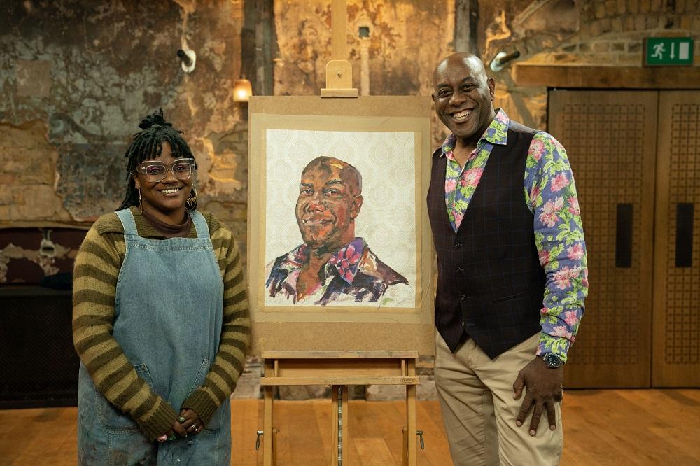
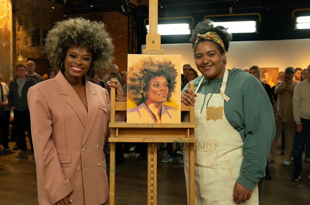
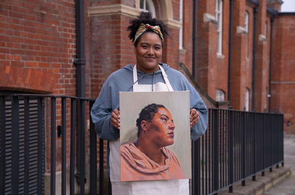
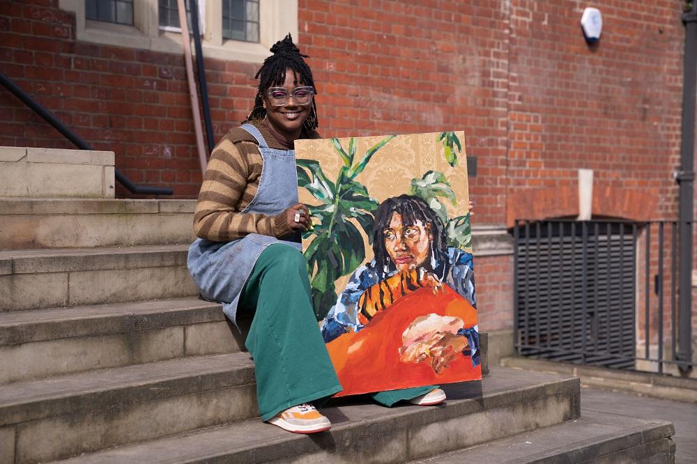
SELECTED ARTIST: YVADNEY DAVIS
Hi Yvadney! Congratulations on making it through to the semi-final! You took part in Heat 3 which was won by Lorena Levi, but the judges enjoyed your work so much they invited you back for the semi-final. That must have been a big surprise! How did you find the experience of painting a celebrity in front of the cameras and judges?
To be honest, me being a wild card in the semi-finals is still sinking in. I can’t thank the judges enough for seeing something unique in how I create portraits. Their questions, compliments and critiques have definitely given me such a huge confidence boost to keep developing my art practice.
I really enjoyed the whole PAOTY experience. The production, crew, audience, fellow artists, and of course, sitters created such an unforgettable atmosphere. I knew that if I was going to stay focused, I had to listen to my painting playlist to try and block out all of the buzz. On both occasions, my plan was to not overthink what the judges might be looking for and stay true to my style, which I’d say, as someone who is self-taught, is intuitive rather than academic. There’s some freedom in that.
That said, I found my heat much more relaxed than the semis, in which I think I put so much pressure on myself (and was still in shock) that I just couldn’t flow into the process no matter how hard I tried. Perhaps I was also a little star-struck, I loved the Spice Girls back in the day, and wanted to make sure I was capturing the Emma I saw in front of me, not the one I thought I knew. It was so hard! I felt so bad, I recently set myself a one-hour time limit to keep going on the portrait and am so much happier with it, it’s come out of exile now!!
You painted TV Chef Ainsley Harriott who brought his late mother’s favourite dutchie pot along, which you were excited to incorporate into the portrait, a nod to both Ainsley’s and your own Caribbean heritage. Instead of depicting the pot, and with little time to create the work, you cleverly incorporated the decorative pattern from the pot into Ainsley’s shirt. Do you often incorporate hidden narratives in your work?
I love incorporating narratives into my work, but they’re normally much more conspicuous. It could be through objects, colours, patterns or even text, but with Ainsley’s portrait I knew I wanted to incorporate the pot somehow. He was already wearing a floral shirt, so it seemed like the perfect fit.
You took up painting during the pandemic, so it’s a huge achievement to have been selected for the semi-final. Can you tell us about your painting journey so far, how has your work developed in just a few years and do you have any tips for those just starting out with painting?
Yes, a homeschool lesson with my children turned into a hobby, which has since turned into exhibitions, awards, commissions and now the Semi Finals of my favourite TV show! I always use that as a testimony to anyone who has ever been remotely artistic to rediscover that passion again. If you’re not sure where to start, start with yourself or objects in your home, or go to a local art class. There are so many online nowadays too. Also, go to art exhibitions and sketch, make notes of what you like about the things you see.
I actually started using pastels, but quickly moved onto acrylic paints doing portraits of myself and friends. Spending time with my late Grandmother inspired my focus on celebrating my Caribbean British heritage. This is where I started using wallpaper, collage and my paint strokes became more layered and detailed, rather than the looser of style I had to use to begin with. I also work on a much larger scale now from the A4 pieces of paper that I limited myself to to begin with.
Tai described your piece as ‘full of character’ and Ainsley chose your work to take home! How did that feel and what is your secret to capturing character in your portraits?
I was elated to have Ainsley choose my portrait. I always want people to see themselves in my work. Under normal circumstances, I like to spend some time chatting with my sitters, then I get an understanding of their backstory, interests, favourite colours, music and most importantly how they hope people will see them in the portrait. I also observe their body language, how they smile, hand gestures, head tilts and most importantly their eyes. Ainsley had a warmth and openness to him, which I wanted to show by having a direct gaze and slight smile.
In the series we’ve seen you paint on vintage wallpaper, in celebration of your grandparents and a tribute to the Windrush generation. The paper adds a wonderful patterned texture to your works, how have you adapted your practice to work on it and what are your other go-to art materials?
Yes, I’ve become quite a vintage wallpaper collector over the past couple of years. I love the texture and the patterns, and most importantly, that the final pieces become history upon history. Learning how to work with this unusual medium has been such a journey. I started by mounting the wallpaper to canvas using traditional wallpaper paste, I’m no DIY expert, so it took practise and patience to learn to smooth out all the bubbles and match any patterns. I’ve recently discovered that Wudcare PVA Wood Adhesive works just as well. In terms of priming it, I used to use an Acrylic Gesso Primer on the areas I would paint on, but in preparation for PAOTY, I discovered I could prime the entire surface area with a clear satin-effect acrylic varnish spray. This has been revolutionary in my work, as I have complete freedom to play around and am no longer limited by my initial mapping.
Thanks Yvadney! See more of Yvadney’s work at yvadney.art or @yvadneydavisart on Instagram.
Feeling inspired?
If you think you’ve got what it takes to become the next Sky Arts Portrait Artist of the Year, the deadline for entries for Series 11 is midday Friday 2nd February 2024. Find out more and apply at skyartsartistoftheyear.tv/portrait. Good luck!
Image credits: Photography © Sky Arts, paintings © Storyvault.

