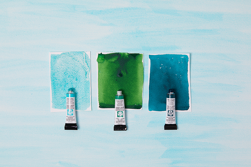
Cobalt teal is a vivid and eye-catching blue-green colour that has captivated artists and designers for centuries. Its unique hue and versatility have made it a popular choice for a wide range of applications, from painting and textiles to ceramics and interior design. In this blog, we will explore the history of cobalt teal, tracing its origins and evolution over time.
The Origin of Cobalt Teal
The first recorded use of Cobalt Teal dates back to the 18th century, when it was first discovered as a by-product of the production of cobalt blue pigment. Cobalt blue had been used for centuries as a key component in glassmaking, ceramics, and other decorative arts.
However, as the production of cobalt blue expanded, a new, more vibrant blue-green colour was also discovered in the process. This colour was initially referred to as "cobalt green" or "cobalt turquoise" and was used primarily in ceramics and enamelling.
It wasn't until the 19th century that cobalt teal began to be used in painting, particularly in the works of French Impressionist painters such as Claude Monet and Auguste Renoir. These artists were drawn to the bright, fresh qualities of cobalt teal, which offered a new and exciting alternative to traditional blues and greens.
Cobalt teal continued to gain popularity in the early 20th century, particularly among the German Expressionist painters. These artists were interested in using bold, bright coloUrs to convey emotion and intensity, and cobalt teal was a natural choice. It was also used in textiles and fashion, particularly in the Art Deco movement of the 1920s and 30s. The colour's cool, sophisticated qualities made it a popular choice for clothing, furniture, and home decor.
Symbolism and Emotional Impact:
As we know colours often hold symbolic and emotional significance. Teal is associated with healing, renewal, and emotional balance. Its calming properties can help evoke a sense of peace, making it a valuable tool for artists who wish to express emotions or create visual narratives centred around serenity and introspection.
It strikes a delicate balance between the calming properties of blue and the revitalising energy of green. Teal is often associated with serenity, tranquillity, and emotional balance. It evokes a sense of rejuvenation, promoting clarity of thought and aiding in decision-making. This unique hue can also foster a connection to nature, symbolising growth, renewal, and healing.
Teal in Nature
Nature has always been an abundant source of inspiration for artists and designers, and teal finds its roots in the natural world. Picture the serene depths of the ocean, where the sea meets the sky, and you'll find the essence of teal. From tropical lagoons to exotic bird feathers and shimmering gemstones, teal can be found in various facets of nature's canvas. Its presence in the environment resonates with a sense of harmony and tranquillity.
Famous works featuring Cobalt Teal
The Starry Night painting by Vincent van Gogh is a masterpiece of post-impressionist art, and it is renowned for its use of vibrant and expressive colours. One of the prominent colours used in the painting is teal, which is seen in the swirling skies above the village and the cypress tree.
Here Teal conveys a sense of calmness and serenity, but also an element of mystery and depth. Van Gogh's use of it in the Starry Night serves several purposes. First, it provides a contrast to the warm yellows and oranges used for the stars and the village. This contrast creates a sense of harmony and balance in the painting, and it helps to draw the viewer's eye towards the sky.
Starry Night
Vincent Van Gogh
Museum of Modern Art
Finally, the use of teal in the Starry Night painting adds a sense of depth and mystery. The different shades of blue and green used in the sky create a sense of depth and distance, as if the viewer is looking out into the infinite expanse of the universe. The use of teal also adds a sense of mystery and intrigue, as if there is something hidden or unknown in the swirling patterns of the sky.
NO.61 (Rust and Blue)
Mark Rothko
Museum of Contemporary Art,
Los Angeles
NO.61 (Rust and Blue) by Mark Rothko
In Mark Rothko's painting "No. 61 (Rust and Blue)," teal is used as a subtle accent colour among a predominantly rust and blue colour palette. This painting is part of Rothko's signature style of colour field painting, in which he explored the emotional impact of large, monochromatic colour fields.
Rothko creates a sense of depth and luminosity through the use of layered, translucent colour fields. The teal colour appears as a thin, vertical stripe in the middle of the canvas, separating the dominant rust and blue hues. This stripe adds a subtle sense of contrast and harmony to the painting, breaking up the flatness of the other colours and giving the viewer's eye a place to rest.
The use of teal in this work also has symbolic connotations. Rothko believed that colour could convey profound emotions and transcendental experiences. Teal is a colour associated with water and the ocean, which can represent depth, mystery, and the unconscious. By including this colour in the painting, Rothko may have been referencing the psychological and emotional depths that he believed his art could access.
Teal serves as a subtle yet important role in the painting's composition and symbolism. It adds a sense of contrast and harmony to the dominant rust and blue colours and references deeper emotional and psychological states that Rothko was exploring in his work.
Cobalt Teal Now comes in a wide range of artist mediums, from oil, acrylic to watersoluble ink and pastel.