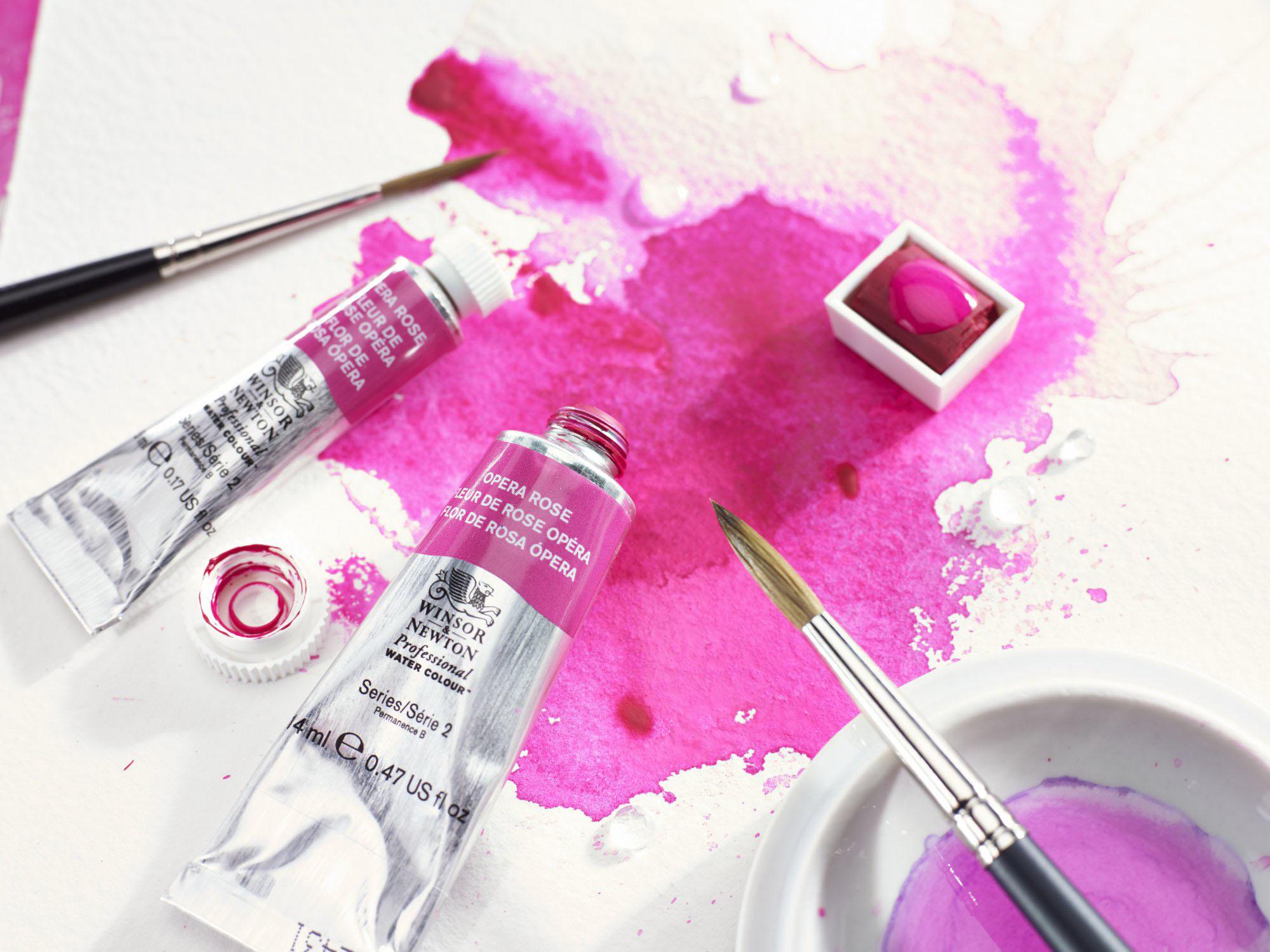
Opera Rose is a vibrant and intense pink colour that is popular among watercolour artists. It was first introduced by the American company, Grumbacher, in the 1970s. The colour is made from a blend of pigments that includes quinacridone, a synthetic organic compound that produces bright and vivid hues. Opera Rose is a non-toxic, lightfast, and transparent paint that is ideal for creating bold and eye-catching paintings. In this blog we wanted to look not only at Opera Rose but the history of the shade of pink.
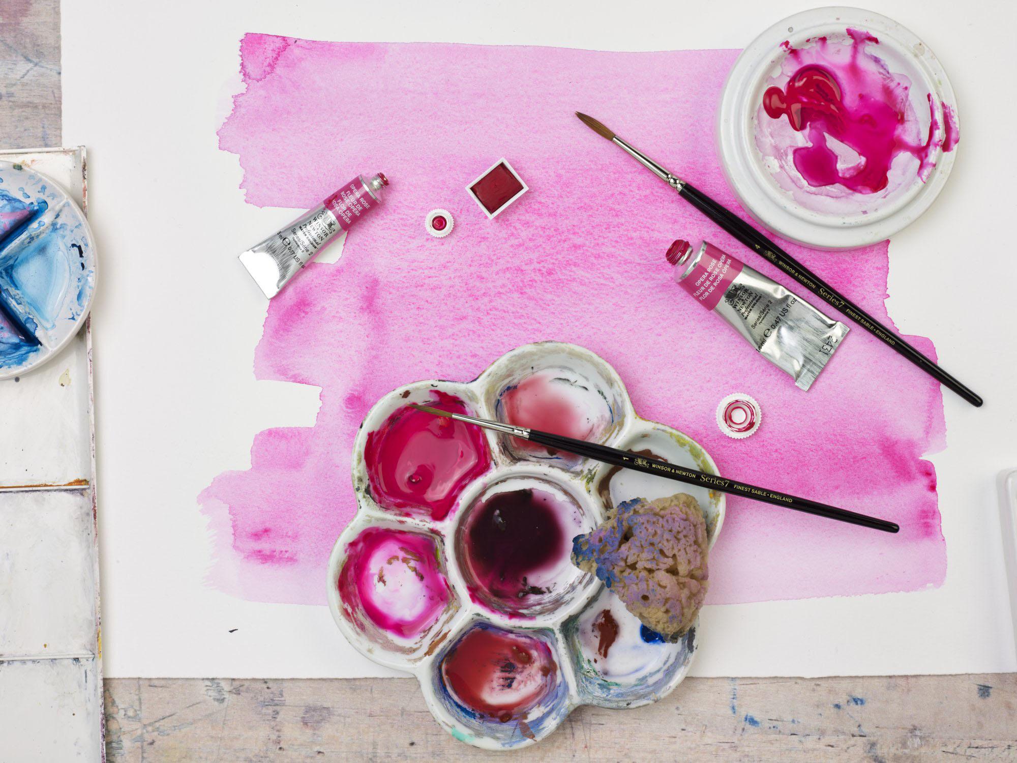
Series number: 2
Chemical description: Fluorescent dye/resin based pigment,
Quinacridone Colour index name: - PR122
Colour index number: - 73915
Permanence rating: B
Transparency/Opacity: Semi-Transparent
This pigment has been formulated from a new generation of Fluorescent pigments. With an astonishing brightness, this shade of pink manifests itself through absorbing energy from the UV invisible spectrum and then reflects that energy within the visible range. Paintings that use it include Flowers by Gerhard Richter, The Liberace Museum by Dexter Dalwood and Divided No.72 by Maurice Cockrill.
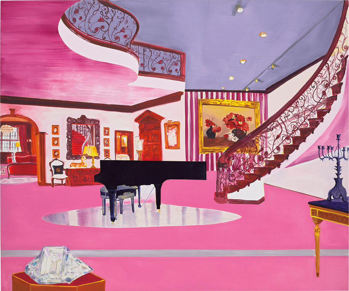
This painting is tickled pink with its ornate furniture and pool of a dazzling reflected floor. Dalwood invents imaginary scenes of celebrities' private lives - picturing the glamour and the gaudy, and presenting us with humour.
Oceans of pink carpet form the backdrop to a winding staircase and several peculiar sculptures - including a crystal ornament and quizzical baby deer in the back.
Dexter Dalwood often incorporates a subtle humour in his work: here bold masculine pinstripes are rendered in garish fuchsia, and a mumsy petit point cushion adorns a distant chair next to a Bambi statue.
The colour pink was recognized as a concept in 800 B.C. in Homer’s Odyssey. The term was coined in the 17th century by a Greek botanist for the ruffled edges of carnations. In the mid-18th century, pink was a fashionable colour among male and female aristocrats as a symbol of class and luxury.
In the mid-20th century, men started to wear darker colours to reflect their World War II service. Bright and pastel colours like pink were rebranded as feminine as part of a postwar effort to remove women from the workforce and reestablish their traditional homemaker roles. Many advertisements targeting women depicted them in colourful clothing.

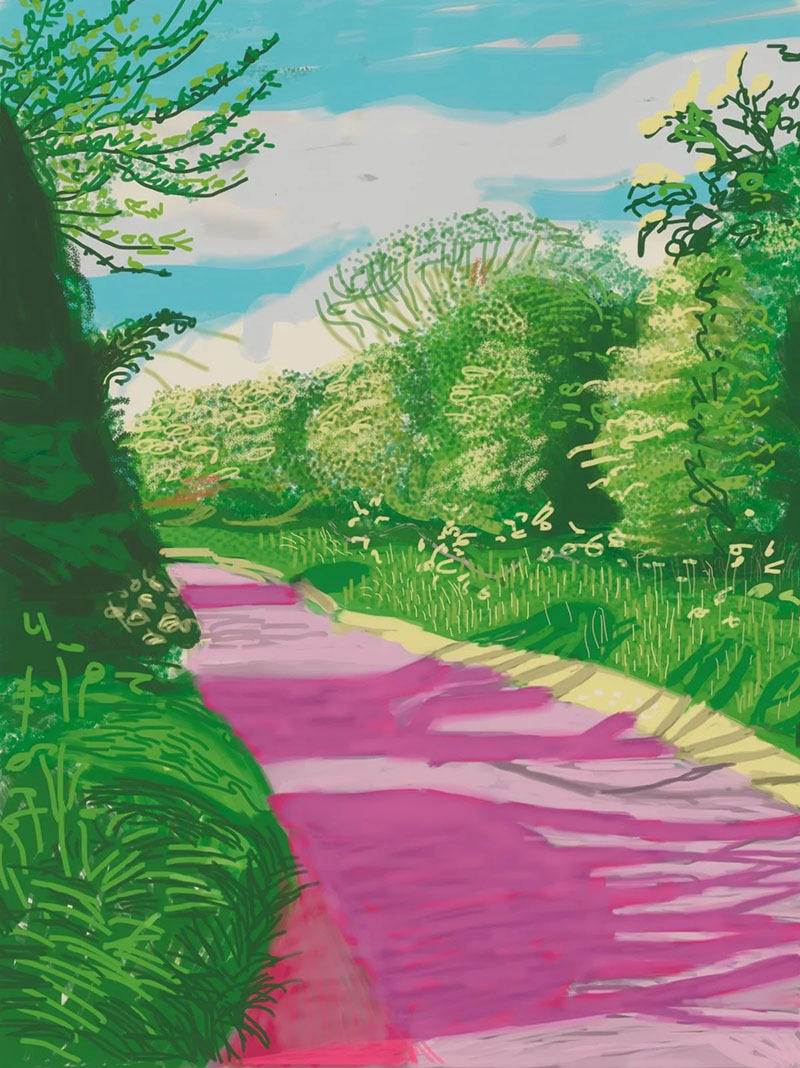
Then the latter half of the 20th century witnessed a radical shift in the perception of pink. Movements like Pop Art embraced the colour for its bold and expressive qualities. Artists like Gerhard Richter and David Hockney (which you can see below) incorporated vibrant pinks into their works, challenging traditional notions and paving the way for a more diverse and inclusive understanding of colour.
The meanings and symbolism for pink have changed over the years. In art, pink was sometimes used for Jesus due to its association with the womb and innocence. The Roman goddess Venus of intimacy and love was also painted in pink.
Today, pink is also the colour of awareness and activism for specific causes, including breast cancer, women’s rights and the LGBTQ+ community.
As the mix between red’s passion and white’s purity, pink symbolizes love, nurture and compassion. It evokes feelings of comfort, warmth and hope. Pink is also a sign of good health with the phrase “in the pink.” It symbolizes success in the expression that “everything is rosy” and happiness with “tickled pink.”
Some studies suggest that pink environments stimulate calmness, so it has been used in prisons and hospitals. However, more recent findings indicate that pink does not affect aggression.
This masterclass from Winsor & Newton shows the different pinks they offers in Water Colour and in Gouache. Here we learn a bit about the sourcing and development of pinks, where pigments originate from and their properties.
From ancient pigments to contemporary canvases, the history of pink is an interesting tale of cultural shifts, symbolism, and artistic expression. No longer confined to gender stereotypes, pink continues to evolve, challenging and delighting our senses. As we appreciate the spectrum of pinks in today's art, fashion, and design, we celebrate a colour that has journeyed through centuries, leaving a mark on the canvas of human history.
Add To List
Add a Wishlist
form to add wishlist here