
Sky Arts Landscape Artist of the Year: Exclusive Heat Winners Interviews
21st Nov 2018
Sky Arts Landscape Artist of the Year 2018 has been as spectacular as ever, from windy beaches and glourious green fields to misty loches, the competition has now reached the semi-finals. Over the weeks the judges have selected their favourite works and the contestants are one step closer to the £10,000 commission and £500 of art materials from us at Cass Art. We caught up with each of the heat winners to find out a bit more about their experience of the show, their work, and the materials they love to use.
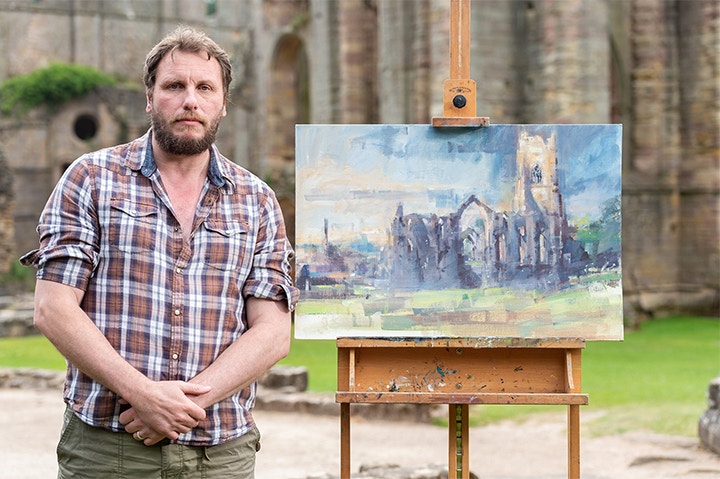
CARL KNIBB - HEAT 1 WINNER
Carl lives and works in Lichfield, Staffordshire. He exhibits in galleries through the region, and also works on commisions from his studio, which is also open to the public, in a farm just outside of the city.
Congratulations on winning Heat 1 of Sky Arts Landscape Artist of the Year 2018! What was the experience like painting at Fountains Abbey?
It was an amazing experience - chaotic, inspiring, nerve-racking and hugely enjoyable - a wonderful way to meet the other artists and the friendly and supportive crew from Sky. Working en plein air in the company of other artists is so enjoyable; I'd love to do it again.
After winning the ‘Capture the Cathedral’ competition in Lichfield in 2017 did you feel quietly confident when your heats location was Fountains Abbey in Yorkshire – given your past successes? Or did it increase the pressure!
Honestly, you saying that's the first time I've made the connection! It would be hard not to be inspired by these magnificent structures, so I was grateful to have such a beautiful location.
Your works have a distinct Turneresque feel about them – indeed your paintings have been exhibited alongside the master himself. Do you draw a lot of inspiration from the artists of this period?
That's very kind, thank you. I've got a long way to go! I do love that period of art, it was a time of great expression in the medium and the craft was really pushed in to new and unimagined areas.
You work with both Acrylic and oil – do you find that you are drawn more to one than the other – or is it very dependent on the subject? And what are you preferred materials?
My heart lies with oils, though acrylics allow for speed and ease of change. Back in my studio I'll often also use charcoal and pastels - I do have a great love of charcoal - the versatility of mark making you can get with it.
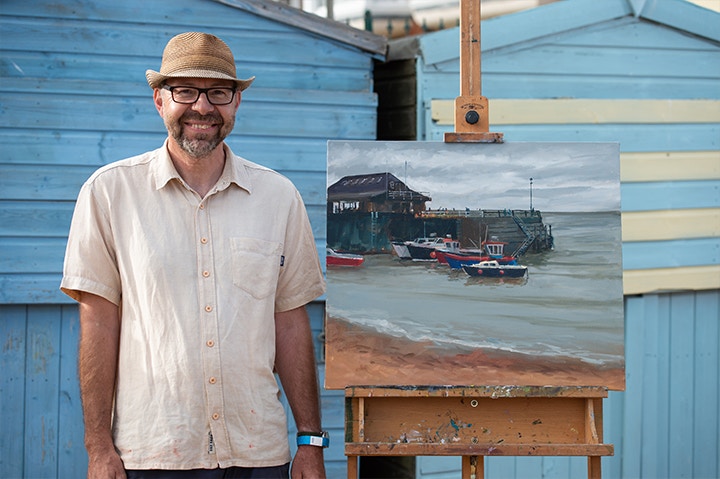
PAUL ALCOCK - HEAT 2 WINNER
Paul is based in Southend on Sea, Essex. After graduating from Camberwell School of Art Paul has been practising as an artist, exhibiting in a range of exhbitions in London and the South East.
Congratulations on winning Heat 2 of Sky Arts Landscape Artist of the Year 2018! What was the experience like painting at Harbour View?
I've been a wild card on a couple of occasions, so I was really thrilled this time to be able to take part as one of the main contestants. I think we were all feeling nervous at the start of the day and no one seemed to have got much sleep the night before. Once I got started with my painting though the nerves melted away.
It was a fascinating experience being on the inside and seeing how the programme is produced. I enjoyed the whole experience of meeting and chatting with the judges, presenters and crew. The day started off with lots of chilly knees and was nothing like the heat wave we'd been experiencing for the rest of June. During the day there were also lots of changes to contend with as we started off with grey skies in the morning but by the afternoon the sun had come out and we'd all started to warm up. The tide was out to start with then it came in and then went back out again! This probably caused me the most problems as the boats were continually on the move and swung backwards and forwards on their ropes. I've painted en plein air for about 8 years now and I always get a thrill from working from life, so the changes didn't particularly bother me. Normally I would stop after a couple of hours if the scene changed too much and come back at another time fi I needed to finish painting. This time though I took a few photos at the beginning just in case it changed beyond what I could remember but in the end, I didn’t need them.
You enjoy the interaction of the man-made and natural worlds – and indeed in your heat winning painting in Harbour View you explored this notion again, with the harbour and boats enclosed by sea, sky and sand. Could you talk more about the interplay between man and nature in your work?
For me it comes down to the trying to create the qualities I enjoy seeing in paintings. I try to create works that are visually exciting and one way of achieving this is to contrast natural forms with the more regular shapes that have been created by man. It's also a desire to include as much life and variety in my paintings as possible; in this case I tried to include the wild cards painting on the Harbour side, the boats moving around in the harbour, the atmosphere created by the grey sky reflected in the sea and I contrasted all this with the strong dark solid shapes of the harbour wall and buildings.
The subjects of your paintings outside of the competition vary extremely widely – from landscapes to portraits, nudes and still life. When you approach a new painting do you have a drastically different mind-set depending on the subject?
I've explored a wide range of subjects and I've learnt a huge amount from doing so. I've always found it difficult to pin point exactly what I'm trying to achieve as an artist, but I think if I was to try and put it into words it would be something like to paint my visual experience of the world around me in a fresh and compelling way. I see the main body of my work though as being in some way to do with painting people and places, but I also value all types of experiences when painting from observation and use these as a means of developing my work. I've always preferred to paint people absorbed in some type of activity rather than in formal poses, having said that I rarely pass up on the opportunity to work from models directly and I regularly attend local portrait and life drawing groups. My own learning never stops, and I'm always looking for different ways to help my students and it’s important that I'm confident in tackling a wide range of subjects and mediums.
If I delved in your studio what materials would I find? Are there any brands that you always return to?
You'd find lots of oil paints to start with as I've been painting in oils for over 40 years. I've amassed quite a collection of all types of materials though. I spend lots of my time teaching, so I try to keep myself well informed on materials by trying out lots of different types and brands. That way I feel I'm speaking from experience when I advise my students. For the last few years I've mainly used Jacksons own brand of oils but recently started buying more artists quality paints. Last year I won a Cass Art materials voucher at Paint Out Norwich which I spent on Michael Harding Oil paints, Bristle Brushes by Pro Arte and Synthetic Grey Cass Art Brushes which I've been enjoying recently. I've also been exploring the Rosemary & Co ranges of brushes. For sketching I use Seawhite A4 sized sketchbooks, both Kraft and Euro and I've mainly sketched with Tombow brush pens, N75, N55 and N35 and Uni a 0.3 pin fine liner and white pastel pencils.
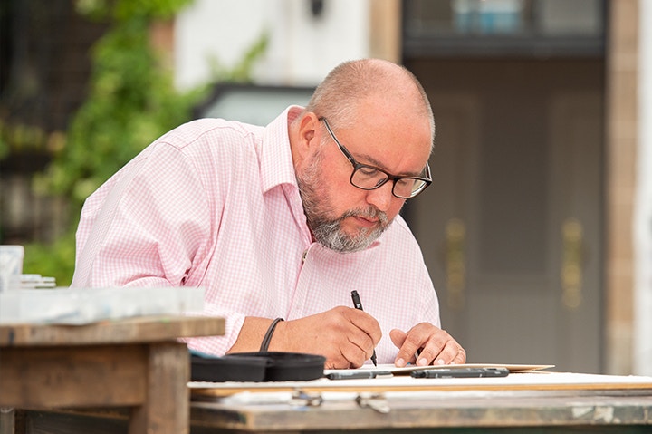
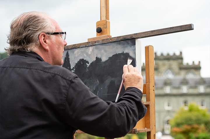
BRIAN RAMSEY - HEAT 3 WINNER
Brian was raised in South Shields and is now based in Darlington, he uses his background as an architectural technician and knowledge of buildings to inform his work in the urban environment.
Congratulations on winning Heat 3 of Sky Arts Landscape Artist of the Year 2018! What was the experience like painting at Loch Fyne?
I really enjoyed myself. I did some research and lots of practice before heading up to Inveraray. I didn’t know what to make of the white blanket we were presented with on the morning, but as the mist lifted and the rain abated, the landscape began to reveal itself. Getting the sky down first was a great relief and helped me to settle down and relax with my drawing.
You really captured the tranquil nature of the misty Loch – allowing the space on the page to speak as loudly as your gestures. Do you think that blank ‘breathing space’ on a surface is as important to a piece as the drawing/painting itself?
It’s easy to say yes now after hearing the judges’ comments, but I strongly believe in leaving space in a painting. I find drawing every leaf on every tree or even, every tree isn’t necessary, it’s not about documenting everything in front of you. I like to give the viewer the opportunity to fill in the blanks for themselves and engage with the painting.
You have a particularly delicate touch in your work, with fine lines overlaid with washes. Could you talk us through your process of combining these techniques?
Whether I am working en plein air or in the studio, I always start with a preparatory sketch. I think these sketches have a spontaneity which is not always present in the longer, finished pieces. The main purpose of the sketch is to resolve composition and trial colour application.
Using the sketch for reference as well as the view presented, I tend to draw everything in 0.05mm fineliner, then I add the watercolour in flat washes. I then go back in with a heavier fineliner such as a 0.8mm or even a fude or parallel pen to emphasise certain lines or edges. I will finish by emphasising shadows and features in watercolour.
When it comes to selecting materials that allow you to work in this way do you have any that you always turn to? For example a brand of pen for your mark making?
For prep sketches I use a Moleskine watercolour sketchbook, my favourite Kaweco Sports fountain pen with Kaweco water soluble inks in various colours, supported by a small travel palette of a dozen Winsor & Newton artist quality half pans.
For finished pieces I use 0.05, 0.1, 0.5 & 0.8mm Uni Pin fineliners and other pens such as a Sailor Fude 55, Pilot Parallel pens and the ubiquitous Lamy Safari.
I use Winsor & Newton and Daniel Smith artist quality tube watercolours and a beautiful Kremer Pigments palette of 14 monochrome colours ranging from Titanium White to Furnace Black.
My paper of choice is Saunders Waterford 140lb Rough. However, for Inveraray, I used a sheet of Arches 300lb Rough, which I will be using again and again.
I’m not very precious about brushes which, I know, will horrify most artists. However, I was kindly given a set of Cass Art sable brushes at Loch Fyne by Story Vault. I’ve been using them ever since and they are great.
LUCY SMALLBONE
Lucy studied at City and Guilds and The Slade, she has been awarded prizes including The David Ballardie Travel Award and the Duveen Travel Prize to Chernobyl. She has exhibited her work across London, including solo shows at The Space Station and Fiumano Clase.
Congratulations on being one of the winners Heat 4 of Sky Arts Landscape Artist of the Year 2018! What was the experience like painting at Studley Royal Park?
It was quite a surreal experience and stressful but also very fun. With the camera crew watching you and all the pressure it's really hard to speak in full sentences let alone paint anything! I was really glad that I had prepared loads of drawings to work from ahead of time otherwise I think I might have frozen up completely!
Your bold use of colour is quite something! During your heat at Studley Royal Park you utilised contrasts of blues, oranges and greens. Could you talk us through the use of colour?
I like to tint and change colours in my work to create atmosphere or to get a certain idea across. In my heat painting I focused on the contrast between the frozen white statues and the lush green around them, then by changing the colour of the statue I increased this tension enough to hopefully create something visually striking.
You pair your palette with a strong approach to mark making, using wide strokes to block out defined areas of space on your canvas – your compositions are as striking as your colours! How do you approach the spatial structure of your paintings?
I love paint and painting as a process, I hate to get bogged down in detailed painting and have no interest in making something look like a photo (just take a photo instead!) so I work by looking and reacting with marks trying to echo what I'm seeing or feeling in a space.
What is it about oil paint that you are drawn toward? Does the material have particular qualities that allow you to render your work in very specified ways?
Oil paint has a variety of textures and visual qualities that you can play around with, whether its oily transparency, dry scratches or opaque chalky blocks, this means you can describe and tap into different sensation and emotions visually. It just has so much to give, the more you learn the more there is to learn!
And do you have a favourite brand to use, for example Winsor & Newton or Michael Harding?
I love Micheal Harding oil paints as I love strong clean one pigment paints as I often thin paints out and hate my colours getting muddy!
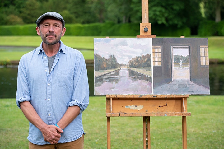
GREG MASON
Greg Mason is an Academician at SWAFAA (South West Academy of Fine and Applied Arts) he graduated from Saint Martin School of Art, and was a semi-finalist on Sky Arts Portrait Artist of the Year in 2017 and is the Cass Art Professional Ambassador for Oil Painting. He lives and paints in Devon, creating a mixture of figurative and landscape art.
Congratulations on being one of the winners Heat 4 of Sky Arts Landscape Artist of the Year 2018! What was the experience like painting at Studley Royal Park?
It was a dull, wet, overcast day – just typical of the Yorkshire I remembered from holidays as a child, but the sight of the iconic ‘Pods’ lined up waiting for us was so exciting – and as you stepped inside it felt strangely familiar from having watched the series all these years.
I remember saying to Tai Shan Shierenberg at the time - who asked me what I thought of the view - that it had everything but it also had nothing. The pods were placed in front of a complex network of carefully engineered 18th Century water features, ponds and gardens but there was no focus, no balance of perspective, no harmony to work with – compositionally it was a real challenge.
The relationships between interior/exterior and natural/manmade in your painting at Studley Royal Park is captivating. Despite the materials being very different there is a tonal quality that links the painting as a whole – the hues of the sky reflected in the water are echoed in your rendering of the floor tile.
Are these relationships something that interests you as an artist?
Whenever I’m painting, the resulting work is going to be the product of some key relationships and the more conscious I am as an artist of these relationships, the more interesting the work becomes for me. My submission was an internal landscape – the interior of an earthquake-damaged building in Farindola in Italy – a record of how nature impacts what is man-made. At Studley Royal, this was turned on its head as the landscape we were given was a classic example of how man had impacted nature – completely transforming it into something artificial.
In this kind of garden you are being manipulated by the designer to focus on an architectural feature or mock ruin, so I decided to paint a diptych with one panel showing what was in front of me and the other from a folly looking back towards the pods. I really wanted my work to go beyond just painting the view on its own, in order to say something about how I was experiencing the place and to extend the conversation about what plein air painting could be. Thankfully the judges really liked it and now I have a wonderful chance to paint again in the semi-final.
You use our Cass Art Professional Oil and Acrylics – what is it you love about the material?
I paint with all sorts of different brands – often taking far too much kit with me on location in relation to what I actually use. The Cass Art oils and acrylics have only been around for a short while – but I’ve used them on a number of large-scale projects with great results. On Landscape Artist you’ll see me using Liquitex Acrylics and Michael Harding Oils in the heat – and then Cass Art Acrylics in the Semi-final.
What are some of the essential items in your artist’s tool kit? Do you have a top 5 materials you simply cannot paint without?
I always carry a selection of paints so that I can do a quick tonal under-painting in acrylic before adding a colour layer in oil. This is mainly for speed, but my ‘can’t live without’ item is Liquin – an oil medium that helps the paint flow and reduces drying time. It lets me paint fast and energetically without building up too much thickness so that I can put layer upon layer until the work is resolved. My other essential companions are my set of ‘Rosemary Brushes’.
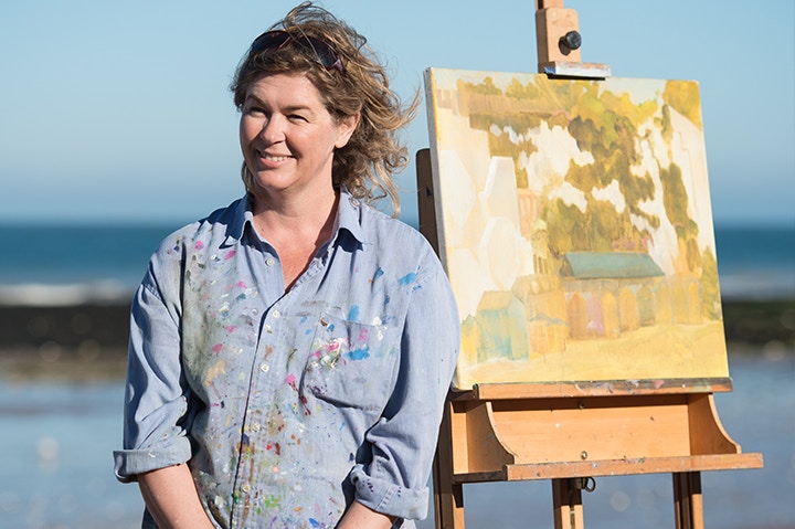
JEN GASH
Jen Gash grew up in Kent, she is a passionate painter, writer and speaker. As well as an artist she is a trained occupational therapist and coach, and uses the creativity needed in each dicipline to compliment the other.
Congratulations on winning Heat 5 of Sky Arts Landscape Artist of the Year 2018! What was the experience like painting at Broadstairs Beach?
It was a fabulous day, warm but not too hot. Travel there was tricky as I broke down and had to get the train into London and back out again to Kent. I decided to just enjoy the day and didn’t think about winning and didn’t look at anyone else’s work. I loved the crew and the chats with the judges and presenters.
Did it feel unusual to be painting so close to the sea but focussing your gaze toward the land?
No, I definitely didn’t want to do the harbour and boats – a bit too twee for me! The cliffs were interesting and the steps were weirdly abstract and that all intrigued me.
The palette in your heat painting focusses on yellows and greens, touched by gentle pinks and blues and contrasted by whites – it’s quite something! Could you talk us through your use of colour in the painting?
Um. I decided to under paint the whole canvas in mustardy yellow and then work in thinnish oil paint. My choice of colours is fairly unplanned and quite intuitive but towards the end of a painting it becomes more strategic once I know what the painting needs to make it work.
You use wide flat brushes in your paintings – what is it about these brushes you enjoy using?
Yes, I enjoy the wide flat areas they can create, without fussy marks. I also like the range of marks you can make with a flat brush – it’s much more adaptable than round heads or thin ones! I also like the robustness of flat brushes as you can be more vigorous with them!
ALLAN MARTIN
Allan graduated from Glasgow School of Art, since then he has worked as a graphic designer, a paint specialist and an illustrator. He has worked with bands such as The Psychedelic Furs and collaborated closely with Annie Lennox.
Congratulations on winning Heat 6 of Sky Arts Landscape Artist of the Year 2018! What was the experience like painting at Inveraray Castle?
Thank you. Painting at Inverary was a series of firsts for me: painting outside, with people watching, working to a limited timescale and of course being filmed and interviewed. So, the experience of the painting process itself was rather disjointed in how it flowed. That said, I started with a familiar process, taking photographs, montaging them to create a reference which I felt had interest. Then starting with rough brush marks to get tones on the surface, and continuing through the day finding details and observed moments to include.
Your painting of Inveraray Castle was a wonderful exploration of monochrome. What are some of the challenges of depicting landscape when working with a lack of “colour”?
Everyone is familiar with seeing monochrome photographs, they have a power due to lack of colour. I find this translates when painting in monochrome, there can be a clarity to what I look for, I see ‘colour’ in tones and nuances, so perhaps the real challenge is not to allow a need to introduce colour in these paintings, instead I explore subtle shifts and differences, discovering how minimal marks or subtle changes in tone can register visually. I am now exploring mixing my own blacks which offers more options than mixing a straight manufactured black with a white or grey.
The brushwork in your paintings has a brilliant texture, could you talk us through your mark making process? Do you find that working with a particular type of brush helps you achieve your desired finish?
I usually start a painting rather freely, using a fairly large brush for the scale of the work even in areas where I know detail will be required. Covering areas in this way starts a process that is open to change, allows chance and suggested possibilities for a different interpretation to evolve. Certain brushes allow this to happen more than others, these marks play their part in the direction I take as much as the surface chosen to work on. I have tended to favour black sable or mongoose hair brushes for a long time, now I include using hog hair and some low cost artificial brushes.
Our readers just love learning about what other artists are using. With that in mind what are the top five things that you always have in your artist toolkit?
For monochrome work, Vandyke Brown, Ultramarine Blue and a grey which I use initially for mixing rather than a white.
More generally a T-square and proportional dividers. I use grids and marks drawn into the paint, the t-square is also very useful to rest my hand on as I work, the dividers have as much use for mark making as for registering size or position.
CALL FOR ENTRIES
Feeling Inspired?
Dust off those paintbrushes and wipe off those palettes and get painting! If you need to top up your materials before you get going you can shop with us in-store or online, we have everything you need.

