
Sky Arts Portrait Artist of the Year Series 9: Heat Winners
29th Nov 2022
The heats are complete! And now the talented portrait artists are ready to compete in the Semi Final of Sky Arts Portrait Artist of the Year Series 9. It’s their chance to win a £10,000 commission to paint actor and broadcaster Sir Lenny Henry for the National Portrait Gallery in London, and win £500 of art supplies from Cass Art. We caught up with the artists to find out more about their experience of the show, their work, and the materials they can’t do without…
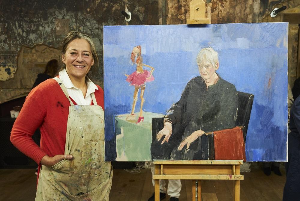
HEAT 1 WINNER MORAG CAISTER
Hi Morag, congratulations on winning Heat 1! This was your second time on Sky Arts Portrait Artist of the Year, having reached the Semi-Final in 2020, how did it feel to be back?
Thank you! Getting another chance on the show was such a privilege! I can't put into words how excited I was to be able to re-experience the joy of it again, I felt calm all day because I was just buzzing and humbled to be there.
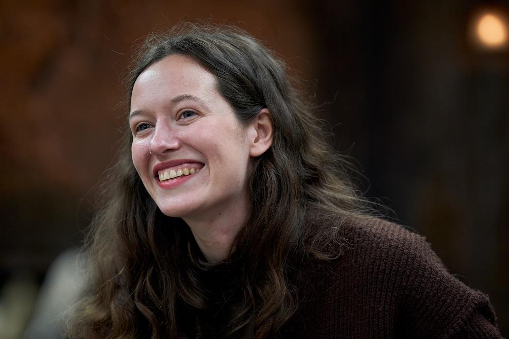
You painted podcaster and best-selling author Elizabeth Day who became emotional when she saw your finished work and chose to take it home! Your style is striking, with elegant lines almost drawn with oil, bold brush marks of faceted colour and large areas of paper left untouched or ‘unfinished’. How did you develop this style and when you’re not taking part in a timed challenge, how do you decide when it’s time to put the brushes down and stop?
I love drawing because it gives me this ability that I don't usually have, to summarise information quickly and let go of the excess stuff, it's such a good feeling - the fact that I'm able to do this in painting is quite exhilarating. I don't feel the need to always make the work completely refined because once there's enough information for it to say what I feel it needs to then it becomes a true reflection of what I'm seeing, and I like that painting can be a way to demonstrate different points of view.
In your heat you were deliberating over whether to use oil on paper or pastels on canvas. Those supports are not traditionally used for those mediums, what drives you to experiment with your materials and do you have any tips for artists who want to try something new?
Using soft pastels on PVA primed calico (or thin canvas) is so enjoyable because of the way the scratchy surface holds the marks and the pigment, it feels like half drawing half painting and you can do it so fast. I started using them because I'd been struggling with paint. I think when you're stuck you can start getting what you were trying to do going again by just grabbing something different to make it with and working it out with a fresh new/old technique. No matter what you use it will still come out with your style and feeling - when pastels started feeling tiring I was able to go back to paint! Paint on paper was a solution to not liking the texture of working on primed canvas, and I liked the way it didn't make me feel like I needed to paint the background.
What are your go-to materials for portrait painting?
I use Sennelier soft pastels and Michael Harding oil paint. They're expensive but so beautiful and the paints last a really long time compared to other brands so I think it works itself out. I find transparent oxide red is such a subtle colour to build that natural warmth that's in all skin tones. Also Cass Art own brand fixative doesn't change the colour of the pastels.
Thanks Morag! See more of Morag’s work at moragcaister.com or @moragcaister on Insatgram.
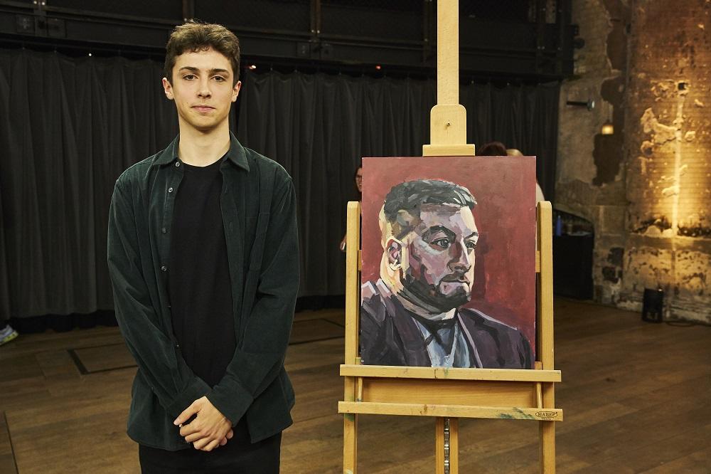
HEAT 2 WINNER NOAH RUSH
Hi Noah! Congratulations on winning Heat 2! How did you find the experience of painting a celebrity in front of the cameras and judges?
Thank you! It was a very full-on experience, the making of the show isn’t as streamlined as the finished program makes it seem – there were constant interruptions from the crew doing mini interviews throughout, which made it difficult to get into the flow of painting. It was a lot of fun though, great to meet all the other artists and share such a strange and exciting experience with them. It was really funny getting there and all the crew already knowing my name, I guess they had done their research, I felt like a proper little celebrity.
You painted comedian and presenter Alex Brooker, and you started at quite a pace, quickly blocking in tones and the composition with thin layers of acrylics and moving on to oils later. You managed to capture the light with purples and highlights of light yellow. Can you talk us through your process and colour choices?
I don’t usually use acrylics, but decided to for the show as they dry quickly and we had a fairly short time limit. I layered oils over the top because of the richness of colour and honestly I just like how they feel to paint with. When choosing which colours to use with each brushstroke I tend to slightly exaggerate the colours I see in real life, but this doesn’t always work out, it can be slightly jarring if I emphasise the wrong colour too much. I struggle with mixing colours if I’m honest, mixing colours true to life is one of the trickiest parts of painting for me.
Judge Tai Shan Schierenberg remarked on how your portraits feel monumental in the way they occupy space. How do you achieve that in your work?
I don’t know how that happens! I just paint what I see and whatever it ends up looking like is as much a surprise to me as it would be anyone else. I guess you’ll have to ask Tai!
What materials would we find in your studio and are there any colours you simply can’t do without?
I use a double primary palette, with a few other colours as and when I need them. I feel like I can mix pretty much any colour I want using this method. I usually buy the cheapest paints I can find but have been investing in some more expensive oils recently, and it really does make a difference! The colours don’t dull when they dry as they often do with cheaper paints. I have a problem when it comes to paint brushes though – I can’t stop buying them! My collection is unnecessarily big at this point, and still growing.
Thanks Noah! See more of Noah’s work @noahrushart on Instagram.
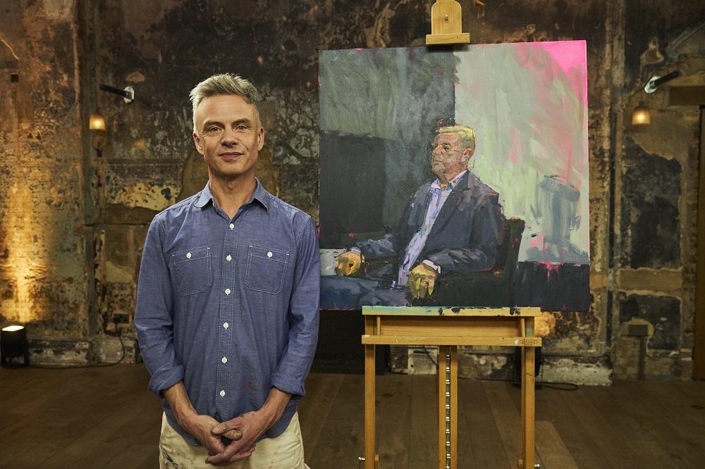
HEAT 3 WINNER TIM TOZER
Hi Tim! Congratulations on winning Heat 3! How did you find the experience of painting singer-songwriter and musician Suggs in front of the cameras and judges in just four hours?
Taking part in Heat 3 was an exciting and overwhelming experience. When you arrive on the set, it takes a while for the reality of the situation to sink in – it’s quite dreamlike to be inside such a vicariously familiar space. Discovering that our sitter was going to be Suggs felt like an amazing stroke of luck; a music icon who provided the soundtrack to a key part of my youth. He’s an imposing bloke and was a great sitter – fully engaged, focused and funny. The set worked, his suit worked and most of my nervousness had been burned away by the time we were allowed to start painting; the pieces fell into place and the time evaporated even more quickly than I expected, even with all the interruptions that are part of making a TV programme. It helped being surrounded by a group of such affable and talented artists too.
Your submission piece had a filmic quality to it, the composition was full of energy and movement, even in the more static pose you captured of Suggs, you created movement within the different tonal values in the background. Can you tell us how you make those all-important compositional choices to evoke a sense of space?
Even though Suggs took quite a regal pose, he was full of latent energy that filled the space around him. I wanted to engage with this space, which was defined by his relationship to the dramatic geometry of the set; the proportions of light against dark were stark and grand, and my composition was an attempt to describe that perceptual experience. The distinctions in painting – between sitter and background, colour and drawing, composition and likeness – are often misleading; I think I’m only painting successfully if I can’t tell where any of these end and another begins.
You used a vibrant neon pink for your ground and red and green lines to add structure to the face, can you walk us through your palette?
When I use acrylic, I find that it’s quick-drying properties allow me to start with almost arbitrary decisions – hues that might resist what I’m trying to get them to do, hence the neon pink ground colour. I brought a large range of tubes to choose from on the day, thinking I would reduce down to what I needed as the session progressed. As a rule, I try not to mix much, preferring the crispness of colour as it comes out of the tube; for this reason, I have lots of pale hues (naples yellow, titanium pink, ultramarine blue light, etc.) which allow me to avoid white, plus mid-value warm hues (yellow ochre, mars orange, etc.) which I used a lot for Suggs’ head. The colour of skin is always fascinating, but I’ve never thought of it as an issue separate from the rest of the painting. The energy of saturation, modulated by clear value structure and compressed inside larger areas of neutral colour, was what I was interested in exploring as the painting progressed. I think this is true of a lot of my work.
Can you tell us about the tools you use for painting? I noticed you were using a protractor to create straight lines, what are your go-to supplies in the studio and do you have any top tips for painters?
I like to use tools that provide a range of marks in the painting and also make clear the process of making it. The protractor gives a line with a different kind of speed and exactness than one made freehand; an edge made with masking tape has a precision that contrasts completely with a brushed one. The surface gets pushed in different directions, forcing me to reconcile these differences or celebrate them. I hope this provides a tension in the surface that evokes the kind of active seeing one has to engage with when painting from perception. I brought a paint roller with me on the day too, but chickened out of using it in the end – my only regret! As far as paint goes, I use multiple brands; great dense acrylics like Lascuax, cheaper but decent quality ranges such as Liquitex Basics, and Golden, which always work as you’d expect. The mix of high and low-end pigmentation and opacity add an unpredictable edge to a medium that can get too safe too quickly. If I had any tip, it would be to take all advice with a grain of salt until you prove or disprove it in your own practice.
Thanks Tim! See more of Tim’s work @tim.tozer on Instagram.
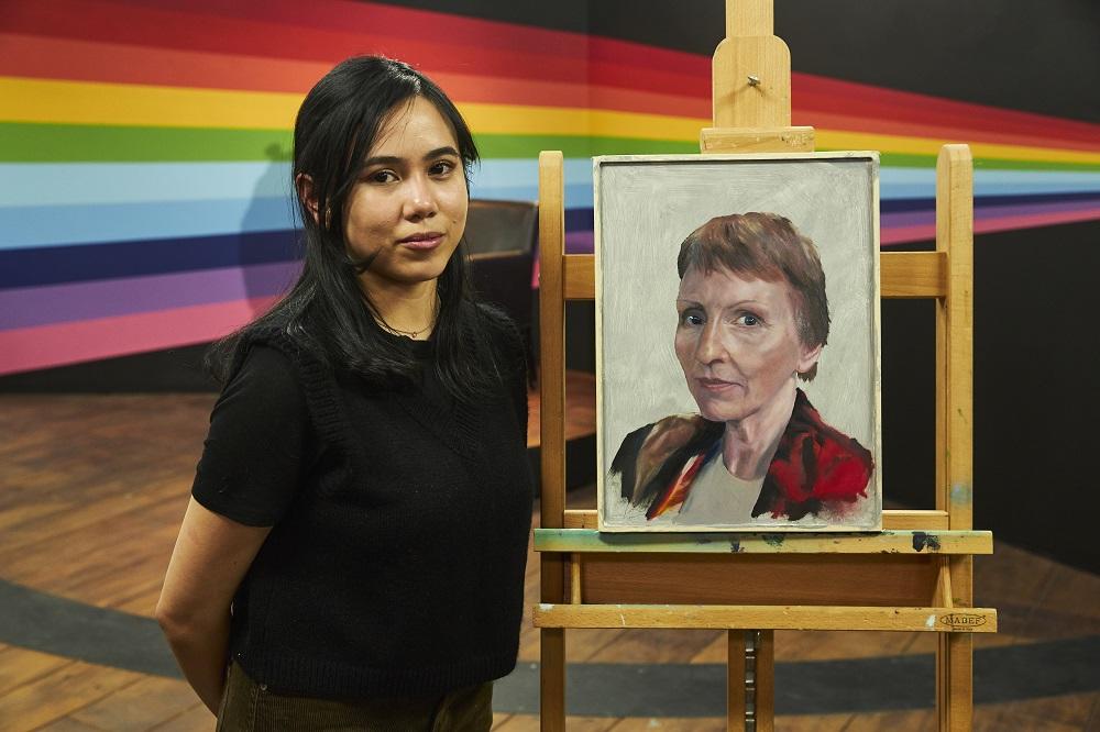
HEAT 4 WINNER KEREN GOLEA
Hi Keren! Congratulations on winning Heat 4! How did you find the experience of painting astronaut Helen Sharman in front of the cameras and judges?
Painting Helen Sharman live was such an incredible experience. The set was popping with colours making the ambience more vibrant and fun despite the nerve-wracking time limit we had to finish our portraits. I actually didn’t really mind having cameras everywhere as the crew were really supportive on what we’re doing, they also make sure to guide us throughout filming. Also, I find it entertaining and helpful talking to the judges and the crew while painting as it helps me calm down, adjust my pace and see another perspective outside of mine.
You managed to capture Helen’s likeness with a particular focus on the direct gaze of her eyes which draw you into the painting. How to you create that connection with the viewer?
Every time I paint, I always start with the eyes. The eyes for me are like the gateway to a person’s soul and it is the foundation of my painting. I make sure that I get the eyes accurately and take my time for this specific area. I make sure not to get too excited or overwhelmed when painting the eye because it’s so easy to be tempted to start painting all the other parts of the face. On Helen’s portrait, I believe I spent about 40mins just doing the eye area and that time helped me significantly in building on the other parts of the portrait.
Your submission piece took you 200 hours to complete, how did you rethink your process to create a successful painting in just four hours and has it made you adjust your process outside of the competition?
With the way I paint, I thought it was almost impossible for me to finish a portrait in four hours so I challenged myself to finish a portrait in 3 hours, giving myself allowance for preparation and finalising the portrait, and practiced almost every day for 3 weeks before the heat. I managed to get the timing that I wanted and studied what else needs improvement and what unnecessary painting habits I need to omit when doing a painting on a strict timeline.
What are your favourite art materials for portraiture, and do you have any tips for creating work in a photorealist style?
I love using oil paints for creating photorealist portraits. I can say Winsor & Newton is a great and versatile brand for painting but my favourite oil colours would be Michael Harding. I love the colour selection on these brands and the texture and consistency of the paint is just superb! Oil mediums that I would recommend would be Winsor & Newton’s Liquin Fine Detail and Liquin Original & Gamblin’s Gamsol for solvent. Without all these materials, it would be hard for me to achieve a photorealist painting.
Thanks Keren! See more of Keren’s work at kerengolea.bigcartel.com or on @kerengolea Instagram.
HEAT 5 WINNER BINNY MATHEWS
Hi Binny! Congratulations on winning Heat 5! How did you find the experience of painting in front of the cameras and judges?
Thank you so much. I’ve had a little bit of experience with BBC’s ‘Star Portraits’ and Channel 4’s ‘The Big Breakfast’ which helped me to know what to expect on the day. As a consequence I felt quite calm. The Storyvault crew were amazing - so thoughtful and enormous fun. What you don’t see in the cut version of the programme is the crew and me splitting our sides with laughter! I would highly recommend it as a thoroughly entertaining day out. I don’t have a TV so I had no expectations when it came to the judges. I did think, on meeting them and hearing their opinions, that they really knew their stuff. They were all very friendly. I had the most engaging conversation with Tai Shan Schierenberg which was too long to include in the programme. It was basically about how to use the paint abstractly to describe a narrative. It took a bit of getting used to, but I wasn’t allowed to ‘talk to camera’ rather I had a conversation with the Director standing just to one side of the camera; the Director all the while pulling encouraging faces and miming. Throughout the competition there was a timelapse camera clicking away behind me. I dealt with this potential distraction by plugging myself into some ambient music. As far as painting in front of the judges was concerned, I didn’t find this particularly distracting. After all, painting a subject from life necessarily means that there is someone else in the room. I always allow my sitter to witness and discuss the progress, so they feel very much part of the whole experience.
You were tasked with painting former Director General of MI5 and thriller writer Dame Stella Rimington. You captured her likeness quickly, portraying her thoughtful expression perfectly. What are your top tips for capturing a likeness in portraiture?
Gosh. Good question. I spent a long time just looking at and getting to know Dame Stella’s face; noting the relationship between the features and forms. I would recommend not rushing in. Look, look and feel. You’ll remember I didn’t do much painting for about 2 hours. This is partly because I was getting to know what it was about Stella that made her unique. I looked at the way she possessed the space she was in and the tilt of her head. I looked at the asymmetry in her face. I would have loved very much to have chatted with her; she must be the most fascinating woman. However subjects curiously reveal their truth regardless of whether they are talking. Armed with this information I could paint fast and with clarity. I think with a clear idea one can put the marks down more accurately without having to go backwards and forwards. This of course makes for a freshness in the portrait. I intuitively felt that Stella should be painted with a lightness of touch.
You were very ambitious, working at quite a large scale given the time constraints! You began by gridding up the canvas – creating an ‘underlying scaffold’ on which to work, and mapping out a compelling composition. Can you talk us through your process from start to finish?
You know what they say?… Big canvas - big brush. It really doesn’t take long to cover a big area with paint. Think house painting! I tend always to paint fairly big. I feel comfortable painting at that scale. Because of the scale I find it essential to divide the canvas up with a grid. Perspective can play tricks on you. This is particularly the case with a very tall canvas - the bottom half diminishes when one is standing close to the surface. The same is true if the model is standing very close to the painter. The center and the central division are very important to any rectangle (including squares) compositionally and geometrically. When this is established I can then decide if I want to go with the stability of this innate structure or mess with it. To mess with it can create tension and unease. In my painting of Stella I used this device in the final rendering. I put a horizontal line either side of her head to act as a sort of ‘washing line’ from which I ’hang’ her head. This device prevents her from slipping off the bottom of the painting.
What art materials would we find in your studio, do you have any favourite brands?
I am very fond of my big wooden palette which used to belong to the painter Henry Lamb (Modern British). It was given to me by an elderly friend who was cleaning out his studio and knew Lamb. I noticed very early on in my career that student oil colour has very little pigment compared to artist oil colour like Michael Harding or Winsor & Newton. It seemed to me essential to spend the money to make better paintings. The same too goes for my brushes. The best ones I find are Rosemary brushes. I do not use any mediums - just turps. If I’m feeling really rich, I use fine Belgium linen canvas. I prime this myself with rabbit skin glue. The process of heating it up and applying many layers takes days but it is worth it. The linen colour is a mid-tone which means that when the colours first go on they maintain their integrity. To paint on white for example poses a problem; colours appear darker by contrast. Later on in the painting when much of the white canvas has disappeared, those very early colours will have changed their tonal value. Nightmare!
Thanks Binny! See more of Binny’s work at binnymathews.com or @binnymathews.artist on Instagram.
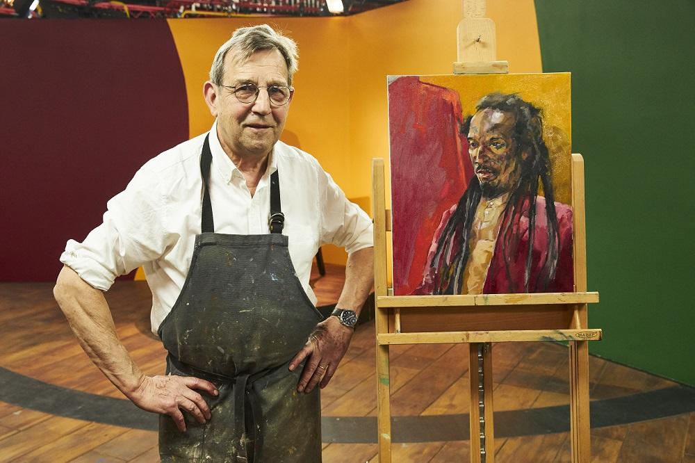
HEAT 6 WINNER OWEN LENNOX
Hi Owen! Congratulations on winning Heat 6! How did you find the experience of painting poet, novelist, musician, actor & activist Benjamin Zephaniah in just four hours in front of the cameras and judges?
I was very pleased that l got to paint Benjamin Zephaniah he has a great presence and good bones. I often paint plein air so I'm used to painting in front of people who invariably talk to you. Four hours isn't long, therefore I made several portraits in preparation for the heat. I knew what size and shape I could handle in that time frame, so I wasn't particularly concerned. Having watched PAOTY since it began I was aware of the format and the judges. So for me it was just a case of getting on with it because overthinking it could be my downfall! It was nice to meet and talk with the judges in real life after watching the show over the years!
Your submission piece pictured yourself with a wrench, and similarly to the piece of Benjamin, featured facets for colour giving a sculptural quality to the way you moulded the form. Can you talk about the way you approach depicting three-dimensional form in your paintings?
A successful painting, for me, hangs on the drawing. The drawing is the solid foundation whatever medium you use. Light creates form and the light that comes from the subject is either highlight, mid tone or shadow. That's how I mix my paint. Because I understand the bone structure under the skin, I am able to build up the form using the variations in the light. The direction of the marks also helps in making the shape of the head. Anders Zorn was a Swedish portrait painter who only used black, white, yellow ochre and vermillion. I decided to adopt this palette for PAOTY, to keep the painting simple and direct. I used the same palette on my submission. Because I used the same palette for the wrench and the self-portrait in the submission I believe it made for a more cohesive painting.
You were previously a teacher and have taught art for over 30 years! What are your top tips for people learning to paint?
As an art teacher I wanted to make lessons fun but curriculum pressures and exam results can make that balance tricky. There are no rules in art, but you have to know the basics. So I taught them in rules of three:
- Draw out
- Block in
- Finish off
- Foreground
- Middle ground
- Background
- Highlight
- Mid tone
- Shadow
- Eye
- Hand
- Brain
I try and guide students to draw what you see not what you know, to leave out never add. Most of all, enjoy making art.
You began your painting of Benjamin by using pastels over a mid-tone ground. What are your preferred art materials for portrait painting and why?
My prefered art materials for portraits are, Winsor & Newton artist quality oil paints on panel. I use pastels for Benjamin as they can give wider marks for plotting the drawing. I fixed the pastels with fixative so it didn't contaminate the oils. I think people can have an expectation of how an academic portrait should look. Oil paints are not used in a secondary school setting for various reasons although I did teach it in the upper school. I like the smell, the feel and the texture of oil paint. It's a very flexible medium you can use it thin or fat, rub it out, or scrape it off, move it around paint over it. I find the aesthetic look of it lush. It has a ritual that is very satisfying to me.
Thanks Owen! See more of Owen’s work @owenlennox50 on Instagram.
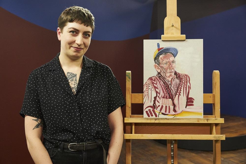
HEAT 7 WINNER JUDE WAINWRIGHT
Hi Jude! Congratulations on winning Heat 7! How did you find the experience of painting Stand-up comedian Henning Wehn in front of the cameras and judges?
Hello! Thank you so much, how surreal!? Henning was a charm, I couldn't have asked for a better sitter. Not only did he suit my style with his characterful face but he sat so incredibly still for hours, which is very hard. Painting in front of the cameras and judges though was beyond terrifying, I’m never normally one that likes to show my work in progress so having to show my working from start to finish to a room full of people felt extremely raw and exposing. Plus answering questions all about how I thought my work was going was quite tough because honestly, I didn't believe it was going well at all! I went along to the day feeling like I was about to be ‘found out’ as a fraud or something as I’m quite an anxious person, but it was much the opposite. The whole program is so well done, so incredibly warm and encouraging. They obviously care so much about art and artists, the judges comments will stay with me for life I feel so lucky to have had this experience!
Your submission piece was a very small-scale self-portrait with an intense expression. You managed to capture a similar intensity in your piece of Henning too. He has a distant gaze which is compelling yet hard to read. How important are the facial expressions in your work and what do you hope they convey to the viewer?
Yes I remember the day I painted that self-portrait I was quite anxious so I imagine that’s why the same came out in my Henning portrait! I paint a lot of portraits, self-portraits especially and facial expressions are key to me. I like to think of portraits as a snapshot of time, like diary entries and without the use of words an expression can say so much. The eyes are very important to me, I could spend hours on them, they are windows. I believe If I can master the expression in someone’s eye the whole painting will come together. Part of my practice is a way of casting something out, putting it on canvas so it’s not inside anymore, an exorcism of ‘feels’. It’s my hope that by being able to convey a feeling to the viewer through expression, they can truly understand the piece and connect with it and me.
Your brushwork is very stylised, you find shapes and trace them out with the brush in lyrical marks. Every brush mark feels important, and you can feel the enjoyment in each one when looking at the painting. How did you develop this style of working?
Oh thank you, well my style of painting has taken years of evolving really, it used to be much more loose and impasto and it’s only recently my work has become so much smaller and intense. I used to throw paint on with much more abandon and now I really think about the impact each stroke will have. I prefer to keep each stroke separate from its neighbour, sculpting the face with medium, giving each area the voice it deserves. I hope by this bold use of mark-making I can convey expression, emotion and character much more successfully, adding a little extra soul into the subject.
You began the piece by drawing in blue pencil on a linen canvas with a clear ground. What are your go-to art supplies for painting?
Oh the blue pencil was suggested by a friend, I used to use charcoal to draw out my initial lines but it used to affect the pigment of my paint so much I had to stop. I prefer working on a rough canvas, something with bite and a hard back like a board. I like to use rabbit skin glue as my ground too as it preserves the rough canvas texture and I like to see the weave beneath the strokes. I almost exclusively work in oil paints, with a good amount of turps. Recently I’ve been preferring Michael Harding paint in just a basic palette, plus I have a wonderful Old Holland ‘Persian Red' which I’m obsessed with, although it’s VERY pigmented so beware. Rosemary & Co. brushes are my favourite, I seem to collect filberts and spotters from them, you can never have enough!
Thanks Jude! See more of Jude’s work at judewainwright.com or @judewainwright_ on Instagram.
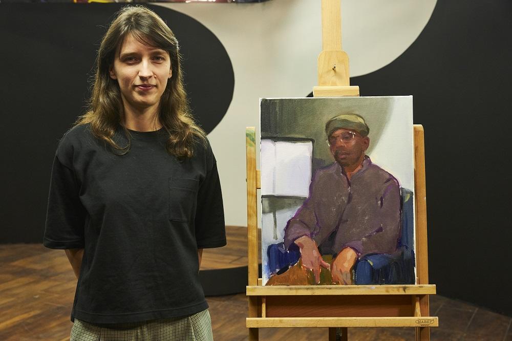
SELECTED ARTIST - NINA RUMINSKA
Hi Nina! Congratulations on making it through to the final! You took part in Heat 5 which was won by Binny Mathews, but the judges enjoyed your work so much they invited you back for the semi final. That must have been a big surprise – take us through your feelings.
It was just after the heat, I was back in Ireland, celebrating my little tv appearance with close friends, when I got a call from the production - the judges liked my work and wanted me back - I was over the moon! It was quite short notice, and the following day I was moving houses - it was all-go! But I thought to myself “you only live once” - and a few days later I was back in Battersea London for the semi-final.
How did you find the experience of painting musician, producer and composer Alexis Ffrench in just four hours? Can you walk us through your process on the day?
Alexis is such a wonderful soul! It wasn’t caught on camera, but we had so many lovely chats, the interaction was great. He was also a very generous sitter, very calm, and still. I enjoy painting from life so that was a huge help. I followed my usual process of establishing the composition, big shapes and big colours first - sometimes a little sketch may help, which I did before moving onto a bigger canvas. I probably spent a bit of time trying to describe the silhouette of each shape, for me portraiture isn’t just painting a face, it’s about creating a well-balanced image first, an interesting arrangement of shapes, creating a beautiful relationship between them - I’m probably thinking of it in an abstract art category. Everything else - details, textures are just vibrations of colour.
There’s a beautiful softness to the way you apply paint, you manage to describe a lot with very few brush marks. How have you developed this style over time?
My style is probably a combination of many hours put into painting over the last few years and some art influences. I generally love strong sense of colour in art and loose mark-making, so naturally, paintings that I look at and analyse shape the character of my art. I’m currently in phase of rediscovering my own roots - I’m fascinated by Polish painters of the 19th and early 20th Century - Jan Stanisławski, Józef Mehoffer, Olga Boznańska, Mela Muter - just to name a few. When it comes to European art, I absolutely adore French expressionism - André Derain, Édouard Vuillard, Maurice De Vlaminck.
What art materials would we find in your studio, and do you have any tips for aspiring portrait painters?
I generally try to keep my art gear very simple - less options makes you happy! I’ve collected many tubes of paint over the years, so I rarely buy paint these days, but when I do I choose good quality, heavily pigmented paint like Old Holland, Michael Harding or Winsor & Newton. I usually try to go for whatever is available locally. When it comes to brushes, I like soft, long bristles - sometimes even watercolour brushes are used! Odourless turps or Zest It, linseed oil and damar varnish are my mediums.
Tips for aspiring portrait painters: paint everything, all the time, never stop! Paint landscape too! I find painting quick landscape studies very useful - they help me loosen up, understand colour better and all the insights can be easily translated into portraiture.
Thanks Nina! See more of Nina’s work at ninaruminska.com or on @nina_ruminska on Instagram.
Feeling inspired?
If you think you’ve got what it takes to become the next Sky Arts Portrait Artist of the Year, the deadline for entries for Series 10 is Friday 24th February 2023. Find out more and apply at skyartsartistoftheyear.tv/portrait. Good luck!
Image credits: Photography © Sky Arts, paintings © Storyvault.

