
Sky Arts Landscape Artist of the Year Series 9: Meet the Artists
Posted by Cass Art on 27th Feb 2024
Sky Arts Landscape Artist of the Year Series 9 has transported us to incredible locations, as talented artists from across the UK sharpened their pencils, primed their canvasses, and prepared to compete to be crowned Landscape Artist of the Year. Cass Art has supported the show since it began in 2015, supporting all participants with art materials throughout the competition.
The artists are challenged with just four hours to capture scenes from Liverpool to Hever, all under the watchful eye of judges award-winning artist Tai Shan Schierenberg, independent curator Kathleen Soriano, and art historian Kate Bryan. All this for the chance to win a £10,000 commission for the Science Museum celebrating the Orkney Islands and their key role in the sustainable energy revolution, plus £500 of materials from Cass Art. 50 additional artists painted along at each location in a bid to be chosen as a wildcard winner and be in with a chance of receiving an invitation to compete in the Semi-Final.
We caught up with the heat winners and wildcard winners from this series to discover the materials they love to use and their experience of the show.
HEAT 1: DUNNOTTAR CASTLE
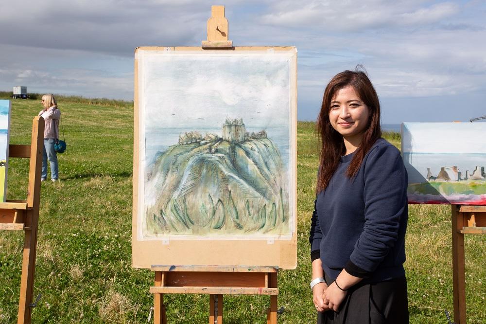
WINNER - KRISTINA CHAN
Hi Kristina, congratulations on winning Heat 1 of Sky Arts Landscape Artist of the Year Series 9! What was the experience like?
Winning Heat 1 of Sky Arts LAOTY was a surreal experience. Dunnottar Castle was a stunning location for the challenge. As a printmaker, bringing my practice out of the studio and into the pods was another big consideration. I loved watching the weather change, reacting and adapting to all these conditions in situ. I’ve never done anything like it before and found it really inspiring.
Your submission piece was an atmospheric image of the Australian bush. The piece you made of Dunnottar Castle also had an other-wordly quality, and the judges enjoyed the ‘strangeness’ of the work. Do you always try to convey an ethereal quality in your landscapes?
‘Strangeness’ was the word of the Heat. Landscape for me, holds this incredible ability to have the past and present collide in the same space. If we look close enough, we can see how history has carved its way through the soil, water has split rock or affected elevation. How we translate this as artists is half the fun. For Dunnottar Castle, I was hit with an immediate sense of history and stillness. We spend so much time moving and scrolling, this stillness becomes ‘strange’ or otherworldly.
You used a multitude of media on your piece, mapping out the composition in coloured pencil, pressing ink over the drawing and worked back into the piece with paint and markers. Can you walk us through your process?
My process has always been very multi-disciplinary. I began by sketching out the scene. Usually, I’d then take the work over to the printing press and mono print different layers of background colours into the work. The wind on the day made this really difficult. I had to adapt and began to paint instead. I painted in thin washes of oil paint before drawing back into the work with coloured pencil, solvent pens and oil pastel.
If we rummaged around in your studio, what art supplies would we find and have you got any top tips for mixed media artists?
A rummage around my studio would reveal some interesting finds I reckon! I rediscovered my love for watercolours. I have a few sets of Winsor & Newton watercolour sets and tubes. I also have my favourite mess of Holbein oil paints from when I first began to paint, I take them with me everywhere. Copic pens and Derwent pencils are also an essential part of my artist’s tool kit.
Thanks Kristina! See more of Kristina’s work @kristina_chan_ on Instagram.
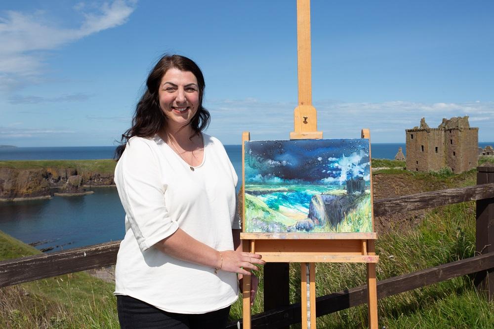
WILDCARD WINNER - REBECCA PATTERSON
Hi Rebecca, congratulations on being selected as the Heat 1 wildcard winner! Tell us about your experience on the day.
Being a wildcard at Dunnottar was such a wonderful experience. I was so lucky that the show was filming so close to where I live, I was delighted to get a spot at the wonderful castle. The day was glorious, which I’m so thankful for as I didn’t fancy being on a cliff top in wind and rain! I was there with my artist friend who also got a wildcard spot, we thought it would just be a nice day of painting, lunch and soaking up the atmosphere, I couldn’t believe I was actually chosen as the wildcard winner! There were so many incredible artists and it was great chatting together and seeing what we were all creating, artists had come from all over the country to be there, such a diverse mix of people, materials and styles. It didn’t feel too pressured and it was lovely to speak to the public - who had lots of questions for me.
The judges loved the atmospheric scene you created, how important is narrative and atmosphere in your landscape paintings?
Narrative and atmosphere are at the forefront of my work. I love drama! Even my calmer scenes all have something expressive in them. Most of the atmosphere I get is in the skies, I’m so inspired by the ever changing light and colour we get in this part of the country. My materials and processes also lend themselves to organic and interesting effects, it’s taken me years to try to utilise them together to create finished, coherent pieces! I tend to work in a lot of layers which build up and create fragments of history which also convey narrative. I love to work with Brusho, which are jewel tone watercolour pigments, these being so bright and deep lead to vibrant and contrasting works when used. I also love carandache Neocolor 2 water soluble crayons, the colours are so lovely and you can get brilliant effects with them too.
You mentioned you used ‘Brusho’ to create the scene, and that it tends to do its own thing. Can you tell us more about how you worked with the medium on the day?
Brusho is dry powder watercolour pigment and comes in small pots. There are a range of different colours, each one made up of several other colours, a bit like fabric dye. When sprinkled on a wet surface it disperses, you can treat it just like watercolours. Depending how much water you use will determine the effect you get. It can be a bit tricky to work with, especially en plein air! I was so lucky it wasn’t windy on the day or I’d have lost so much of it and the colours would have cross contaminated on the pre wetted canvas board. To get organic effects I tend to overlay some cling film so the pigments get trapped in the veins, it gives beautiful wave patterns. I knew I had to use this technique for the sea at Dunnottar. I always start with a quick sketch, then I set about with the sky. On the day I had planned to paint over the pigment but it had settled so lovely I decided to just leave it, even though it was dark and stormy looking! I then work from back to front to help with perspective, usually finishing with some acrylic paint and Neocolor for detail and definition.
What are your other go-to art materials that you simply can’t do without?
As a mixed media artist I use so many different things, usually altogether in layers! My must haves are of course Brusho by Colourcraft Ltd, Neocolor 2 Aquarelle crayons by Caran d'Ache, acrylic paints by Daler Rowney, System 3 and Sennelier. I love titanium white dry pigment by Sennelier and I do my dispersed effects with Zest It brush cleaner. I work on canvas boards from Cass Art or Winsor & Newton and sometimes on white rag Khadi Paper sourced from Cass Art also.
Thanks Rebecca! See more of Rebecca’s work @rebeccapattersonartist on Instagram.
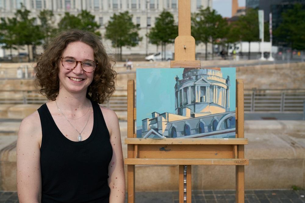
HEAT 2: LIVERPOOL ALBERT DOCKS
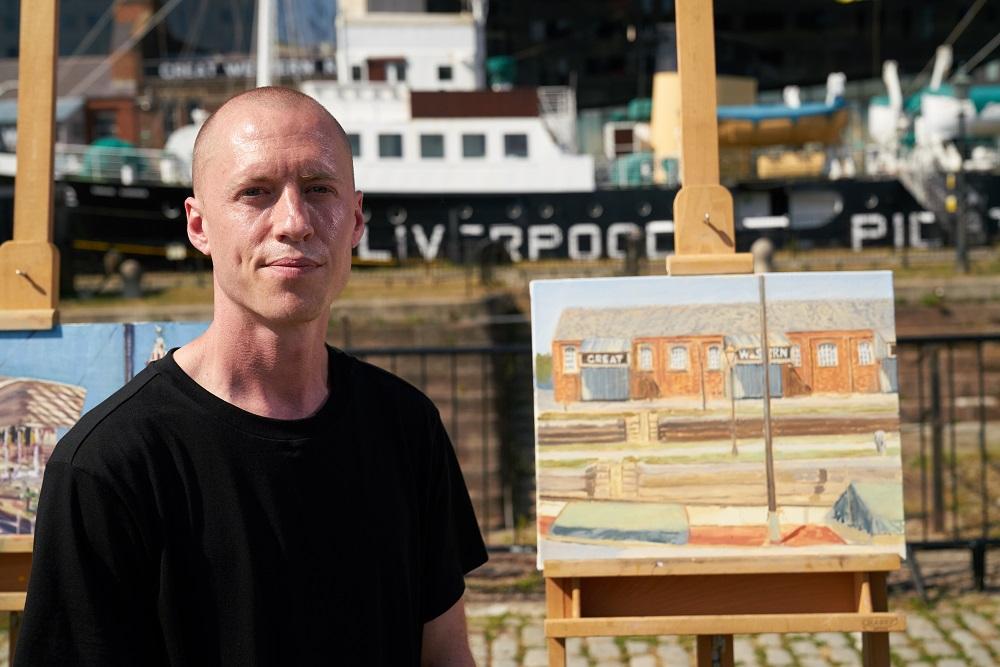
WINNER - WESLEY SMITH
Hi Wesley, congratulations on winning Heat 2 of Sky Arts Landscape Artist of the Year Series 9! What was the experience like?
The experience was completely new for me, I’ve never done anything like it before. It was nerve wracking on the days leading up to the heat. I practiced painting outside every chance I got because I didn’t think I was good enough. The night before the heat I hardly slept. On the day everything seemed busy and organised, as though there wasn’t time to be nervous anymore. I had runners checking on me as I worked and that amazing pod to paint in. I felt so well looked after, I really enjoyed it!
You were selective in the composition, editing down the busy Liverpool Albert Docks skyline to focus on the old Great Western Railway building. What was it about that particular building that interested you?
That composition came to me when I stood in that pod. There was so much to see and choose from. I noticed that the Great Western Railway building and the boat parked in front had a vintage look, so I decided to focus on that. Everything in the foreground looked great and helped to create some depth. I also loved the letters on the railway sign.
The piece had a charming filmic quality, with Wes Anderson-like perspective. Your submission piece was a nocturnal street in Brighton during lockdown, full of atmosphere. How important is narrative to you in landscape painting?
When I paint a landscape I’m attracted to the light and colour first, so the composition is most important. I focus on the style and character of the scene and include a lot of detail. Maybe that’s where the sense of narrative comes from.
What are your preferred art materials when painting landscapes?
I paint with; Daler Rowney: Acrylics, Georgian oils and brushes, Winsor & Newton: Oil paint and solvents and Cass Art Oil paint, brushes and canvases.
Thanks Wesley! See more of Wesley’s work @wsmithart on Instagram.
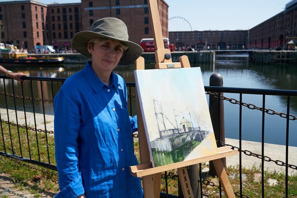
WILDCARD WINNER - SUE BILLINGS
Hi Sue, congratulations on being selected as the Heat 2 wildcard winner! Tell us about your experience on the day.
Thank you. The day started by registering at 7am then setting up looking across to docks, there was a lovely atmosphere - lots of camaraderie amongst the wildcards. Winning was a huge shock I was lost for words.
With so much to choose to paint from, how did you decide on the composition for your piece?
It took a while to decide what to focus on. I did a few sketches in charcoal looking directly towards the dock - too many bricks and windows, I finally settled on painting the swing-bridge in portrait which was much nearer so I could see more detail. The little building and stonework were almost monochrome so together with the muted sky gave the painting a moody feel.
The judges were charmed by the romantic mood in your piece and the reflections you captured in the water. Can you describe the painting techniques you used to do this?
I went straight into drawing on canvas with charcoal working quite fast, I then used acrylics to over paint leaving some of the under-drawing visible particularly the out of focus ironwork, the paint was built up in layers - the hot day meant it was easy to make changes (it was drying on the brush) I added the floating vegetation and reflections in the foreground to give some perspective.
What are your go-to art materials when painting outdoors?
My favoured acrylic paints are Liquitex heavy body, it has good consistency with intense pigment. I tend to draw with charcoal and graphite sticks.
Thanks Sue!
HEAT 3: HEVER LAKE
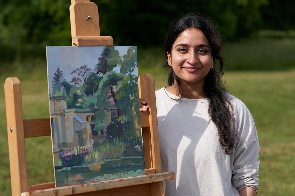
WINNER: DEEPA GOSWAMI
Hi Deepa, congratulations on winning Heat 3 of Sky Arts Landscape Artist of the Year Series 9! What was the experience like?
It was honestly surreal! Definitely a once in a lifetime moment. I was very very nervous, less
worried about painting and more worried about staying calm under so much pressure. I hadn’t been painting much over the past year so I was a little out of practice, and was as intrigued to see what I would produce at the end of the day as probably everyone else in the audience! The location was absolutely beautiful however, which really calmed my nerves, and I fell in love with it as soon as we were taken to the pods. I couldn't have asked for a better location, it was perfect! The crew and contestants made it such a pleasant environment to work in, I really enjoyed the day.
Your submission in gouache was an interesting interplay between nature and the built environment. Did the landscape and loggia at Hever play to your strengths?
I love observing and painting buildings, especially textures of stone and brick, so I was really
glad to see the loggia, even though you could only see a glimpse of it in my final painting. I was initially drawn to the built elements in the expanse of choices I had but because I live in a very built up urban environment, it was a breath of fresh air to be able to paint the lake and the greens in the landscape. I would paint open landscapes every day if they were local to me, however I do feel at home with architectural structures. I do hold lakes and lilies close to my heart as it was the main subject of one of my paintings as part of my first ever en plein air trips which was at Dumfries house during my Art Foundation Year at the Royal Drawing School and I so channelled that memory to pick and choose what to include in my composition.
At Hever, you began by mapping out tonal values in light washes of colour, building colour and opacity in layers. Can you walk us through your process?
I mapped out the composition using ultramarine with a synthetic watercolour size 8 brush to keep the touch light and loose. I find ultramarine or burnt sienna usually a good choice to create a tonal blueprint. This colour also later contributes to the wash by bleeding into the top layers, for example the ultramarine wash with yellow to create the green of the trees. I then started to fill in thin layers of the base colours to maintain the lightness of the picture and tried not to apply thick paint too soon. I was tutored to refrain from using white out of the tube until the absolute last stages of the work and I still stick to that rule in all my works, especially if I'm trying to create depth in a painting!
The trees were the most challenging part as I wanted to show the depth but also the variety of foliage without making it muddy. The mass of the trees was mostly thin washes of yellow and green painted on with a medium flat brush. I started working into the negative space using the darker greens made up of ultramarine, burnt sienna and ochre to pull back the depth of the image. It was at this stage when all the hard decision making was over and I had the main bones and shape of the painting down. This was the stage that I really started enjoying the process of putting on more “fun” shades of greens, pinks, blues blending into each other and working together to create the misty effect that the judges loved! With 1 hour remaining I started to “embellish” the painting with small details using finer brushes for the finishing touches. Fortunately I didn’t have enough time to overwork the piece which turned out to be a blessing!
What are your favourite art materials for landscape painting and do you have any tips for artists thinking of applying next time?
Gouache is my favourite art material to use regardless of where I'm painting but it works especially well for plein air landscape painting. The reason being that I find it very malleable. I find that it's a happy halfway between a ghostly watercolour wash and a heavy oil brushstroke that achieves a translucent chalky finish. If I need to go back and amend, or add to, an area I merely need to reactivate it using water. I use a mix of Daler Rowney Designer and Winsor & Newton Designer gouache depending on what colours I need and how specific I need them to be.
If you’re thinking of applying, it’s definitely worth taking some time out and practising some plein air painting, especially when you’ve never painted a live scene before. It’ll help you understand how to deal with constantly changing elements, especially lighting, that occurs when working on site vs when working from a fixed photograph. It’ll also help you understand mundane things like how you prefer to set up a portable workstation away from a desk. Do you keep your tools to the left or the right? Where does your hand reach for that paint tube? Efficiency will be important when that clock is ticking! The abundance of choice at your location can be quite crippling. When you have 4 hours to paint, decision making will be super important. If you tend to be indecisive (like me), take the first 15-20 mins to think about what you really like about the view in front of you and work away at that, don't dwell too much! As long as your painting is a reflection of what you think is true to you, it’s a win!
Thanks Deepa! See more of Deepa’s work @deeswami on Instagram.
WILDCARD WINNER – DAVID WARREN
Hi David, congratulations on being selected as the Heat 3 wildcard winner! Tell us about your experience on the day.
Despite being drenched early in the morning waiting in a downpour, it was a great day. I never really dried out. My feet were still wet driving home after. I had been encouraged to apply when a previous wildcard artist friend described her day as ‘Glastonbury for artists’. She wasn't wrong.
You masterfully captured the overcast day at Hever and the brooding sky reflected in the lake with bold brush marks. How did you achieve this?
I think my painting style actually fitted with the conditions. I wanted to concentrate on composition with a quick drawing onto the canvas and I avoided the building as much as I could. I know I'm not a careful painter and wanted to dodge the straight lines. I have no real technique or approach I could describe, so tend to just paint what I see in front of me. I pay so little attention to technique, I often end up covered in paint, use just one brush all day and mix on the canvas as I go. This generally gives me muted colours and naturally lower highlights so I tend to lean into the dark areas to give contrast. On a mainly overcast day, this seemed to suit the conditions.
You mentioned you lost a little faith in the work half way through, how do you salvage a piece when you feel it’s not going your way?
I always get fed up with a painting. I usually paint portraits and some of those have been wiped and re-started from the canvas multiple times before I'm happy. I usually paint in one sitting although I have been known to go and fiddle when I notice something I don't like as the piece sits there drying in the corner. I can't be happy with how things are going until the canvas is covered. At that point I can figure out how it's going. On the day I got to that point and didn't like what I had in front of me, so I took a break, walked around the field seeing the work everyone else was doing, had something to eat, came back and started to work over what I had done.
Tell us about the materials you use, what colours would we find on your palette?
I use oil paints on canvas mostly but would prefer to paint on a hard surface so there's no give when applying the paint. I had a canvas board on the day. I think most of my paints are Winsor & Newton but I use whatever is cheap. I use some I get on offer in Lidl. I'll grab whichever colour I have closest to what I think I need. For me, paint works best when it has a buttery texture and great coverage.
Thanks David!
HEAT 4: STONEHAVEN HARBOUR
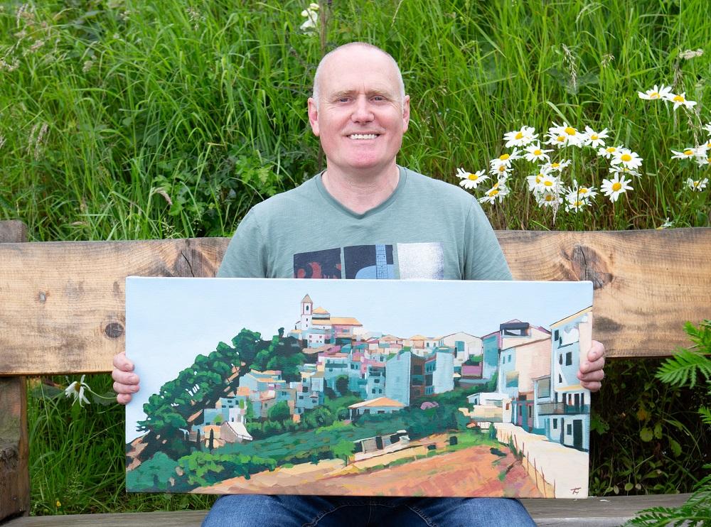
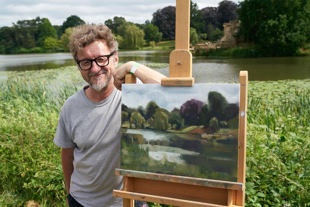
HEAT 4 WINNER - TONY GRIFFIN
Hi Tony, congratulations on winning Heat 4 of Sky Arts Landscape Artist of the Year Series 9! What was the experience like?
On the day I didn’t really know what to expect. It was a mixture ofanticipation, excitement and adrenaline. Not being an experienced plein air painter I found the location overwhelming at first, There was so much to choose from and limited time for editing. Once I had decided on my composition I got straight into putting paint on canvas. I generally work quite fast and this gave me the freedom to focus on the painting and try to block out any distractions. As the day went on I began to relax and really enjoy the whole experience. It was lovely chatting to the onlookers and meeting my fellow artists.
Your submission was a depiction of buildings cascading down a hill in Andalucia with a wonderful rhythm to the composition. At Stonehaven, the judges were impressed again by your panoramic composition. What’s the key to finding a great composition?
There are many ways to find a great composition but I’m not sure if I consciously adhere to any of them. I paint what I think will work using colour and tone. Sometimes it doesn’t work and I have to adjust my process. I found a similar rhythm in the Stonehaven painting as I had on the Andalusian painting. For me it was the rhythm of the houses and the ladders on the harbour wall with that great curve of stonework taking the eye across the composition. The mirrored triangles of sky then brought the eye back into the picture for some more exploration.
At Stonehaven Harbour, your piece was full of vibrant tones and contrasting colours of purples and yellows. Can you walk us through your colour palette choices?
On the day the weather was not great, it was grey and flat, there didn’t seem to be much colour at all. As with anything there are things to be found if you look hard enough. I began blocking in the composition working on the tonal values when I picked up on the slightly purple slate roofs. I found that I could balance that out with the contrasting yellow sand against the dark green hillside. The off white, reddish brown and yellow buildings mirrored the boats in the harbour with the pink boat in the middle becoming afocal point. As long as I kept my tones as true as possible I knew the colours would work.
What art supplies would we find in your studio, and have you got any top tips for painting water?
I always make my own canvases from manufactured stretcher bars and cotton duck canvas. It’s the way I’ve always done it from my time in art school. I then prime each canvas with a good quality acrylic primer. I feel that I have more control over the whole creative process if I do as much as I can myself. The oil pants I use are Daler Rowney Georgian, 3 blues, 3 yellows, 2 reds, burnt sienna and titanium white. I’ve never had an issue mixing any colour from this limited pallette.
My only tip I can give for painting water is paint what you see, especially if it’s highly reflective. The mirroring has to be quite precise, then you can play with the movement of the water. It’s always good to alter the brushstrokes from horizontal to vertical.
Thanks Tony! See more of Tony’s work @tonygriffin.art on Instagram.
WILDCARD WINNER – KATIE KERR
Hi Katie, congratulations on being selected as the Heat 4 wildcard winner! Tell us about your experience on the day.
I really enjoyed the day at Stonehaven, taking part in the Sky Arts Landscape Artist of the Year. A friend had told me that he'd taken part as a Wildcard the previous year and said it was great fun and open to everyone. I managed to get a place as a Wildcard, really just to enjoy the day and meet all the people on the show, never expecting to win.
It's quite an early start to be there to check in but a very friendly atmosphere and I chatted to many other people who were taking part. Not sure what I was going to paint with or on what, I took much way too stuff, but I was glad of the huge golfing umbrella for the end of the day when the rain arrived.
It was lovely and inspiring to be painting outside with so many other artists; there was a great feeling of camaraderie. Many local residents came to watch, chat, give encouragement and admire all the work in progress. I met so many wonderful people, made new friends and found both the judges, and Stephen Mangan charming.
Kate Bryan commented on the way you managed to capture the timelessness of Stonehaven Harbour, how did you manage to depict this in the work?
I tried to keep some harmony in the colours of the houses by the harbour. It is a picturesque place and the mix of old and new buildings I felt blended well together tonally, which gave that timeless appearance. The tide was in when we started painting and, being a very still day, the reflections on the water were incredible. First thing in the morning the hill behind the harbour buildings lush with trees and grass glowed in the water, giving wonderful green colours to the seawater.
Your piece had some underpainting of peachy-orange, which glows through the buildings and introduced a warmth to an otherwise grey day. Could you walk us through your colour choices?
Having arrived early for the competition I found the people of Stonehaven to be very warm and welcoming and, because of that I used undercoat of peachy-orange. I wanted the warmth to come through the houses in my painting to convey the feeling the place and its inhabitants gave me. I felt the oranges complemented the greens from the hill and the colours in the sea. I think the painting also has a watery appearance which given it was high tide helped me create effect I was looking for. The judges commented on it being a grey day but I didn't find it to be so. Touches of blue appeared in the sky throughout the day which I tried to capture in the painting.
What are your go-to art materials for landscape painting?
If I'm painting on my own, I normally have a small box of water colour paints. I like the Winsor & Newton’s compact box of 12 pans as it's easy to pop in my bag along with a few brush pens and a sketchbook. My sketchbook is like a diary and brings back memories of what I've seen and where I've been. I don't have any oil paints yet but have just recently invested in an easel I can use outside. If I'm not using watercolour, I use acrylic paints because they dry quickly. These paints are a mixture of what I can find locally from Graduate to better quality Daler-Rowney paints.
Sky Arts Landscape Artist of the Year is such a wonderful and special thing to take part in, and I would recommend it for anyone wanting to paint. It feels good to be painting outside with other people and seeing how we all create such different images from the same area. It's given me the confidence to paint more outside and be more practical about what I need to take.
Thanks Katie! See more of Katie’s work @kerrpop on Instagram.
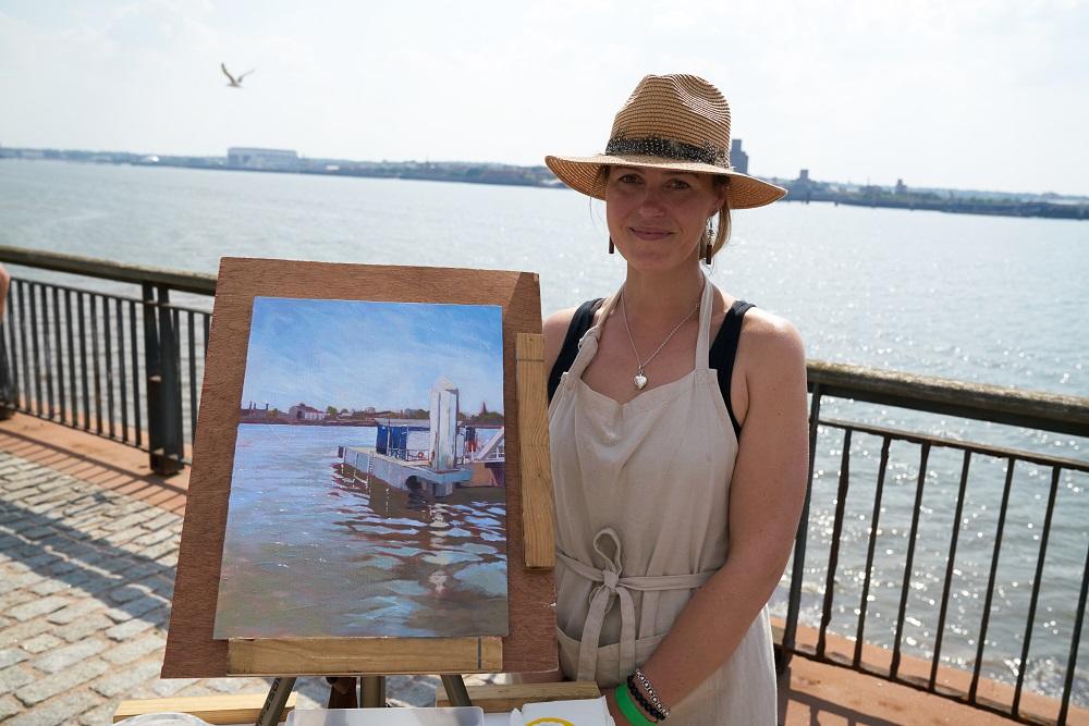
HEAT 5: LIVERPOOL THREE GRACES
WINNER - MONICA POPHAM
Hi Monica, congratulations on winning Heat 5 of Sky Arts Landscape Artist of the Year Series 9! What was the experience like?
Thank you! The experience was so much more rewarding, emotional and exhausting than I ever expected. Being Gibraltarian, I’m normally okay with the heat but that day in Liverpool was on another level! I’ve followed LAOTY for years so to actually experience a day in the pod felt really special.
Submission piece was an acrylic piece, a small detail, a window ajar in the bright sunshine with a washing line. What do you look for when choosing a subject to paint and how do you decide what to focus on and what to crop out?
When finding a composition for a painting I’m always interested in harsh sunlight and striking shadows. I find, if you crop a large portion of the landscape out and focus on a small area, you can make a really interesting painting which ultimately is made up of simpler shapes and contrasting colours.
In your submission piece the light green paint of the building is accentuated by the tiny contrasting red pegs on the washing line and deep green shadows. And in the painting you made on the day, you play with tone and colour again; a turquoise sky contrasts with the peach light hitting the building. Can you tell us a bit about how you approach light and colour in your paintings?
As my main inspiration comes from the Mediterranean light and Gibraltar, accentuating colours is an important part of my process. It all comes down to warm and cold tones. The warmth of the sun is captured in oranges and yellows and the coolness of the shadows is shown through blues and purples. It is basic technique which I exaggerate in my paintings. I find that I’m constantly chasing that vivid, golden light you get as the sun sets on a summer’s evening. If I could bottle that colour up, I would!
What are your preferred art supplies and what colours would we find on your palette?
I only ever paint with 4 colours. Titanium white, azo yellow medium, cadmium medium red and phthalo blue which are all Winsor & Newton. If I have these 4, I can mix any colour I need. I don’t think I could paint a painting without phthalo blue! It is what I credit my vivid cool toned colours to.
Thanks Monica! See more of Monica’s work @popham.studio on Instagram.
WILDCARD WINNER - MELANIE THORN POTTEN
Hi Melanie, congratulations on being selected as the Heat 5 wildcard winner! Tell us about your experience on the day.
Thank you so much! Well it was an unforgettable experience, a real highlight for me! I travelled up to Liverpool with my friend the day before the heat and sussed out the general location of everything, mostly to help prepare myself for what to expect the following day in terms of where I needed to be. I was very excited but also feeling quite nervous, mostly about the time limit, and the searing temperatures! We had an early start to the day itself, and it really was quite a buzz meeting all the other wildcard entrants, and waiting to be told where to set up. I aimed for a slightly more secluded spot, apart from the main hub of activity, knowing that this would suit me best in order not to get too distracted by what everyone else was doing. The heat was very intense, so this was a huge challenge, especially with acrylic paints. They were drying out on the palette whilst I was mixing the colours! I was very intensely immersed in my painting during the entire time, and didn't really stop for a break, other than to chat to a few of my fellow wildcards and spectators, all of whom were so lovely!
I was genuinely feeling so contented after many of the spectators came over and made such lovely comments on my work. Once the judges called time on the competition, I was almost ready to collapse in the heat, but felt really happy that I had just about finished my piece, something I knew would be one of the biggest challenges on the day. I had only had very brief interactions with the judges throughout the day, and I wasn't even sure that they'd really venture out to where I had positioned myself, so to see Kate walking in my direction I assumed she would be heading to another artist nearby! I was a little overcome with emotion when she told me I was the winner, and thankfully had sunglasses on to hide this! The camera crew appeared and then a crowd gathered, everything after that was a bit of a blur. This was the second experience as a wildcard, but to win this time around was just so fantastic. I would recommend to anyone considering entering the competition, just to go for it. The whole experience was so uplifting!
Your piece beautifully captured the blue sky reflecting on the water. Could you take us through how you capture this in paint?
I am very drawn to skies and seas when looking for landscapes to paint, especially when there is a beautiful reflection there too, that's hard to resist. I've noticed my style starting to evolve recently, and one element of this that I like to focus on is creating a sense of perspective through the density of brush marks and layers of paint. In this painting I kept elements of the industrial skyline across the Mersey quite vague with little detail in muted tones. This helped to enhance the brightness of the sky and the reflection onto the water below. I built up areas of paint and thickness of brush marks to build up the foreground, and with the reflections I left elements of the undercoat showing through, presenting a higher contrast in tone and texture. I don't try in any way to recreate a landscape photographically, but instead aim to capture an impression of the view in front of me, and an impression of the day itself.
Did the landscape in Liverpool play to your strengths, or did you find it a challenge?
I did spend about 20 to 30 minutes at first deliberating which way to face. Towards the Three Graces or towards the Mersey. I think both vistas were actually really intriguing and my initial choice would actually have been the buildings, however, with the time restriction of the day, I thought I might have struggled to complete a painting. So that's why I eventually decided to choose the water. Both views were challenging, but also both excited me, so I think I was lucky this time to be spoilt for choice, rather than facing a view that would have been difficult to compliment my practice.
What are your go-to art materials?
Liquitex heavy body acrylics are my absolute favourite for painting. I find when painting finished pieces, using products across one single brand, I get better results. They offer a really excellent quality, with a beautiful range of colours offering a range of transparency. I don't use water to paint with, instead I love to use Liquitex acrylic gloss medium. This offers more movement and flexibility with the paint without compromising on the vibrancy. However, when I'm dabbling in my studio, and experimenting in my sketchbook, I tend to use some basic ranges of acrylics such as System 3 - I feel I can be a bit more 'slap-dash' with these and less precious perhaps. I also love to experiment with acrylic inks, often Liquitex, MagicColour and Daler-Rowney, mixed media collage and Golden fluid acrylic.
Thanks Melanie! See more of Melanie’s work @melanie.thorn.potten on Instagram.
HEAT 6: HEVER CASTLE
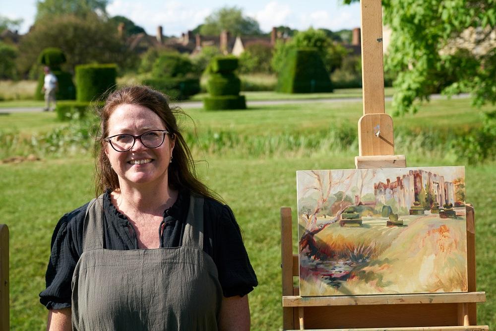
HEAT WINNER - DENISE FISK
Hi Denise, congratulations on winning Heat 6 of Sky Arts Landscape Artist of the Year Series 9! What was the experience like?
I entered because I am a huge fan of the programme and thought that the possibility of being involved as a wildcard would be great fun. However, to my surprise, I was invited to be one of the featured artists. It would be a lie to say it wasn't nerve-wracking but I was determined to rise above that and enjoy the privilege and experience of being a contestant in one of the pods. One of my favourite moments was the first time I saw my pod for the day.
The style of my submission painting lent itself to producing a landscape in the allotted 4 hours. In order to not feel out of my depth on the day, I had practised my ideas and processes in depth before the competition day. I was amazed at the huge amount of production staff involved in making the programme; everyone was so welcoming and encouraging.
The day was very long and I have never been interviewed and photographed so much in my life (!) but I loved meeting the judges, Kate, Tai & Kathleen and presenter Stephen Mangan, all of which added to the fun of the day. Half-way through, I saw the quality of the other artists - they were so impressive that I relaxed knowing that I couldn't possibly compete. I was therefore shocked when my name was called initially as one of the final three and then as winner of the heat.
Despite being presented with a rather green landscape, you started off with red brush marks, confessing that you are drawn to autumnal colours. How do you decide where to invent colour and where to replicate it?
A feeling of warmth glows through my paintings when I begin with a red, textured background. It is a way of connecting with my passion for our natural, organic Earth. I am however conscious and respectful of good observation. I hope to use what I observe whilst avoiding any harshness. This also helps to knit the painting together, reinforcing the dynamic composition and colour contrasts. The resulting painting is comfortable to read but dramatic on the eye.
Both your submission piece and the work at Hever Castle were full of atmosphere, how do you convey mood through your application of paint?
Always conscious of the atmosphere I am trying to convey, mark-making is used for texture. Contrasts in colour & tone are used to create a dynamic narrative inspired by the elements in nature.
Tell us about the materials you use, what colours would we find on your palette?
I use Michael Harding oil paints, mostly Burnt Umber, Burnt Sienna, Yellow Ochre, Ultramarine Blue, Alizarin Crimson, Cadmium Red, Lemon Yellow and Titanium White. I use Rosemary & Co. brushes and prefer painting on cradled board or gessoed canvas. I use Zest-It thinner for the beginning of a painting.
Thanks Denise! See more of Denise’s work @denisefiskart on Instagram.
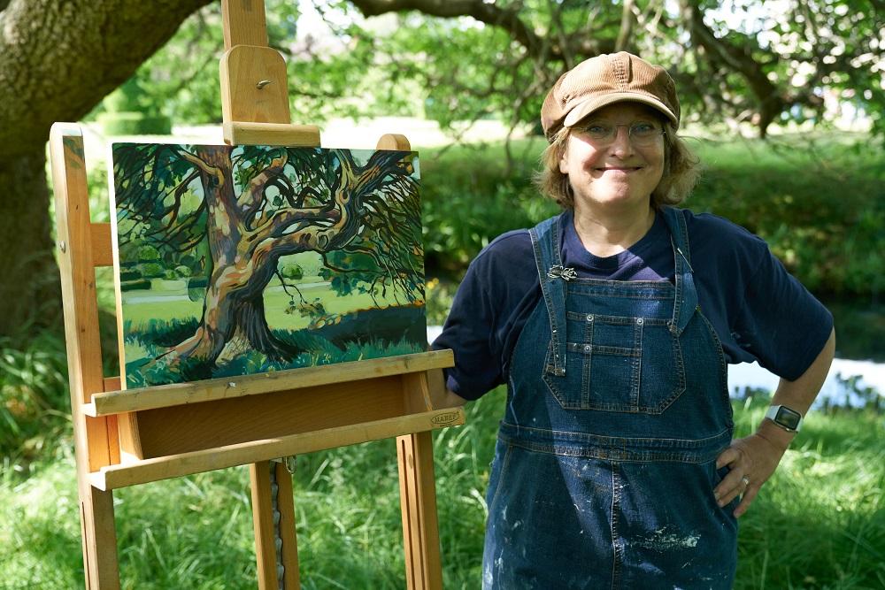
WILDCARD WINNER - RACHAEL STEDMAN
Hi Rachael, congratulations on being selected as the Heat 6 wildcard winner! Tell us about your experience on the day.
The whole day was just really great fun. It started really early arriving at Hever Castle at about 7.00 and getting in a very long queue with all the other wildcards. There was a bit of hanging around but this gave me chance to talk to some of the other artists which was really great. Once we were all signed in we were let into the grounds and were filmed walking through the gardens. I felt so lucky to be a wildcard on that day because the weather was beautiful unlike on the previous days filming when they’d had some real bad downpours and everyone started the day soaking wet. Once we arrived on site we were given an area to set up our easels which gave us a wonderful view of the castle. I found a spot right in the middle of the pack which had a really great view but then I just thought how hot it was going to get later in the day so I decided to head off down to the moat where there was a little bit of shade and found this lovely spot next to the tree.
Your chose to paint an old, twisted tree, describing its branches with dark lines and finding pops of colour amongst the dappled sunlight on the bark. What drew you to this viewpoint in such a rich landscape?
I originally was intending to paint the castle but thought I’d just do a bit of warming up first and so started on the tree and as I painted I just got more and more fascinated by it and so I just let myself have some fun playing with the textures of the bark and the black lines of the branches. I thought that I was really well hidden and that no one would spot me as I’m really very private and don’t like showing my work so when Tai walked past and asked if he could have a little chat in front of the camera’s I felt rather startled. I really shouldn’t have worried as Tai is such a lovely chap and no matter what you have produced he always brings out the positives.
The light is portrayed perfectly in the piece, the viewer can imagine sitting beneath the tree enjoying the shade. Do you have any tips for painting light?
Thank you that’s really kind. When I painted this tree I was very aware of the time limit given and so I decided not to get too worried about getting accurate colours but just to put down lights and darks. To help this I was working with pre-mixed emulsion paint (old tester pots left over from decorating the house) Because the light was changing all the time I just tried not to worry too much about the detail. A little trick I have is to take my glasses off when I paint. I’m short sighted I can’t see distance so well and so it’s easier to get down the basic impression without getting hung up on the details.
What are your other go-to art materials that you simply can’t do without?
The tree painting is a little unusual for me as I was using a wooden painting panel. This was the first time I’ve used one of these as normally I would use primed mount card but it was a nice surface and I would certainly use one again. I like to use Liquitex acrylic paint on a tear off disposable pallet but as the day was so hot I thought the acrylic would dry out too fast and so opted to use the emulsion pots instead. I use Winsor & Newton oil paint within my studio but have found that water based oils really useful for when I’m needing to paint quickly and they are great when working outside as there is far less mess.
Thanks Rachael! See more of Rachael’s work @Rachael_Stedman_Paintings on Instagram.
Feeling inspired?
If you think you have what it takes to be the next Sky Arts Landscape Artist of the Year, entries for Series 10 close at midday on Friday 3rd May 2024. Find out more and apply at skyartsartistoftheyear.tv/landscape. Good luck!

