When it comes to watercolour, artists are often faced with a difficult choice: go for quality, or keep it affordable. At Cass Art, we don’t think you should have to choose. That’s why we created Cass Art Watercolour — a range of professional-grade paints that deliver exceptional performance at a price that makes it easier to create more.
Whether you’re an experienced watercolourist or just starting to explore the medium, here’s everything you need to know about our own-brand watercolour range — what makes it different, why artists love it, and how it holds its own next to the biggest names in watercolour.
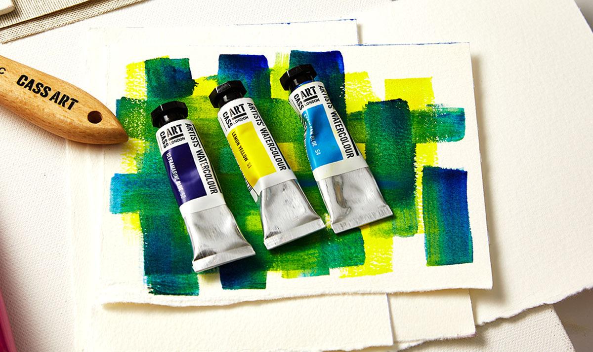
Cass Art Watercolour was created with one clear goal: to give artists access to uncompromising quality at a price that encourages exploration, not hesitation.
Here’s what you can expect:
Transparency and Luminosity - One of the most appealing qualities of watercolours is their transparency. The pigment allows light to pass through the paint, creating a luminous effect that is nearly impossible to replicate with other mediums.
Flow and Blending - Watercolours rely heavily on the flow of paint and the way pigments blend together on paper. With the right techniques, artists can create smooth gradients, soft transitions, and vibrant color variations that are hard to achieve in other mediums.
Ease of Cleanup - Unlike oil or acrylic paints, watercolours require minimal cleanup. Water is the primary solvent used, making it easier to work with, clean up, and dispose of waste materials. This makes watercolours a favorite choice for artists who prefer a hassle-free painting experience.
Portability - Watercolours are known for their portability. Artists can easily carry a small palette of paints, brushes, and a pad of paper wherever they go. This makes them a popular choice for outdoor or travel sketching.

Mastering colour mixing is a key skill for any watercolour artist. With Cass Art’s carefully curated palette, you have the perfect foundation to explore a wide range of hues and tones. Here are some expert tips to get the most out of your paints and create dynamic, vibrant work:
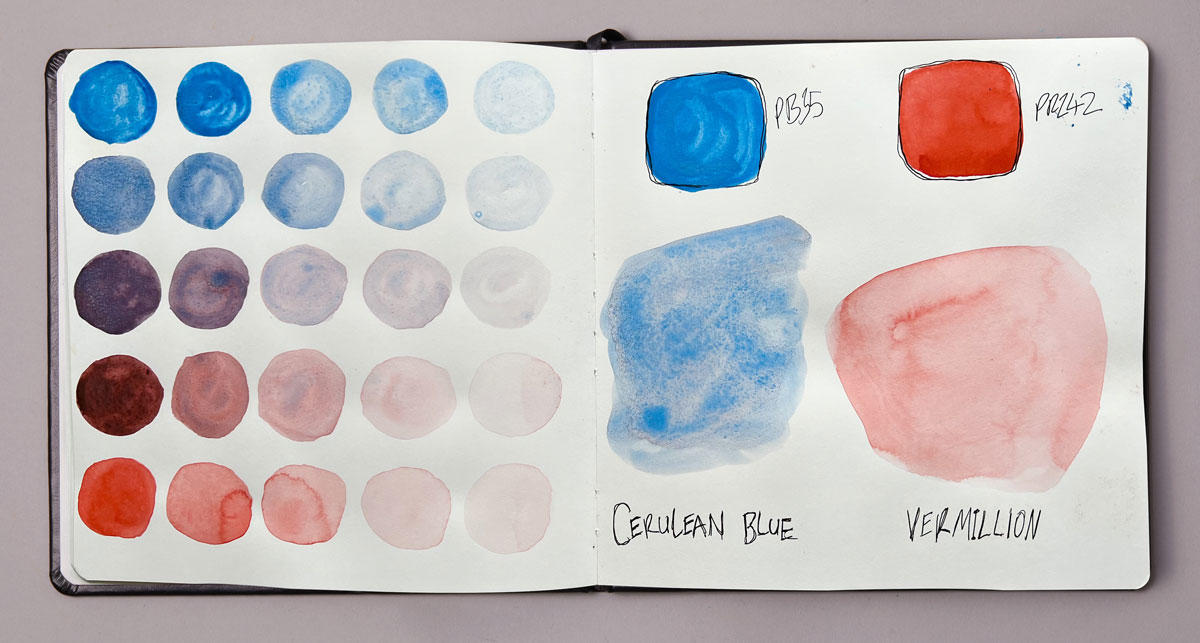
Combining Vermilion and Cerulean Blue offers a versatile way to create subtle, balanced colours that can bring depth and atmosphere to your paintings.
Understanding the Colours
Cerulean Blue is a cool, slightly greenish-blue with a soft, powdery quality. It’s often used for skies and waters due to its gentle transparency and light tone.
Vermilion is a warm, bright red with an orange undertone. It’s vibrant and intense, perfect for adding warmth and energy.
When mixed, these two create a spectrum of muted neutrals and soft greys that can be warm or cool depending on the proportions:
Warm Neutral: Using more Vermilion with just a touch of Cerulean Blue results in a warm, earthy neutral with a slight reddish undertone. This is ideal for shading warm surfaces, skin tones, or sunlit areas where you want subtle warmth without bright colours.
Cool Neutral: Increasing Cerulean Blue relative to Vermilion shifts the mix toward cooler greys and blues. This works beautifully for creating atmospheric shadows, distant landscapes, or cool midtones in portraits.
“As an illustrator that works mainly with watercolour, I found the choice of colours great – certainly enough to experiment with different shades. Also, the consistency was quite thick, which meant that a little bit of paint went a very long way!”
"The colours are very concentrated, which is great because they allow more space to play with transparency and opacity. Some of the colours are so vibrant there is no need to mix them with other mediums as I usually would do."
Add To List
Add a Wishlist
form to add wishlist here