
Face to Face: Exclusive Interviews with BP Portrait Artists 2019 Part 2
Posted by Cass Art on 28th Aug 2019
The BP Portrait Award is back for its fortieth year at the National Portrait Gallery. The prestigious painting competition brings us the very best in contemporary portraiture today; showcasing a breadth of approaches to portraiture this year’s award includes the unusual, the beautiful and the uncanny. This year’s exhibition has ranged from self-portraits, to portraits of friends, family and strangers. This year’s group of artists truly express the breadth and diversity of contemporary portraiture, from detailed hyperrealism to bold blocks of colour. They push the boundaries of figurative painting and show us that portraiture is still very much present in painterly conversation. Portraiture and figurative painting is as relevant and exciting today as it has been for hundreds of years.
We caught up with some of the shortlisted artists of 2019 ahead of our Face to Face exhibition in Cass Art Islington for an insight into their process, their must-have materials to achieve their unique approaches to painting and the inspiration behind their works:
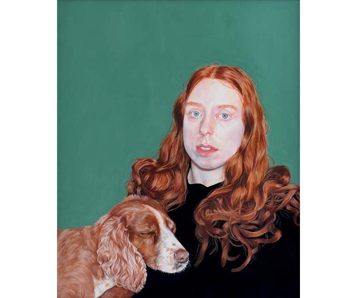
Helen Lee Robinson, Resting (on show in this years BP Portrait Award)
HELEN LEE ROBINSON
Helen Lee Robinson (b.1996) recently completed a BA (Hons) degree in painting and printmaking at the Glasgow School of Art. Her work has been seen in group exhibitions in Glasgow and a solo exhibition in Ilkley, West Yorkshire.
The tonal quality of your palette is simply lovely, the soft green, and the amber of the sitter’s hair mirrored by the dog’s fur. How do you approach your colour selection and colour mixing?
Colour is often a big inspiration to me when having the idea for a piece, and for this portrait I deliberately chose to paint my sister with our dog as I found the unusual and similar tones of their hair and fur interesting. I knew this aspect for definite when starting to paint this piece, yet colour selection often for me is about simply allowing the painting to develop and letting instinct tell me what works with what and, importantly, what needs to be reined in to allow other colours to shine. This informed my decision to make the sitter’s clothes deep deep blue, almost black, as I did not want to distract from the bright colours, but rather enhance the soft richness of them. I am inspired by the richness and sumptuousness of colours I see in historic paintings, but bearing this in mind, I wanted to mix both old and new elements so I wanted the background to be more modern and blank and flat – a sort of non-space. The background colour was one I played around with a lot. I knew I wanted it to be green, but not too cool nor too warm. If it was wrong I knew it would change how the sitter’s blue eyes came across and either overshadow or enhance them.
What are the vital tools in your studio and how do they influence your process?
In my studio, the most important things to me are probably small brushes, and very soft brushes. I like to be able to make the layers of paint very thin and hardly there, with very little texture from the bristles creating the smoothness of the skin with an almost glowing sheen of colour. I use these tiny brushes for the details of eyes, lips and especially the textures of the hair and fur. The small scale of the details means that for hours at a time my nose is inches away from the painting. I prop my chair as close as I can get to the easel and put my knees up on it. This means I must step back and walk around every so often to rest my eyes. It is all about very tiny movements and actions with the brush that seem inconsequential but alter the balance or the colour of the painting crucially.
Manu Saluja, Jenne (on show in this years BP Portrait Award)
MANU SALUJA
Manu Kaur Saluja (b.1971) studied psychology before undertaking a Bachelor of Fine Arts degree in illustration at the school of visual arts and an MFA in painting at New York Academy of Art. Her work has been seen in solo exhibitions in the United States and Canada and in numerous group exhibitions including regular selection for the American Women Artists Juried Exhibition and the Portrait Society of America Award.
Your portrait of Jenne is larger than life-scale, could you talk about the importance of scale in your work to convey certain messages or meanings?
When I paint a portrait, I think a good deal about head size as an integral part of the composition and how it will effect the viewer’s experience of the subject. Jenne is by nature a kind and gentle person. She has a vulnerability yet is strong at the same time. I wanted her to have an important and weighty presence yet convey a sense of intimacy. To do this, I made her head size about 16 inches in height so she is both literally and figuratively imposing. The average human head is 8-9 inches in height. An artist can use scale to convey various messages and I do so in my work. For example, when we speak to most people, we are about 2 feet away from them at least so, in life-size compositions, a head size of 6-7.5 inches conveys atmosphere and a conversational distance, which is sometimes desired. However, if you are up close to someone, imagine almost nose-to-nose, their head will take up most of your peripheral vision. By going up in scale, hopefully you feel a closeness and empathy for Jenne. My intended message is that our humanity is important, and that to persevere is to be “larger than life”.
How do you technically approach a new portrait – and do you have any advice for aspiring painters?
For me, composition is the first consideration. I do a small study of the painting to work out placement, value and color harmony ideas based on my imagination or initial reference materials. When possible, I’ll then have the person pose for as many sittings from life as their time allows. This is an important because iI get to know them better and it becomes a shared experience. While I use photography when needed to supplement information for the portrait, it tends to distort perspective and skin tones. I’ll begin loosely with a drawing in paint directly on the canvas. I’ll then block in the entire painting in variations of transparent and opaque passages to set up the largest tonal relationships. I’ll keep working from biggest to smallest shapes, taking care to think about relative values, colour and edges and the degree to which I want to bring a finish to certain areas.
My advice to aspiring painters would be take the time to hone your skills and work from life as much as possible. While there is no singular, correct way to express oneself artistically; and being open to experimentation and new ways of working is ultimately critical to one’s studio practice, a solid foundation gives you the power to make intentional artistic choices. For portrait painting these skills are learning to draw and paint the human form, and understanding how your choice of medium can be used to express your ideas. My second bit of advice is to have a mentor and community of artist friends. While creating art can largely be a solitary endeavour, it is important to get out there - go to classes, art openings, and museums.
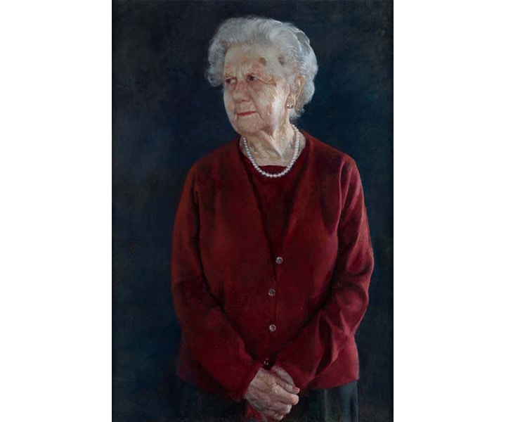
Miguel Oyarbide, Ninety Years (on show in this years BP Portrait Award)
MIGUEL OYARBIDE
Miguel Angel Oyarbide (b.1954) worked as an assistant to the sculptor Francisco Espinós, before undertaking formal training in painting at the Superior School of Fine Arts of San Fernando, Madrid, to achieve a Bachelor of Fine Arts award. His work has been seen in numerous group and solo exhibitions in his native Spain and is held in private and public collections there.
It’s interesting that the gaze of your sitter is off the edge of the paintings frame, she is looking away from us the viewer – does this decision have a specific intension?
I made the decision to arrange the sitter (my mother) looking out of the picture with a clear expressive intention. When I started the portrait I tried other poses, but in the end I decided to paint her standing and looking outside the painting frame, not as if something had suddenly caught her attention, but in a stable and deliberate position - looking beyond natural reality. I wanted to avoid the frequent solution in portraits where there is a direct visual communication between the subject of the portrait and the viewer - I wanted to stimulate different questions in the viewer. In addition, I wanted the sitter not to have any visual relationship with the painter - myself, her son. In fact, I think this allowed me to discover nuances of her personality which I actually wasn't too familiar with. However, I believe that the meaning of what is painted must always be open to the interpretation of the observer.
Could you talk us through how you approach a painting? And are there any particular materials that compliment your approach?
I have always been very attracted to the abstract dimension of painting. I absolutely agree with a reflection from Maurice Denis - that a painting, before being a landscape, portrait or battle is simply a flat surface full of coloured spots sorted in a certain way.
So, when I visit an exhibition, first of all, I usually do a general visual scan of the space and focus my attention on structures, harmonies or compositions rather than any specific piece. Then I get closer and discover what is represented on that painting and begin to enjoy its narrative, meanings and of course the qualities that are impossible to appreciate in the distance. As I often say, I am actually more interested in music than the actual lyrics of the painting.
Regarding actual painting materials, I have to say that they are absolutely essential. Although my palette is very small (I only use four or five pigments) I use the best quality colours - my favourites are Winsor & Newton and Rembrandt (Talens).
When I use oil colours I like when the paint has a body so that it is malleable when applying glazes, qualities and transparencies to enrich the surfaces. In the case of portraits I usually use cloudy glazes that create precise effects to highlight skin qualities.
Also, canvas weft lately bothers me so I prefer to paint on panels which I prepare with gesso.
Daniel Nelis, Untitled (November) (on show in this years BP Portrait Award)
DANIEL NELIS
Daniel Nelis (b.1990) gained a BA (hons) degree in fine art painting from Ulster University, Belfast. His work has been seen in the annual exhibitions of the Royal Ulster Academy (2011, 2013–18) and winning the Portrait Prize in 2015, the Royal Hibernian Academy (2017–18) and the Ulster Artist of the Year (2009).
You say when talking of your portrait in the BP Award that ‘These still moments of quiet contemplation are of greatest interested’ in your work and that they provide ‘intense reflection in the vivid reality of the present.’ This feeling of quiet reflection is mirrored in the viewer as they contemplate your paintings, is this moment of reflexive space something you are aiming to create when you paint?
Absolutely. The images that are of greatest interest to me as a viewer are those that conjure a feeling quiet reflection, like those by the German Romantic painter Casper David Friedrich, where you are required to almost free your mind of notions and just bare witness.
The area that I’m from is something I continue to mine for inspiration, given it’s ability allow such a relational ethic. The area is surrounded by miles of bog land, land that has been worked and marked over time. Standing in that space and seeing the incursions registered on that landscape is wonderful, because it at once references a presence that has been and gone, and as a result makes you more aware of your own.
As my painting is very intimate in terms of mark making and scale, it is in a way an invitation to the viewer to look closer and interrogate the figure more intensely. By extension, this should also feel like a bit of an intrusion, as there is no such thing as innocent bystanding, and this awareness is an essential component of allowing the viewer to occupy said reflective space.
What are the essential tools that you always have in your studio and do you have any particular brands you return to?
I wouldn’t announce myself as being loyal to any specific brand, as long as the materials are of a good quality, and they don’t result in a malnourished looking painting when dried then I take that as a good sign. In terms of surface and brushes, I tend to work primarily on MDF or MTX with synthetic brushes, for no reason other than I like how the smoothness of the board holds the intimate mark making well.
Besides the making of the image, the preparation of the board itself tends to be the most laborious, required multiple layers of finely sanded primer to ensure it maintains the level of smoothness I mentioned earlier.
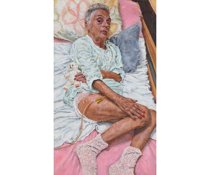
Jeff Midghall Doctor-Patient (on show in this years BP Portrait Award)
JEFF MIDGHALL
Jeff Midghall (b.1962) undertook a BA (hons) degree in fine art at Kent Institute of Art & Design (Canterbury). His work has been seen in numerous group exhibitions France, Poland and the UK, including the Royal Scottish Academy Exhibition, Glasgow (1998).
In your portrait of your mother-in-law you have portrayed her in her hospice bed. You’ve also made sure that none of this truth is hidden from the viewer, the title Doctor-Patient, the nightgown with exposed legs and catheter. Could you talk us through these visual decisions?
In order to answer your question, I think I need to give you some background information about her first, to put things into context. Her name was Dr Krystyna Cywinska-Serafin, during her life she had worked in General hospitals, a children’s hospital, a psychiatric hospital and up until her retirement, as the Gdansk Prison Doctor. After retiring from working as a Doctor, she decided to volunteer at a hospice in Gdansk, at first she didn´t tell the people there she was a Doctor as there were Doctors working there already and she didn’t want to step on their toes, so she volunteered as a general helper and cleaner. It was only when a day release prisoner, working at the hospice from the prison recognised her as the ex-prison Doctor and started calling her “Madam Doctor” that she told the bemused staff what she was and started helping as a Doctor from then on. She was very humble for a Doctor, but very open, warm and confident woman who knew the reality of life and death and did not want to hide from it. She had a form of blood cancer for many years, even while volunteering as a Doctor in the hospice. She went on Polish radio and television as a spokesperson and fundraiser for the hospice, to attract more retirees as volunteers, telling her story and that of the hospice, and of course it’s many patients, and had won several Polish humanitarian awards for her work.
The background answers the first part of your question about the work in the BP portrait exhibition, its title Doctor-Patient, the Doctor who became a patient. She had posed many times over the years for my partner, her daughter, who is a photographer, so she was quite happy to let me sketch her in the bed, which was in her favourite room in the hospice. She had always said if I end up as a patient here I want to be in that room. The composition of both portraits, the one in the BP and the one in “Face to Face” at the Cass Art gallery space were almost obligatory, she had suffered a major stroke to add to her cancer just before going into the hospice, her left side was paralysed this dictated the position of the left arm in both works and often the position of her body as her right side was stronger she often rolled onto her left. I had to show in each of these works the truth about what it means to be in palliative care, she wouldn`t have wanted me to do otherwise. She had lost a lot of weight over the period spent in the hospice and showing the thin arms and legs of a body in decay is far more truthful than covering them up with a sheet for example. Due to the stroke she became unable to go to the toilet unaided and so had to have both nappies and a catheter, again she wouldn’t have wanted me to smooth over the indignities of palliative care that many people have to go through as their lives are coming to an end. She was a strong and defiant woman with an amazing personality, she always tried to look her best even making sure her nails and hair were in order at all times, hence the position of the right hand showing off her nails. She was a woman who never gave in and fought to the end, having had the last rights seven times in the year up to her death. This led me to the title for the second portrait which was painted in the same period as the first, in the few months before Krystyna’s passing away. It can be seen in the “Face to Face” exhibition, namely, Patient-Doctor, the Doctor who is patiently waiting for whatever may come next. One addendum to the story is that of her bear Coccolino, in the first portrait he is looking out hopefully and in the second turned away not wanting to see the end. He was with Krystyna at all times, he was in the bed when we left the night before she died, when we were called in the next morning to be with her in the last moments, he was nowhere to be found and none of the volunteers or staff knew where he had gone. He has never been found.
Could you talk us through how you approach a painting? And are there any particular materials that compliment your approach?
It is a difficult question to answer as it would depend on exactly what I am painting, but as we’re talking about portraits I will try and put into words the mental and physical processes that occur when I have a specific goal to work towards. I prefer to work from life if possible, it has a more immediate feel to the work as it progresses and the skin tones are there in front of you to be seen. I will try to get the sitter to be there for at least several sittings of a few hours each if possible, this allows me to do some reference sketches and some quick oil sketches. It’s a good exercise for loosening up before starting the portrait itself and they are often very expressive works in themselves. I do sometimes use reference photographs, often due to circumstances than preference. For example a sitter cannot always be present as much as I might like, or, as in the portraits of Krystyna, clothing or location prove to be a problem. She had her bedding and clothing changed every day and so it was necessary to choose one day that would fit with what I wanted to say and take photographs of the sheets, pillows and clothing she wore then and stick to it. The pastel pinks, yellows, greens and greys were a reference to the colours many of the buildings in Poland are painted, including the block she lived in before going into the hospice.
Also it was difficult to work in the hospice itself, it was fine for sketching Krystyna, but it would have been impossible and for that matter not allowed to have painted the whole portrait in situ. Especially as my preferred medium is oil paint, the solvents used with oils in such a place would not have been acceptable. For that reason these two portraits are done using water soluble oil paint, it was a first for me but I found no problem adapting to their unique properties. I used both Daler-Rowney and Winsor & Newton water soluble oils to make these works and both performed admirably. When not restricted by location, i.e. in my own studio, I use a variety of different oil paints, again Daler-Rowney, Winsor & Newton are used, although Rembrandt (especially Cadmium Yellow) and a few others get used if I find I like the pigments or they are more appropriate for what I want. In some of my works I like thick impasto and I often add different media to the paint or create my own mix. For example beeswax and turpentine get used quite often as does PVA and pure pigments, in some other works I have added sand and occasionally sawdust, it sounds cliché but the painting tells me what it needs. As an example I mostly work on canvas, but in the case of the portraits of Krystyna I found several pre-cut panels of plywood outside the entrance to her block of flats just as I had decided to do some painting, on one I painted a quick sketch of the view from her flat, I thought she might like it in her room at the hospice, but before giving it to her we realised she would never come back to the flat to see that view again. So, I then used it as the under-painting for the work in the BP exhibition, the view would always be behind her, metaphorically and physically. It also gave the surface of the work its appearance of gentle decay.
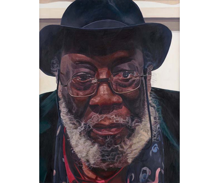
Tedi Lena, Artist Frank Bowling (on show in this years BP Portrait Award)
TEDI LENA
Tedi Lena (b.1996) has recently graduated with a BA (Hons) degree from the Sir John Cass School of Architecture and Design at the London Metropolitan University. In addition to his university studies, Lena attended short courses at Hampstead School of Art and the Royal Academy of Arts. In his graduation exhibition Lena was awarded the Owen Rowley Prize, 2018, he is currently preparing for a solo exhibition in London.
The framing in your portrait of Frank Bowling is very interesting, his face holds almost the entire surface. Could you talk us through the decisions that led to this representation?
Through Hyperrealism I had the possibility to
What are the essential tools that you always have in your studio and do you have any particular brands you return to?
Easel, huge palette, Oil paint, different solvent
Oil XL Pebeo
Oil Georgian
Rembrandt
And Daler Rowney brushes, other brushes.
Feeling Inspired?
Want to try your hand at your own portrait? We've got everything you need - from paints, brushes and canvas. Take a look online or pop in-store to talk to our staff artists who'd be happy to help with any questions you have about getting started. Don't forget to hashtag #cassart on social media to show us your creative endevours!
Our annual exhibition Face to Face at Cass Art Islington brings together the works of artists exhibiting in the BP Portrait Award 2019 at the National Portrait Gallery. An insight into their practice beyond the award, this show celebrates portraiture and figurative painting in its many forms.
To attend the Private View on Thursday 5th September 6pm-8pm, please RSVP to islingtonartspace@cassart.co.uk with ‘Face to Face Private View’ in the subject line or click the ‘Book Now’ button below.

