
Guest Blog: Galeria Moderna and The London Invitational Art Contest winners interviews part 1
Posted by Cass Art on 5th Nov 2020
Galeria Moderna are the online gallery and organisers of a new and exciting brand of city-based art contests. Each contest will see twelve winning artists selected by a panel of esteemed judges; each judge a gallery owner/manager from the host city, also including special guest judges. The selected works from the winning artists will form the 'Invitational Art Exhibition'.
Working in association with Castle Fine Art the UK’s leading Commercial art retailer and Cass Art the UK’s leading art supplier, Galeria Moderna endeavour to provide our winning artists the best possible exposer, with a combination of our physical and online exhibitions, along with prizes from our patrons of the arts.
To learn more about our winning artists and our future contests, please click on our logo above and visit our website.
Below we catch up with six of the twelve-winning artists for London Art 2020
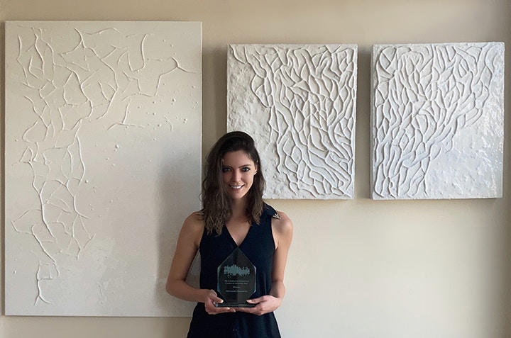
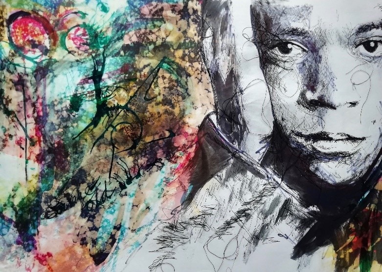
Aleksandra Romashko
Aleksandra Romashko has always been fascinated by nature and the frequent overlap of patterns in her surroundings. Aleksandra explains, “I see a constant correlation between natural and manmade fractals. To name a few examples; leaf structures, cells, webs and corals - all mimic the same structures of nets, tube maps, cityscapes and roadmaps. The list seems endless, yet despite the fact we build in a similar manner, we ultimately cannot seem to find the correct balance without causing destruction to our planet. We are all stuck in a system that does not permit us to coexist, myself included.
In my art practice I concentrate on these overlapping patterns through three-dimensional paintings, which are inspired by particular analogies. The materials I use are an additional reflection and depiction of the direct impact we cause. Clay - being the most natural medium is a reflection of earth, which is then covered and juxtaposed with resin - essentially a toxic substance that acts as a representation of plastic (though I do use non-toxic resin as I try to be mindful).”
Congratulations Aleksandra on becoming one of the winning twelve artists for London Art 2020 Can you tell us a little more about your two entries?
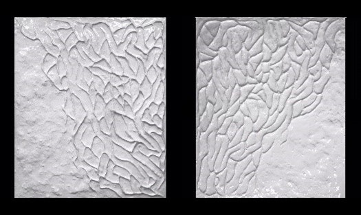
The two entry pieces are part of a ‘Sculpted Creatures’ series – The sculptural style is intended to imitate living forms. They change in colour and cast-off different shadows as light hits them throughout the day, making them even more alive. These two pieces are intentionally white as they concentrate on the bleaching of corals that seems to be constantly rising at alarming rates.
Unlike live coral, I invite viewers to touch my work, as I believe it acts as a friendly reminder that we are all able to play a part in instigating change and preserving our planet. By touching something we automatically perceive it as real, no longer is the expression ‘out of sight, out of mind’ feasible, or the approach of ‘let the future generation deal with it’. Global warming is not a new issue, yet now more than ever; we are starting to see the true repercussion of our actions.
Your work has a bold ethical and ecological theme. Can you explain the importance of this for you as an artist?
When I was a child hiking in the Swiss mountains (which consistently to this day - still grounds and inspires me), we were taught to ‘take only pictures and leave only footprints’. This phrase has always stuck with me. I believe we should attempt to live our lives in a similar approach.
We may feel a sense of helplessness while there is constant political and environmental turmoil, but each person has individual control to some extent. We can make more sensible decisions about how we treat our surroundings - instead of repeatedly ‘biting the hand that feeds us’. We must find a way to synchronize with nature as it unquestionably nourishes and sustains us. We cannot live without it.
By all means I do not want to be a preacher, as I mentioned I am also very much stuck in this system. Having said that, I still try and play my part. The incentive behind my creations is a desire to inspire people to be more appreciative and motivate them to be more conscientious towards our fleeting existence.
Andrea Cryer - Winner of The Westbury Mayfair Art Award
Andrea is a Textile Artist and has always loved drawing. However, these days Andrea uses a sewing machine instead of a pencil.
Andrea tells us “I draw with thread to create unique portraits and landscapes. Since completing my degree in Creative Art where I combined Fine Art (Printmaking) with Textiles, I have continued to develop my interest in textural mark making using a sewing machine as my main drawing tool. I suppose it is an unusual way to construct a drawing but the lines that are created by free motion stitch are extremely hard to recreate with pen or pencil. Stitched lines of tiny threaded, connected marks, create their own unique textural quality that would be exceedingly difficult to replicate in other artistic mediums. It is this individual uniqueness of the mark making that fascinates me.
I have a passion for colour but have only recently begun adding colour to my portraits. This has either been applied to the background of the sitter or perhaps to clothing or an item of jewellery the sitter may be wearing. I like to use monochrome line to create the image, so that it reads like a pen and ink drawing at a distance but has an additional textural element on closer inspection”.
Your skill with thread to portray identities is truly fascinating – can you expand on how you arrived at this working process?
I first started drawing with a sewing machine, whilst on my degree course. The crossover between fine art printmaking and textiles intrigued me. It seemed to me that the two disciplines could complement each other. I initially spent my time in the print studio producing portraits on paper using monoprint, linocut and etching techniques.
After lots of experimenting adding carborundum and drypoint processes to the mix, I began transferring my portrait drawings onto fabric.
In the textiles department, I was interested in mixed media processes, layering, manipulating and embellishing fabrics using industrial machines.
It was whilst in my final year that I began exploring the possibility of drawing with an ordinary domestic sewing machine using thread as the conduit for mark making. Something I could do at home as well as in the studio.
The impetus for this was a project about my late mother in law, Kath. I had created a soft fabric book of small etched drawings depicting items that had personal resonance with her.
As a supplementary piece I began monoprint and drypoint drawings of Kath from photographs of her at age 18 and age 88. I wasn’t happy with the results. It was definitely a Eureka moment when I decided to draw her face with thread using my sewing machine. The softly textured lines of stitch perfectly portrayed the lovely lady I had the privilege of knowing for many happy years.
I have since developed using a sewing machine as a drawing tool to create landscapes, townscapes and portraits. I am happy to draw ’freehand’ and also enjoy actually writing with a stitched line.
Free motion stitching with thread has become second nature to me. It has taken oodles of practice and I don’t always get it right. Over ebullient stitching to the extent where the marks cannot be unpicked become ‘happy accidents’ that are left in place and give the work its uniqueness.
Your work is certainly getting the attention it deserves Andrea, can you tell us a about any future projects?
I have a couple of projects on the go. My series of Bath townscapes is an ongoing venture, documenting in stitch some of the buildings in the beautiful Heritage City of Bath, UK that I lived and worked in for many years.
During Lockdown I have been using thread to draw small vignettes of ‘ordinary life’. Just snapshots of everyday objects, such as a coffee cup with reading glasses and a book left on a table. Finding joy in the mundane.
I am also currently working on a series of ‘conversation pieces’ where I create a stitched drawing ‘selfie’ portrait of myself in conversation with someone I have never met but with whom I would enjoy having a chat. They are fun to do and give me food for thought as I recount an imaginary conversation whilst I am actually stitching.
So far, I have enjoyed virtual in depth conversations with David Hockney and Barack Obama.
I am delighted to have been chosen as a contestant on an upcoming series of Portrait Artist of the Year. Having to produce a stitched portrait in a very limited time frame and under pressure is very challenging but also surprisingly energizing (once you have got over the fear of embarrassing yourself on national TV!). I had to review my way of working and adjust my technique to have any hope of producing a recognizable portrait within the allotted time.
It is important to step outside a comfort zone sometimes. Being on the programme has reinforced my decision to stick with what I do … because it is different and because I enjoy doing it!
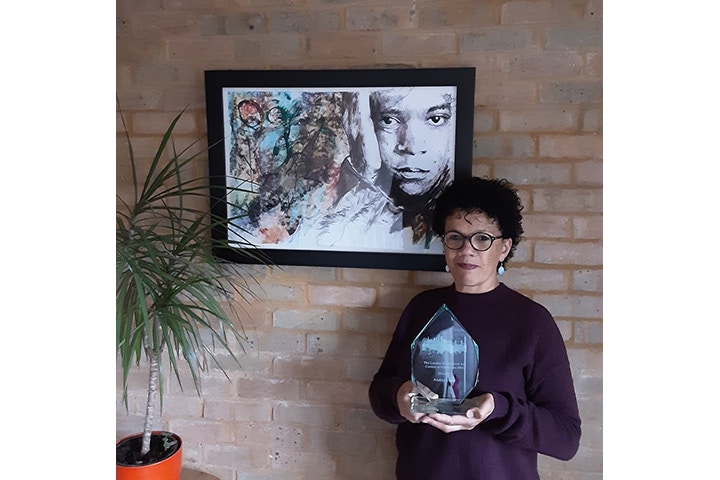
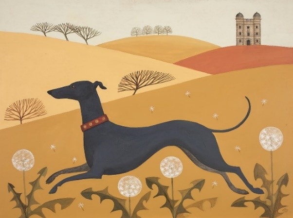
Catriona Hall
Catriona’s style is folk art/naive with stylised renditions of recognisable creatures. Catriona tells us “I am careful to keep to the correct markings/traits of animals and birds but tend to play around with their dimensions as I like to pare down their main shape and features to a few dominant shapes. My subjects tend also to be rather flat with little light and shade, but I like to suggest movement and a certain realism in their stances, albeit exaggerated. I stick to earthy tones and rarely use blue which I have trouble differentiating from green as I am slightly colour blind.”
Catriona’s studio is situated on the edge of the Peak District moors and her landscapes reflect this in the bare wind blasted hills, Catriona tells us she tends to represent the birds and animals she sees there. “I like the sturdiness of working on board and have done pieces as large as 8ft x 4ft but more often stick to a square format and images of about 12 x 12 inches.”
I firstly prepare the board with gesso, then spend a lot of time working out the design in pencil and am careful to balance gestures to fill the space and when I apply the acrylic paint, I like to evenly distribute dominant colours so that a pattern like quality is achieved. I work in acrylic on board as I find that the fast-drying time suits my style. All my experiments with oil ended up on my sleeve as I was too lacking in patience to wait for the paint to dry. I get a lot of my supplies from Cass Art so am delighted with this opportunity.
Well done Catriona on becoming one of the winning Twelve artists for London Art 2020, your folk-art themes are fascinating when did you adopt this style and who were your influences?
Thank you. I have always painted in this simplified exaggerated style which I suppose emanated originally when illustrating nursery rhymes for children. I liked the freedom of not sticking to perspective and scale but still being able to show a recognisable subject.
My influences were Edward Bawden, John and Paul Nash and early medieval Italian masters.
What are the essential tools that you always have in your studio and do you have any particular brands you return to?
I have to have mechanical pencils and a good rubber for the precision of my drawing. A big tub of gesso, flat topped brushes to aid my lines and a selection of tiny brushes for fur and feathers. I like to have Buff Titanium and Yellow Ochre paint always at the ready.
I use Winsor & Newton, Faber-Castell, Pro Arte, Golden, Liquitex and Cass Art.
Cristina Ilinca
When approaching 40 Cristina started to question the meaning of life in general and the meaning of her life. “Although I am still searching the answers for these questions, I decided to change my life and I choose to express myself through art. Glass art mainly, still not exclusive.” Why glass? Cristina tells us: “Because I was fortunate enough to make a trip to Venice, in 2006 I think, and there was the place where art struck me. Glass art – omnipresent in the city – has fascinated me with such force of seduction, that I decided this should be the way I want to follow from that moment on.”
Cristina has registered herself as a student in National Decorative Arts University in Bucharest, glass section, to have a proper education in the art field and the opportunity to work with hot glass. Cristina has also achieved the university degree in glass art in 2010.
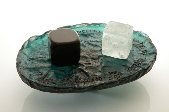
This is an extremely tactile and interesting piece Cristina can you tell us about the narrative behind the work?
It is always very difficult to “narrate” your work, because it seems that I have to create a story or a poem or, if I was a composer, a symphony to translate into another language what I have already said in glass. This question is puzzling me every time because I think people should just look at the piece and see it through their own sensibility and understanding. Art is, in some respect, a sort of open story: the artist provides the canvas and the pretext for the other to create their own artwork. That is what links artists and art lovers: everybody is creator in this tight relationship.
On the other hand, I understand people’s need to know more about art works, to find out details and to look behind the curtains; it is natural curiosity and I think this has, too, its role in advancing the relationship between the artist and the public.
I created this piece, named after the title of the homonym poem of the French poet Stéphane Mallarmé “Un coup de dès jamais n'abolira le hasard...” ('A roll of the dice will never abolish chance') as a tribute to the French culture for its role in shaping the European and later world culture. Now, when our world is increasingly levelled by globalization and cheap (or expensive!) cultural ersatz, I feel the need to thank all creators from all times who built our European culture and cultural identity. As France culture has, in my opinion, renounced its former leadership after World War II in favour of the American one, I felt the need to say a gracious thank you and, sadly, goodbye.
Similar to the poem, my work is highly symbolic. It explores the dynamic relationship between the content and form, it plays with textures and shapes of different and rather conflictual nature and uses the space in various degrees of depth and arrangements. The multi layered content is mirrored external in multiple forms and various movements.
Your use of colour is so delicate, can you tell us about your process and importance of colour for a piece like this?
I am glad you asked this question, because I am convinced that I could not realise this work in blue or red or in any other colour than this fluid green with turquoise accents that is liquefying in the bright light and is becoming dark, solid, impenetrable when the light is getting away. It is, as always, a powerful relationship between glass and light, which, in this case supports and enhances the symbolism of the piece.
The contrast between the dark part of the piece and the spot of pure, translucent white of the regular dice (the dark one is an unresting no dots dice) remains powerful even when the piece is abundantly lit: even when the dark green is replaced with light turquoise, the contrast between dices colours remains powerful. I am not sure if I deserve all the credits for the quality of the colour – the Poschinger glass I used for casting this work has also its merits -, but for sure I am very glad that I found the right balance in mixing up the pigments and that it turned out so beautifully meaningful.
Diana Jane Scott-Malden
Diana works in the medium of digital photography using digital collage to create her work. Diana builds up her images with many layers to create surreal landscapes and seascapes. Everything is real but all is imaginary. She starts with brief sketches of ideas then photograph objects that she has collected in order to bring the ideas to life.
Diana tells us "I tend to work in projects and build upon a theme that runs through a collection of images, the Covid 19 project I am working on at the moment has three finished images and two more I am working on. I visualise the work in my head and work towards the finished image, it is quite free flowing as things change and evolve as I work.”
Diana’s background is in photography and Fine Art. She attended the University of Brighton to complete a BA Hons in Photography in 2003, then worked as a portrait Photographer and freelance for many years. Diana then went on to obtain an MA in Fine Art from the Winchester School of Art in 2013 and has been working full time as an artist for the last four years. Diana is a member of the Surrey Artists’ Open Studios and works from my home studio in Surrey.
Diana tells “I hope to go on to do a PhD in the future and am in the process of producing a book about my work, research and processes over the years.”
Congratulations Diana on becoming one of the winning twelve for London Art2020 please tell us a little bit about your two entries?
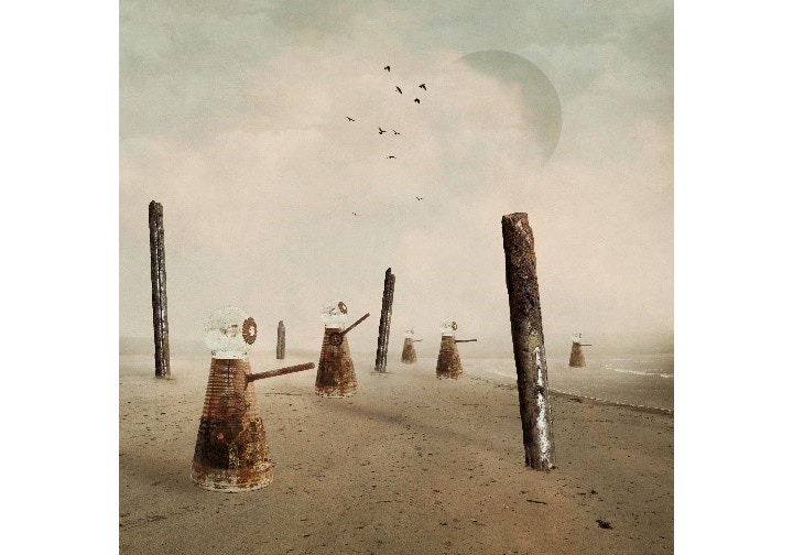
Thank you very much, I was really thrilled to find out I had been selected. These two pieces of work are part of my Covid 19 project. As the UK went into lockdown at the end of March I wanted to create a body of work in response to the very uncertain and unsettling time we found ourselves living through.
This year was thrown into chaos and I needed to ground myself and give myself a direction to focus on. ‘Safe Passage’ is the second piece in the series, I see the balloon as a home, everyone safe inside in order to protect themselves and others.
I have used many objects within both images that represent things of importance to the time. An old baked bean tin, a key and a motherboard, referring to the internet communication that really became invaluable to many. ‘Together We Stand, Divided We Fall’ was in direct response to the easing of lockdown, people were getting complacent and the kindness that had been so powerful was wavering. They do remind me of Daleks, this wasn’t intentional, but once I had finished I felt the concept worked as Daleks represent a force, something powerful that can protect or demolish.
As with much of my work the final images are soft and quiet with much of the colour removed. I am always trying to create an atmosphere within my work, something people can connect and respond to on an emotional level. I love the fact that everybody reads my work differently, they see things that I don’t and find their own interpretations. I think that is what is so special about artwork, it's so subjective and personal.
Your work is incredibly unique and eye catching have you had any influences from artists past or present that have inspired you?
Over the years I have found many artists’ work that I have found inspirational. I am sure they have influenced me in some way even if not directly.
One of my favourite artists is Christian Boltanski, his piece called ‘No Mans Land’ which addresses a multitude of subjects such as life, death, chance, time and God, is such a powerful piece of work that really makes you think about how fragile life is and how we are all individual but so connected. The collective heartbeat is very poignant, very apt for this period of time we are living through.
Sally Mann was one of the first photographers who’s work really caught my eye. Her way of working with large format plate cameras which is such a physical demanding process really inspired me in my early work. She is still today my favourite artist who’s work challenges the viewer to ask questions and face uncomfortable subjects but all presented with such depth and beauty.
Other artists whom I admire and have definitely inspired me over the years are; Sophie Calle, Cy Twomble, Annette Messager, Roni Horn and Minor White. All very different in their approach, style and medium but all have shown great individuality and passion within their work.
Emma Foster
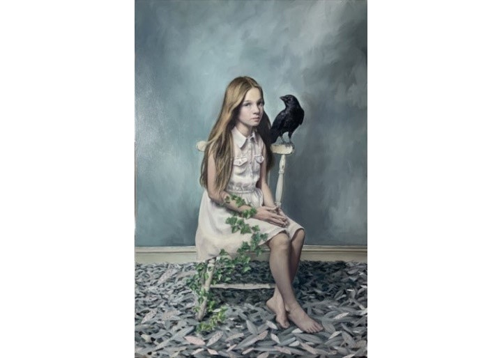
Emma is a realistic figurative artist, working in a mixed media of oil paint and gilded leaf, whether that would be silver, or gold, or white gold. Emma uses layers of very thin paint to achieve as much luminosity as possible.
Symbolism, whether it may be a written, and previously decided upon symbol, from folklore or religion, or whether it be a more personal, instinctive symbol, is an especially important element of her work. Also, nature, and humanity, and our place within the structure of nature, is also crucial to Emma’s artwork. Emma studied at Central St Martins school of Art, and took a degree in Theatre Design, which she tells us that may well have a large factor in her use of symbols and underlying, unspoken drama. Emma tells us, “until a few years ago, I worked as an illustrator, but my heart was never entirely captured, so when this was interrupted, by the birth of my fourth child, I began my artistic journey, back into the world of painting, purely for the pleasure of it.”
Congratulations Emma. Could you talk us through the influences within your art?
It is so hard to absolutely define what influences my artwork, as we are all exposed to so many hundreds of images on a daily basis, via social media. However, there are several artists that have always influenced me, and I have long admired.
The very first of which, that inspired my creative journey was the Art Nouveau Illustrator and Author, Aubrey Beardsley. I was introduced to his work at the age of 8, by my mother, who would sit with me as we gridded up and copied out his ink drawings together, at the kitchen table. It was at around this time, that I decided with a passion, that I wanted to be an artist!
Other Artists that I have always admired, and I believe have influenced my work, are Klimt, whose exquisite compositions of the human form amongst the beautiful patterns he surrounds them with astounds me, and of course, his use of gold leaf started off my exploration of gilding.
The Pre-Raphaelites, with their illustrative beauty and symbolic imageries also, have been hugely influential in my work, Dante Gabriel Rossetti, in particular. Yet, quite separate from the poetic, ‘Other-worldliness’ of the Pre-Raphaelites, is the artist James Whistler with his quietly sombre, yet beautiful, often monotonal compositions. He has also had a large influence on the style of my work.
Your entries to London Art 2020 are superb, can you tell us a little about each and expand on your use of symbolism within them?
Thank you very much. In each of these pieces, the model is my daughter Fleur, whom I’m very lucky to have to help me put these works together! ‘In Between Two Worlds’ was inspired by a (very unusual, thankfully) bout of insomnia, where I had a vision, which was duly scribbled out on my iphone. The idea of being torn between two worlds, two different expectations, wants, loves, needs, is something that we can all relate to. The idea of being tied or bound to the mundane, whilst wanting or hoping for more or different, is what is at the root of this piece.
The hummingbirds represent youth, joy, freedom and hope, the ethereal, whilst the convolvulus or bindweed in this piece, represents the bind to the normal, the usual, the everyday mundane.
‘The Keeper’ was composed in a much more instinctive way. The piece evolved as it was created. The decaying leaves, with the creeping ivy containing and surrounding the figure, whilst she sits within this interior space evokes feelings of unease, of threat perhaps. The crow, although often a common symbol of darkness and death, in this piece, however, for me, seemed to symbolise protection, strength and security, within this envisioned world of decay.
Feeling inspired?
Find out more about Galeria Moderna and keep up to date with their future opportunities

