Winsor & Newton’s Artists’ Oil Colour range has always been shaped by innovation — but their latest launches take things in two directions at once. On one hand, a dive into the past with a revival of five long-lost shades. On the other, the expansion of their core palette with new, contemporary colours designed to meet the needs of modern painters.
Whether you're reinterpreting tradition or pushing your palette in new directions, these additions give you more freedom to work the way you want — with the reliability, texture and permanence you’d expect from a professional-grade oil.
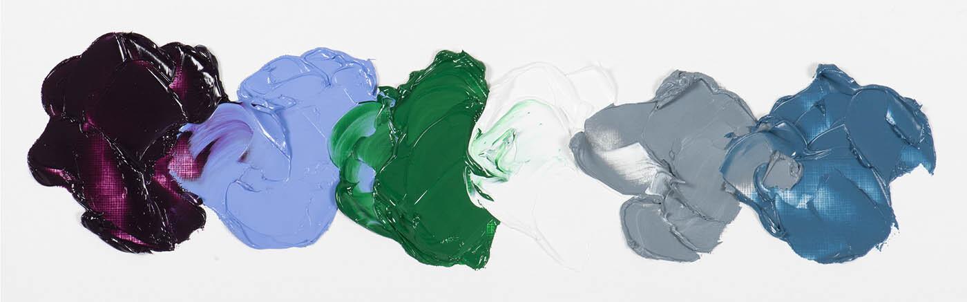
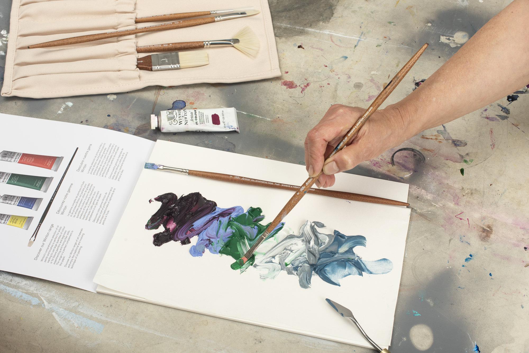
Drawing on over 190 years of pigment expertise, the new Historic Set brings five long-retired colours back to life. These aren’t just reproductions — they’re reformulated with safer, more stable ingredients, made for the demands of today’s oil painters. Each colour is inspired by a particular moment in pigment history — pigments that were once prized for their vibrancy but lost to time due to instability or toxicity. This set brings them into the present without compromise.
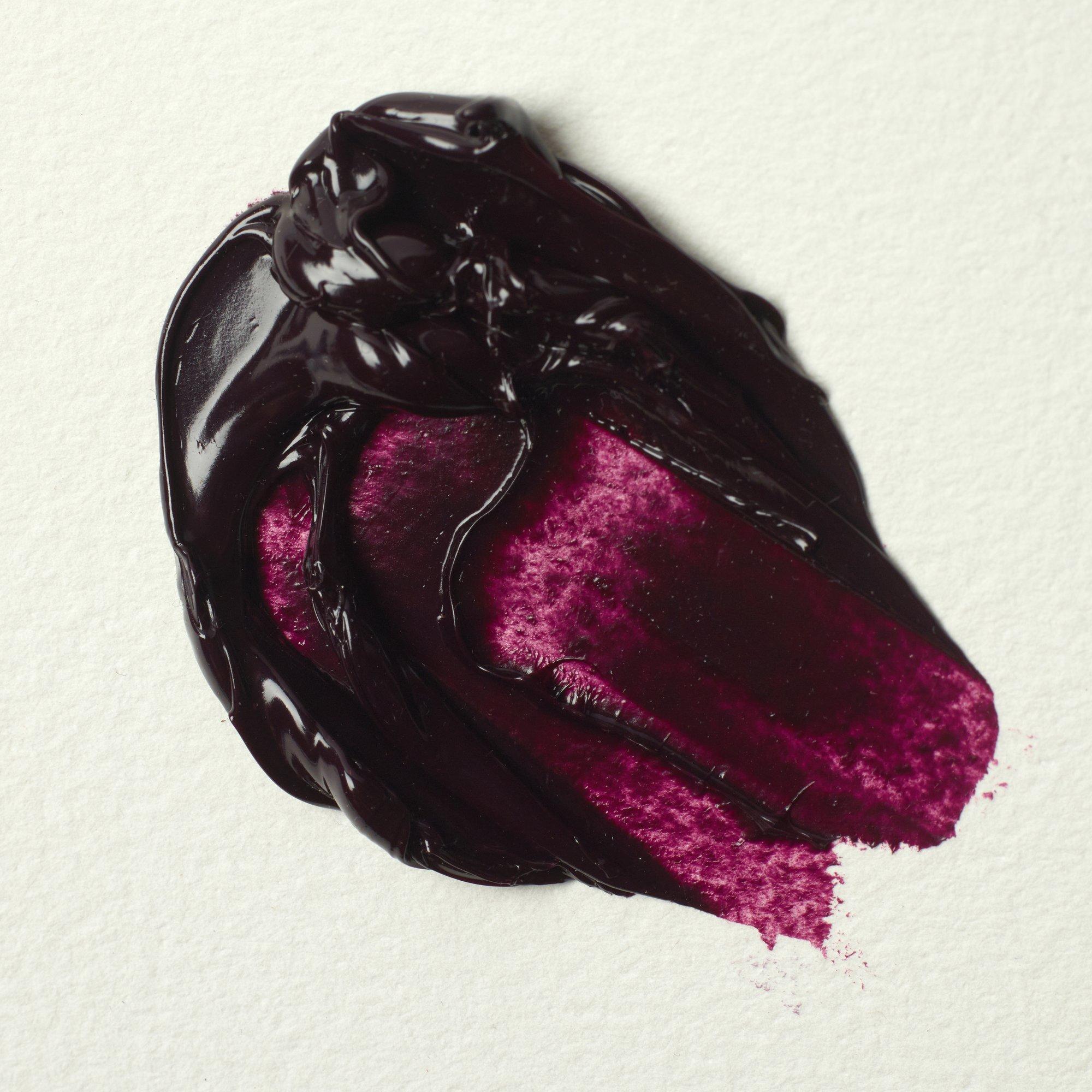
A rare single-pigment pink with a cool violet bias. Made by tweaking the chemistry of natural lapis-based ultramarine, this is a delicate but expressive shade that shifts depending on how you use it — soft and transparent in glazes, but surprisingly rich in mass tone.
- A cool pink with a soft violet undertone
- Ideal for atmospheric skintones, florals, or lifting cool shadows
- Offers transparency without losing chroma
- Adds nuance without dominating a mix
- Single pigment
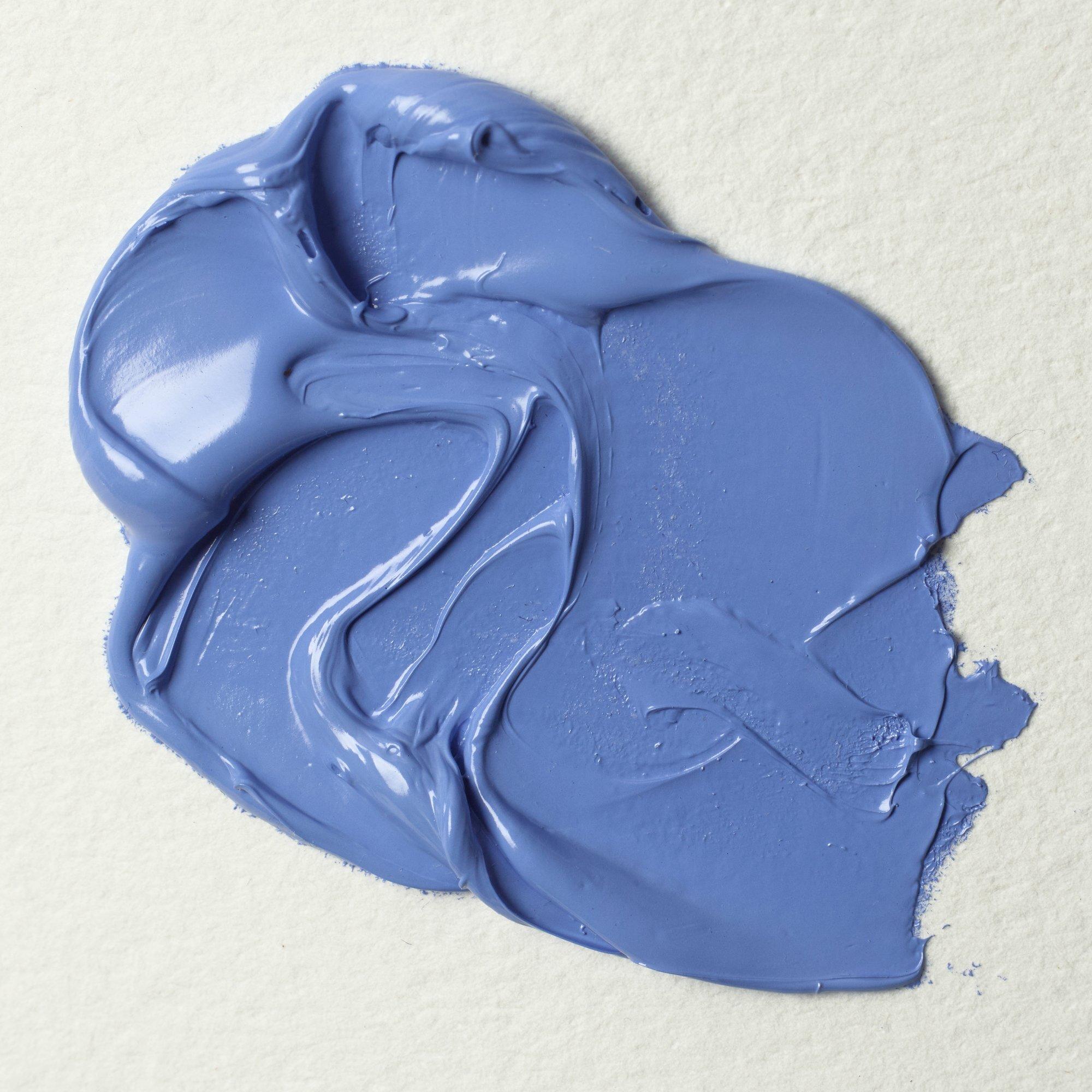
A strong, bright, mid-toned blue with powerful tinting strength and solid opacity. Historically known as King's Blue or Brilliant Blue, this version cuts through earths and neutrals cleanly, making it a dependable addition for modern mixing.
Opaque, bold, and balanced — without being garish
Works as a solid base for cooler skies or architectural work
Mixes cleanly with earth tones to create unexpected greys and teals
Useful for building form without leaning on black
If you’re looking to shift away from ultramarine or phthalo but want depth, this is your bridge colour.
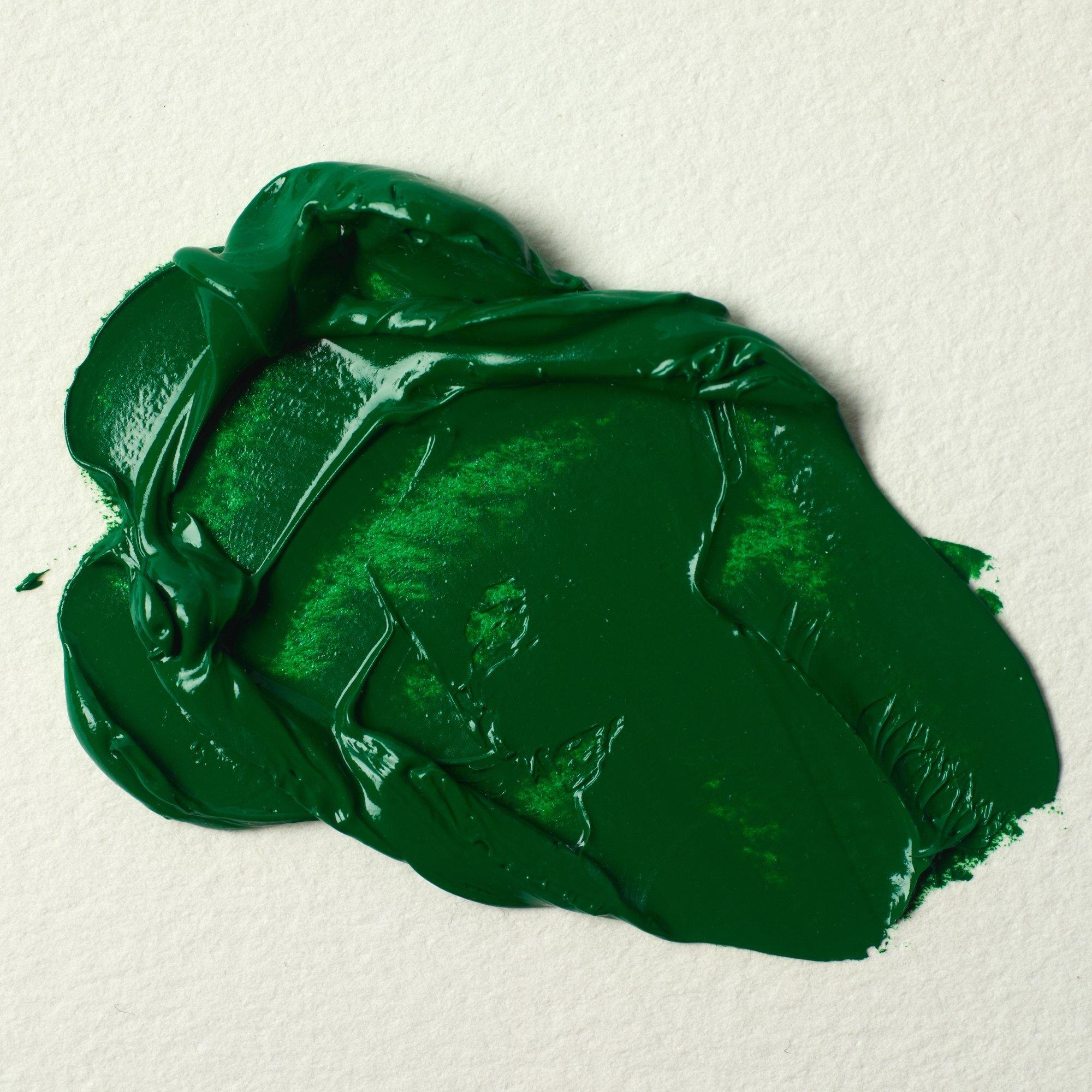
A bright mid-green once associated with toxic chrome pigments, now reimagined as a safe, permanent alternative. Slightly warm, semi-opaque and incredibly versatile — particularly in figurative work where you need control across a broad tonal range.
- Balanced green that doesn't lean too blue or too yellow.
- Holds its own in mixes without becoming muddy
- Tints beautifully with titanium or warm white
- Great for natural environments, botanical studies, or subtle greens in portraiture
- It’s the kind of green that plays well with others — rich enough to stand on its own, subtle enough to build into something new.
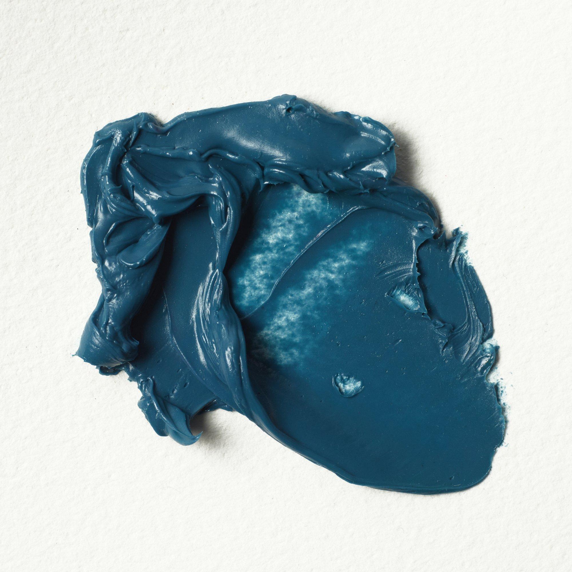
This isn’t ultramarine with white — it’s something more subtle. Soft blue-grey with a mineral warmth, born from long pigment trials and ash-based ultramarine residue.
- Sits between blue, turquoise and grey depending on light and mix
- Semi-transparent with a smoky, granulating texture
- Amazing for shadows, misty light, cool highlights
- Blends well with pinks and ochres for atmospheric colour
- It brings a softness to hard lines — great for expressive painters
The lab at Winsor & Newton have been investigating this colour for many years - it’s not just an Ultramarine reduced with white, it’s subtler than that. And still we could achieve quite an array of colours between blue, turquoise and greys, bright or dull. They tried many pigments and mixes to achieve this good colour. Turns out, you can burn your ultramarine blue shade when in very specific and diluted conditions, making the colour turn brown over time. Approaching it with a different perspective and the help of the green earth pigment, to reach this soft blue colour with good mineral tone while keeping it stable and lightfast.
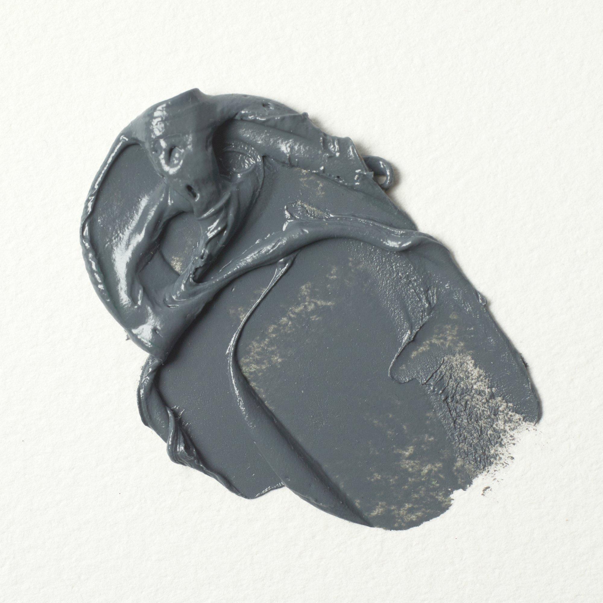
A transparent, mineral-based grey drawn from lapis residue and historical processes. It granulates slightly on the surface, lending texture and softness without weight.
- Lovely for layering glazes, toning colour, or muting intense hues
- Doesn’t deaden colour — retains clarity in transparent mixes
- Works especially well with violets, blues and earths
- Excellent choice for tonal underpaintings or grisaille techniques
- Adds elegance and restraint to bold palettes
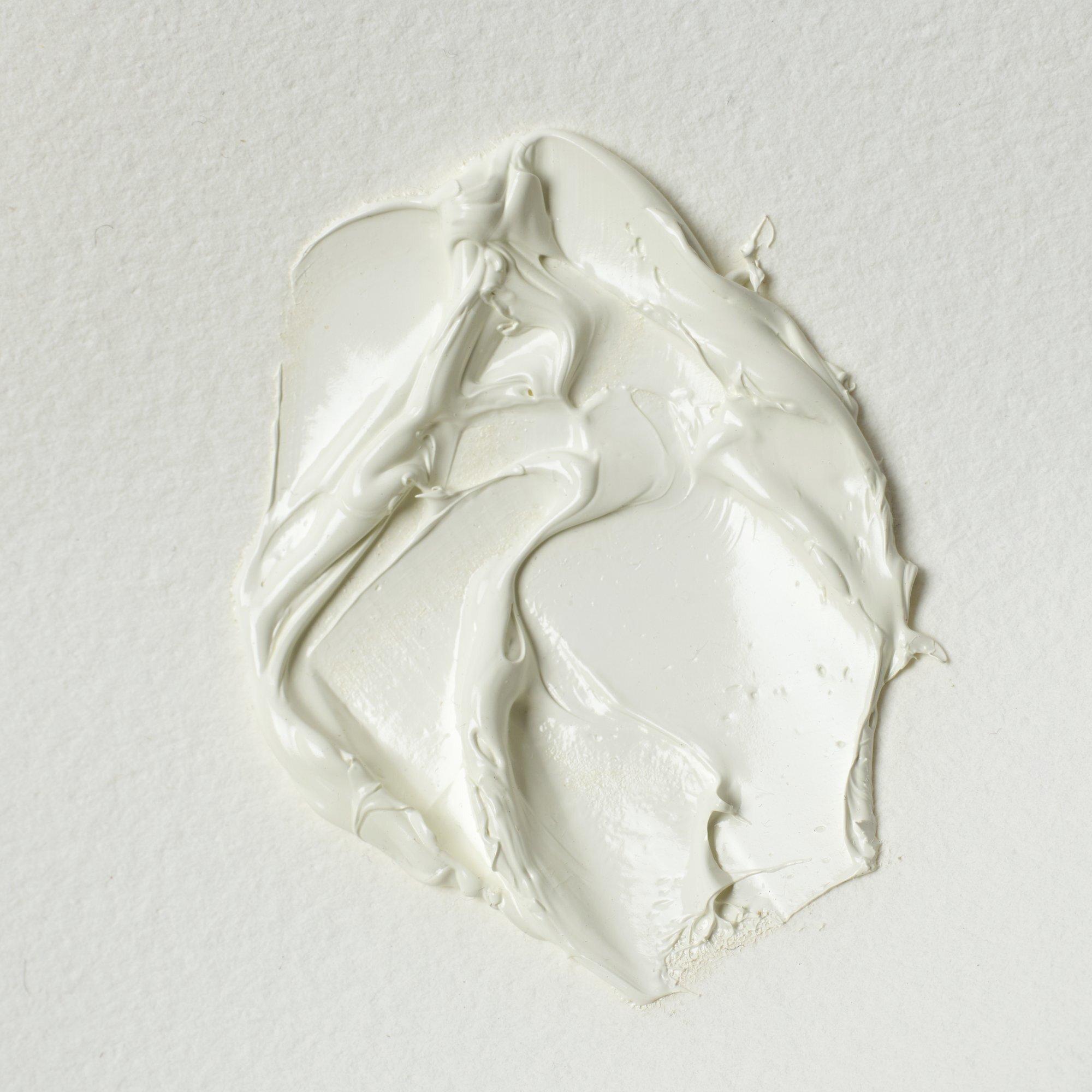
Warm white possessing the warmth and qualities of its Toxic white predecessors, White lead paint is known as "flake white" or "Cremnitz white". Was valued for the ease of handling and resilience. Lead white paint dries relatively quickly to form a strong, flexible paint film. Lead-based white is one of the oldest manufactured pigments.
This synthetic inorganic pigment derived from lead. Is warm white, made from completely opaque and permanent pigment, Flake White is a fast drier and mixes very well with other pigments, reducing their colours softly due to its low tinting strength.
- Ideal for softening strong hues or adding light without coolness
- Maintains luminosity in transparent mixes — no chalky veil
- Harmonises beautifully with earth tones, reds and muted greens
- Brings a natural, sun-lit quality to both modern and classical palettes
Add To List
Add a Wishlist
form to add wishlist here