
BP Portrait Award 2017 Exclusive Artist Interviews Part 2
Posted by Cass Art on 23rd Aug 2017
The BP Portrait Award returns for 2017, bringing together international talent once more for the most prestigious painting competition in the world.
Showcasing a breadth of approaches to portraiture; from family portraits to the challenges of infertility, to intricate portraits illumining skin and the richness of fabrics, to symbolism and numerous references to the great masters, the variety of works makes yet another unmissable show at the National Portrait Gallery.
This year’s entries marked four decades of the competition and the thirty-eighth exhibition at the NPG. The top prize of £30,000 was awarded to Benjamin Sullivan with his piece ‘Breech!’, which will be on display at the NPG alongside a series of shortlisted artists.
We caught up with the shortlisted artists of 2017 for an insight into their process, their must-have materials to achieve their unique approaches to painting and the inspiration behind their works for the BP Portrait Award and their artworks featured in the second annual show ‘Face to Face’ at the Islington Flagship this Summer.
Laura Quinn Harris
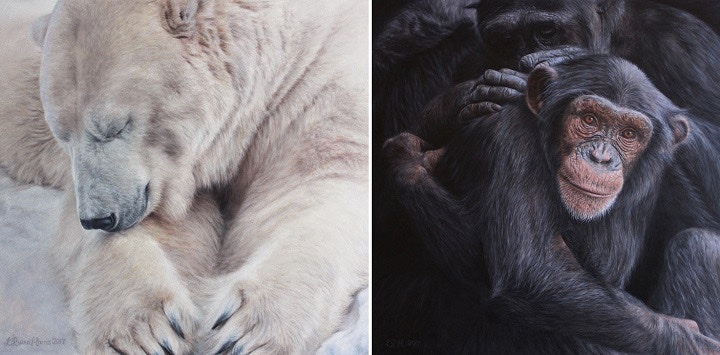
Laura Quinn Harris gained a BA (Hons) in scientific and natural history illustration from Blackpool and the Fylde School of Art and Design. Her work has previously been selected for the Artists & Illustrators Artists of the Year exhibition and she was a finalist in the BBC Wildlife Artist of the Year competition.
You previously studied in a degree focused on scientific and natural history illustration. How do you think this has influenced your approach to painting?
It was while studying for this degree that I gained many of the skills I use to paint today and it really set me on my current path. When I went back to college to study for my Art Foundation diploma I discovered a love of drawing animals. My tutor recognised that I was much more suited to small intricate drawings than the large expressive ones, and I ended up producing a book of wildlife etchings for my final project. This led to my decision to study Scientific & Natural History Illustration, where, amongst other things, I learnt how to accurately paint detailed images of plant and animal life.
Working in a controlled precise manner isn’t for everyone but it’s how I like to work, so the course suited me perfectly, combining my love for the natural world with my love of detail. Although I’d assumed I would go into the field of botanical or medical illustration, when we were given the task of producing a piece of wildlife art to submit to a competition, I was surprised to find that my work was selected for the National Exhibition of Wildlife Art and then sold at the show. This gave me a taste for wildlife painting, so I produced more and began a career in pet portraiture.
I then decided to try my hand at human portraits – since my animal paintings were all portraits anyway I figured it couldn’t be that different – and I really enjoyed it, so now I do both in equal measure. But my scientific illustration training definitely shaped the way I paint.
The delicacy of your paint application is beautiful, especially when it comes to referencing the feel of the fabric, skin or hair. What techniques do you use to achieve this? Do you have any materials in particular which aid this technique?
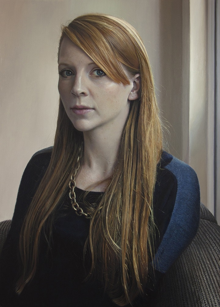
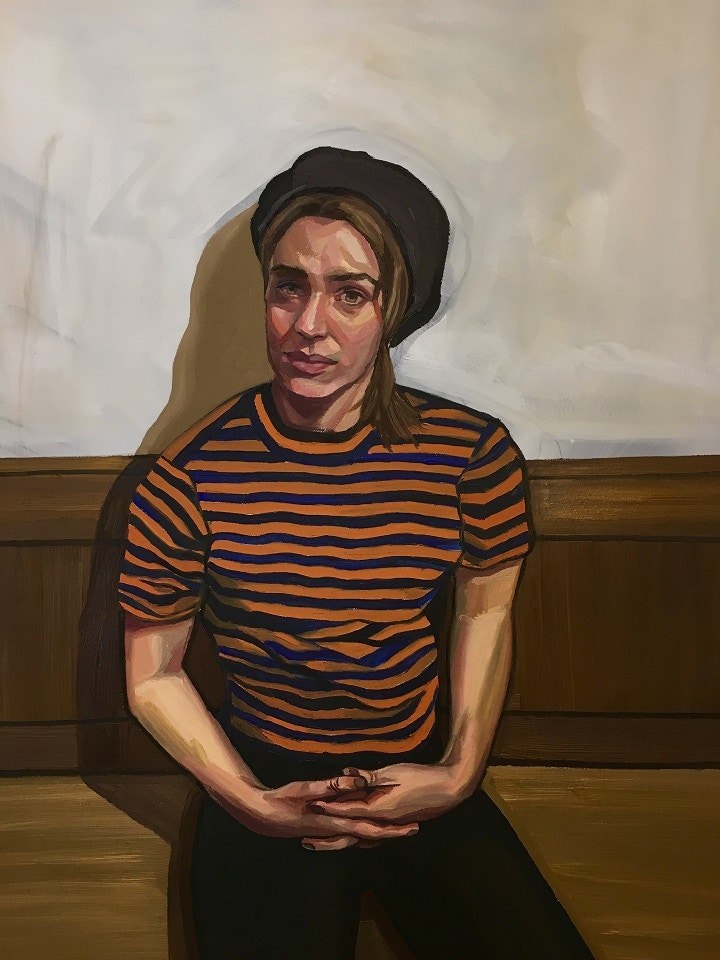
When you look closely at someone’s skin - even Jessica who has beautifully clear skin - there are many different colours and tiny spots and bumps. So I use lots of small strokes of paint, over several layers, to try to achieve this texture. I think it helps make the skin appear luminous if you build up thin layers, leaving earlier ones showing through in places, and so I use a bit of Liquin Impasto gel to make translucent glazes.
Although I don’t use my paint thickly, I like to use the impasto version because it helps retain the brushstrokes and add some body, as well as speeding up the drying process. With hair I use larger brushes to get down most of the colour and small ones to define individual hairs in the later stages. I always think the addition of wispy hairs at the end of the painting process (or whiskers on animals) really brings the portrait to life.
When it comes to painting fabric, each time is different depending on the item, so I just make it up as I go along! The top Jessica is wearing in my portrait of her was quite difficult to paint as it was a very fine knit, so there was a lot of uniform detail I had to get right. I spent longer on that than any other part of the painting by a long way, and I still don’t feel like it was enough. If it hadn’t been for the BP deadline I’d probably still be working on it now!
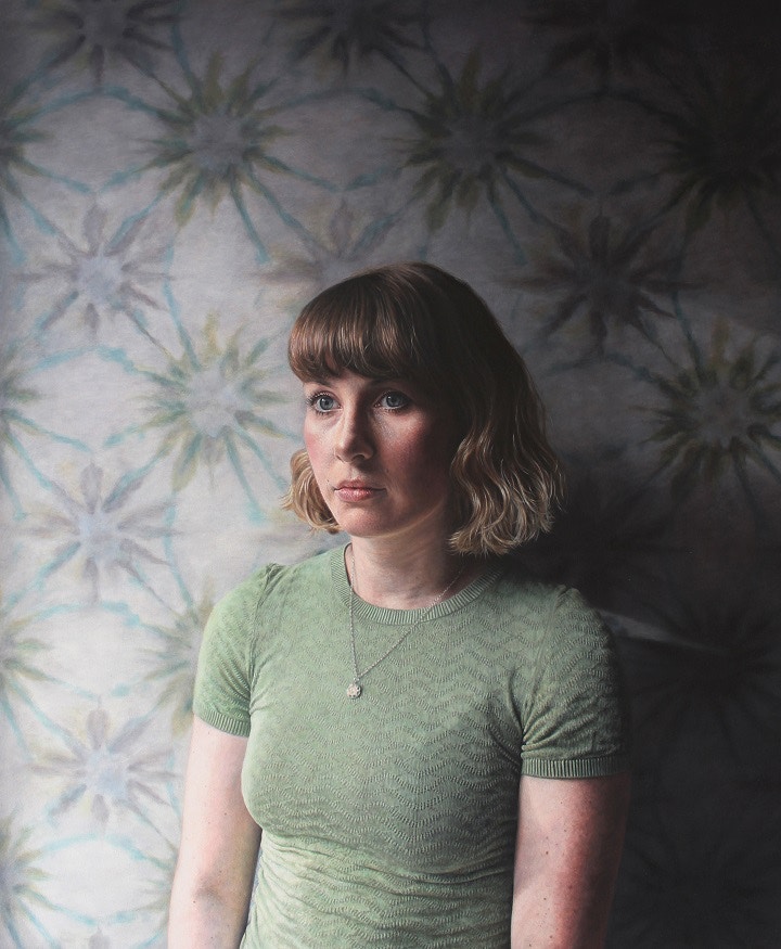
Your colour palette has quite an earthy feel to it. How do you think the colours influence the perception of a sitter’s personality? Were you trying to present a particular side to your friend, Jessica, in your submission for the BP Portrait Award entry?
The wallpaper in the background of the portrait really dictated the colours I used. I chose a top for Jess to wear that I thought complemented it well. I wanted the portrait to have a wistful feel about it, and so the colours are quite muted, but that was my own personal vision rather than a representation of Jessica’s personality. She is actually a very sunny person, so I suppose the colours I’ve used reflect a persona I wanted to her to exhibit, rather than her true self.
You have been featured within numerous competitions, including the Artist & Illustrator Artist of the Year Awards. What advice would you give to painters applying for the BP Portrait Award?
This is the fourth time I’ve entered the BP Portrait Award and the first time I’ve been selected, so my main advice would be - don’t give up! I’ve been successful in other juried exhibitions but I’ve also had a lot of rejections, and after each rejection I try to think about what I could have done differently and how I can improve the next time.
I think having something to aim for - especially the BP Portrait Award, where the calibre of artists featured is always so high - helps me focus on producing the best work that I can. Plus, each painting that I’ve created for a competition and had rejected I have then entered into different competitions, often with success, so it is never a waste of time. It is helpful to look at past exhibitors in the competitions you enter as well. I don’t believe that you should change your style to fit a competition, but it helps you get a feel for what the judges are looking for, and I have learnt from experience that you can save yourself time and money by avoiding competitions for which work similar to yours never gets chosen.
Explore more of Laura’s work at www.lauraquinnharris.com or find out more about her work selected for the BP Portrait Award 2017: Laura Quinn-Harris
Raoof Haghighi
Raoof Haghighi is a self-taught artist whose work has been seen in group and solo shows in the UK and Persia. His work has been included in the annual exhibitions of the Royal Society of British Artists and the Royal Society of Portrait Painters. He was previously selected for the BP Portrait Award in 2011 and 2015.
Your work is exceptionally detailed. Has photorealism always been a key focus in your work?
I am detail-oriented, but photorealism is not my main focus. I'm driven to pursue many different interests, to learn in a variety of ways and let my feeling guide me through.
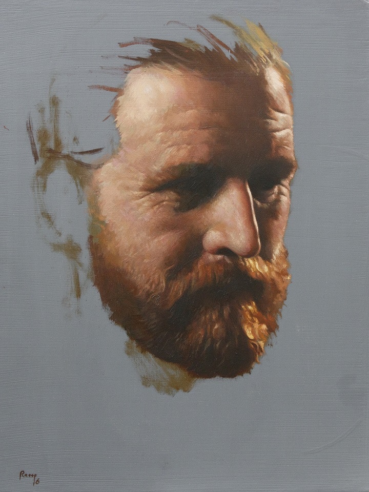
You often paint on aluminium – how does this change your approach to painting and the finish of your final work?
Actually, I don’t often paint on aluminium. I have experimented painting on aluminium because usually I like to paint on ultra-smooth, hard surfaces.

You have previously appeared on Sky Arts Portrait Artist of the Year and now the BP Portrait Award, what advice would you offer artists looking to apply for painting competitions?
Be yourself and enjoy the art and painting, not to strive for winning any competition. All competitions are driven by judges choices, therefore an artist should just follow their intuition, to create a piece that comes from heart.
Explore more of Raoof’s work on his website www.raoofhaghighi.com or find out more about his work selected for the BP Portrait Award 2017: Raoof Haghighi
Ania Hobson
Ania Hobson undertook a degree in fine art at the University of Suffolk followed by short courses at the Prince’s Drawing School and Florence Academy of Art. Her work has been seen in group exhibitions in the UK and the annual exhibitions of the Society of Women Artists and the Royal Society of Portrait Painters.
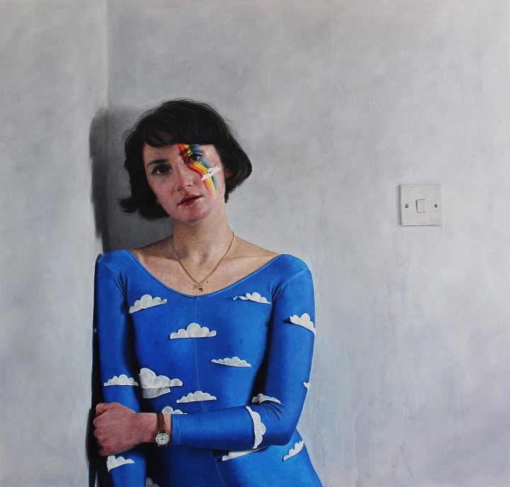
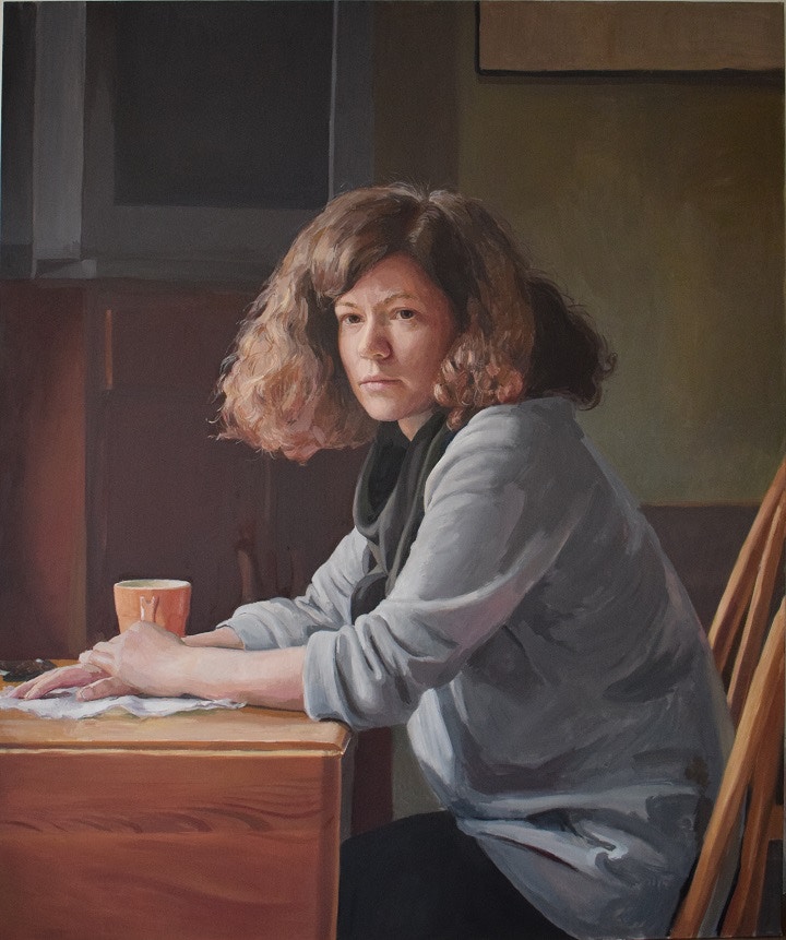
You are one of the few artists to submit a self-portrait to the award. What was the thought process behind this piece and why did you choose it for the submission?
The piece that I submitted for the BP Award came about after many weeks of struggling with painter’s block - where nothing seemed to work or go well. This painting became a means to break through the frustration of not creating work I was happy with. Challenging myself with the strange perspective made it exciting, not really knowing what the outcome would be.
The perspective I chose was designed to take it away from realism and turn it into something contemporary with an abstract feel to it. In fact, once I started painting it came together pretty quickly, the challenge then was not to overwork it! Eventually my self-portrait was a painting that I created more for myself and how I was feeling at the time, I was really pleased with it and decided to submit.
You have studied and painted abroad, how do you think your time in Florence has developed your painting style?
Studying in Florence for 3 weeks really helped build my senses and instincts up as a painter. It’s the home of renaissance art, so you are surrounded by it everywhere you walk. I would spend many evenings in the Plaza of the Outside Museum sketching the statues or visiting the Uffizi Gallery, soaking it all in.
The Florence Academy Of Art base their techniques on the renaissance style which really made me aware of techniques I didn’t know before. I don’t tend to paint in the traditional style, but it’s a really good platform to start from and to learn basic techniques. For instance working in the right lighting, how to create skin tones, colours according to warm and cool temperatures, and learning the sight-size technique .Working from life really built my confidence up as a portrait painter, and by the end I found it difficult to paint from a photograph rather than from a living form.
Where do you take your influences from?
My influences can be anything from modern portrait painters to abstract artists. As a child I spent countless hours looking through art books at home, so it’s quite hard to say at what point influences stop or start. I will pick small things out from each painter I like and build them into something of my own. Alice Neel, Kerry James Marshall and Lucian Freud are ones that I have probably been influenced by the most.
What are the vital tools in your studio?
As well as my paints my vital tools are my inspirations and impasto. I have recently started using beeswax impasto which I find is great for keeping the textures of the brushstrokes whilst allowing the paint to move more, and importantly it also helps matt the paint.
Cass Art has always been an important stop off place for me over the years - a visit to the National Portrait Gallery and then slip into the shop round the corner to Cass Art Charing Cross to stock up on supplies!
Working in the right space is also very important as it allows you to stand back from your painting and to focus. I am currently renting a space at the amazing Asylum Studios, at the old American air base in Rendlesham, Suffolk. It’s a studio collective where I have my own private studio, but it’s also a place buzzing with amazing artists - so there is always a friendly face around to have a cup of coffee with and share or bounce ideas with! It also has a large exhibition space which is very useful if you want to hang a painting away from all the studio clutter.
Explore more of Ania’s work on her website www.aniahobson.com find out more about her work selected for the BP Portrait Award 2017: Ania Hobson
Hero Johnson
Hero Johnson undertook a postgraduate diploma in fine art at Cyprus College of Art with further studies at the Heatherley School of Fine Art, Chelsea. Her work has been seen in group exhibitions in the UK including the annual exhibitions of the Royal Society of Portrait Painters, winning the Society’s Changing Faces Commission Prize 2015.
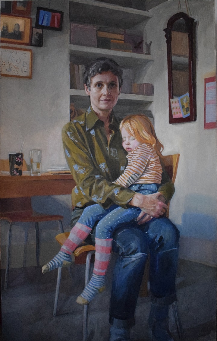
Your portrait for the BP Portrait Exhibition 2017 continues your friend Tabitha’s documented style of her experience of infertility. How do you translate a sense of narrative through your work?
In 2013, finding herself unable to conceive, Tabitha made a piece of work called ‘The Wish’ which was an imagined photographic portrait of what her elusive child may look like. Now that her daughter Gilda is a firm physical reality in the world, I wanted to add to their story, almost as an update in my own painted version.
But I think the sense of narrative in my work is implicit rather than explicit. I will have a reason why and how I want to paint a certain person and I can read that in the final work but it’s not something I always feel the need to make blatantly obvious.
Throughout your work, the background setting has a prominent feature. How important is it to you to contextualise your sitter’s environment?
It is becoming increasingly important. I only ever used to paint from life, generally in my studio. I wasn’t comfortable painting in someone else’s home. So this meant that the sitter’s environment was really my environment. This can be an interesting dynamic but I was becoming increasingly aware of its limitations. Once I started to work from photography as well as from direct study I felt the world opening up. From a formal perspective it has given so more potential in terms of composition too.
What are the vital tools in your studio?
I use a very limited palette of Michael Harding Oil Paints, which I’m very attached to. The core of it doesn’t change at all although I’ll occasionally alternate a second blue. I enjoy the sense of getting to know it more deeply as time goes on. I buy the same Pro Arte Sterling brushes over and over. I take much better care of them than I used to but I still find that I ruin the finer ones very quickly. I have had the same Mabef Easel for 20 years which has travelled with me from place to place. Again, I feel very attached to it.
Explore more of Hero’s work at www.herojohnson.com or find out more about her work selected for the BP Portrait Award 2017: Hero Johnson

