
SKY ARTS LANDSCAPE ARTIST OF THE YEAR SERIES 11: MEET THE ARTISTS
Posted by Cass Art on 26th Feb 2026
The eleventh Series of Sky Arts Landscape Artist of the Year sent talented artists from across the UK to incredible locations to compete for the title of ‘Landscape Artist of the Year’. Cass Art has supported the show since it began in 2015, supporting participants with art materials throughout the competition.
The artists are challenged with just four hours to capture scenes from the beautiful vistas of the Lake District to London’s bustling South Bank, all under the watchful eye of judges award-winning artist Tai Shan Schierenberg, independent curator Kathleen Soriano, and new judge, Director of Frieze, London, Eva Langret. All this for the chance to win a £10,000 commission to create a landscape of Croagh Patrick in County Mayo for The National Gallery of Ireland. 50 additional artists painted along at each location in a bid to be chosen as a wildcard winner and be in with a chance of receiving an invitation to compete in the Semi-Final.
We caught up with the heat winners and wildcards from this series to discover the materials they love to use and their experience of the show…
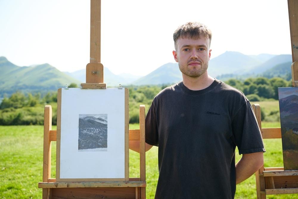
HEAT 1: DERENTWATER, LAKE DISTRICT

WINNER – KIM DAY
Hi Kim, congratulations on being selected as the Heat 1 winner! Tell us about your experience on the day – did you have a game plan?
I remember on the morning of the heat my main aim was to try and stick to what I know! I had a little list of all the stages I normally take with my painting, in case I got distracted with everything that was going on. Actually, the night before, I went and sat near the pods and just took it all in and had about 3 good compositions in my mind’s eye. Strangely, I ended up doing something different and just went with my gut in the moment. Best policy I think!
Your submission was a colourful mixed media piece of the dunes in Studland Bay, Dorset. You talked about using colour instinctively, selecting colours to evoke emotion rather than remaining true to life. What was it about that scene that made you want to capture it, and can you tell us about your colour choices?
With my submission, I was really thinking about the tactile nature of the Dunes at Studland Bay, there is so much variation in the grasses and mosses, all the beautiful changing colours. At a certain time in the day during spring and summer, you can see these really pearl-like sea and sky tones, the pink hues just seem to bounce around the atmosphere. I think I was trying to capture both the textural feeling of the dunes as well as my own emotional state, which accounts for these contrasting colour elements and my mark-making to express all these differing aspects of the environment.

At Derwentwater, the judges were impressed by your composition; layers of trees rising up behind the boathouse on the lake and the mountains beyond. Can you walk us through your process?
My composition of Derwent Water was led by my desire to show the full grandiosity of the mountains against the boathouse. I felt that if I had pulled back to show more of the environment, it would effectively reduce this impact. I also loved the mysteriousness of the boathouse and that human element, that was part of the story of the image for me. It was then just a case of working on the texture and mark-making and trying to reflect the beauty, colour and movement of the trees, they were so varied in shape and form that it was a joy. I also used stronger colours with the trees to help separate them visually, whilst actually desaturating all the mountain colours behind, using colours that were taken from the hills much further away to the left of the scene to balance it out.
You use quite a range of materials on each piece, do you have some favourites?
I use Winsor & Newton acrylics, these are my foundation. I apply them quickly to block out the canvas, once this is done, I then start to use my water soluble Neocolour Caran d’Ache pastels, I love the pastels as they soften edges and add texture to the painting. In the heat, I was also using acrylic brush pens, it is a fast way to build up texture and finer detail (at this scale). I think my favourite materials are my glazes, I use often use Golden for my glazes, when I add a glaze of colour over my acrylics everything suddenly comes to life - I couldn’t live without them!
Thanks Kim! See more of Kim’s work at dayfinearts.com or @day.finearts on Instagram.
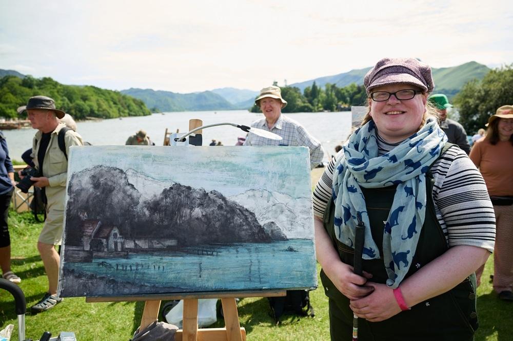
WILDCARD WINNER – GINGER (GEMMA) RAMSDEN
Hi Ginger, congratulations on being selected as the Heat 1 wildcard winner! What was your experience like on the day?
Full on! The day begins with sign-in and briefings before the production team takes you to your painting location. They were already aware of my disability, so from the moment I arrived I felt genuinely supported. The team checked in with me throughout the day, which helped me relax and fully enjoy the experience while staying focused on my work. The atmosphere was incredible - so much talent in one place. By the end of the day, there was an inspiring range of artwork, and a real sense of camaraderie, with artists sharing tips, tricks, encouragement, and even snacks.
Alongside the tight 4-hour deadline, as a sight-impaired artist, what additional challenges did you face, and how did you navigate those?
Distance and terrain always provide a fun challenge. The further away an object is, the more it blurs and melds into the land around it, making it tricky to separate the elements of the landscape. I researched the area in advance to understand the key shapes and forms. I also rely on a consistent setup: all my media and water sit to the left of my easel - water at the back, pastels and charcoal at the front - with sight tools clipped to the right. That way, I always know where everything is (and I’m far less likely to knock over my water… or set fire to the grass with my magnifier!).

Although it was a bright, sunny day, your work captured a brooding scene full of atmosphere; a panoramic view of the lake with dark monochrome trees set against pale washes of colour. What made you decide to depict the landscape in this way?
We were facing directly into the sun for much of the afternoon, which meant I was effectively light-blind for a good portion of the time. When that happens, much of what I see reduces to contrast and tonal values - strong lights and deep darks - while colour becomes washed out. Rather than fight that, I decided to embrace it. Working with a limited palette allowed me to focus on atmosphere, structure, and mood. The brooding quality felt honest to my experience of the scene, capturing not just the landscape itself but how I physically see and interpret the world around me.
We saw you using mixed-media, manipulating the surface with your fingers. What are your go-to art supplies for landscapes, and do you have any techniques and tips you’d like to share?
I like to create heavily textured surfaces because they help me navigate the composition - almost like a tactile map. In some ways, it’s similar to how Braille or touch maps guide movement and understanding. The best way to create this texture is by using a mix of modelling paste, gesso, and pastel ground, creating a thick surface with enough grit for pastel to properly adhere. My go-to material is charcoal; its versatility and ability to mix with water make it the perfect foundation. Because contrast and value are so important to my sight, most of my paintings begin in black and white before colour is introduced.
Thanks Ginger! See more of Ginger’s work at @ginger_ramsden_scottish_artist on Instagram.
HEAT 2: ST JAMES’S PARK, LONDON
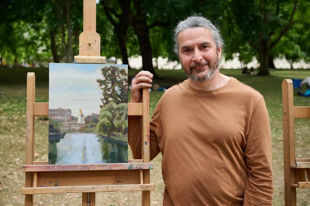
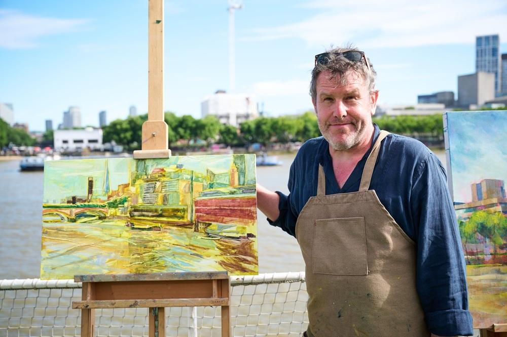
WINNER – NIGEL GLAZE
Hi Nigel, congratulations on being selected as the Heat 2 winner! What was it like for you on the day?
It was an amazing experience. Just the process of traveling to somewhere new, being out of my comfort zone, and the surreal experience of being asked questions throughout the day felt quite unique.
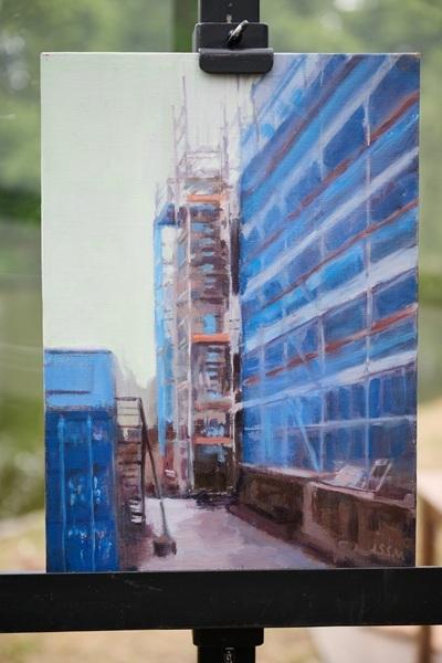
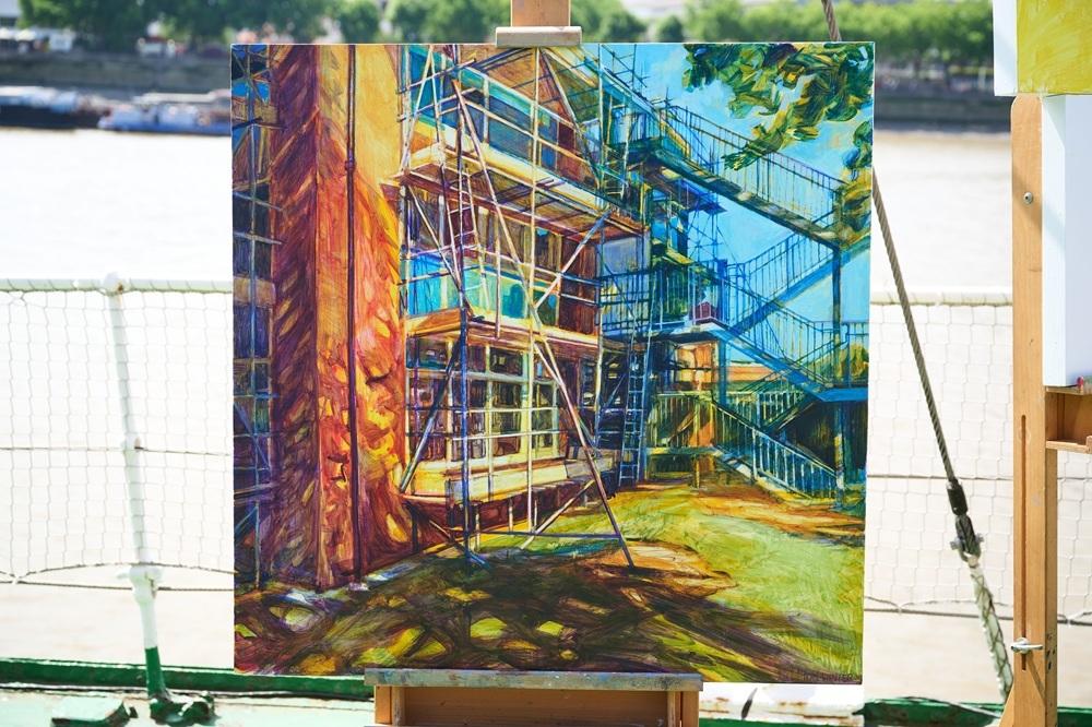
Your submission was an urban landscape, depicting a building covered in scaffolding with a vibrant blue cover, creating an interesting colour composition. You chose a similar composition in your heat, can you tell us more about your composition choices?
The location of St. James’s Park has a very formal structure, with manicured gardens and monumental trees. To me, the composition needed to echo this, so I chose a strong vertical and a clear "way into" the scene.
You mentioned that in your usual practice, you tend to focus on subjects that are often overlooked. How did you feel when presented with the grandeur of Buckingham Palace and St James’s Park?
Standing there, the formality of the place was clear, yet the sounds of the Changing of the Guard and the bustle of people led me to consider the palace as a strange home - a private space viewed by thousands. It made me consider the tension between the personal and public - a weird voyeurism.
You started with underpainting in warm tones, before building up the soft blues and greens of the landscape. What colours would we find on your palette?
I often start with a strong tonal structure, finding the patterns of light and dark. Plein air painting holds a challenge in knowing how the light will shift over four hours; the darks and lights often need to be known, and then the colour and feeling of the piece. This was a hot day with a hazy, warm light, so I used various warm whites and contrasted them with cool blues and greens. My palette consisted of:
- Unbleached titanium, Naples yellow, lemon yellow, yellow ochre, and cadmium yellow deep.
- Alizarin crimson and cobalt violet.
- Cobalt blue, cerulean blue, terre verte, and viridian.
- Raw umber.
I often try to reduce colours where I can, and I was particularly conscious of leaving red out of the palette for this piece.
Thanks Nigel! See more of Nigel’s work at nigelglaze.art or @nigelglaze.art on Instagram.
WILDCARD WINNER – NEIL MULDOWNEY
Hi Neil, congratulations on being selected as the Heat 2 wildcard winner! Tell us about your experience on the day – was it what you expected?
As a professional Artist in Ireland I love creating my work on locations where trees are found beside water, so I was delighted that Heat 2 was held by St James’s Park lake. The Heat was very exciting and the crew were absolutely amazing. The intense sunshine of the day proved to be a challenge as my paints were drying quicker than I could use them. I couldn’t believe it when Kathleen Soriano approached me and shook my hand. It’s a moment I will never forget, I am so grateful to get selected as the Winner amongst 50 wildcard competitors.
With such a majestic scene in front of you, how did you decide which part to focus on for your composition?
The scene was a predominantly green one. I needed to decide early-on regarding the strong shapes I wanted to focus on, if I didn’t do that I felt the scene could become a jumbled chaos of green. I chose to focus on a beautiful willow tree at the water’s edge. I captured the curved form of that particular tree to give movement to my painting. I hoped it would add contrast against the leggy trees behind.
I was delighted with how the public connected with the piece and wanted to discuss it while I was painting.

You managed to depict the reflected light and landscape in the water perfectly with bold, almost graphic brush marks. Do you have any tips for painting water and light?
I really love how water can add so much character to a piece and even tell us more about what is just outside the edges of the painting. I like to focus on the ripples in lakes, and how they grab little snippets of colour from the surrounding trees and sky. I worked quite blocky on all aspects of my painting just to make sure I got down enough information on the canvas while the clock was ticking.
My advice for painting water and light would be to start with blocks of colour and work from dark to light. My favourite part was adding the lime green highlights beneath the willow where it meets the water.
Your painting had a warmth to it, with a soft pink ground, cream coloured clouds reflected in the water, and deep, rich purples in the shadows. Are there certain colours you always pack for plein air painting?
When painting predominantly green scenes such as St James’s Park I find that vast areas of greens can become a bit too much for the eye. I like to use a base colour of warm orange/pinks/purples. For me, this allows the block of green to have a contrasting tone peeking through the gaps. I find it reads a bit easier. My aim is to give my greens a bit of breathing room so the value of each tone of green won’t be lost amongst a woodland of similar colours.
I do use a lot of purples in my shadows, I find they work effectively next to the green shades I use. The cream coloured cloud in my painting features both in the sky and the lake. This is not something I would normally do, as it was very large, however it was representative of the overcast morning we had in the park. Tai was enthusiastic about this addition to my piece so I decided to keep it in my painting.
In my work as an artist I find the technique of charcoal for my underpaintings followed by acrylic paint over the charcoal works best. I love working with Liquitex paint and I find their paints are very vivid and reliable.
Thanks Neil! See more of Neil’s work @neil.muldowney.art on Instagram.
HEAT 3: DOVER FERRY PORT
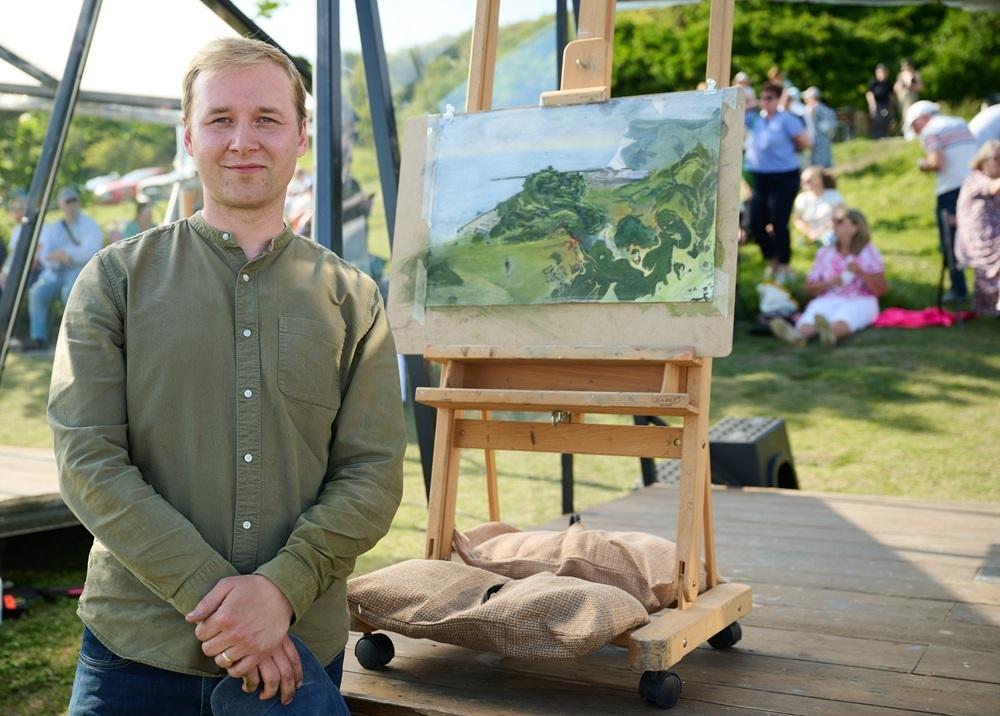
WINNER - PRASAD BEAVEN
Hi Prasad, congratulations on being selected as the Heat 3 winner! How did you find the experience of being on the show?
I found the whole experience to be quite daunting yet at the same time wonderful. You're thrown into a focused environment full of professionals and the general public, and the topic of interest is your art which at times does not leave the privacy of its own studio. In that sense, I felt the experience was very important because you need people to see your work, to engage with, to talk about it, to have a greater understanding of it. Each artist is on their own journey, and I feel there are always important reflections to make along the way in order to progress. Being under the watchful eye of the judges in itself was an important experience that I can come away from and grow. Not to mention the whole crew were incredibly kind, dedicated and personable, assisting in any way they could to make the experience positive for the artist.
In the heat, we saw you begin in quite a unique way, using marbling to create initial shapes on the surface. Can you walk us through your painting process?
Yes, I discovered a complete fascination with ink marbling through its delicate nature, organic flow and meditative process. It has allowed me to explore the landscape within myself. The process entails floating Chinese ink on the surface of water, basically working from a bath of water no more than 2cm deep. Then with the brush I move the ink around exploring shapes and compositions - I like to think broadly in terms of positive and negative shapes, after which I catch the ink off the water by laying down a sheet of paper on it. Crucial to the process is the paper. The paper must be absorbent and at the same time sturdy enough to withstand the weight of water and ink. Once this part is complete I work in washes of watercolour, bringing out and discovering forms suggested in the marbling after which I sometimes refine with pastel. I've found key to the success of this process the transparency of watercolour washes to allow the beauty of the ink marbling to seep through.
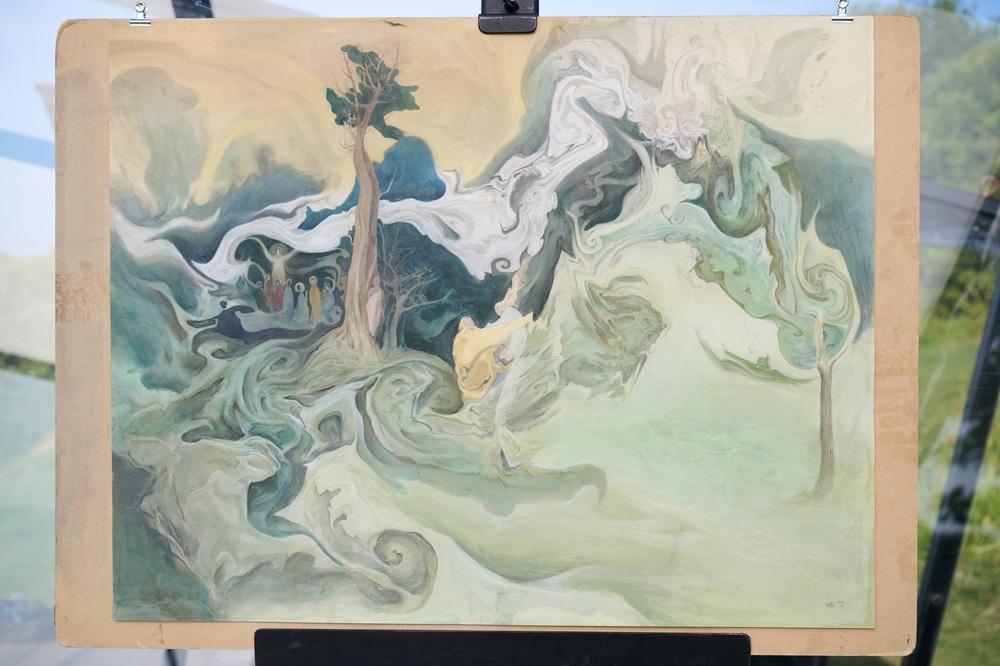
Your submission was an imagined landscape with swirling, natural forms, created using marbling, watercolour and pastel. By contrast, the bustling port at Dover presented you with an industrial scene within the landscape. Did you feel out of your comfort zone, and how did you decide to tackle this?
Yes, the submission and the scene we had to paint were very different, yet I had enough natural shapes to work with. I practically ignored the ferry port as I didn't find it interesting, but I did manage to fill in suggestions of it as my piece evolved. Regarding how comfortable I felt, I would say I was in a very concentrated state during the whole day, and this managed to settle my nerves, once I caught a glimpse of the white cliffs I knew what I wanted paint. I decided on a diagonal composition, compressing the ink marbling in the lower right corner and giving enough open space in the top left corner to depict the sea's horizon. Once I was happy with the overall composition and the broad washes, I started to expose the ferry port in areas between the marbling and paper, as if the industrial scene was being interrupted by the flow of marbling or vice versa. Towards the end, I started to observe the landscape more, bringing out saturated colours to give a sense of the place and time of day.
Which inks do you use and what are your other go-to materials for landscape painting?
I use Chinese inks from a bottle as it's already in liquid form as opposed to an ink stick. My other go-to materials are really just watercolour and occasionally pastels. I tend to keep my options fairly simple if I can. I also like to use a range of calligraphic brushes which have an expressive mark-making quality.
Thanks Prasad! See more of Prasad’s work at prasadbeaven.com or @prasadbeaven.art on Instagram.
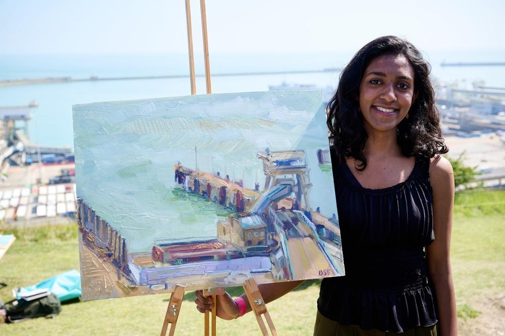
WILDCARD WINNER – DEBORAH FRANK
Hi Deborah, congratulations on being selected as the Heat 3 wildcard winner! How did the day play out for you?
Thank you! I set off early from home to Dover, Kent and as a whole, the day was a real joy and surprise. I enjoy painting en plein air, thus, when I arrived I was very quickly engrossed in looking and painting. The atmosphere of all the wildcards, film crew, pod painters and my mum together was brilliant and there was a concentrated but relaxed atmosphere. Actually, it was so relaxing, it was only a few minutes before the end of the painting time that I was reminded it was a competition. I was really surprised to have won, and thought it an amazing opportunity in itself to have met so many other practicing artists from across the UK.
You chose to focus on a small section of the port, dropping it down to the bottom of the canvas, allowing a large area for you to explore the subtleties of the sea and sky. With so much to choose from to paint, what made you decide upon that composition?
My composition decision was foremost dependent on the position of the sun. I didn't want to have the direct light shining on my painting surface, so straight away I had to eliminate the west view of the cliffs. Also we arrived at the location overlooking Dover port quite early, and there was still a haze sitting over the east and west cliffs and the atmosphere was shifting. Comparatively, when I looked down at the port, the view was crystal clear. I felt the small dock had a weightiness and solidity in comparison to the surrounding landscape. I enjoyed defining these two contrasts, between the solidity of the dock and the lightness of the sea and sky. The transition between the sea and sky was beautiful and I read the sea and sky as one mass, with little definition. Also, the port I painted had a charming old building with round windows on the left. I wanted this in the painting and consequently centred the entire painting around its stonework.
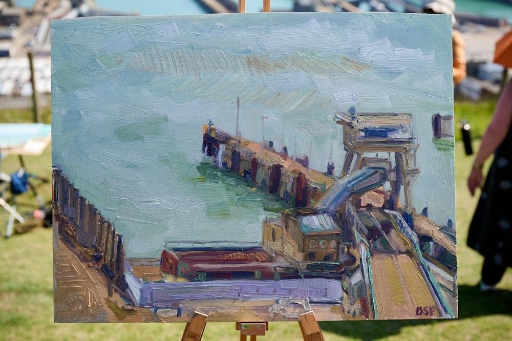
You have a very interesting way of putting down paint, with energetic, directional brush marks, moulding the landscape with thick paint. How did your painting style develop?
When I paint, the whole process is quite playful. I enjoy, like you mentioned, moulding the shapes and colours with different brushes and marks. Every surface has a different posture and pose, and to heap more paint on allows me to overcome the painting surface (board) and really engage with the texture and language of what I can see. Also, I find the opacity of the paint can change the weight of an object and its direction.
What art materials would we find if we visited your studio?
Linseed oil, canvas rolls, paper, oil paints and a staple gun.
Thanks Deborah! See more of Deborah’s work at deborahfrankartist.com or @deborah.simon.frank on Instagram.
HEAT 4: SKIDDAW MOUNTAIN, CUMBRIA
WINNER – DAN WEST
Hi Dan, congratulations on being selected as the Heat 4 winner! What was it like for you on the day?
Once I'd got past the pre-show nerves and I started putting pencil to paper, it was actually just a really enjoyable experience. I got to share a special moment with my family, and I managed to achieve something I could have only imagined. I also got to take the day off work to sit in the sun all day, so no complaints from me. I had a great time.
In your heat, Kathleen commented on the intensity of mark-making, can you walk us through your approach to mark-making in the drawing of Skiddaw?
Yes, so my approach to mark-making had to suit the time restraints we were all set. I’d normally be happy to spend hours on little parts of a drawing, but I thought right, there's no chance I am going to be as detailed as I normally am because I’d get nothing done. So, before I went on the show, I experimented with ways to fill in space quickly and effectively (foliage in particular). With this, I concluded on a technique which involved applying material and pulling it back off, which combined a scratchy effect that I picked up through experimentation, helping me to create texture and depth in the limited time I had.
As a general concept, I find that contrasting dark and intense mark making with subtle, light areas helps highlight areas I want people to look at, as a way of building narrative. I tried to follow this concept on the show and I am happy that it was well received!
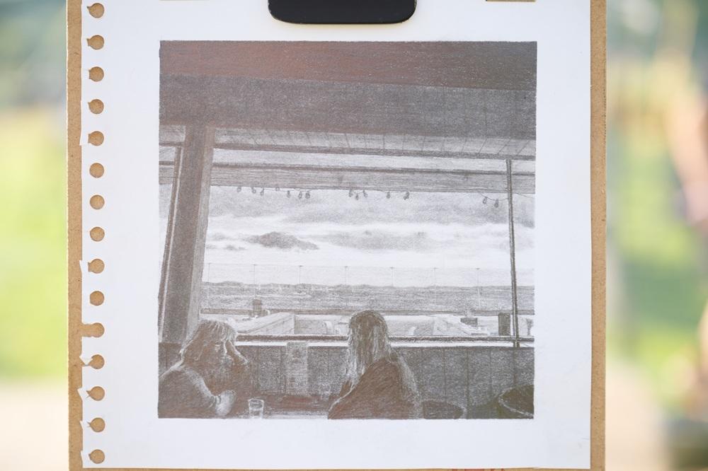
Your submission piece was a narrative, cinematic, small-scale drawing of two women in a cafe, with a view of the landscape beyond through the window. Tell us more about that piece.
This piece was based on a cafe in Portsmouth that I’d go to with my family when they came up to visit me at university. The cafe was on the seafront and had a big window at the back, which framed the landscape perfectly; I knew the first time I walked in that I had to draw this at some point. I ended up taking a few photos there and actually forgot about it completely - it wasn't until I was flicking through my photos looking for some inspiration to base a submission to LAOTY on, that I came back across it again and began my drawing. It took me only a few hours to draw this, contrary to the time that I normally spend. It was a good excuse to get an idea out in a limited time period and fuelled a succession of time-constrained drawings afterwards.
What’s in your plein air sketching kit - anything you can’t do without?
If I’m being honest, I don’t often draw outside... I’ll typically take a photo of something that stands out to me and use this as a base for my drawings. But regardless, I try to use Faber-Castell pencils where possible in both my monochrome and colour work. When working with graphite, I will always use a blender, a putty rubber and a MONO Zero Elastomer Eraser.
Thanks Dan! See more of Dan’s work at danwestart.com or on Instagram @danwest.art
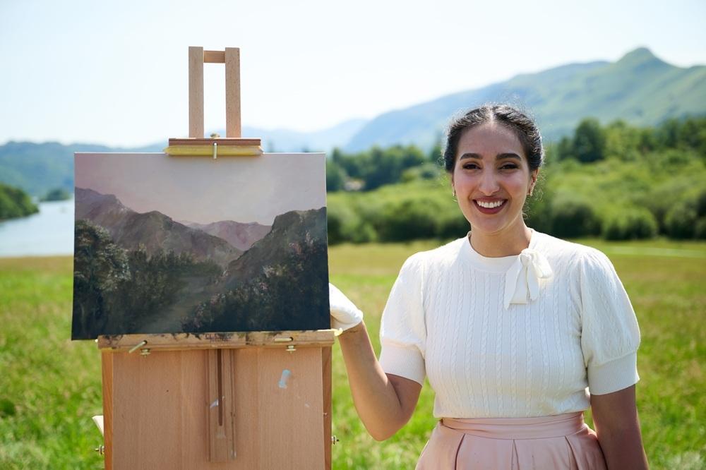
WILDCARD WINNER – LAMYAA ELGEN
Hi Lamyaa, congratulations on being selected as the Heat 4 wildcard winner! Tell us about your experience on the day – did everything go as planned?
Thank you so much! It still feels so surreal. I travelled all the way from Oxfordshire to Keswick and managed a few hours of sleep before a very early start. I completely underestimated the uphill walk to Crow Park with my heavy supplies and easel, and in classic neurodivergent style, arrived slightly late to find my group of excited fellow Wildcards and the friendly production team.
Although I have treasured memories of Keswick, this was my first time in Crow Park and I remember feeling awe of the hills and mountains. I almost immediately mapped out what I thought was the perfect composition of the lake in my head, before realising our intended view was overlooking Skiddaw. A few of us Wildcards decided to take some artistic licence and face slightly left of the lake opposite the pods. I was drawn to what felt like a compelling composition - one that allowed space for atmospheric perspective.
The next few hours became what is called a “hyperfocus” - an intense state of concentration dedicated entirely to the view in front of me, with one clear goal: to reach the end of the day with a finished work of art! That did mean forgetting sunscreen on an extremely hot day and later buying a watch just to cover a rather dramatic wristband-induced tan line!
I must say that the most wholesome part of the experience was the support throughout the day - from locals, tourists, fans of the show, the production team and fellow Wildcard artists during painting breaks. I had the pleasure of being interviewed twice - firstly with Stephen and then with Eva. Moments after my easel suffered a little wobble, Kathleen quietly but graciously inspected my work-in-progress and responded as though she had tasted something very sweet, which made me smile. I can’t quite explain the disbelief and nerves when I realised Eva was walking towards me - the happiness I could only express in the form of a hug and slightly trembling lips in front of the camera. It was the most joyful and beautiful experience.
Did everything go to plan? It was a challenge - especially as it was my first experience painting plein-air. Was it all worth it? Yes, absolutely! I’m honestly grateful to have connected with talented artists across LAOTY and PAOTY since the show has aired!
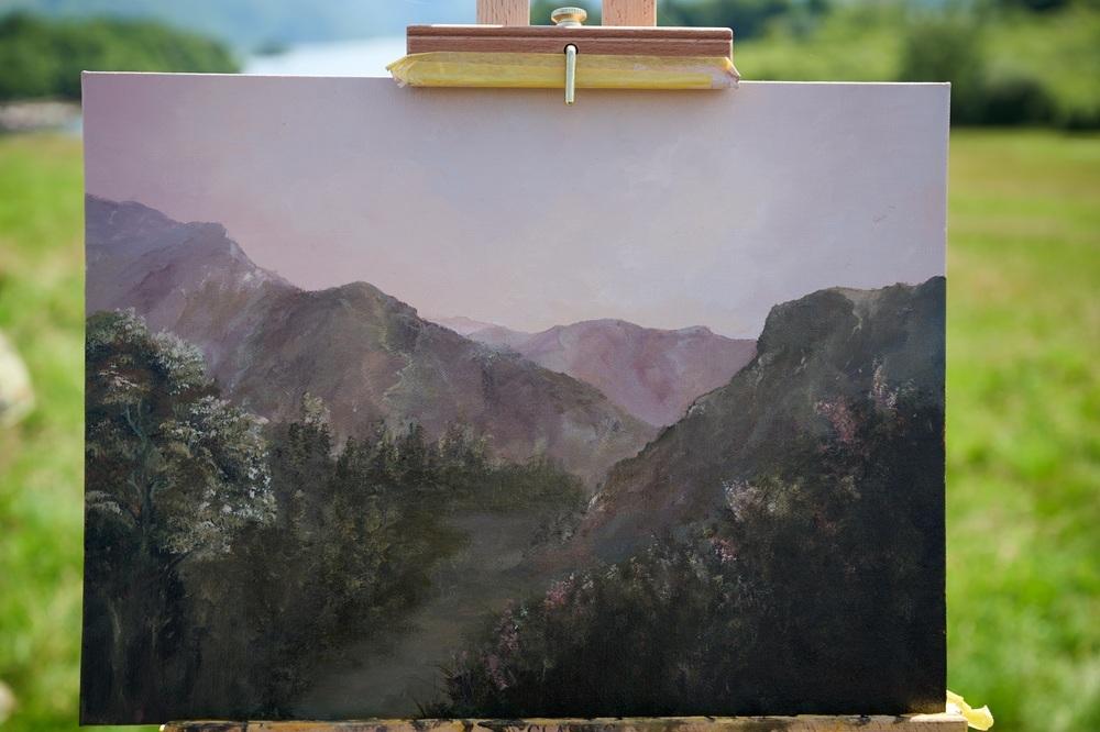
The judges were impressed by the texture and colours in your work. You managed to create an atmospheric piece, leading the eye through the mountains to the distant hills beyond. How did you convey the sense of scale and distance in the work?
I’m genuinely honoured by the judges’ feedback, as creating a believable sense of atmosphere is a creative endeavour of mine. I love the challenge of creating scale, realism and depth from a flat 2D surface, and would describe myself as quite methodical in this regard.
As soon as we were told to begin, I spent the first hour focused purely on composition, experimenting with various possibilities in my sketchbook. I’m a big believer in the Golden Ratio - a mathematical phenomenon found across the natural world - which helped me determine the position of the skyline, foreground and focal point before any paint touched the surface. Although in reality I was faced with an army of trees in the foreground, I carved out a natural pathway to lead the eye into the distant hills, rather than letting the viewer feel visually obstructed in the first few seconds.
I used earthy-toned acrylic paint markers over a wash of Burnt Sienna/Naples Yellow to sketch the final composition: the closer the subject, the darker the mark. I then began blocking in colour to establish the tonal contrast across the landscape, starting with Naples Yellow and Titanium White in the sky and gradually introducing deeper tones as I moved forward.
I kept the most distant hills softer with muted pale blues, violets and burnt umber to create that sense of distance, whilst the trees and foliage in the foreground carried richer, warmer tones and thicker, textured brush marks - creating the illusion that you are close enough to reach out and touch them!
Which other artists are you inspired by and why?
I’ve always deeply appreciated the masters who came before us. For example, I’m inspired by Constable’s ability to capture intricate detail whilst maintaining strong composition, and Turner’s gift for evoking an emotional response through light and atmosphere - particularly in his later works. I’m also drawn to the Hudson River School and Luminist painters of the 1800s - notably Albert Bierstadt and Frederic Edwin Church - as well as Caspar David Friedrich.
As a child, I had a special interest in the sky and often felt emotionally moved by light radiating through clouds. That sense of illumination, movement and grandeur continues to inspire my own interpretations of the British landscape.
What materials do you prefer to use for plein air painting?
Equipment:
- Julian French Full-Size Sketchbox Easel - my very first investment from Cass Art
- Masterson Sta-Wet Handy Palette
- Cotton white gloves
- Decathlon folding trolley - which truly saved me on my journey home from the Lakes!
Colours:
- Liquitex Professional Acrylic Paint Markers - for compositional sketching
- Golden Open Acrylic Paint and Thinner
- Faber-Castell Graphite Matt Pencils
Surfaces:
- Loxley Archival Linen Panels
- Ampersand Gesso and Smooth Panels
- Seawhite Eco Sketchbook
- Daler-Rowney Langton Cold-Pressed Sketchbook
- Hahnemühle Acrylic Paint Block
Brushes:
- A good range of sizes and shapes
- Synthetic Mottler Brush
Thanks Lamyaa! See more of Lamya’s work at lamyaaelgen.com or @lamyaa.elgen on Instagram.
HEAT 5: HMS WELLINGTON, LONDON
WINNER – LIBBY WALKER
Hi Libby, congratulations on being selected as the Heat 5 winner! This time, the artists were given the extra challenge of painting on board a ship! What was that like for you on the day?
Thanks so much, what a wonderful thing! Being on a boat was so great. I think it was more of a challenge for the crew, just with it being so uniquely different from the other heats, but for me, on my first time, it was just another amazingly surreal element to the day. Not going to lie though - we all started feeling a bit seasick, glad I had my ginger tablets!
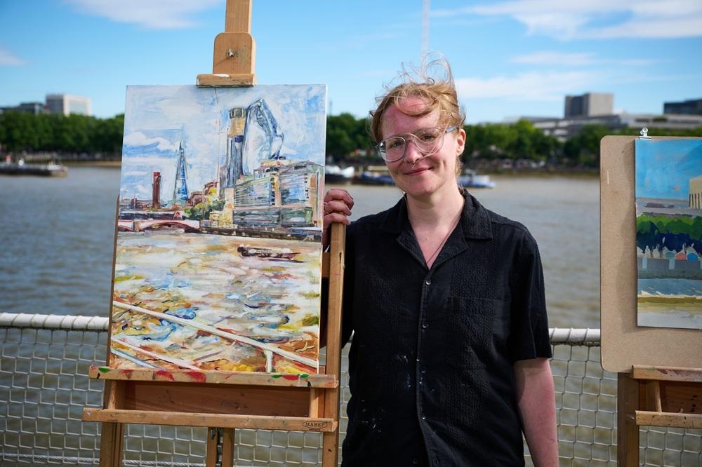
The view from the HMS Wellington spanned London’s Southbank with views from the Shard to the London Eye. What caught your eye, and how did you choose what to include?
I very quickly ruled out the London Eye, it has too many thin, detailed elements to be fun to paint. However, the Shard gave such a strong sense of place, especially beside the tower of the Tate. These are both great shapes towering into the sky. The glass of the Shard was a great challenging surface to paint, and I felt that it would help capture the light of the day. The sunlight was bouncing and dancing over the water, so I wanted to choose what would tell the story of the day best. That’s why I wanted to include the ship’s barriers in the composition as well, to show we were on the ship, not just the riverside, it was a big part of the feelings of the day.
The judges were captivated by the poetry and lyricism in your painting style, both in your submission and the way you were able to transform the muddy Thames into dancing colour. Can you walk us through your process?
After filming, Tai made a lovely moment for me, telling me enthusiastically how poetic he found my painting. I was absolutely thrilled that was his response, such a compliment and it really made a special moment. Then I realised I had no clue how my work was poetic or lyrical. What do those words mean when it comes to painting? I began to understand it as having a sense of feeling in the work, like reading poetry and feeling emotions that aren’t specifically described. I do think about colour and have an ambition to make it sing. Making marks to create rhythm and movement, and allowing colour to shine, can be seen as lyrical, I think. These comments really developed my work and my way of thinking. It was such a great opportunity to receive them.
My process starts with observational drawing. Then I start layering up and searching for colours. I enjoy getting paint on, something to respond to and play with. There was a lot going on that was easy to be distracted by, so I grounded myself in colour, thinking about the view and what I wanted to shine most. The sky was so blue, and using complementary colour theory, I began finding the orange in the painting and the water. It started me off, and I was soon layering up the paint, capturing the time and changes of the day. I work with thin layers, the heat and the fast-drying medium really helped the process. I used biodegradable baby wipes as a tool, taking the paint off to reveal the gesso of the board as the white - it saves on using white paint and keeps the painting luminous. It worked well for me, getting the colours down and then having some playful time responding to what was there, kept it fun and fast!
You used water mixable oils, why do you prefer those, and which brand do you use?
I used oils before and always found the solvents expensive. I loved thinning the paint, putting it in bottles to spray the canvas and build up texture. Then I was outside and spilled my solvent in the forest, and I felt very guilty about that. I then saw the Cobra starter kit in Cass Art and thought I would try it out. I was chuffed, because now I could simply use water to dilute and thin the paint, and it pushed and developed my style further on a tighter budget. I now add colours to the Cobra set with Winsor & Newton tubes, there are individual tubes now available.
Thanks Libby! See more of Libby’s work at libbywalker.co.uk or @libbywalkerartist on Instagram.
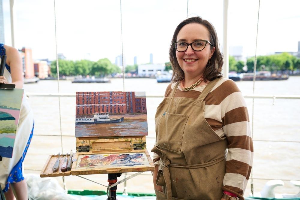
WILDCARD WINNER – SHERI GEE
Hi Sheri, congratulations on being selected as the Heat 5 wildcard winner! Tell us about the day – were you nervous or feeling confident?
Thanks so much! I’ve done a fair bit of plein air painting in various spots, rural and urban, in crowds and alone, so I felt prepared (rather than confident) to paint. The episode was filmed early one June day, with the heat rising steadily as the paintings progressed. Having painted out on hot days before, I’d intentionally dressed to avoid sunburn and try to stay cool. I think all of us in the Wildcard area were really glad of the shelter, as we were below deck from the finalists. I’ve never painted onboard a ship before, but thankfully it had a fixed mooring, just moving a little in the wake of passing boats - nothing too bad and no motion sickness! I felt calm in myself, but as I came to put details on the piece, later in the session, I noticed a slight shake to my palette knife, beyond anything caused by the wake. Clearly, all was not calm beneath my surface! Everyone was so lovely though, from crew to fellow artists - it was a great day, I really enjoyed it!
Water is notoriously tricky to paint – particularly en plein air, whilst on a boat! You managed to perfectly depict the muddy waters of the Thames reflecting the blue sky above. What’s your approach to painting water?
Thank you! I haven’t ever thought of water as being tricky to paint, at least no more tricky than a building or a tree. Everything has its challenge. I tried to make an impression of the water and not get too caught up in detail. I began this piece with a loose acrylic underpainting on the gesso board. There was a large tower in the background that was casting a long shadow on the water, which I was really eager to capture. I think a lot of it in the early stage was about the directional brush strokes - sweeping the acrylic horizontally across the panel with a stiff brush, leaving traces of the white gesso panel through the strokes. This helped give a sense of current, over which I added the highlights later in oils.
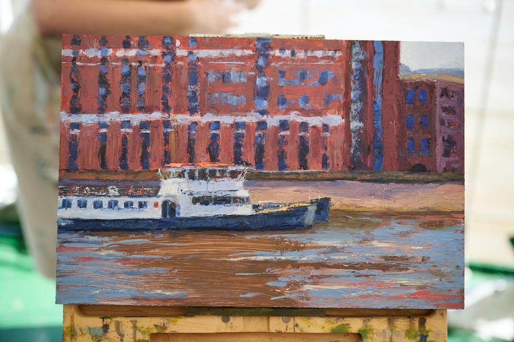
The judges enjoyed the composition you chose, closely cropping the buildings and boat. Were you excited by the landscape on arrival, and with such a huge panorama in front of you, how did you decide on your composition?
With anything you paint, you have to work out what excites you - which part moves you to capture it in paint, breathing life into the piece. In part I was daunted by the vast panorama, but also, I couldn’t find a way in, mentally. I am really moved by colour and was mesmerised by the effects of the shadow on the water’s colour, cast by the distant tower, but I was also drawn to a patch of blue, an ultramarine window, singing against shaded brick, across the bank from where we were moored. The tight composition also allowed for a beautiful relationship between the highlights on the boat and a patch of sky, top right. These moments helped bring the piece to life for me.
Your work was painted in acrylics and oils with a thick impasto. Which paints do you use?
I love painting in oils most of all. I’ve been experimenting recently in my plein air painting with building the surface and mark-making on top of a loose, dry underpainting. If I do that entirely in oils, wet in wet, I'll risk muddiness in my colours, so I’ve recently started taking acrylics out with me too. The piece was painted on a Belle Arti gesso panel, supported by my New Wave U.Go plein air easel. For the acrylics, I used Daler Rowney System 3 and my oils are a mixture of Winsor & Newton Artists Oil Colour, Winton and Michael Harding oils. I tend to use a split primary palette, of cold and warm primaries, plus Titanium White, but over the years have added a few special colours, such as Michael Harding’s Brilliant Pink which I adore using. For the impasto effect, I mixed cold wax into the oil paint, which thickens the texture considerably, applying much of the later stage with a palette knife. I especially love my RGM, size 61 palette knife - which is really narrow, to get into small spaces.
Thanks Sheri! See more of Sheri’s work at sherigee.com or @sheri.gee.art on Instagram.
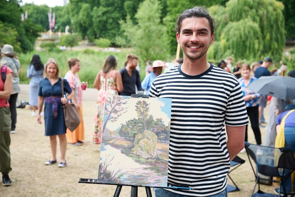
SHORTLISTED HEAT ARTIST – TOM WINTER
Hi Tom, congratulations on being selected to join the Heat Winners in the Semi-Final! Although you didn’t win the Heat, the judges thought your work was so good that they wanted to see more. How did you find painting on-board the ship?
Although I was a ‘Pod Artist’ on HMS Wellington, there wasn’t the room to erect the Pods themselves, so you were pretty much hostage to the weather. On the day (fortunately!) it was beautiful, if slightly blustery, so my easel needed to be weighed down by sandbags at the base. Because I’d elected to work on a more panoramic composition, I needed to fix it to another board on the easel to raise it to my eye level & attached the whole thing with tape to fix it further. There was a slight swell from the Thames, which was entirely bearable, although in the space of 4 hours the ebb & flow of the tide meant you had to respond quickly to rising & lowering shorelines, as well as your viewpoint being affected as the boat moved. The heat from the sun did mean the glaze medium which I tend to use, dried faster than I was used to.
In the Heat, you began with a vibrant yellow underpainting, followed by translucent layers of realistic colour, gradually building the scene. The painting glows as a consequence. Talk us through your colour choices.
The vibrant yellow I used was a Cadmium Lemon (a particular favourite since student days, some time ago). From that base, I’ll wipe away to the white of the painting surface to pick out some of the highlights in the composition. I find it helps to obliterate the white of the painting surface, but also see some of the foundation colour in the finished painting. After this, I’ll work through the spectrum, with the colours progressing through to the cooler shadows & some local colour. In a studio painting (such as my submission piece) this process can take considerably longer than the time we had in the heat & even with glaze medium, there is some drying time between subsequent layers. I have in the past, had a tendency to overwork paintings where time is less of a factor, so it did force me to improvise, working with a more reduced palette & scratching into the painting to emphasise the finer highlights & reflections on the water.
The judges were impressed by the dynamic compositions you created both in your submission and of the Southbank. What’s the secret of a great composition for you?
For me I’ll usually start with the golden ratio, although in my painting of the Southbank I divided up the composition by 3rds. The one constant in my paintings is to include a strong perspective element to lead the eye across the picture plane (usually at a diagonal). The straighter lines of the architectural elements across the water being echoed in the more fluid, wavey lines of the tide leading up to it.
What art materials would we find in your studio?
It’s always important for me that paint is obviously paint, whether it’s painted in thick Impasto or thinner, using Glaze medium. The Glaze medium I swear by is Roberson’s. I’ll use a Matte medium for landscape or Glossy for portrait. Equally, I really like to work on board as opposed to canvas, so I’m able to see the brush marks. I’ll use a Thixotropic Alkyd primer, because it gives a tough, gesso like finish, which still allows me to work in a ‘Reductive’ way to pick out the tones of the composition. Paint-Wise I use Winsor & Newton Artists oils or more recently Michael Harding. When you work in thinner layers as I do, strong pigmentation means your colours go further. If money is no object I use Roberson brushes- I still have some of my larger artist hog brushes which date back to my degree in the late 90s!
Thanks Tom! See more of Tom’s work at tomwinterart.co.uk or @tomwinterart on Instagram.
HEAT 6: DOVER CASTLE
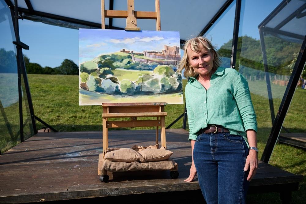
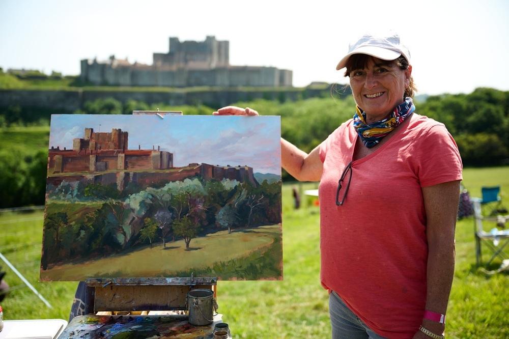
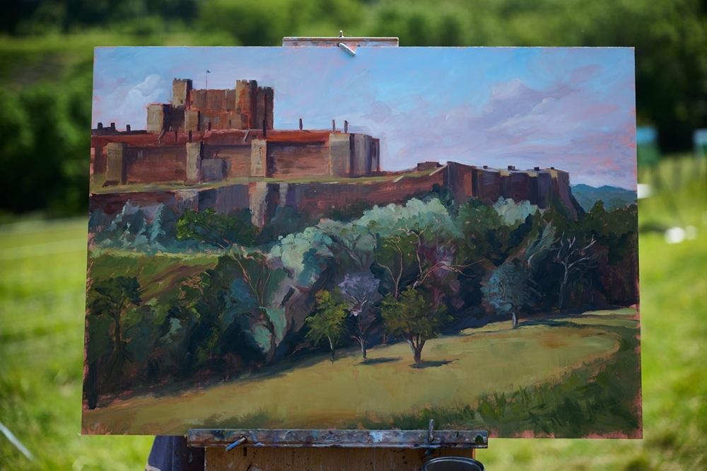
WINNER – LELIA GERAHTY
Hi Lelia, congratulations on being selected as the Heat 6 winner! How did you find the experience of painting in the pods?
So strange to be in a pod after seeing them in the previous series. It was exhilarating and a novel experience. There is a lot going on so I had to force myself not to get distracted. I did like talking to the judges when they came in for a filmed chat… it just reminded me what I was meant to be doing and spurred me on a bit!
The judges were impressed by the style and energy of your brushwork. How did your style develop and which artists are you most influenced by?
I'm sure my style of painting has changed quite a bit over the years. I am really interested in how colours relate to each other in a painting and how colours can convey a mood. I love much of the art of the late 19th Century and early 20th Century for example Paul Gauguin, Toulouse-Lautrec, and Fauvist painters such as Matisse, Andre Derain and Raoul Dufy.
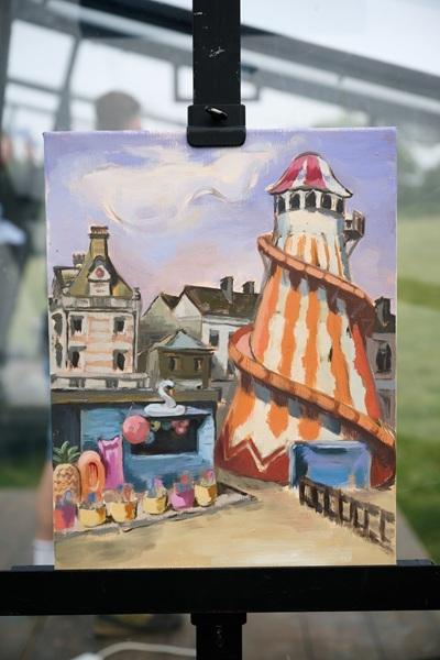
Your submission piece was a colourful yet strangely eerie depiction of a Helter Skelter slide on a beachfront. What excited you about that scene?
I really enjoyed painting this. There is something about seaside towns that is quite incongruous. It was very quiet on the beach at Weymouth the day I painted the Helter Skelter, I think it must have been the end of the summer holidays and it all felt a little strange… I couldn’t resist!
What’s in your plein air painting kit?
I have a small case with Old Holland, Michael Harding and Charvin oil paints and a wonderful portable easel… and I always take a sun hat!
Thanks Lelia! See more of Lelia’s work at @lelia_painting on Instagram.
WILDCARD WINNER – KAREN ADAMS
Hi Karen, congratulations on being selected as the Heat 6 wildcard winner! Tell us about your experience on the day – what was it like painting with all the wildcards?
My Day as a Wildcard at Dover Castle was absolutely brilliant from start to finish. My husband and I arrived at the location early and everything was extremely well organised. We were kept well informed about what was going to happen and when. Whilst waiting for the first bit of filming (the arrival of the wildcards) I got chatting with others waiting and swapped stories of our experience in painting en plein air etc. After about 4 takes of the arrival of the Wildcards, we were told where we could set up and get ready to start painting. I had brought a selection of canvas panel sizes and decided to use my largest (50 x 70cm Belle Arti Panelli fine cotton Panel). This meant I had to work fast so I didn't have that much time to go and chat to the other wildcard artists. However, I did take a break and wandered around to see what everyone else was doing and a number of the other artists came to me and chatted which was great. After I was announced as the winner, many of the other artists came to chat and congratulate me and were extremely kind and generous with their comments.
Judge Tai was impressed by the tonality and the wonderful range of colours in your work, which brought the scene to life. What colours would we find on your palette, and do you have any tips for aspiring landscape painters?
Judge Tai came to chat and commented on the range of colours in my painting. I love to look hard at a scene and try to see subtle colours within it, for instance, in the trees and slight colours visible in the castle. I will then enhance those colours in order to make the painting more interesting. A typical palette of colours that I would choose from are: Warm White, Titanium White, Buff Titanium, Naples Yellow Light, Lemon Yellow, Cadmium Yellow, Cadmium Red, Permanent Magenta, Mars Violet, Dioxazine Purple, Ultramarine Blue, Cerulean Blue, Viridian, Raw Sienna, Burnt Sienna, Raw Umber and possibly Neutral Tint or Blue Black.
You managed to create a sense of movement in the painting, both in your treatment of the sky and particularly in the trees in the midground. Tell us a bit about how you achieved this.
When painting on a large canvas with a time limit, you have to work fast, which is good as it stops you from being too precise and fiddling too much. I try to vary my brush strokes as much as possible to make them interesting, particularly in areas like the sky and trees where precision is not so important.
What are your preferred art materials for plein air painting?
My preferred surface to paint on would be either fine linen or cotton adhered to an MDF panel (I like Belle Arti Panelli) which I would then coat with an additional toned gesso. In Dover I chose a panel that had a mid-toned pinky/orange ground that I could let show through a bit and would contrast well with all the various greens. I use good quality oil paints mostly Michael Harding and Winsor & Newton and a mixture of brushes.
Thanks Karen! See more of Karen’s work at karenadamsart.co.uk or @karen.adamsart on Instagram.
ARE YOU THE NEXT WINNER?
If you think you have what it takes to be the next Sky Arts Landscape Artist of the Year, entries for Series 12 close at midday on Monday 23rd March 2026. Find out more and apply at skyartsartistoftheyear.tv/landscape. Good luck!
Image credits: Photography © Sky Arts, paintings © Storyvault.

