
SKY ARTS PORTRAIT ARTIST OF THE YEAR SERIES 12: HEAT WINNERS
Posted by Cass Art on 25th Nov 2025
Another scintillating series of Sky Arts Portrait Artist of the Year has us captivated once again, as artists from across the UK take to their easels to capture celebrity sitters in just four hours. Competing to win a £10,000 commission to create a portrait of award-winning Mathematician and Broadcaster Professor Hannah Fry for the Royal Society, their works are carefully analysed and chosen by a panel of expert judges - award-winning artist Tai Shan Schierenberg, independent curator Kathleen Soriano, and art historian Kate Bryan.
Working with Winsor & Newton, Cass Art has supported the show since the first series in 2013. We caught up with the heat winners to find out more about their experience of the show, their work, and get tips and advice for emerging portraitists…
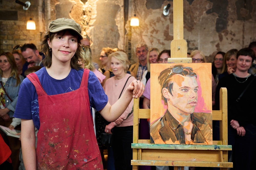
HEAT 1 WINNER: EDIE BOUND
Hi Edie, congratulations on winning Heat 1! How did you find the experience of filming on the day?
Unexpectedly, I thoroughly enjoyed the day of the heat. I had been so nervous on the run up, and had barely slept the night before, but as soon as I arrived I instantly relaxed. The other artists in my heat were overwhelmingly kind and talented, I felt so lucky just to spend the day getting to know them all. In addition, the crew is so uplifting and gentle with all of us fragile artists, you really feel cared for. By nature, I am a very chatty person, and I found it hard not to get carried away talking to the audience members and the judges, however I had practised every day for a month before, so I felt comfortable with the time limit on the day (which didn’t make the most exciting TV, no frantic countdown montage for me).
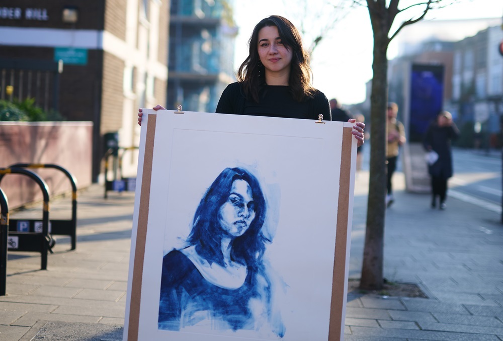
You painted Musician & Pop Star Yungblud in a sharp black suit. You captured a likeness very early on, particularly his piercing eyes, which were a focal point in the work. What were you hoping to portray in your portrait of Yungblud?
As soon as Yungblud walked out, I knew how I wanted to paint him. I got really lucky in that my style suits his look, it gave me the opportunity to put my best foot forward and demonstrate what I can do. I always paint very quickly, and I try to use my brushstrokes economically, to maintain a painterly feel. Yungblud has a sharpness to him that I was keen to capture and the contrast of his dark hair and angular features allowed me lay down a foundation really fast.
You started by painting upside down on a warm ground, blocking in confident brush marks to build facets of colour. The judges were impressed by the brevity of your mark-making and Tai remarked on its speed and lightness. Could you walk us through your process?
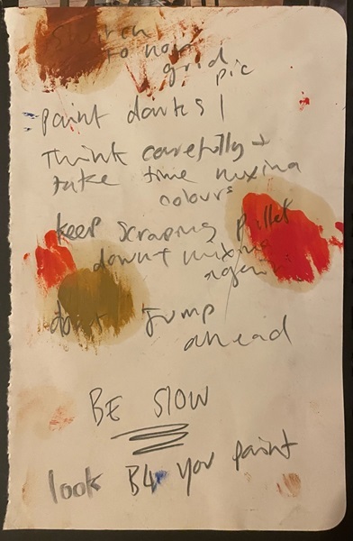
I paint on an orange ground for a number of reasons, I find it easier to mix colours correctly when working on a mid-tone surface, as it contextualises the colours more accurately. In addition, it allows me to be more sparing with my brushstrokes, as I can leave sections untouched and it doesn’t jump out to the eye. Laying down the underpainting with the board upside down was actually something I only began doing in the lead up to the show, to make up for the lack of time that I would usually spend labouring over proportions, however, I found it so useful that I have continued to do it since then. After I have the underpainting in, I work dark to light, which I found difficult in the heat as Yungblud was so well lit, there wasn’t much contrast on his face. Instead, I emphasised the cooler shades to create that contrast myself. I try not to go back over sections of my painting, instead working slowly and thoughtfully, which was hard to do under so much stress. Below is a photo of my notebook that I had on the table as I was painting, so that I didn’t completely forget how to paint.
What are your go-to materials for portrait painting?
I use a glass palette with a board underneath painted in the same orange that I use on my boards, I love using glass as it’s so smooth and easy to scrape down. On my palette I have 8 colours. On the left, I have my warm primaries, Yellow Ochre, Cadmium Red, and Ultramarine Blue. I have Titanium White in the middle and then my cool primaries: Lemon Yellow, Alizarin Crimson, and Cobalt Blue. I also have Burnt Sienna to the side. The brand of oil paints I use is called ‘Spectrum’. They are the perfect paints for me, I have tried other brands but the consistency and colours are incomparable. The only caveat is that ‘Spectrum’ no longer exists. My supply comes from a large dusty crate that I found in my Dad’s studio- a finite stock. In preparation, I did some investigating a couple of years ago and discovered ‘Cranfield’ took over the brand in 2009, they sent over some testers that seemed nice, but don’t have the whimsical charm my Dad’s ageing collection.
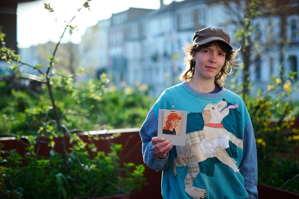
Thanks, Edie! See more of Edie’s work at edieboundart.com or @eboundart on Instagram.
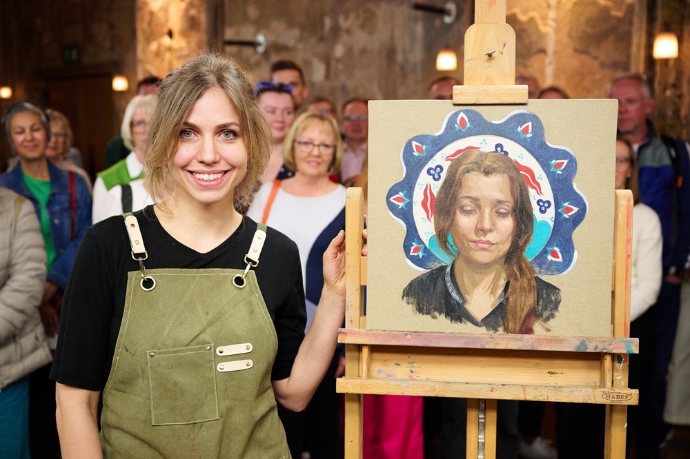
HEAT 2 WINNER: PAULINA KWIETNIEWSKA
Hi Paulina, congratulations on winning Heat 2! How did you feel about painting live in front of the cameras and judges?
Thank you! To be honest, at first I was worried that stress would affect me a lot, but the moment I started painting, I felt a peace of mind and painting was nothing but pleasure. The judges were incredibly nice and speaking to them was a distraction that I found rather helpful; I find it difficult to take breaks during work, especially if time is restrained, so those little moments of not looking at my painting were a blessing. Another beautiful thing about that day was the audience. I wish I could have met them properly after the heat, their support was a real highlight of the day.
Your sitter was award-winning Novelist Elif Shafak, who brought along a patterned ceramic tile from Istanbul, which meant a lot to her. You chose to paint her with eyes cast down as she read, placing the tile behind her head in a halo-like effect. The result was a thoughtful portrait, reminiscent of Pre-Raphaelite works. How did you come to decide upon this composition?
Elif was a wonderful sitter: natural, harmonious, and with captivating eyes. There’s something magnetic about her. I admire her work as a writer and as a human rights activist, and it was a real privilege to have her as my sitter. There was also another quality that would have made her a great model even if I’d had no idea who she was — she had a uniquely distinctive way of looking and being. When I saw her, I instantly felt inspired. As she decided to read during the sitting, I thought a pose with her eyes cast down would describe her best. After all, the show is about painting from life, and this is what was before us. Reading in front of a painter is an act of trust — you can’t focus fully on posing and reading at the same time. I found that empowering. I wanted my portrait to radiate the gentleness that seemed such an integral part of Elif.
Next to her was a Turkish tile, which I felt compelled to incorporate into the painting in some way. It seemed symbolic and helped add a narrative to the portrait, which in my mind was already a story. When I saw the tile and its pattern, the composition appeared instantly in my head. I took a picture of Elif and her object, and used my iPad to create a reference for the portrait. Elif seemed to embody a very feminine, almost motherly presence that reminded me of many references from art history: medieval depictions of saints, the Pre-Raphaelites (the beautiful form of her hair!), and romantic portraits from the nineteenth century. I decided to place the tile as a halo behind her head. My aim with this portrait was to capture femininity, wisdom, and gentleness - to tell the story of this beautiful person. Despite the conditions, I somehow managed to reach that beautiful state of flow. Talking to Elif was another highlight, I wish I could have spent an entire afternoon in that conversation. When asked about one book she’d like to be painted with, she mentioned Cervantes’ The Man of La Mancha. I found that symbolic, placing her bet on a man who’d fight for what he believed in, no matter the circumstances and the reactions of the crowd.
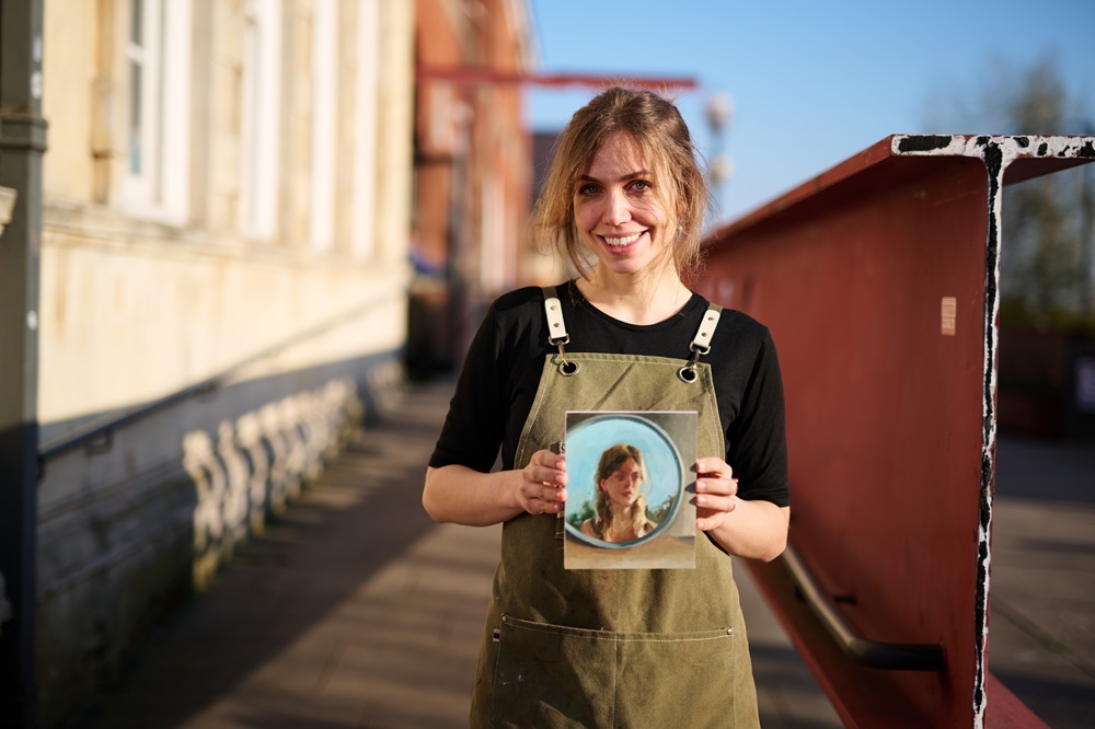
Your submission piece was a small-scale work with a similar framing to your painting of Elif, a reflection in a circular mirror. Painted in just an hour, its beauty is in its simplicity, capturing light and atmosphere, a quiet interior reflecting a sunlit exterior. Tell us more about the piece.
'Summer self portrait' (2024) celebrates a moment of my motherhood journey. I painted it during our family holidays by the Baltic Sea when for the first time since becoming parents we had time for ourselves during a family trip. Our children made new friends and spent a lot of time outside; we didn't expect this to happen and had a lot of spare time to do anything we felt like. I took the bathroom mirror to the porch and spent a little more than an hour painting this portrait. While working on it, I felt a certain duality of emotions. There was a feeling of freedom and gaining something back, for sure, but there was also the sadness of realising that my children are growing up, that they're starting to have their separate paths. There was a sense of an ending. I felt like these soft, blurry shadows and strong, bright lights aligned with what I felt on that day.
For this portrait, I used a simple palette of Titanium White, Turner’s Yellow, Transparent Oxide Red and Ultramarine Blue. Limiting my palette makes painting easier and faster so I always do it when I don’t have much time. I like this painting because it’s a combination of blurry planes with strong, decisive brushwork, and I think handling paint this way reflects my emotions from that moment. Light blue is a dominating colour in this composition. For me, blue sky means hope, baby blue stands for the early moments of motherhood and blue in general is a very nostalgic colour; all three of these thoughts are included in this painting.
Which oil colours do you always reach for?
I use Michael Harding oil paints. The colours I usually use are Titanium White, Lemon Yellow, Transparent Oxide Yellow, Cadmium Red, Transparent Oxide Red, Ultramarine Blue and Ivory Black. I love their Cobalt Teal as well and I was so glad I threw it into my paint box the morning of the heat!
Thanks, Paulina! See more of Paulina’s work at paulinakwietniewska.com or @paulina.kwietniewska.paintings on Instagram.
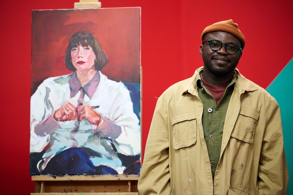
HEAT 3 WINNER: KATIE JONES
Hi Katie, congratulations on winning Heat 3! What was it like to paint a celebrity live with the 4-hour time limit? Did the nerves kick in, or were you feeling quietly confident?
Thank you so much! It is all such a blur, it was a very intense day, a real rollercoaster of emotions. I hadn’t slept much the night before due to nerves and my stomach was doing constant somersaults, so I definitely was not feeling confident! There were so many great artists on my heat day, so I just wanted to produce something that I was happy with, winning the heat didn’t even cross my mind in all honesty. It is such an overwhelming and overstimulating environment to work in, quite different from how I work every day, in solitude in the Somerset countryside with a podcast on in the background. James May was a great person to paint, I just wish I had spoken to and engaged with him more, but honestly, there didn’t seem time, 4 hours flies by. I finally relaxed into it after the first hour was done, and I could see I had drawn a person that vaguely resembled James May, at that point, I could relax a bit and enjoy the painting process.
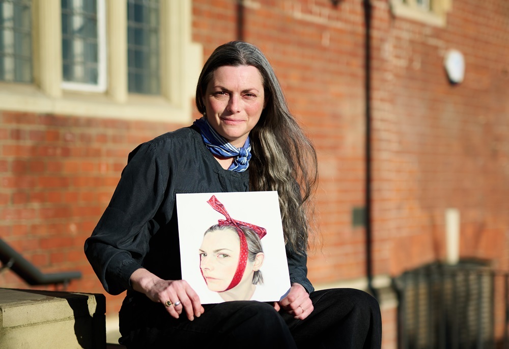
Your submission piece depicts your head on a plain white background with a bow tied oddly around your head. Tell us more about the narrative in this piece and the other works in your self-portrait series.
Through my self-portraits I examine different views, angles and perspectives of myself physically, as in, head tilted to the left/right etc, and how I differ visually with each shift in position, but I choose the objects/accessories to not only display how I think about myself but maybe how others, and society especially views me, women, mothers and situates us in a narrative sometimes not of our own choosing. I painted myself with a ribbon around my head, interrogating the idea of adornment and beauty; did this accessory make me more appealing to the viewer and myself? Did it change my perspective, their perspective of me? I explore themes around identity a lot, so I use my self-portraits to explore my own identity and history, creating narrative paintings. Plus I am always here, so it’s a good way to practise and try out different themes and narratives. I am really interested in psychology, anthropology, history and ultimately what it is to be human, so being able to observe myself and work out why I do the things I do, why I look the way I do and what that all means fascinates me.
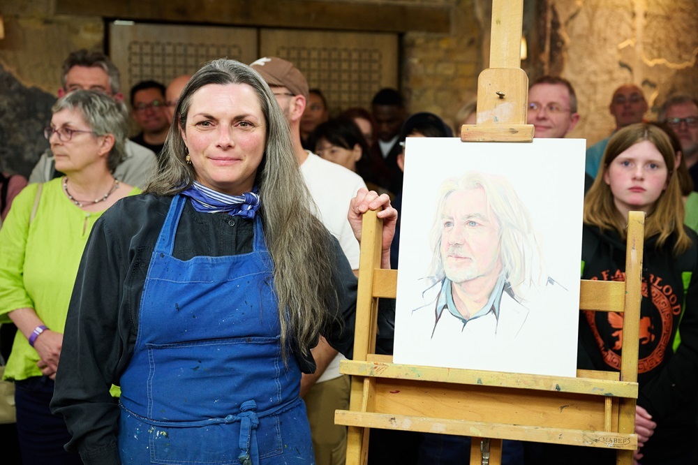
Your sitter was Broadcaster, Author and Journalist James May. Beginning with a grid system, you quickly pencilled in his face and began painting in detail straight away. You instantly captured a likeness with a realism in the eyes, which the judges felt gave the work a psychological intensity. How important is that psychological connection in your work, and how do you achieve it?
Oh thank you! I am self-taught really, so I paint how I paint I suppose. It’s how I have learnt and refined it over years with practice. The eyes are the windows to the soul and all that, but in reality, I just really like painting eyes, I mean they are incredible aren’t they!? In only 4 hours, set against a background colour not of my choosing and without knowing James May personally, I tried to position him in a composition I thought would work well. It was always going to be a challenge for me to capture any psychological depth in this sitting, but the judges seemed to think I did, so I’ll take the win!
You used soft yellow highlights, warm pinks and greens in the shadows, giving the work a luminous effect. Can you walk us through your colour palette?
I started out, about 20 years ago, using acrylic paints for my portraits as that was what I was taught to use during my GCSEs at school back in the early 90s, but I really wanted to learn how to use oil paints, so I figured I would start by using the Artisan Winsor and Newton Water-mixable oils as I could use them in the same way as acrylic. I have stuck with them ever since. The colours I always use are; Lemon Yellow, Cadmium Yellow, Yellow Ochre, Burnt Sienna, Raw Umber, Viridian Hue, Phthalo Green (blue shade), French Ultramarine, Cerulean Blue, Alizarine Crimson, Cadmium red and Titanium white.
Thanks, Katie! See more of Katie’s work at katiejones.me or @katiejones_somerset on Instagram.
HEAT 4 WINNER: CHLOE BARNES
Hi Chloe, congratulations on winning Heat 4! Tell us about your experience of the day, how was it painting in front of the judges and film crew?
Thank you so much! The whole day was such a surreal blur. Being in Battersea Arts Centre was definitely not the quiet haven of my studio. There was so much stimulation from the film crew running around and interrupting for mini interviews, not to mention the pressure of the judges peering over my shoulder and the audience in the background!
I did semi-anticipate this… and thankfully brought along my earphones. My plan for the day was to try and re-create the atmosphere of my studio, so I kicked off my shoes and blasted music to focus — and had a little dance when I wasn’t being filmed. Although the whole experience felt unnatural, I went into the day determined to just have fun. As my specialised medium is niche, I loved showing what I do and sparking curiosity among the crowd.
Your submission piece was an etching ink monotype in blue with black charcoal marks, an emotional piece created in the days following a break-up. Tell us more about it. Is it typical of your other work?
In my practice, I’m very introspective, and my self-portrait emerged from a particularly difficult point in my life. My ex-partner knew that emotion is at the heart of all my work, and he suggested that I create a series of portraits of him and myself from life to document the break-up. I only made three portraits in total, but the experience was cathartic as I reflected on the relationship and our memories over the past years.
I painted my self-portrait from a mirror over a period of three hours, before printing it onto paper and adding the charcoal. Due to the limitations of the monoprint process — including time constraints and the unpredictability of the etching press — I’m encouraged to work intuitively and spontaneously. The final monotype channelled feelings of grief and loss of identity, which I felt were reflected in the abstraction of my eyes.
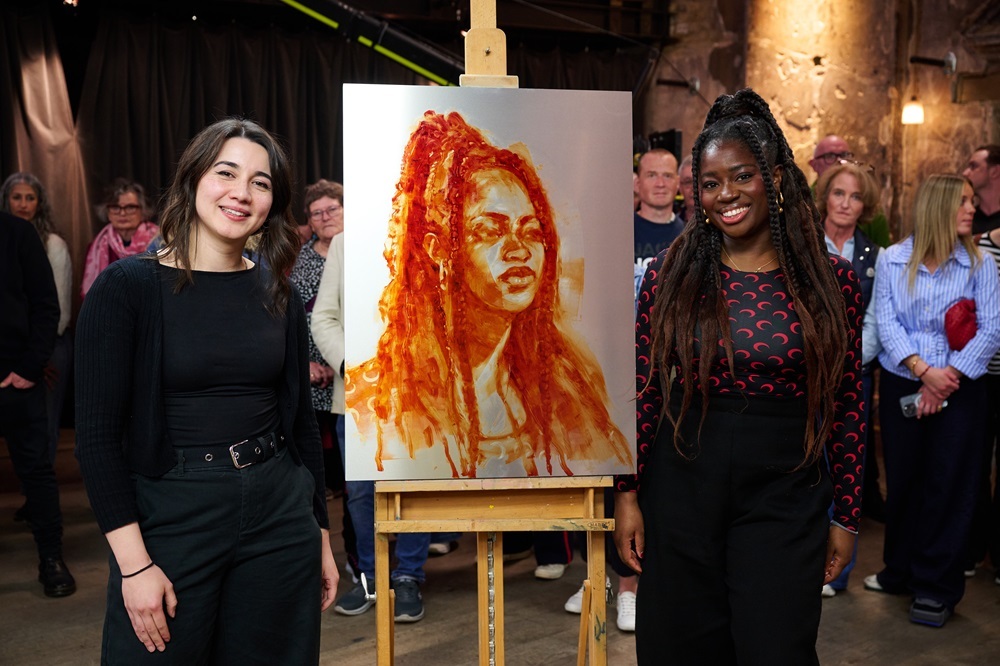
Your sitter in the heat was award-winning Broadcaster Clara Amfo. Instead of making a monotype, you decided to paint directly on aluminium. You created a powerful, monochrome image, using transparent layers, building up bold marks with a roller and brushes, and working back into those by wiping away areas to create highlights and detail. Why did you choose to work in this way on the day, and do you think it gave you the winning edge?
As an artist specialising in painted monotypes, I need an etching press to print my plates — which I didn’t have access to at Battersea Arts Centre. This limitation is one of the reasons why not many printmakers appear on Portrait Artist of the Year! Because of this, my solution was to do everything except the printing stage, resulting in a painting on aluminium.
During life-drawing sessions at the Hesketh Hubbard Society, I’ve painted plates from life before printing them in my studio later in the evening. I’ve had many artists comment that these painted plates are artworks in their own right. I wasn’t sure how the judges or the audience would respond to an unconventional medium and half of my typical monotype process. But for me, it was all about emotional mark-making, which I hoped would come through in my portrait of Clara.
What are your favourite art supplies and do you have any tips for those wanting to try making monotypes?
To make my monotypes, my go-to painting medium is Charbonnel etching inks. They are archival and highly pigmented, with a wide selection of colours. I specifically use etching inks because they’re quite “stiff”, providing the versatility to paint, roll, and wipe to create a variety of marks.
As a printmaker, paper is also very important to me. I typically use 300gsm Hahnemühle etching paper, which has a light texture. The weight of the paper captures the ink beautifully and gives a tactile quality that enhances tonal depth.
If you don’t have access to aluminium plates, you can also use 2mm sheets of perspex to paint your monotypes. For anyone wanting to have a go, just have fun and embrace the unpredictability! The sooner you let go of creating a “perfect” painting, the sooner you can embrace expressive mark-making.
Thanks, Chloe! See more of Chloe’s work at chloebarnesartist.com or @chloe_barnes_artist on Instagram.
HEAT 5 WINNER: LAUREN ROSS
Hi Lauren, congratulations on winning Heat 5! This was your second appearance on Portrait Artist of the Year, having appeared on Series 2 when you were just eighteen. How did it feel to be back ten years on?
It felt like a completely different experience. When I was 18, I was much more ambitious! I remember aiming to either be in the top three of my heat or have my portrait chosen by my sitter, whereas this time around I went in with hopes of simply enjoying the experience and creating a painting I was relatively happy with. It’s been interesting to reflect on how I’m no longer a fan of the same materials and methods, like oil bars, canvas board and the grid method. It was lovely to reunite with members of the production team who remembered me from series two, and of course the judges. Everyone was just as warm and supportive as I recalled from my first experience.
We briefly saw a list of tips you had written for yourself to refer to on the day, can you share those with us for any aspiring applicants out there?
Having my list of ‘art tips’ definitely helped to ground me.
- Just sit and think. Instead of letting the ticking clock make me rush into the painting, this was to remind myself that the concept is super important and I should take time to experiment with ideas for the composition and colour palette.
- Try different compositions. In the end, I let my intuition guide me for the heat and went with my first idea (see rule eight).
- Do the maths and trust it. This is all about measuring to achieve accurate proportions. I don’t use a highly mathematical method: I end up guesstimating, then compare my initial sketch with the photo reference now and then, flicking between the images on my phone to check for errors. This helps me achieve a balance between accuracy and fluidity.
- Build a robot. Start simply, using straight lines to build the basics of a head so that there’s a sense of a solid skull beneath the skin painted on top. This helps me to avoid jumping into details I would have to erase if proportions were off.
- Don’t rush the brush! My worst habit is reaching for the nearest brush to quickly fix something, since marks can end up the wrong shape or size or a muddy colour.
- Refresh your eyes. There are lots of creative ways to do this, and it’s important since you can become blind to problems in your work. I prefer to simply stand back, take a break, or look at my work through a mirror, like a black phone screen.
- Feel the energy you want to imbue the painting with. I believe the way you feel makes its way into your brushstrokes, as with handwriting. When creating a portrait of someone else, it helps to match your mood to the energy they’re giving off. Music can aid this.
- Don’t be a good student - be a great one and break rules. I am a big believer in learning art rules, then deciding which suit you and which don’t. These choices become a major part of your style.
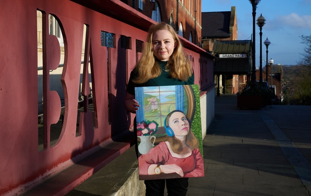
Your sitter was DJ Melvin Odoom who brought along a bracelet, given to him by his grandmother, which you incorporated large-scale in the background. Depicting Melvin with eyes cast down, you created a narrative in the work, with Melvin quietly contemplating his family and heritage. Your submission piece was also full of narrative. Tell us more about that self-portrait.
My self portrait is based on the poem ‘The Lady of Shalott’. In the story, she goes after what she loves regardless of the consequences. I painted myself into her position and altered details to reflect how I felt a connection with her: she makes the decision to see the world through her own eyes rather than through the lens presented to her, so the story inspired me and gave me courage at a time when I realised I had to be authentic, even if it was daunting.
In my painting, there is a woman in the background in place of Lancelot, picking the same flowers you see in the vase, which creates a link between her and myself. There are oak leaves and acorns stencilled onto the wallpaper of the room I’m in, representing the confinement of tradition. The time on my watch shows just after midnight to match with the idea of magic and curses that appear in the poem, while the headphones tie the painting to the present day and tell a bit about me (I’m always listening to music so I can become even more lost in my thoughts). Additionally, the colour palette is in keeping with that of Waterhouse’s painting ‘I Am Half-sick of Shadows, Said The Lady of Shalott’ (1915), but also happens to consist of my own favourite colours.
You began the painting of Melvin by underpainting in blue to contrast against the acid yellow of the backdrop, gradually building layers and facets of colour with soft brush marks to find the likeness. What are your go-to art materials for portraiture?
I prefer to paint on smooth surfaces so that the paint texture doesn’t vie with the surface texture. I tend to go for wood panels, often buying them from hardware stores and priming them myself, but I also love Ampersand’s Gessobords and Claybords. For paint, I mostly use Daler-Rowney Georgian oils and have recently been loving Pro Arte Bristlene Series D brushes. Refined linseed oil and Zest-It are also painting staples for me, and both tear-off palettes and Daler-Rowney’s water washable oil brush cleaner make life so much easier
Thanks Lauren! See more of Lauren’s work at foliotutoring.co.uk or @laurenr4444 on Instagram.
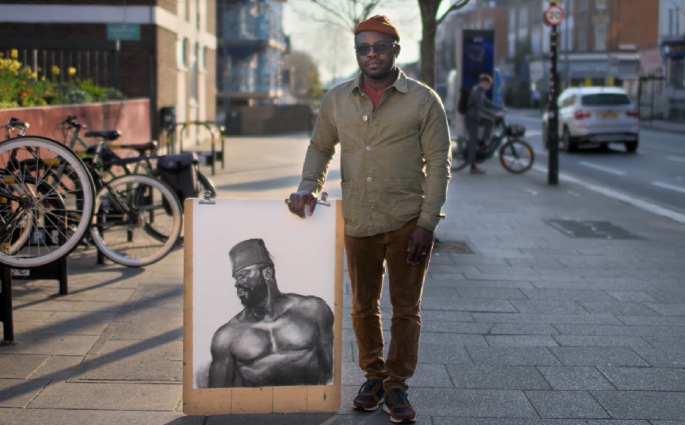
HEAT 6 WINNER: UTHMAN WAHAAB
Hi Uthman, congratulations on winning Heat 6! What was it like being on set on the day?
It felt very exciting for me to be on the set as it was going to be my first time on a show like this and my first contest. I never take to competition. I was also curious to see what the whole day had for me.
Your submission was a striking self-portrait in charcoal, depicting you in the act of a meditative chant. On the day, you brought along charcoals, acrylics and oils. With such a versatile practice, how do you choose which medium to use for your subject?
My choice of medium is informed by my subject. Though my self-portrait submission for the heats was in charcoal, I brought along all possible mediums I am confidently in control of to the heat. I expect the subject’s character and energy to inform the medium I will use to represent and capture her state of mind or character outside the daily routine.
My process requires all kinds of energies, from the subject, the ambience and my temperament. I will start with some quick sketches to get myself familiar with the subject and to also warm up my wrist for more flexible movement in my mark making. Most importantly, it’s quite therapeutic for me to get rid of possible anxiety from the crowd’s stares and the awareness of the cameras.
The major painting on canvas started with gauging the position of the subject in the space, immediately followed by mark making and blocking-in to build up the forms and colour values, while I negotiated what position I wanted her arms and hands to take with the props (pen and note pad) she came in with.
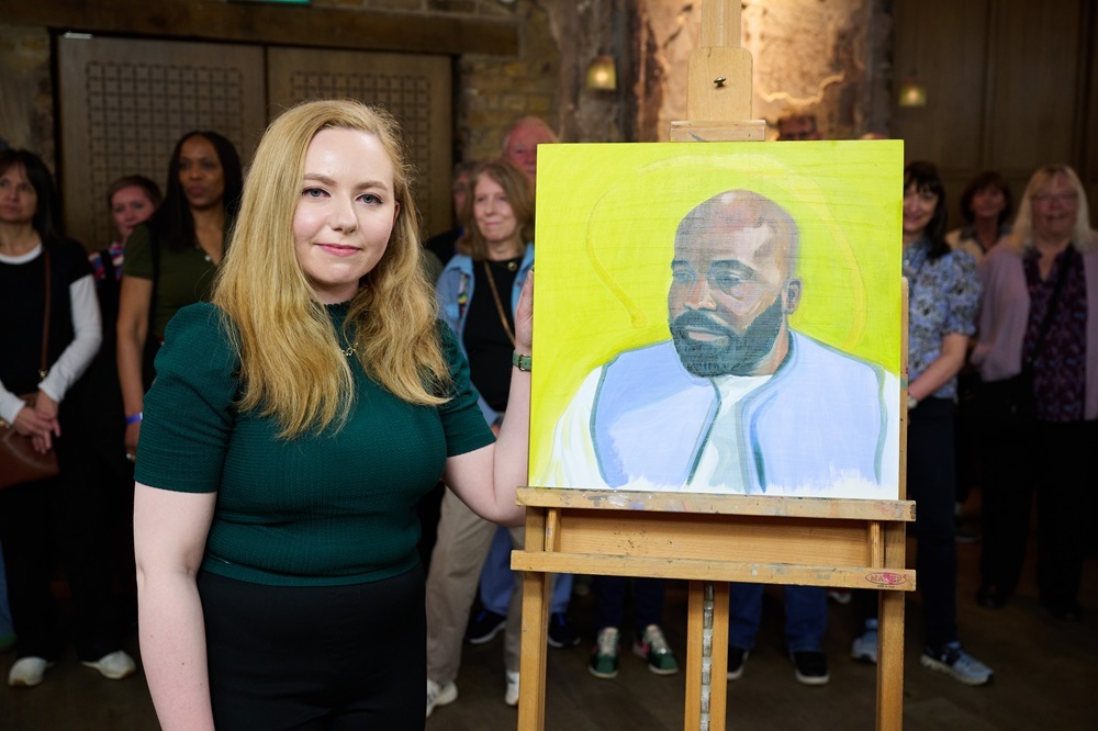
Your sitter was Political Editor at Sky News, Beth Rigby, who brought along a pen and pad which held meaning for her. You began with multiple quick sketches in charcoal, then moved on to paint, working quickly with fast, confident brush marks, capturing the feeling and energy of the sitter. Beth remarked that you are a physical painter. Can you walk us through your process?
I really love Beth’s remark “a physical painter” - I wouldn’t say I am one. That again is the sensation of the whole dialogue between the artist and the subject isn’t it? It gives me the confirmation of the kind of energy and connection I seek while making a life portrait. So the heat with Beth was a complete package of fulfilment for me, as I haven’t done any life portraits since I graduated from art school about sixteen years ago.
What are your must-have art materials? Are there any you simply can’t do without?
My must-have art materials are larger hog brushes both in rounds and flats. Professional/artist grade oil paints from Williamsburg and Michael Harding. I love my oil bars and sticks from Sennelier. My larger drawing paper in rolls and sheet from Fabriano, my Golden and Liquitex acrylic colours and all dry mediums from Charcoal bars and sticks, pastel to Conte.
Thanks Uthman! See more of Uthman’s work @uthmanwahaab on Instagram.
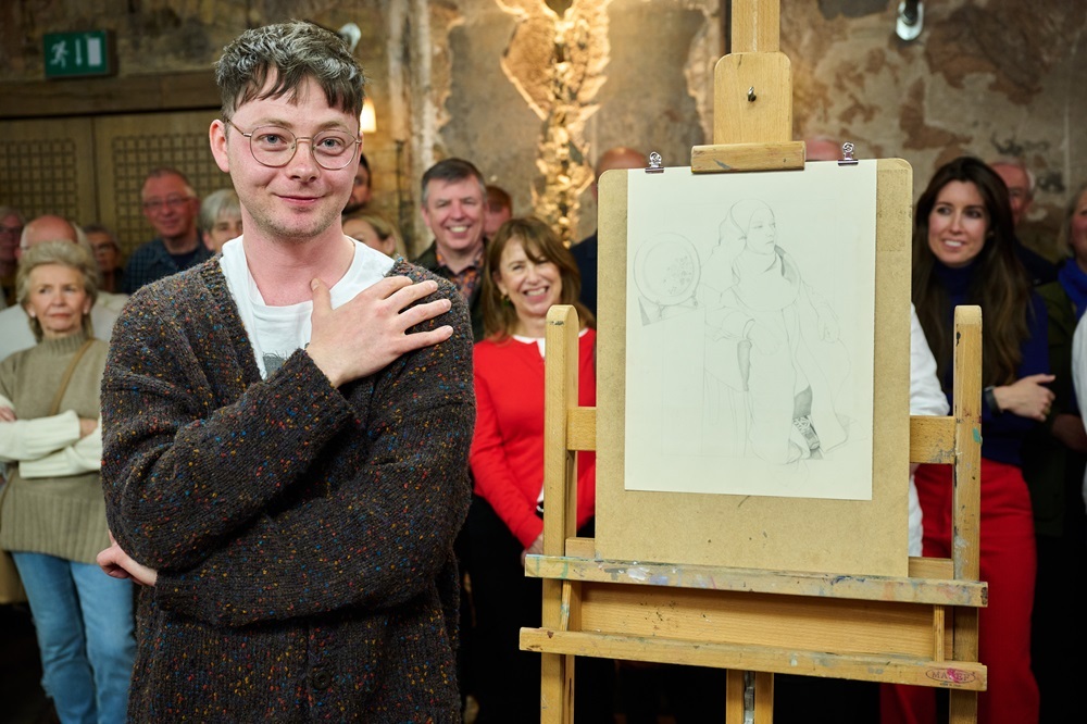
HEAT 7 WINNER: VINCENT STOKES
Hi Vincent, congratulations on winning Heat 7! How did you find the experience of creating a work in just 4 hours?
It was with utmost enthusiasm and excitement that I approached my portrait on the day. PAOTY was a welcome change to my usual routine; normally I would wake up at 4am to draw - this being the most peaceful time of day in my otherwise hectic household. Everyone is wide awake by 6:30am so I never really have very much time to draw in the day. 4 hours straight working whilst the sky was bright blue made for a real change - it felt like such a treat!
Your submission piece included a lot of symbolism and narrative, exploring the clash between boyhood and adulthood after becoming a father. Tell us more about that piece.
The self-portrait I submitted was my first considered attempt at using symbolism, metaphor and allegory to generate a narrative. At the time, I was reading Kierkegaard's The Concept of Anxiety, which explores the nature of anxiety as a fundamental aspect of the human condition. Literature has always influenced my visual art, and I have always sought ways to build bridges between words and pictures. My Self-portrait was, in a sense, an attempt to 'write' with images. In its entirety, 'What is the boy now?' is an expression of the loss of innocence. It is an inquiry into the psychological effects of senescence, of the erosion of youth and marks the beginning of consequence, judgement, uncertainty, perhaps even failure. The title is taken from the first line of The Ball Poem by John Berryman.

Your sitter was Comedian and Writer Fatiha El-Ghorri who brought a family plate along as her meaningful object. You took multiple photographs of her, working mostly in outline, picking out small details in her hijab pin, hands, trainers and the plate and used some imagination to piece these elements together. The resulting work was a delicate, considered drawing. How do you choose which elements to focus on and perhaps more importantly, which to leave out?
That's a delightful question. I am of the opinion that in order to uncover or conceive any sense of depth, narrative or 'inner life' of a sitter then one must pay keen attention to three aspects: head, hands and feet. It is these three elements of any human being that contain the stories, histories and reflections of one's life. In paying keen attention to these areas, the artist may succeed in apprehending the totality of their subject. Given the time limit, I was aware that in order to create something that reflected my values as an artist, I needed to focus on the head, hands and feet. By concentrating almost exclusively on these characteristics and by drawing them only in relation to themselves - overlooking such principles as proportion, form and depth - I was able to produce something that was at once direct, serious and heartfelt.
I was and am proud of my portrait and thank the angels that they were on my side that day. The plate was slightly intimidating though, more so was the plinth that it was set upon. I spent a long time thinking how I might work around such a big blank and boring object as a plinth in my drawing. I like to think I resolved this issue sufficiently.
What drawing materials do you like to use? Do you have any recommendations for artists working in pencil?
Well, in my dreams I paint and sculpt, though in reality the chaos that ensues from these materials inspires in me a terrible disquiet. Dry media is my preferred choice, so pencils, crayons, chalks, pastels and pens. For about two years I have worked almost exclusively with mechanical pencils as they enable me to produce the levels of detail I most desire. They also do not require sharpening, which makes my workstation much tidier. I would recommend anyone interested in drawing to experiment with mechanical pencils. They revolutionised my practice and changed the way I saw the potential of my work. That they come in a range of different sizes is just wonderful. My preferred size was the 0.03mm nib which is to my knowledge the thinnest nib available.
Thanks Vincent! See more of Vincent’s work at vincentstokesartist.com or @vincentlstokes_artist on Instagram.
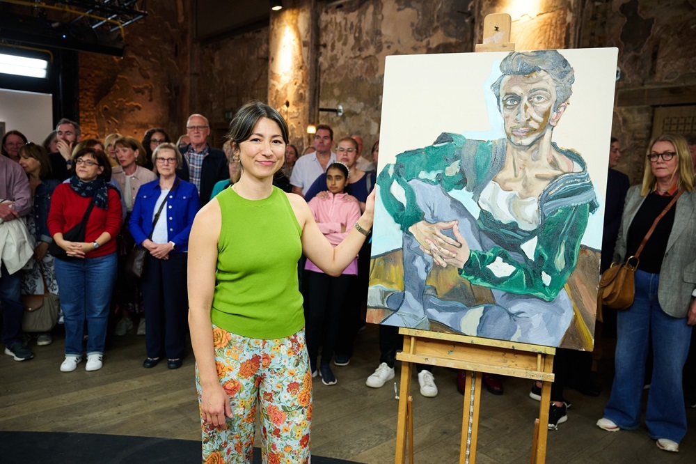
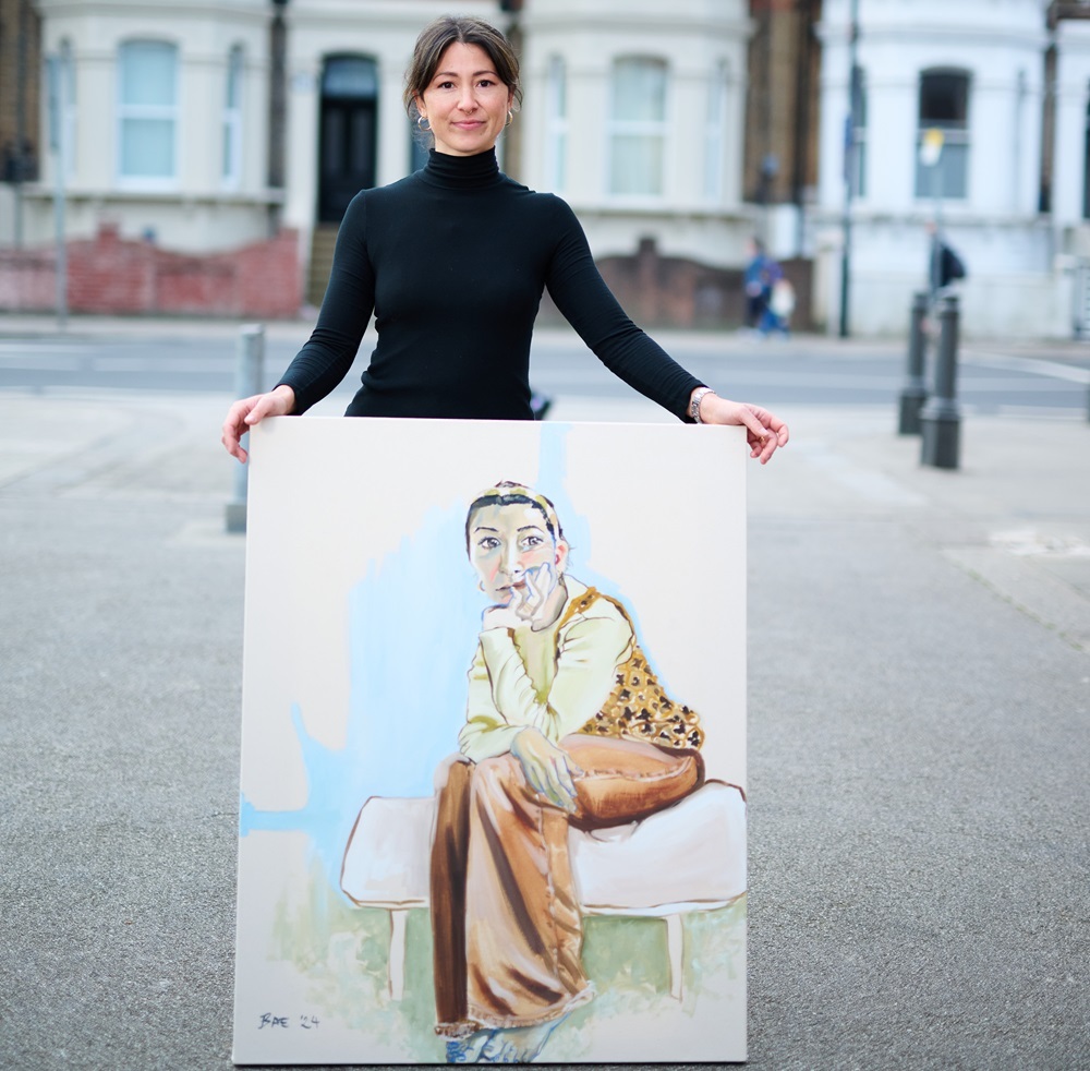
HEAT 8 WINNER: COURTNEY BAE
Hi Courtney, congratulations on winning Heat 8! What was it like creating a painting in front of the judges and audience?
It's a funny thing really, because painting is typically such an isolating practice for many of us artists, but I found myself near tears a few times in the heat because I was just so overjoyed with the concept of doing something I find so beautiful (creating) in front of and amongst a group of people who all simply feel joy watching it. It's a feeling I often get when I walk through a gallery or art museum - it's this visceral feeling of engaging in and experiencing something so very human and just so pure and beautiful.
As for the judges, I cannot stress enough how grateful I am to have their critique and thoughts. 12 seasons in, but let's not forget that these are three hugely respected and experienced figures in the art world - that shouldn't be taken lightly at all. To have their thoughts and their time on my work is incredibly valuable and something that has already helped me grow so much.
Your sitter was Principal Dancer at the Royal Ballet, Reece Clarke, who arrived in costume. Although he chose to stand for the 4 hours, you directed him to try a few different positions and decided upon a seated pose on the floor. Can you tell us more about your compositional choices?
You know, I didn't quite realise how controversial this might be! For me, I knew it was cheeky to ask him, but I was gentle and mindful when asking, and Reece was very kind and absolutely willing to comply. I just knew immediately that I needed to do this to get the best work done. You have to understand that I am equal parts a figurative artist and a portrait artist, so the whole figure is important to me. It is crucial to my process to have the composition art directed from my very own perspective. I don't begin my work with paint or even with sketching, I begin with the lighting, the background, the pose, and usually also I'm playing with the styling too. These elements are the skeletons of my work, and without them I'm not able to work. When you get to know the rest of my work, perhaps you can understand better.
With Reece specifically, I wanted to get in the shapes that a standing pose wouldn't allow. A standing pose will almost always corner me into a place where I cannot find a vulnerability, create a softness, and invite intrigue from the viewer. But the floor becomes grounding, folding his body created degrees of distance, allowing him to curve and shape his posture meant I could get more expression. There's just so much more that I could play with here.
You painted with bold marks and stylised features, including a level of distortion, creating an impactful painting that impressed the judges. Where does the line sit for you between making a portrait with a strong likeness and making a great painting? How do you determine how far you can push the boundaries of portraiture?
Kate was absolutely right, I am always concerned more with making a great painting than I am worried about getting a likeness. If I see that someone has this angular nose or maybe their eye sockets sit deeper than others for example, I will lean into that because I see it as something beautiful and identifying that only belongs to them. It is far more interesting to create a portrait that allows you to feel something, to understand something, and also to not understand many things, all at the same time. I'm not here to take a photo, I'm here to paint through my eyes.
I hope I push the boundaries of portraiture! I mean, I can really only hope I can and that I never stop doing this. Every painting I do is pushing, every single time.
What art materials would we find in your studio, and do you have any tips for aspiring portrait painters?
To start I use only clear gesso Liquitex, because I always love the organic look and feel of the canvas. There's something too stark and aggressive about working on a white canvas. I work with a whole range of different paint brands, Michael Harding, Cass Art, Charvin, Winsor & Newton and Gamblin too. My brushes are generally all quite large because I like to work very expressively and loosely, but also as a necessity because I don't typically work small. Almost all of my brushes these days are flat and long although I keep a round small brush for my line marksmanship, which brings a contrasting dynamic to my work. I stretch just about all of my canvases with cotton canvas from the roll, but sometimes I explore wood panel and paper too. I do love Michael Harding's oil medium, I shifted to this from linseed a while ago and am very happy.
Thanks Courtney! See more of Courtney’s work at courtneybae.com or @courtneybaeartist on Instagram.
ARE YOU THE NEXT WINNER?
If you think you’ve got what it takes to become the next Sky Arts Portrait Artist of the Year, the deadline for entries for Series 13 is Friday 20th February 2026. Find out more and apply at skyartsartistoftheyear.tv/portrait. Good luck!
EXHIBITION: MARKS OF REFLECTION
SKY ARTS PORTRAIT ARTIST OF THE YEAR 2025 SEMI-FINALISTS
Noho Showroom will host an exclusive exhibition of works by the semi-finalists of Portrait Artist of the Year 2025, on view from 16th to 21st December, 2025 at 67 Great Titchfield Street, W1W 7PT. Find out more here.

