Blue, a colour that has captivated artists and cultures throughout history, possesses a rich and fascinating pigment history. From the precious stone lapis lazuli to the development of synthetic blue pigments, the journey of blue pigment spans centuries and continents. In this blog post, we embark on a historical exploration of blue pigment, tracing its origins, trade routes, and transformative advancements. Here we'll unravel the captivating history of this beloved colour and explore some of his key hues on the colour blue spectrum
Ancient Origins
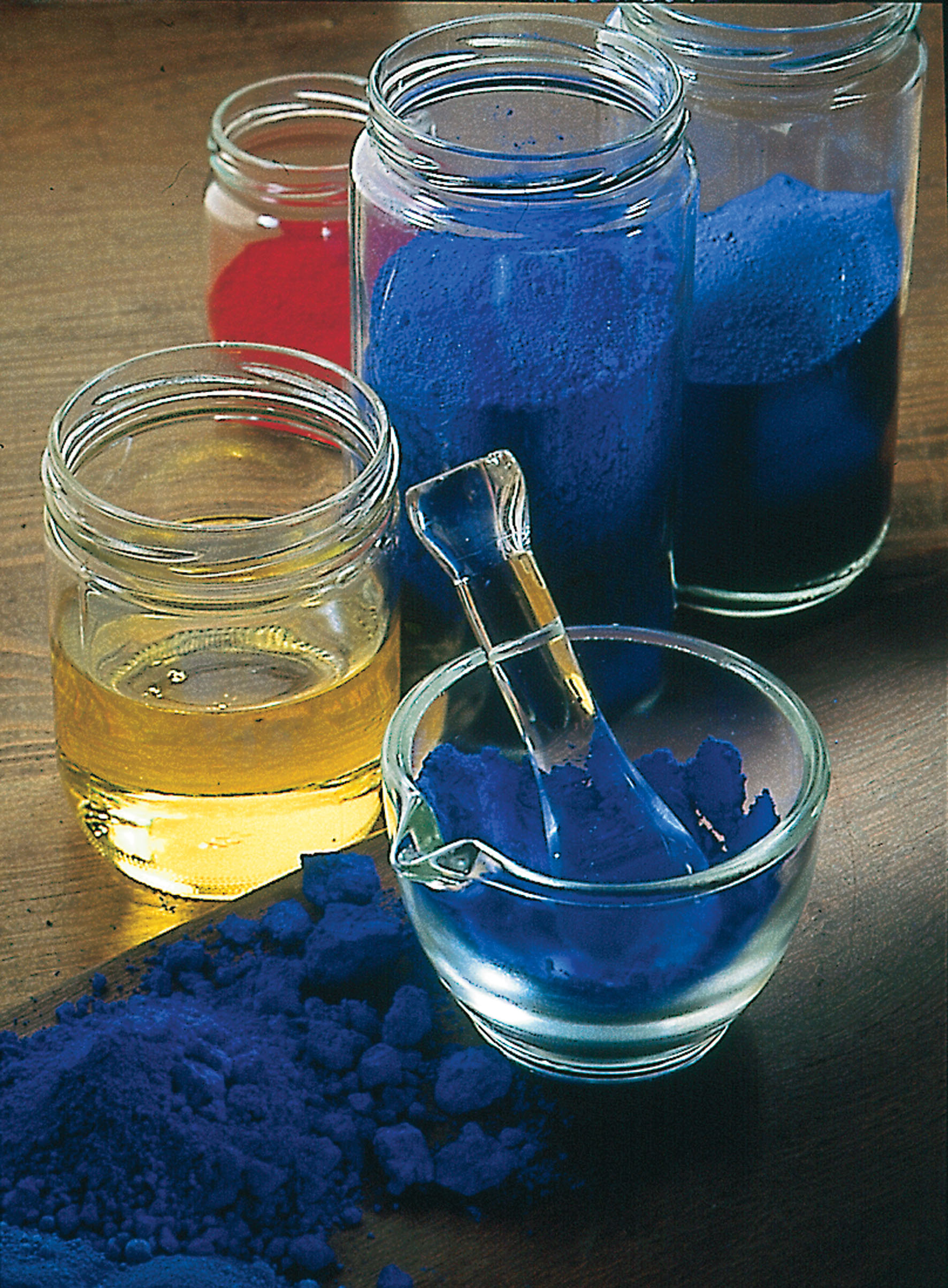
Lapis Lazuli and Egyptian Blue The earliest blue pigments can be traced back to ancient civilizations. Lapis lazuli, a semiprecious stone, was ground into a pigment by the Egyptians, Mesopotamians, and later, the Greeks and Romans.
This vivid blue pigment symbolized royalty and divinity. Additionally, the Egyptians developed Egyptian blue, one of the first synthetic pigments, created by heating a mixture of sand, limestone, and copper compounds.
In ancient Egypt, blue was associated with the sky and divinity, and as the colour of the afterlife, featured heavily in their funeral ceremonies. It was important enough that they imported one of the most expensive pigments in the world, lapis lazuli, from Afghanistan. It was a semi-precious stone and was ground into a pigment, and used for pottery glazes, and carved into beads and jewellery.
Ultramarine Blue
Pigment no.
Transparency/Opacity: Opaque
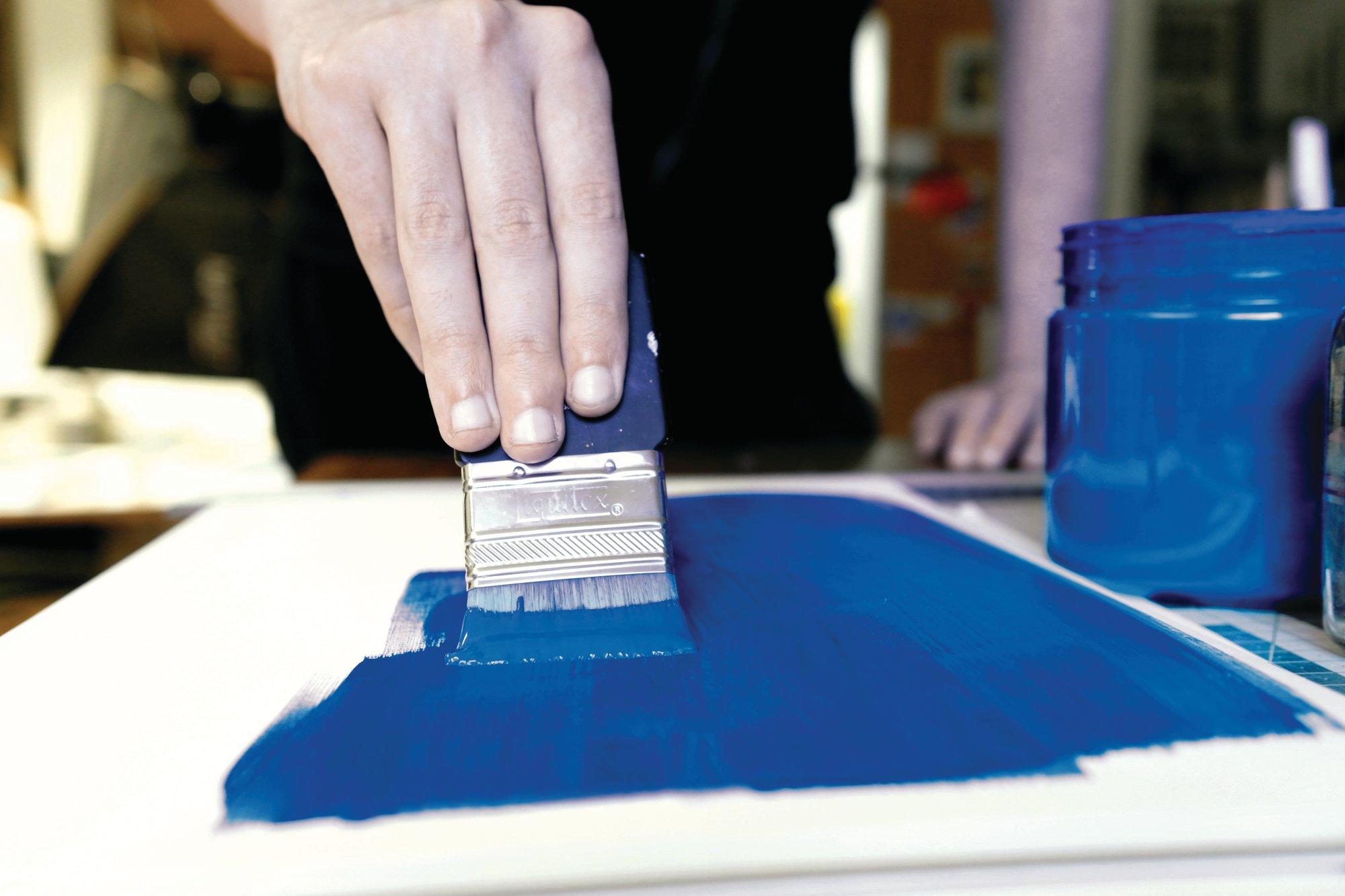
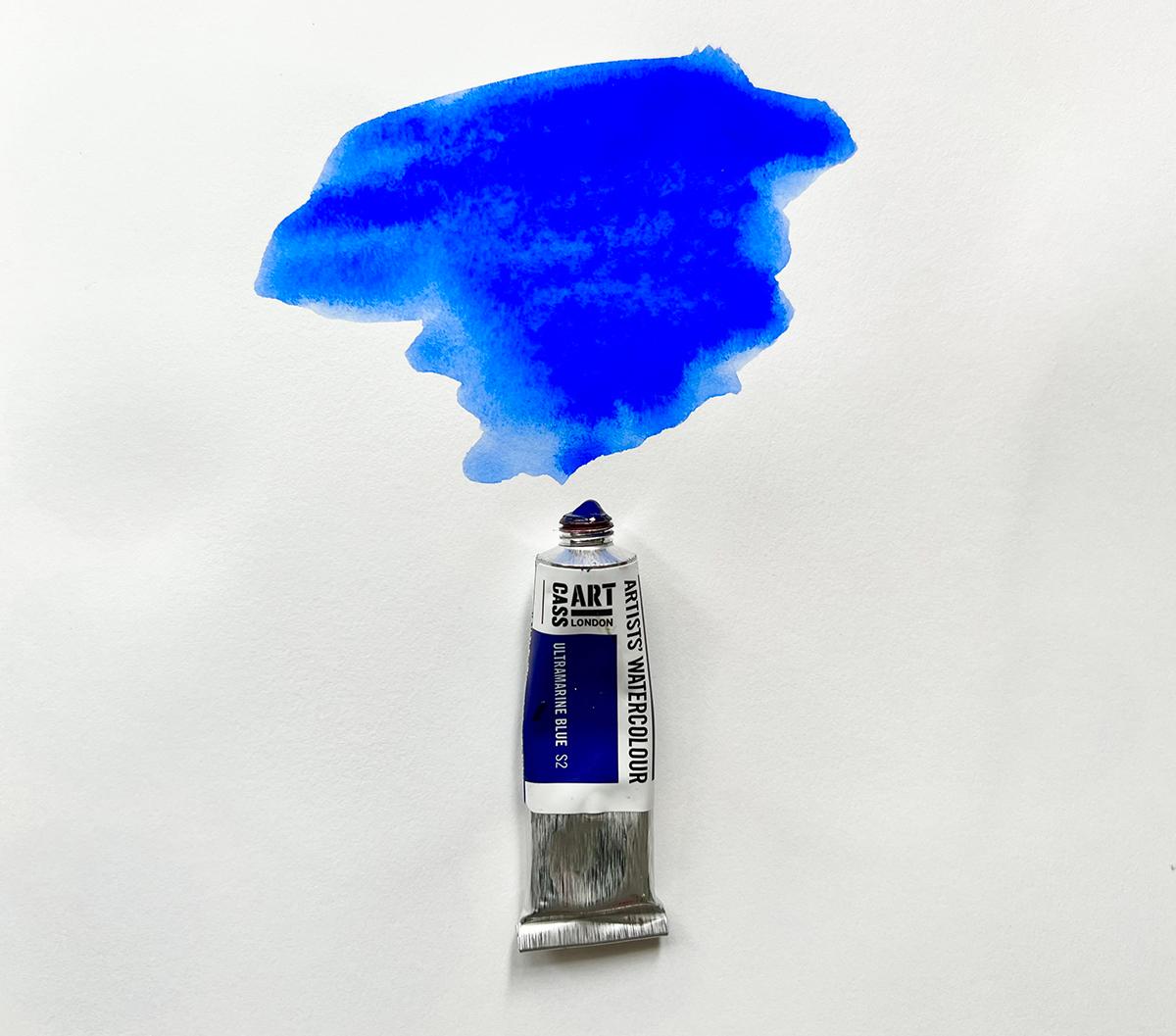
Ultramarine Blue is a synthetic version of the historical mineral pigment we mentioned above - Lapis Lazuli. It was discovered in teh 1800s by a French chemist called Jean-Baptiste Guimet and made by heating kaolinite, sodium carbonate and sulfur to create a pigment that is identical to Lapis Lazuli.
Ultramarine Blue is a warm, reddish-blue which has many variations of Ultramarine depending on the brand such as ‘green-shade’ or ‘red-shade’ which indicates the subtle hue tint.
Cerulean Blue
Pigment no. PB35
Transparency/Opacity: Opaque
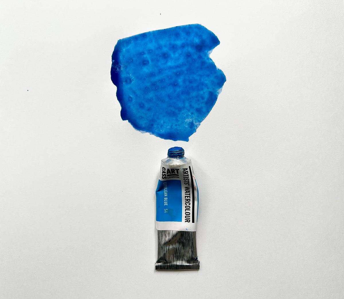
A pure blue pigment, Cerulean Blue is opaque and bright due to its highly refractive particles. It is stable and does not react to light or chemicals, making it a permanent and invaluable part of the artist’s palette.
For a clue to the origin of the name, you need to look upwards. The word cerulean comes from the Latin caeruleus, meaning dark blue caelum – which in turn probably derives from caelulum, meaning heaven or sky.
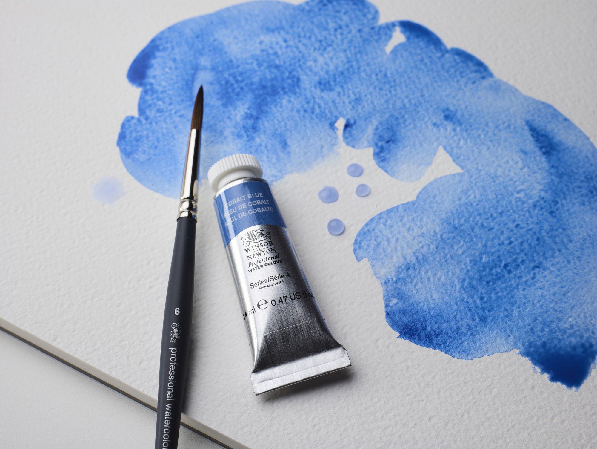
Cobalt Blue
Pigment no. PB28
Transparency/Opacity: Semi-Opaque
Another blue hue developed in the 1800's by Louis Jacques Thénard is Cobalt Blue. It is a clean blue that is neither cold nor warm with moderate tinting strengths. With its radiant and pure blue hue, it became a favourite among artists such as J.M.W. Turner and Vincent van Gogh.
Cobalt Blue is an inorganic pigment and has distinct greenish-blue hue, with a heavier, more mineral appearance when seen as a dry pigment. It has provided artists with a bright and intense blue that retained its brilliance over time.

Phthalo Blue
Pigment no. PB27
Transparency/Opacity: Transparent
Phthalo Blue, also known as Phthalocyanine Blue, is a vibrant and intense blue pigment widely used in various artistic mediums, including painting, printing, and plastics. It belongs to the phthalocyanine family of synthetic organic pigments.
Phthalo Blue has a deep, rich hue and is highly valued for its strong tinting strength. It is known for its exceptional lightfastness, which means it resists fading when exposed to light over time.
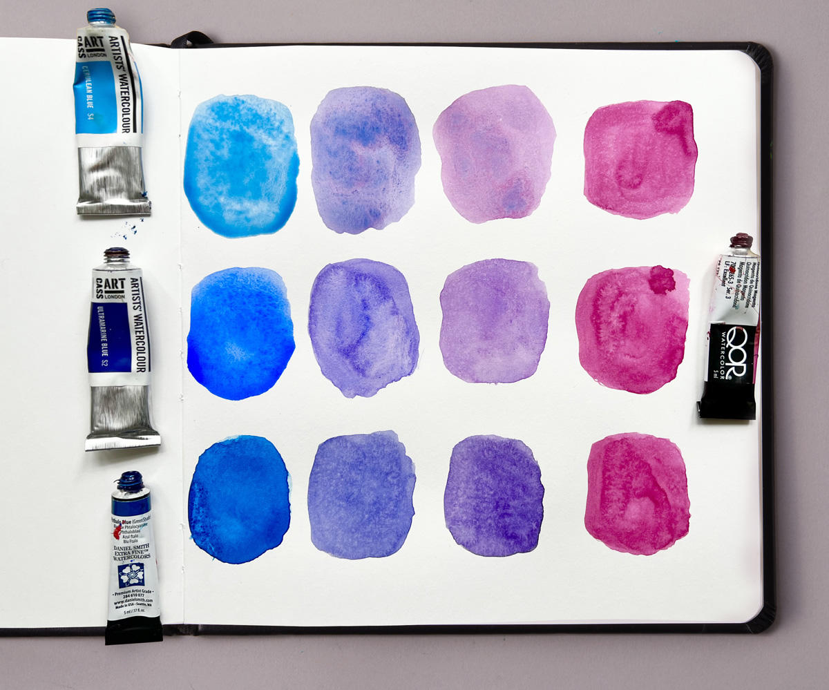
The blend of Magenta with Cerulean Blue offers a lovely spectrum of purples and violets. With as we know Cerulean Blue being a cool, light blue with green undertones, beautifully contrasts with the warm and intense Magenta.
Wiith it mixed with Ultramarine Blue you get a rich collection of deep purples and blues. Ultramarine Blue in contract to Cerulean Blue is a warm blue with hints of red, interacts harmoniously with the vibrant Magenta creating an almost softer purple tone.
Phthalo Blue, with it's intense saturated blue shade, complements the intensity of Magenta and when blended, these colours create an explosion of such bold, eye-catching hues.
The mixing of one of the most important colours on any artists palette - Magenta with different shades of blue, including our 3 blues above offers artists an exciting palette of colours and harmonies to explore. From delicate lavender to deep indigos, from regal purples to vibrant magentas, these mixtures unlock a wealth of creative possibilities.