

The landscapes of the Brecon Beacons have influenced Michael Harding's work for many years. Around 2009, after many years based in Whitechapel, East London, Michael made the decision to relocate to the Brecon Beacons in South Wales. Living among its vast skies, shifting weather, deep valleys and fleeting moments of light only deepened his connection to the landscape, shaping the colours he mixed, tested and refined in the studio. Together, these experiences inspired the 10 colours that make up this final set.
The Brecon Beacons Oil Paint Set is the fourth and final release in our year-long celebration of 40 years of Michael Harding Oil Paints. Each set in the series has reflected a different stage in Michael's approach to colour, shaped by decades of developing pigments and refining his range. Like every paint in this anniversary collection, all 10 colours in the set are vegan. Inspired by the landscape and atmosphere of Wales, this final release brings the series to a close with a palette that Michael describes as the natural conclusion of everything that came before.
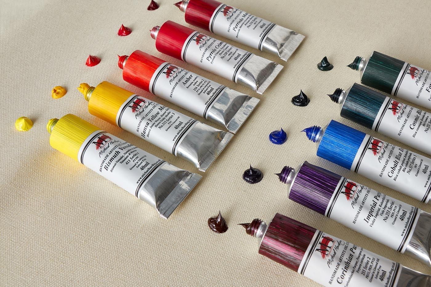
Michael has spoken often about how a landscape gets under a painter's skin long before it appears in the work itself. Wales, for him, was exactly that kind of place. That process of absorption, rather than direct copying, is central to how Michael approaches colour. He isn't trying to reproduce a Welsh sky on the palette. He's trying to capture the feeling of standing underneath one, watching it change.
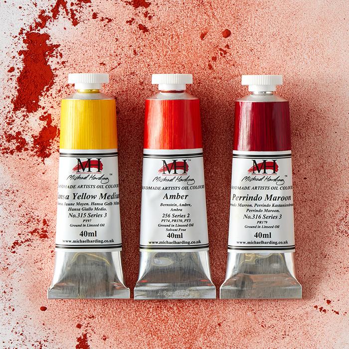
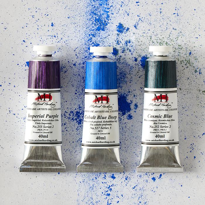
This is a theme Michael returns to again and again, the idea that colour rarely does its most interesting work in isolation. It's in the meeting points, where one hue sets another alight, that a painting starts to breathe.
"A painting should invite the eye to travel through unexpected harmonies and moments of discovery. When colours surprise us, they bring life to a painting, and perhaps that sense of discovery is one of the true joys of being an artist."
What ties this set together isn't just the landscape that inspired it, it's the way these colours behave alongside one another. Michael points to yellow beside purple as an example of the energy that unexpected pairings can create, and amber against deep blue as a source of sudden warmth and light. It's this kind of interaction, rather than any single colour on its own, that gives a painting its sense of discovery.
It says something about how Michael thinks about palette selection more broadly. A set of colours isn't judged only by how good each one looks in isolation, squeezed onto a palette or swatched onto paper. It's judged by what happens when they meet. Put Corinthian Purple next to Hansa Yellow Medium and something happens that neither colour can do alone, a kind of visual friction that pulls the eye in and holds it there. Put Amber against Cobalt Blue Deep and the warmth of one intensifies the coolness of the other, each colour making its neighbour more itself.
This is the quiet logic behind the Brecon Beacons Set. It isn't 10 colours chosen at random, or even 10 colours chosen purely for their individual merits. It's a set built around the relationships between them.
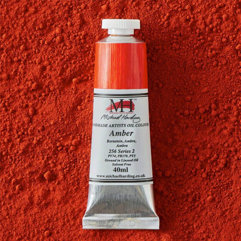
Series 2
Ⓥ VEGAN
Rich, glowing and beautifully warm, Amber sits somewhere between deep orange and burnt gold. It immediately makes me want to paint. There is something luminous about it, as though the colour radiates from within. Whether used in glazing, landscape painting or portraiture, Amber brings warmth, depth and a natural glow to every mixture.
Colour Index PY74, PR170, PY3
Drying Speed Average
Transparency Semi-Transparent
Lightfastness Excellent
Oil Content High
Tint Power Average
Toxicity Non-Toxic
ASTM D-4236 ✔
Series 2
Ⓥ VEGAN
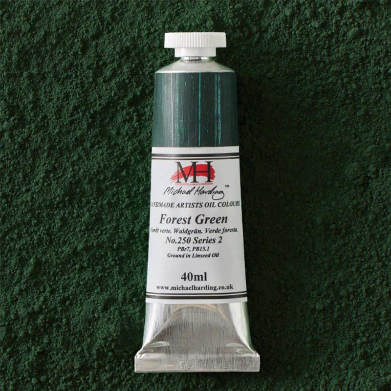
Another really sumptuous, verdant, sappy green, ideal not just for landscapes but any area where a green might be required. Forest Green has a natural richness and vitality that allows it to move effortlessly between foliage, shadow and reflected colour. Full of character, it feels as though it belongs in the landscape.
Colour Index PBr7, PB15.1
Drying Speed Fast
Transparency Semi-Transparent
Lightfastness Excellent
Oil Content Average
Tint Power High
Toxicity Non-Toxic
ASTM D-4236 ✔
Series 3
Ⓥ VEGAN
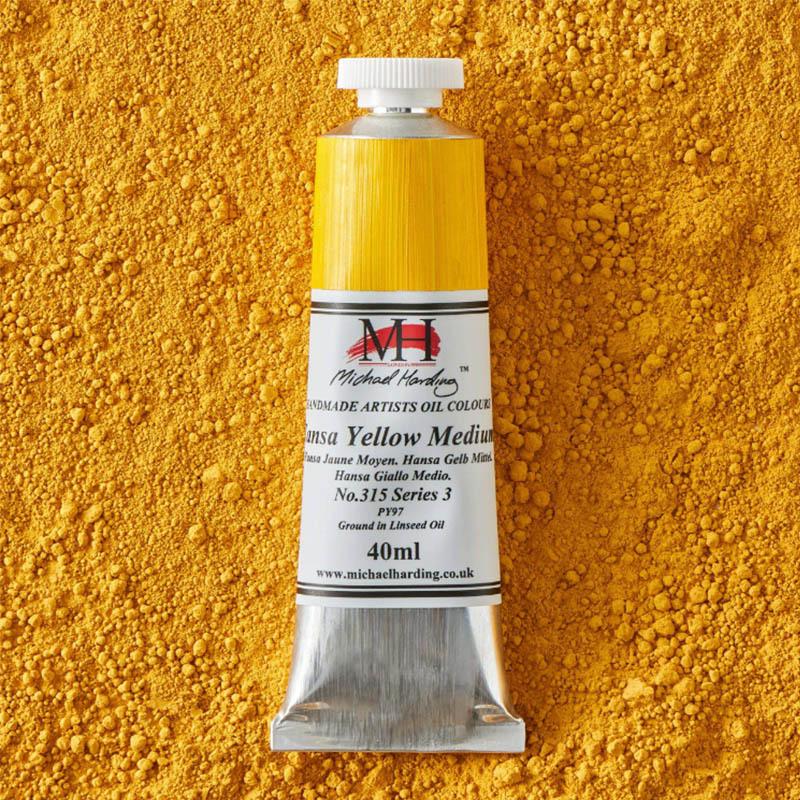
Warm, yolky, transparent, essential and powerful. Hansa Yellow Medium possesses the clarity and strength that every painter looks for in a modern yellow. Ideal for vibrant still lifes, luminous landscapes and brilliant mixtures, it quickly earns a permanent place on the palette.
Colour Index PY97
Drying Speed Slow
Transparency Transparent
Lightfastness Excellent
Oil Content Average
Tint Power High
Toxicity Non-Toxic
ASTM D-4236 ✔
Series 2
Ⓥ VEGAN
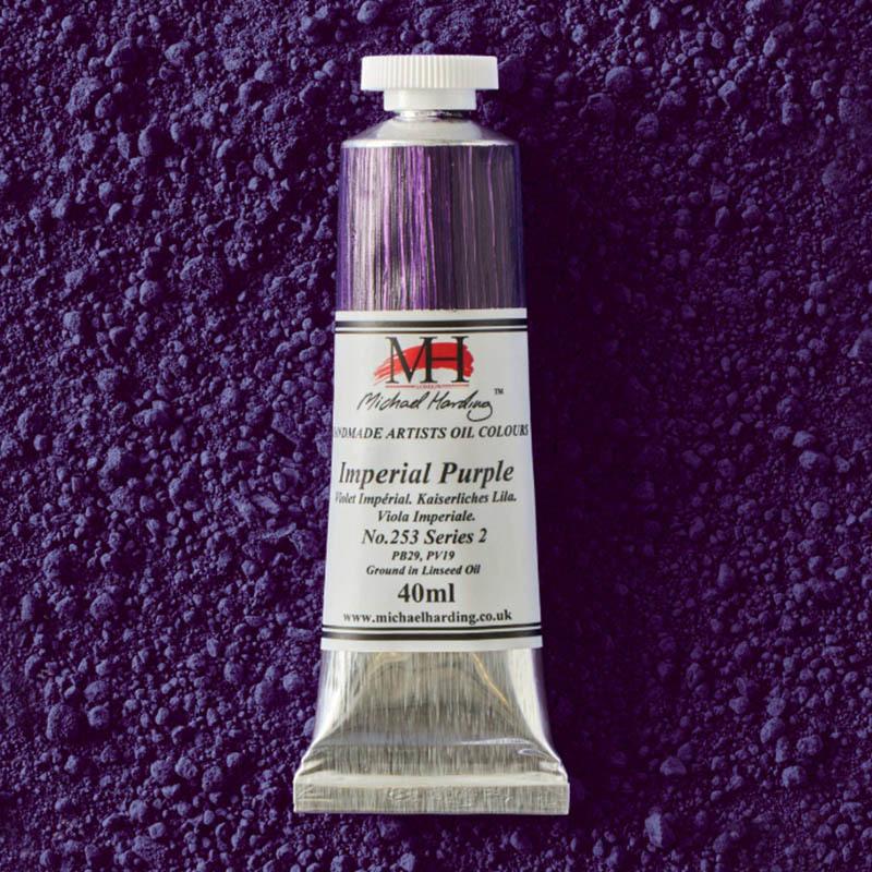
Imperial Purple combines the depth of Ultramarine with the brilliance of Quinacridone Violet to create a colour of remarkable elegance and versatility. Transparent and atmospheric, it moves effortlessly from rich shadow to passages of vibrant colour, making it an invaluable addition to the painter's palette.
Colour Index PB29, PV19
Drying Speed Average
Transparency Transparent
Lightfastness Excellent
Oil Content Average
Tint Power Average
Toxicity Non-Toxic
ASTM D-4236 ✔
Series 2
Ⓥ VEGAN
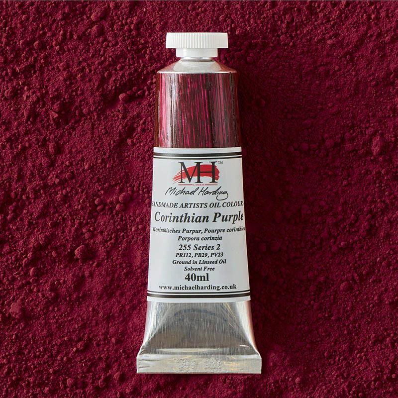
A fantastic coming together of three wonderful pigments; a colour that is really going somewhere. The moment it touches the palette, ideas begin to emerge: evening light, nocturnes, deep shadows and atmosphere. It is one of those colours that immediately sparks the imagination and seems to suggest paintings of its own.
Colour Index PR112, PB29, PV23
Drying Speed Average
Transparency Semi-Transparent
Lightfastness Excellent
Oil Content Average
Tint Power Average
Toxicity Non-Toxic
ASTM D-4236 ✔
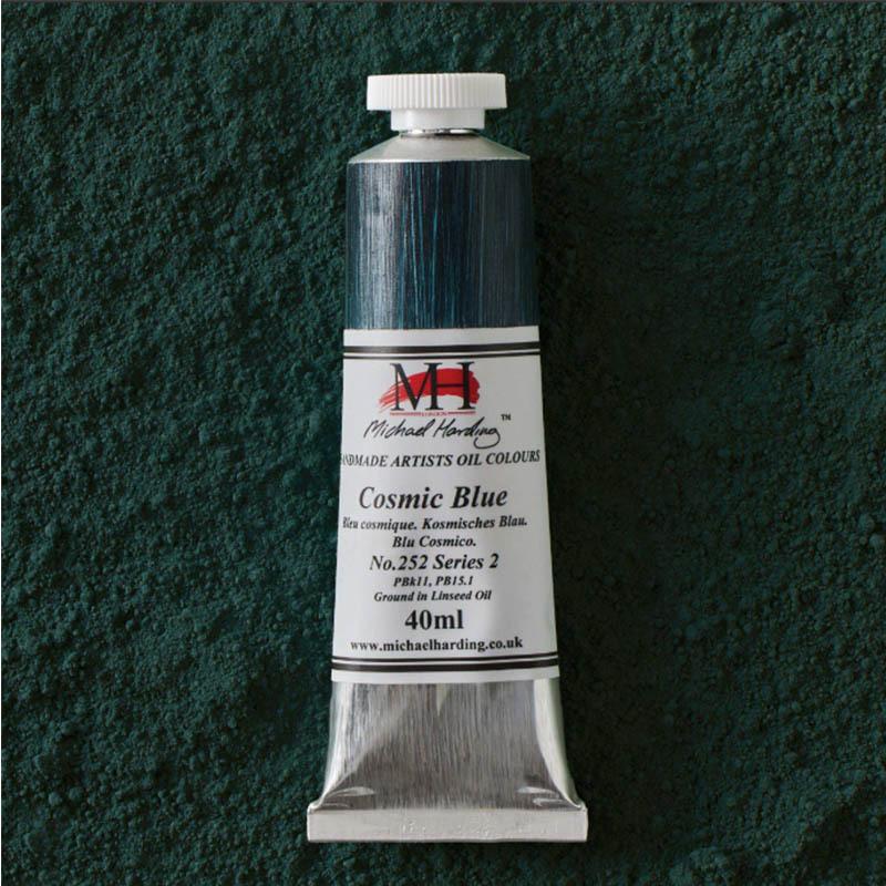
Series 2
Ⓥ VEGAN
Subtle, gem-like, yet icy. Hidden within a dark, shadowy black lies a remarkable sapphire-like blue that reveals itself gradually as it is worked. Cosmic Blue offers something quite different from the traditional blues, possessing depth, mystery and an unexpected luminosity.
Colour Index PBk11, PB15.1
Drying Speed Average
Transparency Semi-Transparent
Lightfastness Excellent
Oil Content High
Tint Power Average
Toxicity Non-Toxic
ASTM D-4236 ✔
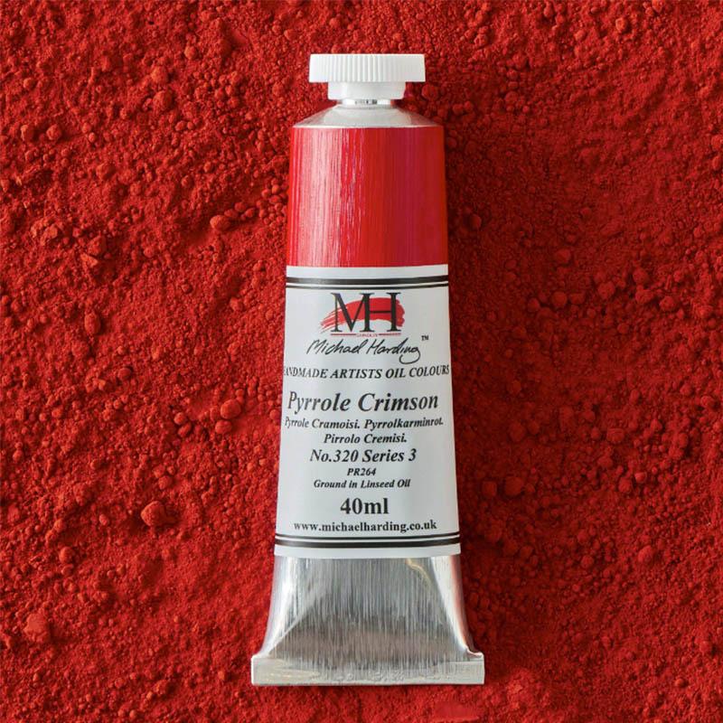
Series 3
Ⓥ VEGAN
A sharp bluey red, ideal for those tricky hues that can sometimes be difficult to achieve. Pyrrole Crimson offers a real special angle on the palette, bringing clarity, brilliance and intensity to mixtures. Particularly effective for dramatic skies and those crazy sunsets.
Colour Index PR264
Drying Speed Average
Transparency Transparent
Lightfastness Excellent
Oil Content High
Tint Power Average
Toxicity Non-Toxic
ASTM D-4236 ✔
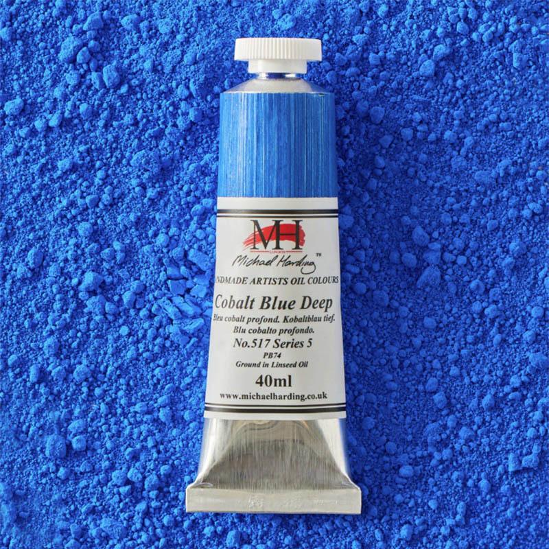
Series 5
Ⓥ VEGAN
Cobalt Blue Deep is one of the most dependable and elegant blues imaginable; rich, atmospheric and wonderfully lightfast. Possessing all the qualities that have made cobalt pigments favourites among painters for generations, it delivers depth, harmony and permanence in equal measure.
Colour Index PB74
Drying Speed Very Fast
Transparency Semi-Opaque
Lightfastness Excellent
Oil Content Low
Tint Power Average
Toxicity Non-Toxic
ASTM D-4236 ✔
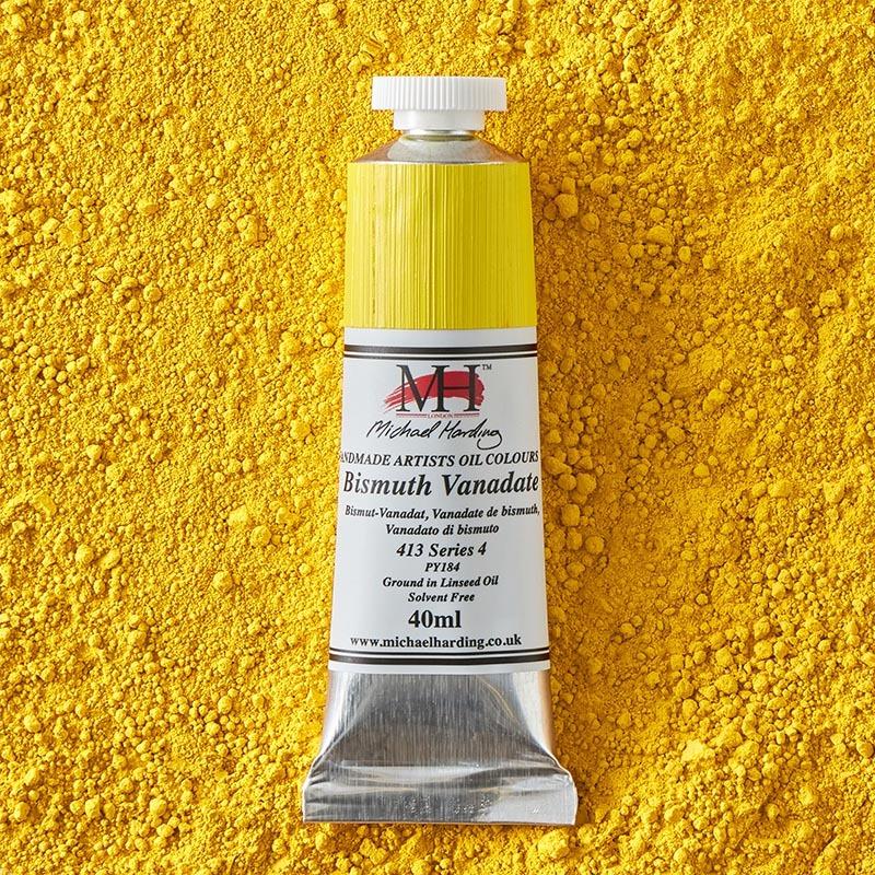
Series 4
Ⓥ VEGAN
A soft, yet vibrant and zesty addition to the range of yellows. Bismuth Vanadate possesses a brightness and freshness that brings remarkable energy to mixtures, while retaining the opacity and permanence demanded by professional painters.
Colour Index PY184
Drying Speed Average
Transparency Opaque
Lightfastness Excellent
Oil Content Average
Tint Power High
Toxicity Non-Toxic
ASTM D-4236 ✔
Series 3
Ⓥ VEGAN
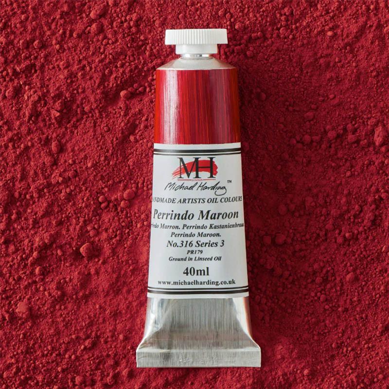
A nice bloody red currant, fruity, deep fiery red. Perrindo Maroon offers a distinctive warmth and richness that makes it an intriguing alternative to colours from the Alizarin family. Transparent and characterful, it is particularly effective in florals, shadows and atmospheric passages.
Colour Index PR179
Drying Speed Average
Transparency Transparent
Lightfastness Excellent
Oil Content High
Tint Power Average
Toxicity Non-Toxic
ASTM D-4236 ✔
With this set the 40 Colours celebration is complete. Across four releases over the past year, the series has traced Michael Harding's colour development through four decades of painting, from early experiments with pigment to the palette he works with today. Each set has told part of that story. This final release brings it to a close, not with fanfare, but with 10 colours built on atmosphere, mood and the enduring joy of colour itself.
It feels fitting that the story should end in Wales, in a landscape defined by change, where the sky can shift from grey to gold in the time it takes to mix a colour on the palette.The set is available now, the last in the four-part series marking Michael Harding's 40th anniversary.
Add To List
Add a Wishlist
form to add wishlist here