
Aritst Felicity Joy Starr is a wonderful artist and also a Michael Harding ambassador. We asked her to try the new Brecon Beacons oil paint set and write up her process. Below, she walks through painting a still life apple from start to finish, and shares her thoughts on the set along the way.
Over to you Felicity!
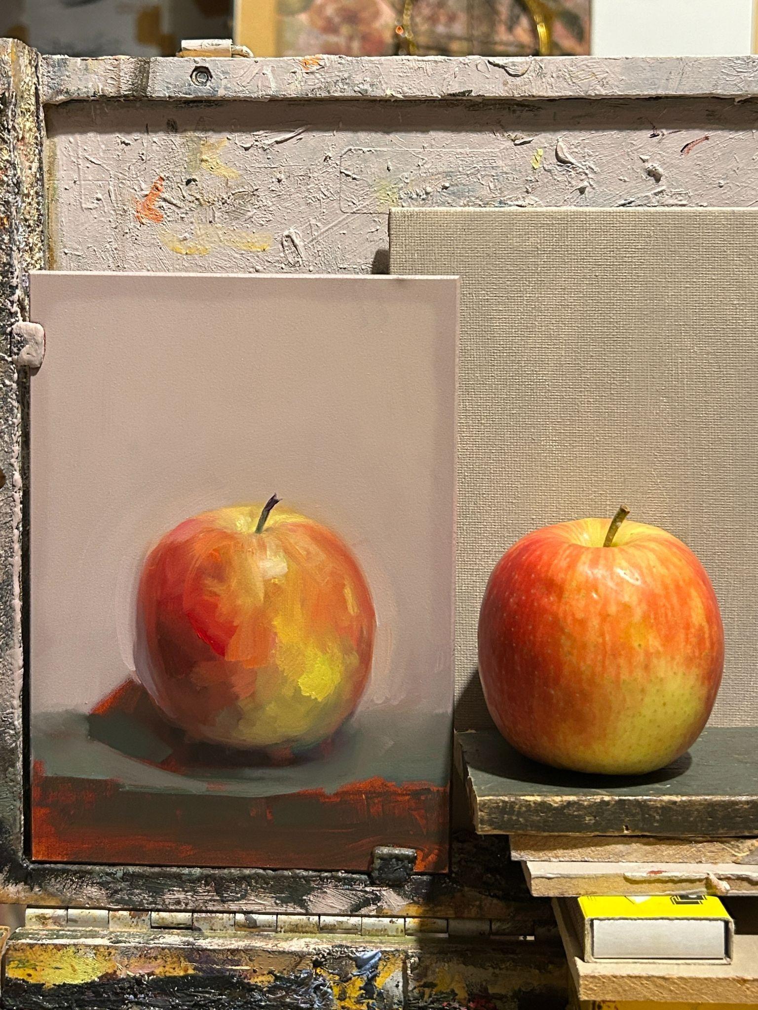
Cass Art and Michael Harding asked me to paint a still life using the new Brecon Beacons paint set and write a step by step guide. I couldn’t have been happier to be asked.
I have a huge amount of respect for Michael Harding not just for the extraordinary quality of his paints, but for the care and thought that goes into making them. Being trusted to celebrate this new collection was a real honour.
Whenever I open a new palette, I always line up every colour and mix each one with white. Before I paint a single brushstroke, I want to know what each pigment is capable of. Seeing a colour at full strength tells me one thing; seeing it in its lighter notes tells me another.
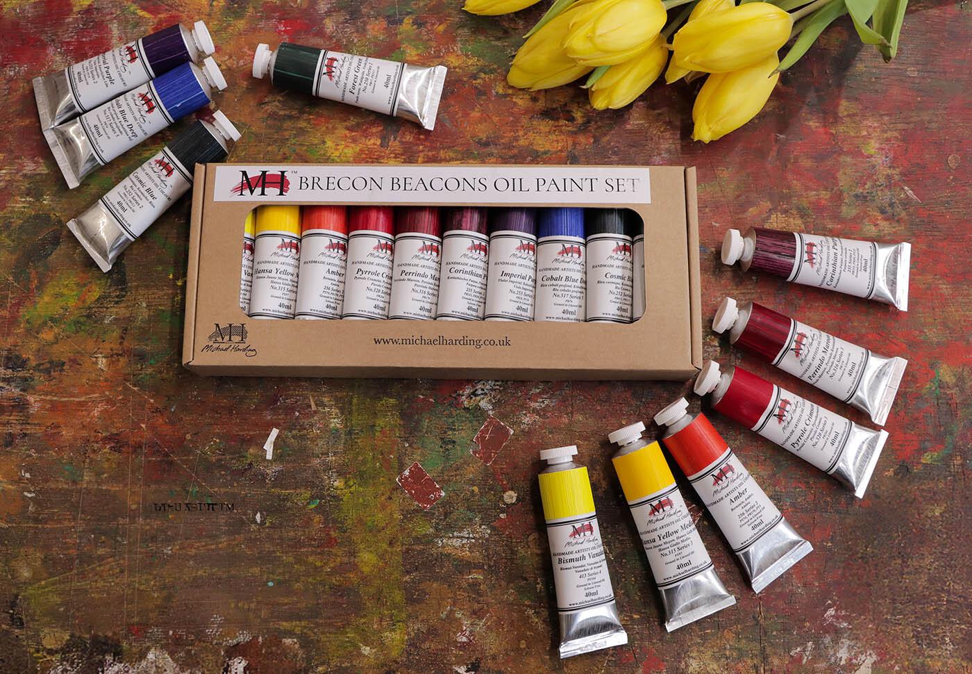
These colours were completely new to me, so I didn't have the usual muscle memory of reaching for familiar mixtures. Instead, I found myself experimenting, playing and discovering unexpected colour combinations along the way. I'd stumble across a mixture I wasn't expecting, pause, smile and carry on!
Although this is a restricted palette in terms of the colours included, it never felt restrictive, it felt like freedom.One of the biggest surprises was the range of greens. There seemed to be a green for every mood, from soft olive notes to deep woodland shadows. And, as always with Michael Harding oils, the pigment strength meant a surprisingly small amount of paint went a very long way. Even through repeated mixing, the colours retained their life and never seemed to lose their energy.
This might sound like an odd comparison, but Michael Harding paints remind me of my mum.
When my sisters and I were children, Mum used to make homemade playdough for us. At the time, I completely took it for granted. I just loved playing with it. Looking back, I realise how much love, care and attention went into making something simply for us to enjoy... These paints give me that same feeling.
They feel made with love, care and attention. Made by people who genuinely want artists to enjoy painting. So, thank you to everyone who works so tirelessly to put something so extraordinary into a simple tube of paint.
Here is the process I followed for painting an apple with the new Brecon Beacons set.
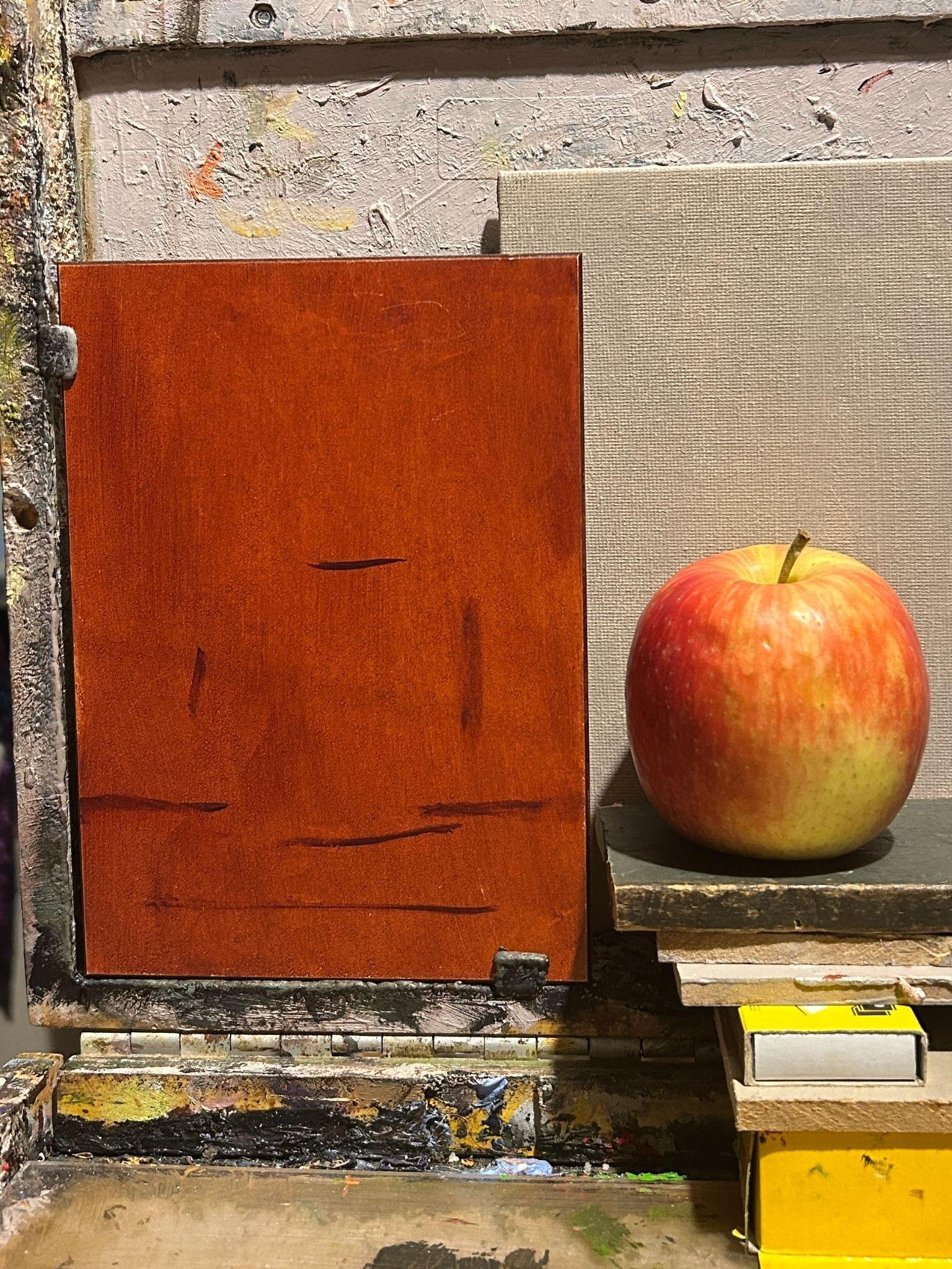
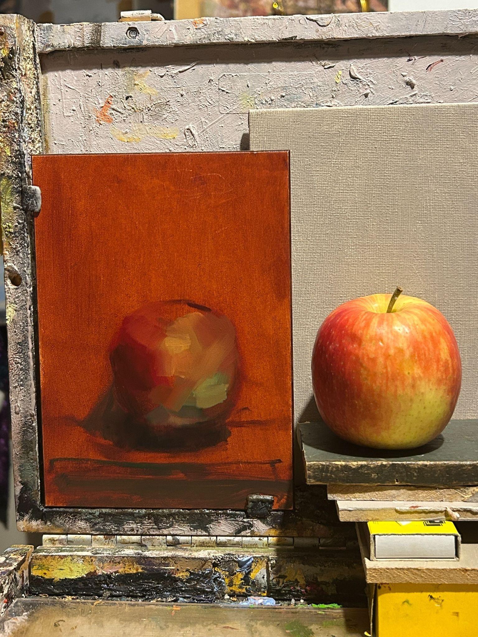
I began by staining the panel with a thin wash of Amber, adjusted with a touch of Perrindo Maroon.
A toned ground immediately removes the glare of a white surface and provides warmth that can remain visible throughout the painting.
Using a dark mixture of Cosmic Blue, Perrindo Maroon and a touch of Amber, I lightly mapped the overall shape of the apple.
Rather than drawing every contour, I concentrated on the largest shapes, the tabletop and the cast shadow.
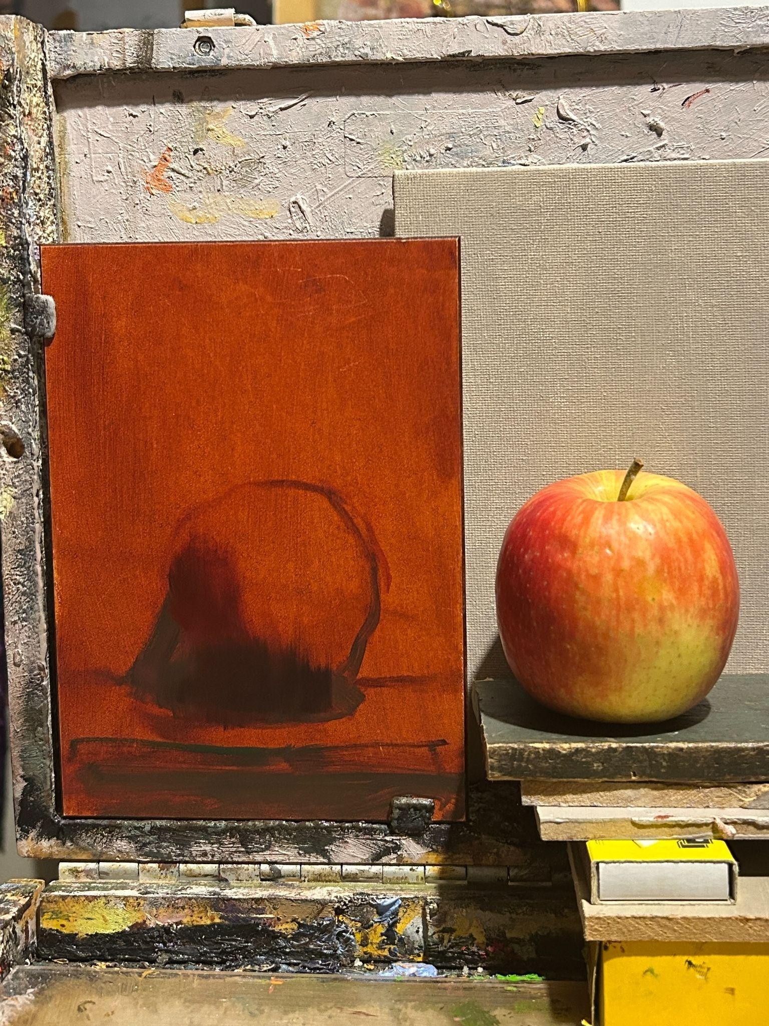
Before thinking about colour, I simplified the painting into light and shadow.
Using mixtures of Cosmic Blue, Imperial Purple, Perrindo Maroon and Amber, I established the darkest areas first. At this stage, I ignored details and focused only on the overall value pattern.
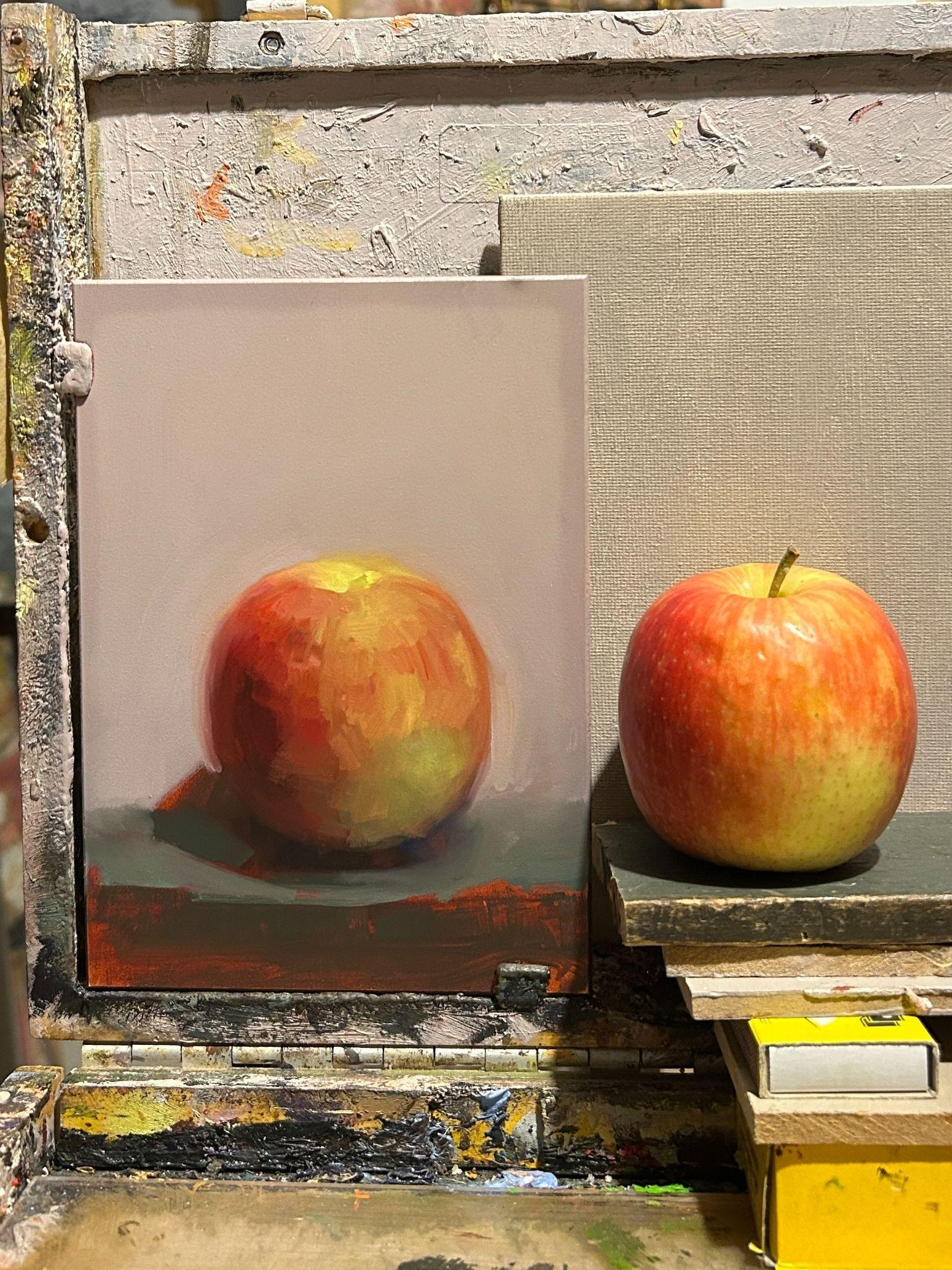
With the drawing established, I introduced the local colour.
- Pyrrole Crimson and Perrindo Maroon formed the richer reds.
- Amber and Hansa Yellow Medium created the warm golden passages.
- Forest Green combined beautifully with Hansa Yellow Medium to produce a surprising variety of natural greens.
- Warm White lifted the lighter planes without reducing the richness of the mixtures.
Rather than blending everything smooth, I tried to keep each brushstroke describing the form of the apple.
The background was mixed from Warm White, softened with small amounts of Imperial Purple, Amber and Cosmic Blue.
Painting around the apple allowed me to refine its silhouette naturally instead of constantly correcting the outline.
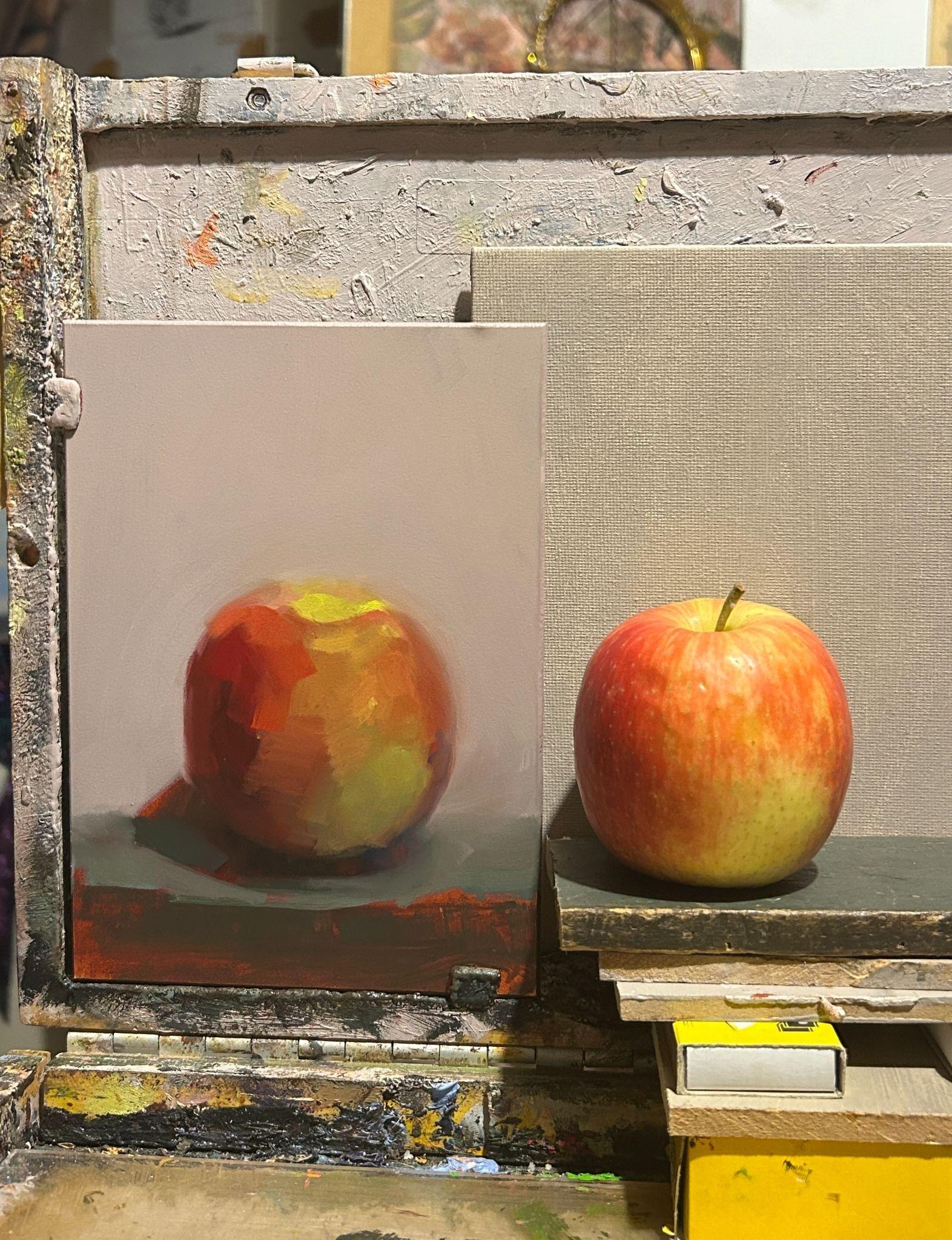
Once the large shapes were established, I returned to the apple to introduce subtle colour shifts.
The reds became richer with Pyrrole Crimson and Perrindo Maroon, while Amber gently connected the reds and yellows. Cooler notes created with the purples helped describe the turning form without relying on black.
Throughout this stage, I worked around the painting, constantly comparing one area with another rather than finishing one section before moving on.
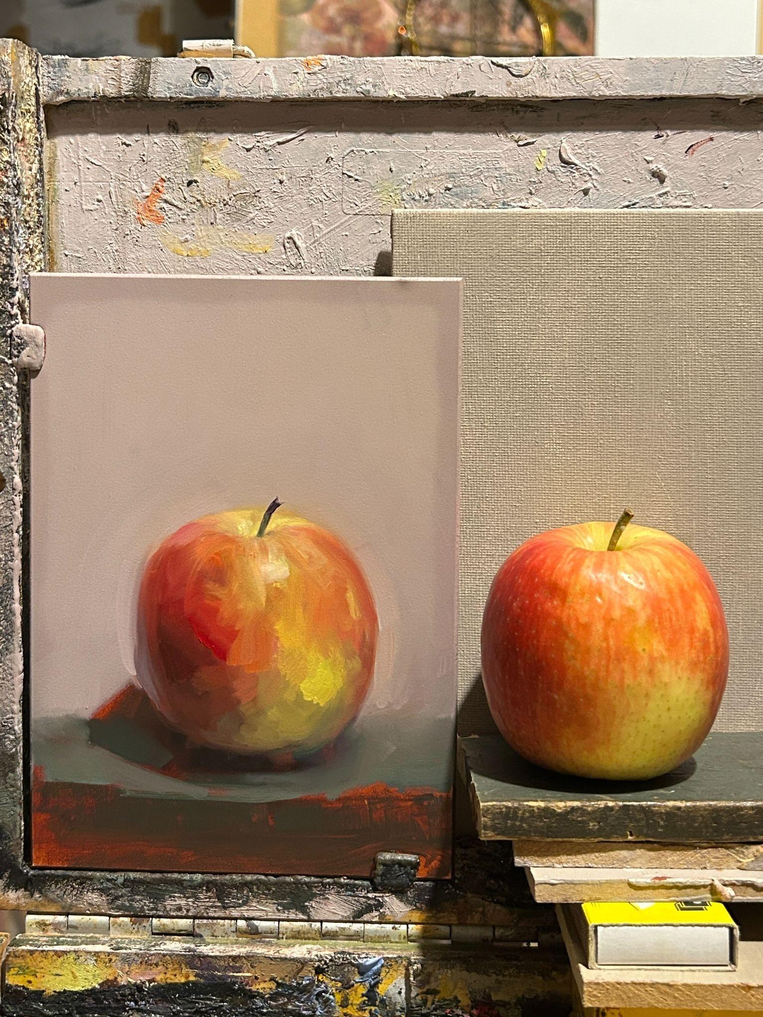
The brightest notes were saved until the very end.
Small touches of Bismuth Vanadate, Hansa Yellow Medium and Warm White brought light to the crown of the apple and helped describe its surface.
The stem was painted with a mixture of Cosmic Blue, Amber and Perrindo Maroon, before the final edges were adjusted. Some edges were kept crisp, while others were softened into the background to help the apple sit naturally within the space.
Final thoughts
Love the paints!
Love painting!
Happy painting to you!
Felicity
Be sure to follow Felicity's work on Instagram @felicityjoystarr
Add To List
Add a Wishlist
form to add wishlist here