
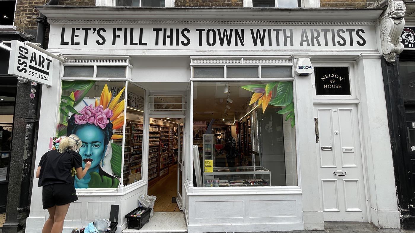
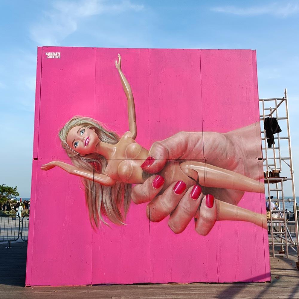
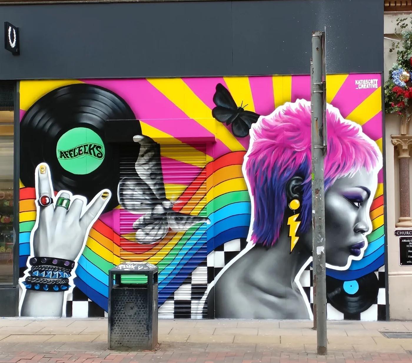
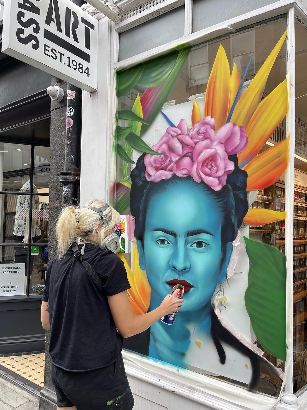
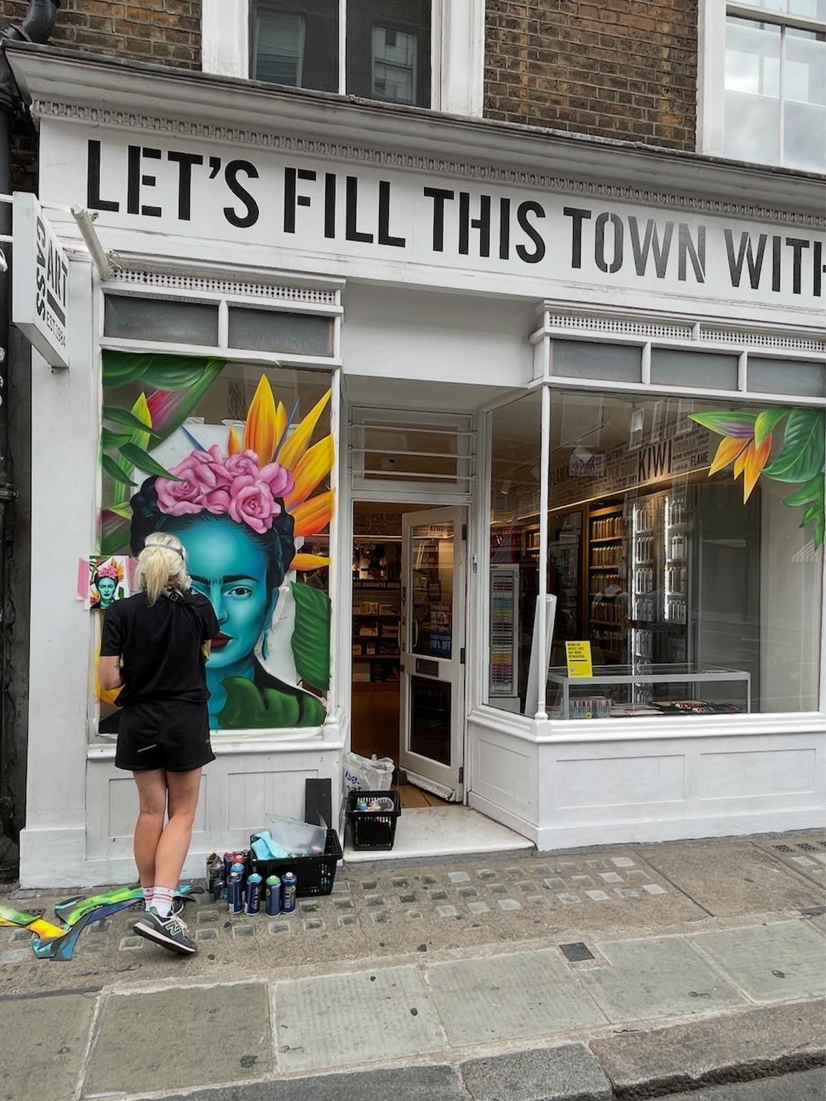
Manchester-based mural and street artist Katie Scott recently transformed the window of Cass Art Soho with a striking portrait of Frida Kahlo, created using water-based spray paint directly onto glass. With a background in illustration, Katie brings together traditional art practices, storytelling and the scale of street art. Her work often combines realistic portraiture with bold, fantastical colour and elements of the natural world, bringing character and energy to walls, buildings and public spaces. We caught up with Katie to find out more about her practice, the process behind the Frida Kahlo window at Cass Art Soho, and how she approaches creating work on such a large scale.
You trained in illustration before moving into large scale mural and street art, how has that background shaped the way you approach a wall compared to working on paper or canvas?
Painting a wall isn't actually that different from working on a piece of paper. You still have to think about all the same design principles like composition, colour and balance, you just have a lot more room to play with! The biggest differences are considering the texture of the surface, the environment around it and, most importantly, the scale. I really enjoy focusing on one key visual at a large scale rather than filling a wall with lots of smaller features, because it gives you the opportunity to really get stuck into the detail.
Your work blends realism with a fantastical colour palette, how do you decide where to lean into realism and where to let the fantastical take over?
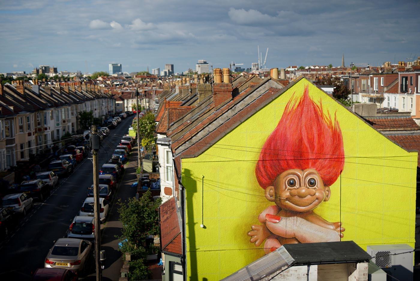
I love experimenting with the colours in my paintings I think it can make you look at things in a different light. I don’t believe there’s such a thing as too much colour! But I like to keep a balance of tones within an image so that you’re drawn into certain areas more.
What materials and tools do you work with when creating a mural like this, from paints to brushes to anything else specific to your process?
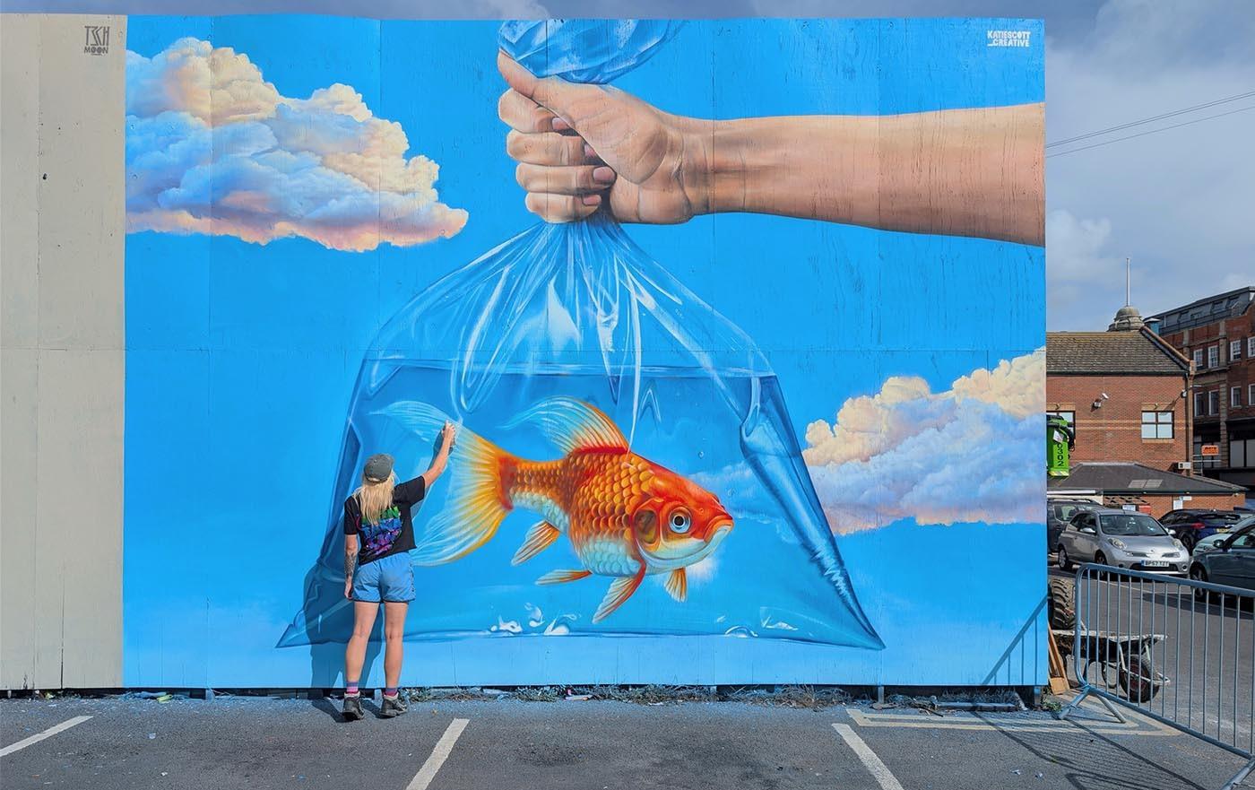
I usually create my murals on a base coat of masonry with spray paint on top. Spray paint is what I use to create the bulk of the image as it’s so good for creating blends and depth. I use lots of tricks like stencil caps and pieces of card to create sharp and fine lines
Portraiture and nature both feature heavily in your work, do you approach painting a face differently to painting foliage or natural elements when working at mural scale?
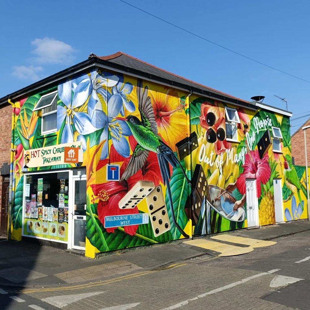
I’m much more structured with my approach to painting a portrait. I’ll grid up my line work for portraits using a doodle grid to help me get all the proportions correct. It’s so important to get these first few marks accurate especially when you’re painting a famous face! I freehand a lot more of the natural elements as I like to slot them in wherever they flow nicely.
You've worked with community groups, schools, prisons and councils, how does a project's audience or setting change the way you design a piece?
It’s really important to have people’s thoughts and ideas incorporated into a mural when it’s going to be a part of their surroundings for years to come. Depending on the project I’ll run workshops with local groups to get people involved in creating elements which will lead to the final design on the mural. Murals have different purposes in different places but most of the time I just want people to enjoy the artwork and brighten up a space.

Soho is such a distinctive, high footfall location, how did the window itself, its size, setting and surroundings influence your design choices for this mural? Or did it at all?!
The location definitely influenced the design. Soho is so vibrant and Frida has become an important queer icon so it felt like a really fitting location for the mural. I also wanted to make the most of painting onto glass rather than treating it like a solid wall. I left some areas transparent between leaves and flowers so you really feel like you’re looking through tropical foliage. From a practical point of view, painting in such a busy area makes the whole painting process a bit more of a challenge!
Soho is such a distinctive, high footfall location, how did the window itself, its size, setting and surroundings influence your design choices for this mural? Or did it at all?!
The location definitely influenced the design. Soho is so vibrant and Frida has become an important queer icon so it felt like a really fitting location for the mural. I also wanted to make the most of painting onto glass rather than treating it like a solid wall. I left some areas transparent between leaves and flowers so you really feel like you’re looking through tropical foliage. From a practical point of view, painting in such a busy area makes the whole painting process a bit more of a challenge!
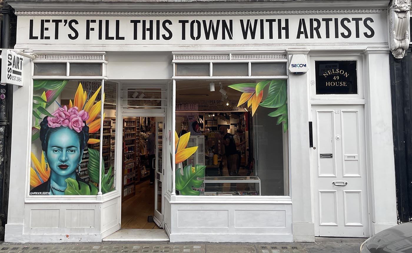
Given your usual style combines realism with vibrant, fantastical colour, how did you balance staying true to Frida's likeness with bringing your own artistic voice to a subject that wasn't your own choice of muse?
Even when I'm painting someone else's chosen subject, I think it's important that it still feels like my work. I kept Frida's portrait realistic so she was instantly recognisable, but I introduced the bold colours and botanical elements that are a big part of my style.
I like painting all sorts of different subjects because you always learn something new with each project. This was also my first time working with water-based spray paint on a glass surface, which was a fun challenge. I think that's what keeps commissioned work interesting, celebrating someone else's story while still putting my own spin on it.
Check out more of Katie's work on her website and be sure to follow her Instagram @katiescott_creative
Add To List
Add a Wishlist
form to add wishlist here