
There's something special about receiving a handmade Christmas card. Whether it's a thoughtful message, a carefully chosen design or the time taken to make something by hand, a personal touch can make all the difference. This Christmas, we're exploring the art of hand lettering to create festive cards with a little more character. Combining expressive brush calligraphy with simple decorative details, this step-by-step guide shows you how to turn a blank kraft card into a personalised Christmas greeting.
Using Tombow Dual Brush Pens, we'll explore how to combine different lettering styles, create contrast through line weight and add festive illustrations to bring your design together. Whether you're new to brush lettering or looking to develop your technique, this is a simple project that leaves plenty of room for experimentation.
One of the most useful tools for hand lettering is the Tombow Dual Brush Pen. With two different tips in a single pen, it allows you to create a variety of lettering styles, from fine, controlled lines to expressive calligraphy.
The flexible brush tip responds to changes in pressure, producing thicker and thinner strokes as you write. The fine tip is ideal for smaller lettering, outlines and decorative details.
A few techniques to practise:
Downstrokes: Apply gentle pressure as you move the brush downwards to create thicker lines.
Upstrokes: Use a lighter touch when moving upwards to produce finer, more delicate strokes.
Letter spacing: Give each letter enough room to breathe, particularly when working with larger brush lettering.
Mixing styles: Combine flowing script with upright block lettering to create contrast and establish a clear visual hierarchy.
Before working directly onto your card, try a few practice strokes on scrap paper. Getting comfortable with the pressure of the brush tip will help you achieve more consistent lettering.

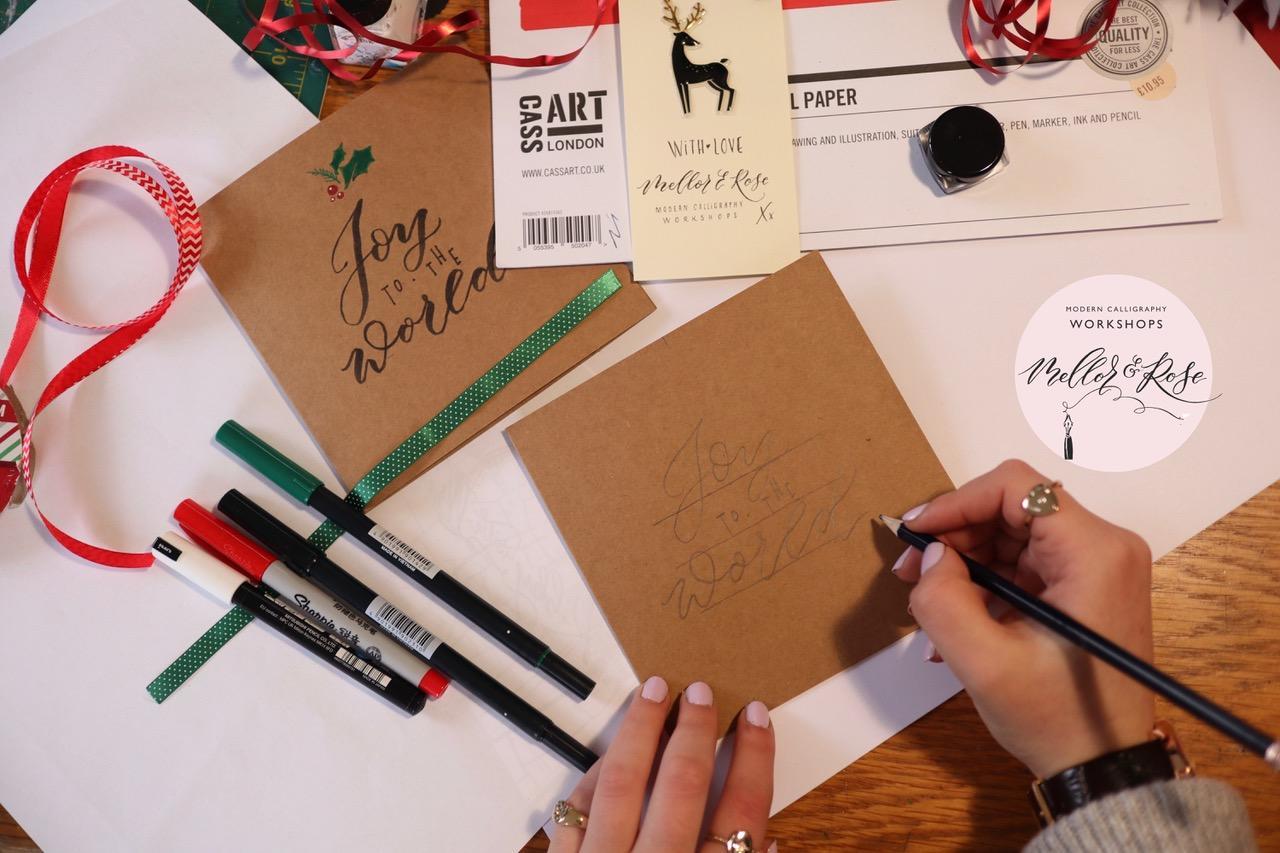
Begin with a square kraft card, using a pencil and ruler to lightly draw three horizontal guidelines. These will help you position your lettering and keep the overall composition balanced.
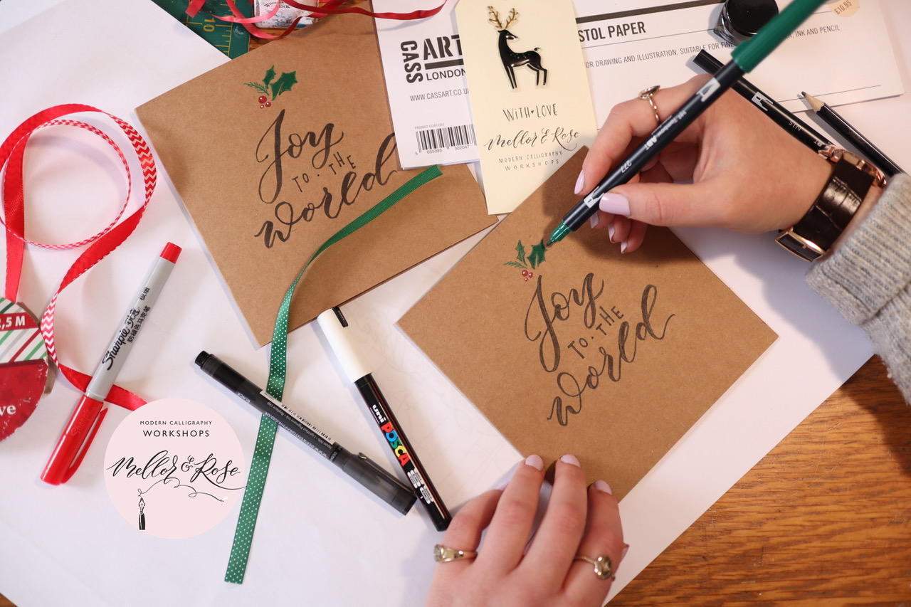
For our design, we're working with the festive greeting Joy to the World, arranging the words across three lines. Start by lightly sketching each word in pencil, experimenting with the size, spacing and placement until you're happy with the layout.
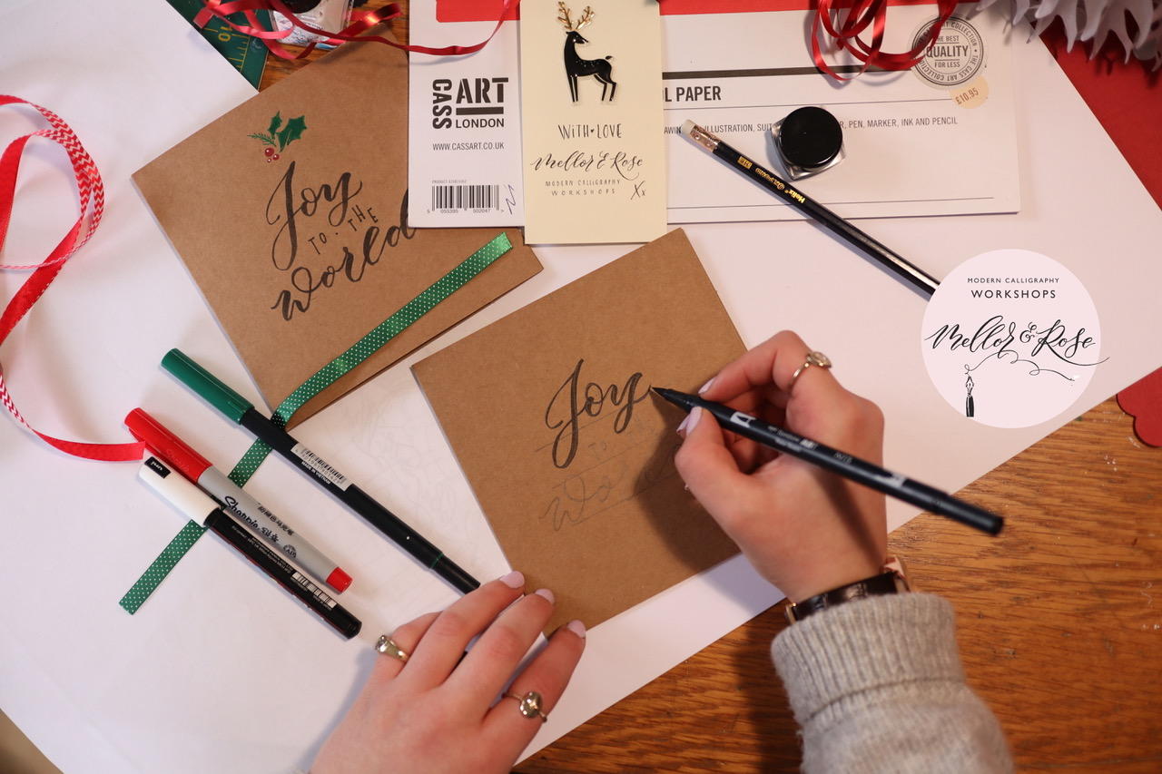
Once your design is in place, take your Tombow Dual Brush Pen and use the larger brush tip to begin lettering the word Joy.
Work slowly, applying more pressure on your downstrokes and easing off on your upstrokes. This variation in line weight creates the flowing, expressive quality associated with brush calligraphy.
Tip: Rather than trying to write the entire word in one continuous movement, concentrate on forming each letter individually. You can always return to strengthen a downstroke or refine a curve once the initial lettering is complete. Remember to leave enough space beneath your first word for the remaining lettering and decorative details.
With Joy complete, it's time to introduce a second lettering style.
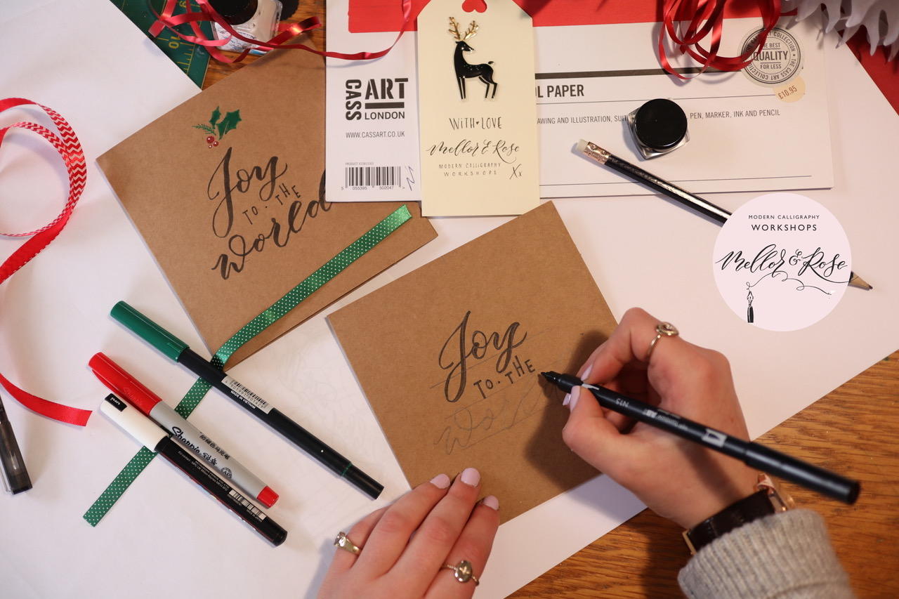
Turn your Tombow Dual Brush Pen around to reveal the fine tip. This end offers greater control, making it particularly useful for smaller lettering and more precise marks.
Using your pencil guidelines, carefully letter the words to the in a simple, upright style. Keep your strokes relatively fine and consistent, allowing the smaller lettering to contrast with the more expressive calligraphy above. Combining different lettering styles is an effective way to introduce visual interest without making your design overly complicated. The contrast between the flowing script and structured upright letters helps establish a natural rhythm across the card.
Tip: Try increasing the spacing between individual letters to give the smaller text a more considered appearance. You can also experiment with uppercase lettering to create an even stronger contrast.
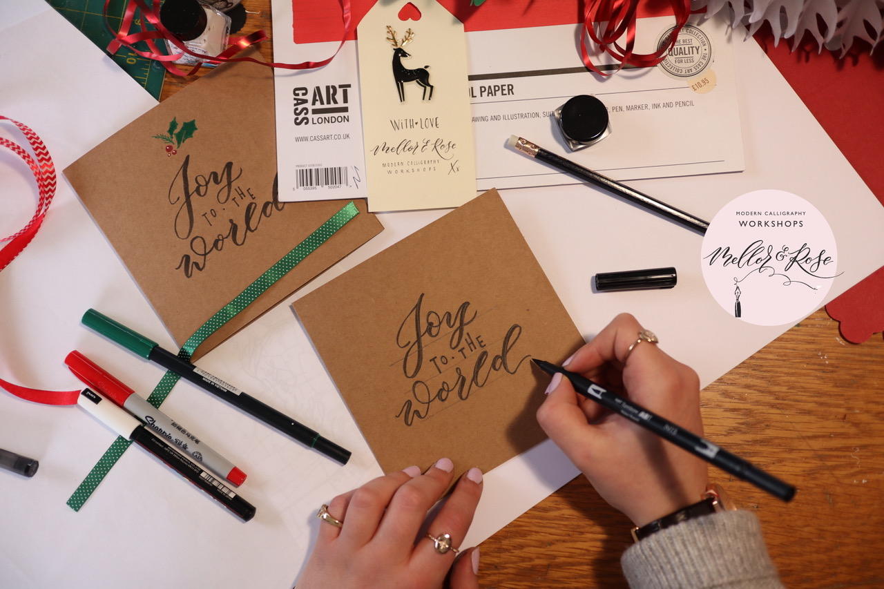
Now it's time to finish the main lettering with the word World. Return to the broader, flexible brush tip of your Tombow pen and follow your pencilled guidelines to create the final word in brush calligraphy. As with Joy, focus on the relationship between your thick and thin strokes. Apply pressure as the pen moves downwards and release it as you move upwards, keeping your movements steady and controlled.
Because World sits at the bottom of the composition, it provides an opportunity to introduce slightly larger letterforms or more expressive curves.
Pay particular attention to the beginning and end of the word. A gently extended stroke or curved finishing flourish can help bring the lettering together.
Once you've finished, take a moment to look at the composition as a whole. The combination of bold brush lettering and fine upright text should create a clear hierarchy, drawing the eye naturally through the greeting.
Tip: If you're struggling to achieve a consistent thick-to-thin transition, try slowing down your movements. Brush lettering is more about controlled pressure than speed. You can also build up thicker strokes afterwards by carefully adding a second layer of ink.
With the lettering complete, we can begin adding a few festive details. Holly leaves and berries are a simple way to introduce colour and decoration without distracting from the main greeting. Start with a green Tombow Dual Brush Pen, using the fine tip to outline your holly leaves. Draw a gently curved central line, then build up the pointed edges of each leaf around it. Once you're happy with the shapes, switch to the broader brush tip and fill them in with a few controlled strokes.
You can leave small areas of the kraft card visible to suggest highlights and give the leaves a little more dimension.
Next, take a bright red fine-tip Sharpie and add small clusters of berries alongside your holly leaves. Varying their size and placement will help the illustration feel more natural. Position your decorations around the lettering, using them to frame the greeting rather than compete with it.
Tip: When adding decorative elements, think about balance rather than symmetry. A small cluster of holly in one corner can be complemented by a few leaves or berries elsewhere in the design.
And there you have it, a hand-lettered Christmas card ready to send!
From the first pencil guidelines to the final holly berries, this project is an opportunity to explore brush lettering while creating something personal. With just a few materials and some simple techniques, you can turn a blank card into a festive greeting that's entirely your own.
Whether you're making a single card or a whole collection, take your time, experiment with different styles and enjoy the process.
Add To List
Add a Wishlist
form to add wishlist here